Hospital dashboards consolidate complex data into accessible formats, enabling healthcare professionals to monitor key performance indicators (KPIs), streamline processes, and make informed decisions. By integrating real-time information on patient demographics, treatment outcomes, and resource utilization, hospital dashboards facilitate proactive management and continuous improvement. This article explores five exemplary hospital dashboards that demonstrate the transformative impact of data visualization in healthcare settings.
Table of Contents
# 1 Hospital Dashboards – Hospital Emergency Room Dashboard
The Hospital Emergency Room Dashboard for June 2019 visualizes critical metrics related to emergency room performance and patient demographics. As a hospital management dashboard, it presents primary metrics such as the total number of patients (506), average wait time (35.6 minutes), patient satisfaction score (5.2/10), and number of patients referred (201). Each metric is complemented by a line chart to show trends over time.
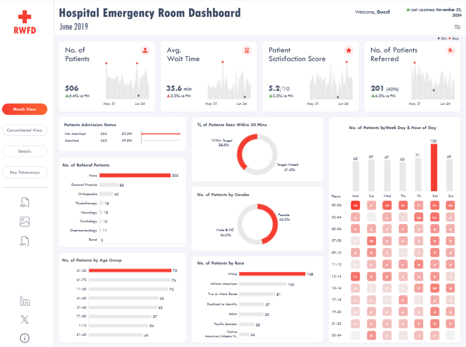
Additional sections provide insights into patient admission status (split between admitted and not admitted), referrals by specialty (e.g., General Practice, Orthopedics), and patient demographics such as age group, gender, and race, visualized with bar charts. A doughnut chart shows the percentage of patients seen within 30 minutes, highlighting the proportion that missed the target. Heatmaps display patient visits by weekday and hour, emphasizing peak times.
This hospital KPI dashboard is designed for healthcare administrators, emergency department managers, and hospital executives. It enables them to monitor operational efficiency, identify bottlenecks in patient care, and assess demographic trends. The insights help improve resource allocation, optimize wait times, and enhance patient satisfaction. Additionally, it may be valuable for healthcare policy analysts seeking data-driven recommendations for emergency care improvements.
#2 Hospital Dashboards – Hospital ER Dashboard
The Hospital ER Dashboard offers a comprehensive overview of emergency room performance and patient demographics. As a hospital management dashboard, it presents critical metrics such as patient visits (81), admission rate (46.9%), average wait time (33.4 minutes), and average satisfaction score (5.3/10). Line charts track these metrics over time, enabling trend analysis.
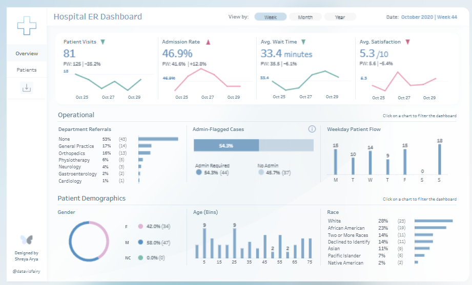
Operational data is displayed using bar charts and progress indicators. Department referrals are categorized by specialty, with General Practice and Orthopedics being the most frequent. Another chart highlights admin-flagged cases, showing the percentage requiring administrative intervention. A bar chart illustrates weekday patient flow, emphasizing peak times during the week.
Patient demographics are visualized through gender distribution in a doughnut chart and age breakdown in a bar chart. A race distribution bar chart highlights the diversity of patients visiting the ER, offering additional insights into the population served.
This hospital KPI dashboard is an essential tool for hospital administrators, emergency department managers, and operational analysts. It aids in understanding workflow patterns, monitoring service efficiency, and identifying areas for improvement. The insights from this hospital management system dashboard can guide resource allocation and operational decisions, ultimately enhancing patient care and satisfaction. It is a critical component of modern dashboards for hospitals.
#3 Hospital Dashboards – Hospital ER Dashboard
The Hospital ER Dashboard offers a comprehensive view of emergency room operations, emphasizing performance metrics, administration, and patient demographics. As a hospital management dashboard, it highlights key performance indicators such as the total number of patients (471), average wait time (34.1 minutes), and average satisfaction score (5.3/10), accompanied by trend line charts for temporal comparisons.
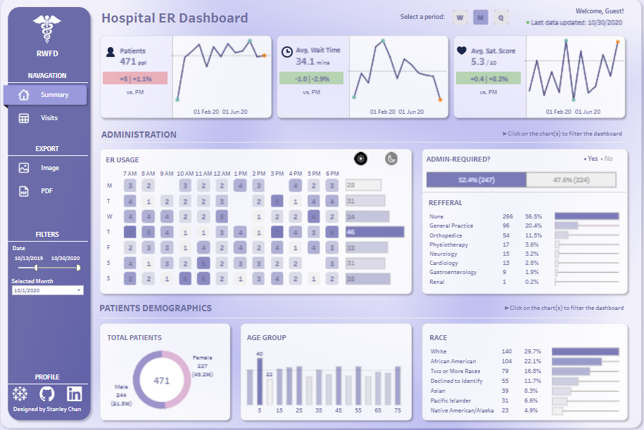
In the administration section, a heatmap illustrates ER usage by hour and day of the week, pinpointing peak times. A bar chart tracks referrals by department, including General Practice and Orthopedics, while a progress bar indicates the proportion of cases requiring administrative intervention.
Patient demographics are detailed through a doughnut chart displaying gender distribution and bar charts breaking down age groups and racial diversity. The race distribution chart identifies the proportions of various ethnic groups, adding depth to demographic insights.
This hospital management system dashboard is a vital tool for administrators, emergency department leaders, and healthcare analysts. By combining operational data with demographic details, it enables effective resource planning and identifies trends impacting service delivery. The insights provided by this hospital KPI dashboard assist in optimizing workflows, improving patient satisfaction, and meeting hospital goals. It serves as an essential component of modern dashboards for hospitals, supporting data-driven decision-making in healthcare management.
#4 Hospital Dashboards – Hospital A&E Patient Analysis
The Hospital A&E Patient Dashboard offers a comprehensive overview of accident and emergency operations, emphasizing patient demographics, wait times, and referrals. As a hospital management dashboard, it features a key metric: the total number of patients (9,216). A line chart tracks emergency room patient numbers over time, segmented by gender for detailed analysis.
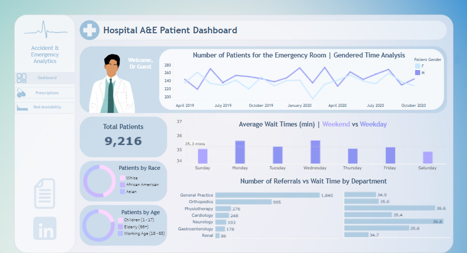
Bar charts compare average wait times across days, distinguishing between weekdays and weekends. Another bar chart correlates referral numbers with average wait times for departments such as General Practice, Orthopedics, and Gastroenterology, aiding in identifying patient flow bottlenecks.
Demographic details are presented in doughnut charts illustrating racial distribution and age groups of patients, categorized into children, elderly, and working-age individuals. These visualizations enhance data depth, facilitating a clear understanding of the patient population.
This hospital KPI dashboard is an essential tool for healthcare administrators and emergency department managers. By leveraging insights from this hospital management system dashboard, decision-makers can improve resource allocation, reduce wait times, and effectively address patient needs. It is vital to modern hospital dashboards, supporting operational efficiency and informed decision-making.
#5 Hospital Dashboards – Hospital Emergency room visits
The hospital management dashboard offers a comprehensive overview of emergency room operations, emphasizing key performance metrics, patient demographics, and service trends. It presents essential statistics, including the total number of patients (471), average waiting time (34.05 minutes), and patient satisfaction score (5.31). A line chart visualizes trends in patient visits over time, providing insights into fluctuations in hospital activity.
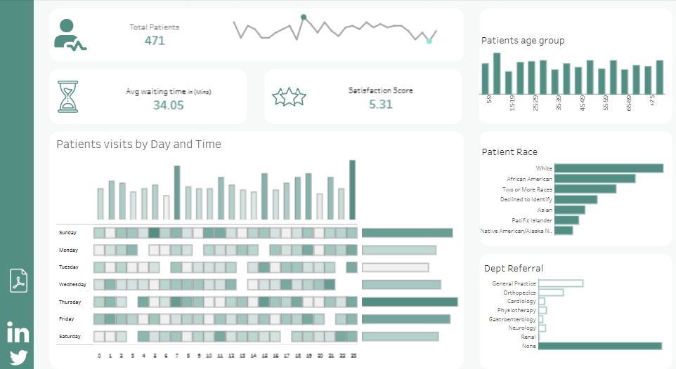
A heatmap displays patient visits by day and time, effectively identifying peak hours and busy days of the week. Bar charts break down patient age groups and categorize patients by race, showcasing the diversity of individuals receiving care.
The referral section utilizes bar charts to highlight the distribution of patient referrals across departments, including General Practice, Orthopedics, and Cardiology. A significant portion requires no referral. These visual elements facilitate quick comprehension of department-specific patient flows and operational insights.
This hospital KPI dashboard is valuable for hospital administrators, emergency department managers, and healthcare analysts. It is a critical tool for identifying bottlenecks, managing resource allocation, and improving patient satisfaction. As an essential component of modern hospital dashboards, it enhances decision-making and optimizes operational efficiency.
The integration of hospital dashboards into healthcare management systems represents a significant advancement in delivering high-quality patient care. The five examples discussed illustrate how tailored dashboards can address specific operational challenges, from monitoring emergency department performance to tracking patient satisfaction and financial metrics. By leveraging these tools, healthcare administrators and clinicians can gain actionable insights, optimize resource allocation, and enhance service delivery. As the healthcare industry continues to embrace data-driven strategies, adopting sophisticated hospital dashboards will be crucial in meeting the demands of modern medical practice and improving patient outcomes.


