A well-designed help desk dashboard is critical for IT managers and support teams, offering real-time insights into ticket management, issue resolution, and team performance. By visualizing key metrics, these dashboards empower teams to make data-driven decisions, identify bottlenecks, and allocate resources effectively. In this blog, we’ll explore seven standout help desk dashboard examples that showcase the power of visualization in optimizing support operations.
Whether you’re looking to enhance your current setup or are in the process of implementing a new service desk dashboard, these examples will provide valuable inspiration and practical insights to help you maximize your support team’s effectiveness.
Table of Contents
1. Help Desk Dashboard
The displayed dashboard is a comprehensive help desk dashboard designed to provide an overview of the current status and performance of a help desk or IT support system. This service desk dashboard presents a variety of critical metrics and data visualizations that collectively offer insights into ticket management, resolution efficiency, and customer satisfaction.
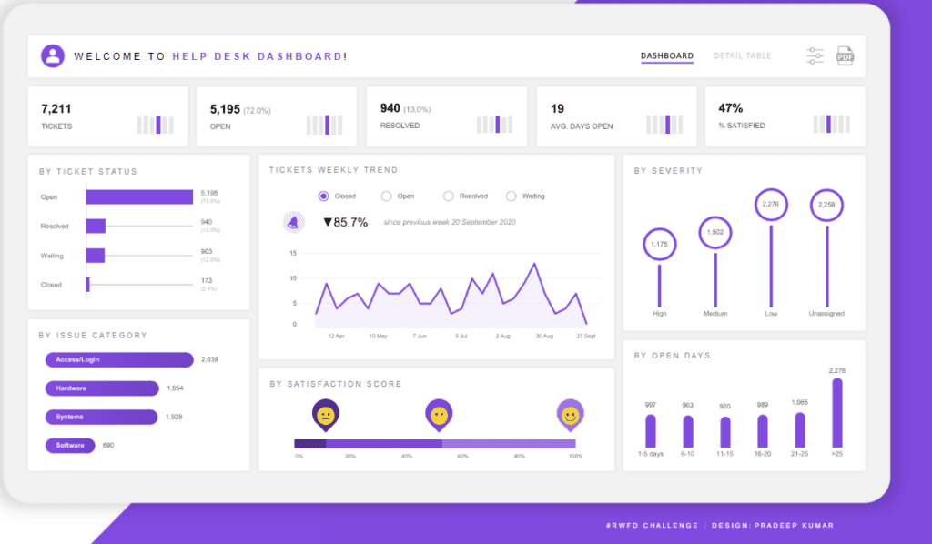
Key Components:
- Top Metrics: The Tableau help desk dashboard features critical metrics such as the total number of tickets (7,211), tickets currently open (5,195), resolved tickets (940), average days open (19), and customer satisfaction percentage (47%). These metrics are prominently displayed at the top for quick access to essential data.
- Ticket Status: A horizontal bar chart breaks down the tickets by status: open, resolved, waiting, and closed. This visual representation is effective in help desk dashboard examples for understanding the distribution of ticket statuses at a glance.
- Issue Categories: Another bar chart categorizes tickets based on issues like Access/Login, Hardware, Systems, and Software. This helps identify the most common problems users are facing.
- Weekly Trend: A line chart displays the weekly trend of ticket statuses over time, providing insights into how ticket volume and resolution evolve.
- Severity Levels: Severity levels of tickets are shown with circular bar charts, indicating the distribution across high, medium, low, and unassigned tickets.
- Satisfaction Score: A horizontal bar with emoji icons represents the satisfaction score distribution, highlighting customer feedback.
- Open Days: A vertical bar chart indicates how long tickets have been open, divided into ranges from 1-5 days to over 25 days.
Audience:
This service desk dashboard is handy for IT support managers, help desk supervisors, and organizational leaders who need to monitor and optimize the performance of their support teams. It enables them to identify bottlenecks, assess the efficiency of issue resolution, and gauge customer satisfaction levels, allowing for data-driven decision-making.
2. Help Desk Dashboard
The displayed dashboard is a help desk dashboard designed to provide a detailed overview of call monitoring and the status of total tickets within a service desk or IT support system. This service desk dashboard is crucial for tracking key performance indicators (KPIs) related to ticket management, customer satisfaction, and overall service efficiency.
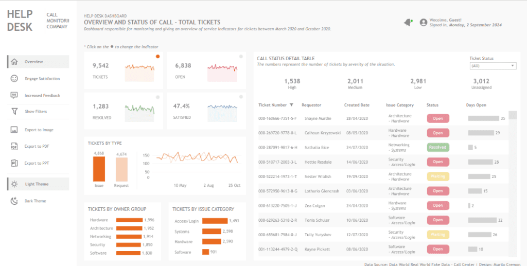
Key Components:
- Top Metrics: The Tableau help desk dashboard prominently displays essential metrics such as the total number of tickets (9,542), tickets currently open (6,838), resolved tickets (1,283), and customer satisfaction rate (47.4%). Each of these metrics is accompanied by trend lines to visualize changes over time, providing insights into performance fluctuations.
- Tickets by Type: A bar chart contrasts the number of issues (4,868) against requests (4,674), offering a clear view of the nature of the support queries being handled.
- Tickets by Owner Group: This horizontal bar chart categorizes tickets by their respective owner groups, such as Hardware, Architecture, Networking, Security, and Software. This segmentation helps identify which departments are most involved in ticket resolutions, serving as a practical example within help desk dashboard examples.
- Tickets by Issue Category: Another horizontal bar chart displays the distribution of tickets across various issue categories, such as Access/Login, Systems, Hardware, and Software, highlighting the areas with the most common issues.
- Call Status Detail Table: This detailed table lists individual tickets along with their number, requestor, creation date, issue category, current status (e.g., Open, Resolved, Waiting), and the number of days open. It allows for granular tracking of ticket progress and resolution times.
Audience:
This service desk dashboard is handy for IT support managers, service desk supervisors, and operations managers. It enables them to monitor the efficiency and effectiveness of their teams, identify bottlenecks in ticket resolution, and make data-driven decisions to improve service delivery. Additionally, the dashboard’s clear visualization of trends and performance metrics is valuable for stakeholders who must ensure that customer satisfaction and service levels are maintained at a high standard.
3. IT Help Desk Performance
The displayed dashboard is a help desk dashboard focused on analyzing and presenting the help desk’s performance metrics over the last 90 days. It provides a detailed breakdown of key performance indicators (KPIs) related to ticket volume, priority, resolution times, and customer satisfaction, making it an essential tool for monitoring the effectiveness of a service desk dashboard.
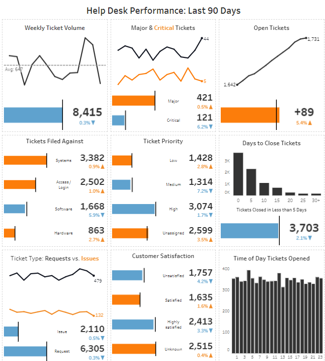
Key Components:
- Weekly Ticket Volume: A line chart shows the fluctuation in ticket volume over the past 90 days, with a bar indicating the total number of tickets (8,415). This is a prime example of how help desk dashboard examples can help identify trends and spikes in support activity.
- Central & Critical Tickets: This section uses a combination of line and bar charts to distinguish between significant and critical tickets, providing insight into the severity of issues being handled.
- Open Tickets: A line chart tracks the increase in open tickets over time, indicating 1,731 open tickets. An additional bar chart shows the volume change (+89).
- Tickets Filed Against Bar charts categorize tickets by the type of issue they were filed against, such as Systems, Access/Login, Software, and Hardware, helping to pinpoint common problem areas.
- Ticket Priority: Another set of bar charts displays the distribution of tickets based on their priority levels (Low, Medium, High, Unassigned), highlighting where resources might need to be allocated.
- Days to Close Tickets: A bar chart shows the distribution of tickets based on the number of days it took to close them, emphasizing the speed of issue resolution.
- Customer Satisfaction: This component uses bar charts to represent customer satisfaction levels, providing insights into how well the service desk meets user expectations.
- Time of Day Tickets Opened: A bar chart visualizes when tickets are most frequently opened during the day, which can inform staffing and resource planning.
Audience:
This Tableau help desk dashboard is invaluable for IT support managers, team leaders, and service desk analysts. It allows them to monitor help desk performance, identify bottlenecks, and make informed decisions to improve service efficiency. The clear visualization of trends and KPIs makes it a valuable tool for reporting to stakeholders and ensuring that customer satisfaction levels are consistently met.
4. Help Desk Dashboard
The displayed help desk dashboard is designed to provide a comprehensive overview of the help desk’s current status and performance. It focuses on key metrics such as the total number of tickets, ticket statuses, severity levels, and customer satisfaction, offering a clear and detailed view of service desk dashboard operations.
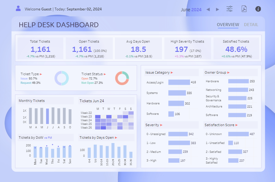
Key Components:
- Top Metrics: The Tableau help desk dashboard highlights essential statistics, including total tickets (1,161), open tickets (1,161), average days open (18.5), high severity tickets (197), and the percentage of satisfied tickets (48.6%). These metrics are presented at the top for easy accessibility, with percentage changes compared to the previous month (PM) for context.
- Ticket Type & Status: Two pie charts break down tickets by type (Issue vs. Request) and status (Open vs. Not Open), providing a glance at the distribution of tasks handled by the service desk.
- Monthly Tickets & Weekly Breakdown: A bar chart tracks the monthly ticket volume, while a calendar heatmap shows the weekly ticket distribution for a more granular analysis.
- Tickets by Day of the Week (DoW) & Days Open: These bar charts display ticket volume by day of the week and the number of days tickets have remained open, helping to identify patterns in ticket management.
- Issue Category & Owner Group: Horizontal bar charts categorize tickets by issue type (e.g., Access/Login, Systems, Hardware, Software) and by owner groups such as Hardware, Networking, and Security & Governance, highlighting the areas with the highest ticket volumes.
- Severity & Satisfaction Score: Additional bar charts depict ticket severity levels (from unassigned to high) and customer satisfaction scores, showing how well the service desk is performing in resolving issues.
5. Help Desk
The displayed help desk dashboard offers a comprehensive view of the key performance indicators for a help desk, focusing on ticket management, resolution efficiency, and customer satisfaction. It is designed to help IT managers, support team leaders, and other stakeholders monitor and optimize service desk dashboard operations.
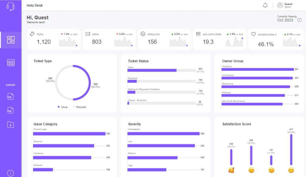
Key Components:
- Top Metrics: The Tableau help desk dashboard presents vital metrics at the top, including total tickets (1,120), open tickets (803), resolved tickets (156), average days open (19.3), and satisfaction percentage (46.1%). Each metric is accompanied by a small line chart showing the trend compared to the previous month (September), making it easy to identify changes in performance.
- Ticket Type & Status: A pie chart splits tickets evenly between Issues and Requests, while a bar chart breaks down the ticket status into categories such as Open, Resolved, Waiting for Requestor Feedback, and Closed – No Action. This helps us understand the current state of ticket processing.
- Issue Category & Owner Group: Horizontal bar charts categorize tickets by issue type (e.g., Access/Login, Systems, Hardware, Software) and by the owner group (e.g., Hardware, Architecture, Networking). These visualizations help identify which areas or teams are most involved in ticket resolutions, showcasing help desk dashboard examples.
- Severity: Another bar chart categorizes tickets by severity (Unassigned, Low, Medium, High), helping prioritize resources and attention where it is most needed.
- Satisfaction Score: The satisfaction score is represented with emoji-based bar charts, providing a quick and visual gauge of customer sentiment, ranging from highly satisfied to unsatisfied.
6. Help Desk | Weekly Analysis
The displayed help desk dashboard provides a detailed weekly analysis of help desk performance for the week commencing April 27, 2020. It focuses on key metrics such as the total number of tickets, average days open, resolution rates, and customer satisfaction, offering a comprehensive view of service desk dashboard operations.
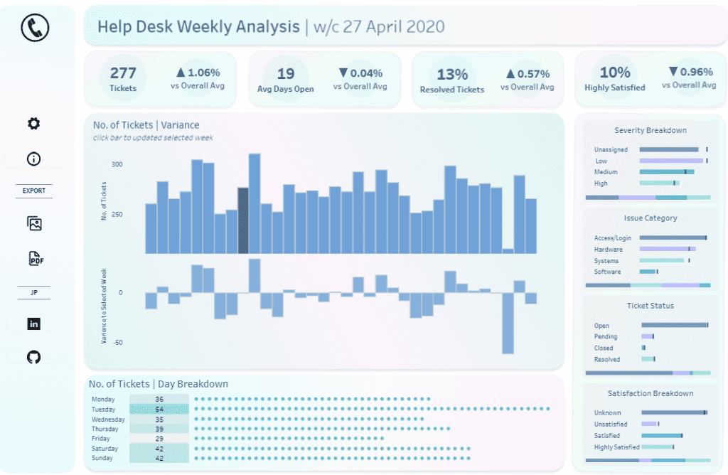
Key Components:
- Top Metrics: The dashboard highlights essential statistics, including the total number of tickets (277), average days open (19), percentage of resolved tickets (13%), and the percentage of delighted customers (10%). Each metric is compared against overall averages, providing context on whether performance is improving or declining.
- Tickets and Variance: A bar chart displays the number of tickets across various weeks, and underneath it, a variance analysis shows how the current week compares to previous weeks. This helps identify trends and fluctuations in ticket volume over time.
- Day Breakdown: A dot matrix chart breaks down the number of tickets received each day of the week, providing a granular view of daily ticket distribution.
- Severity Breakdown: A horizontal bar chart categorizes tickets by severity levels, such as Unassigned, Low, Medium, and High, helping to prioritize which tickets require immediate attention.
- Issue Category: Another bar chart breaks down tickets by issue category, including Access/Login, Hardware, Systems, and Software, allowing for quick identification of the most common issues users face.
- Ticket Status: A chart displays the status of tickets, categorized as Open, Pending, Closed, or Resolved, giving a snapshot of how many tickets are actively being worked on versus those completed.
- Satisfaction Breakdown: The satisfaction score is detailed in a bar chart, showing the distribution of responses from Highly Satisfied to Unsatisfied, providing insight into customer sentiment.
7. Help Desk
The displayed help desk dashboard offers a focused view of help desk performance metrics for the week of October 25, 2020. It provides insights into ticket management, customer satisfaction, and issue severity, making it a valuable tool for IT managers and support team leaders.
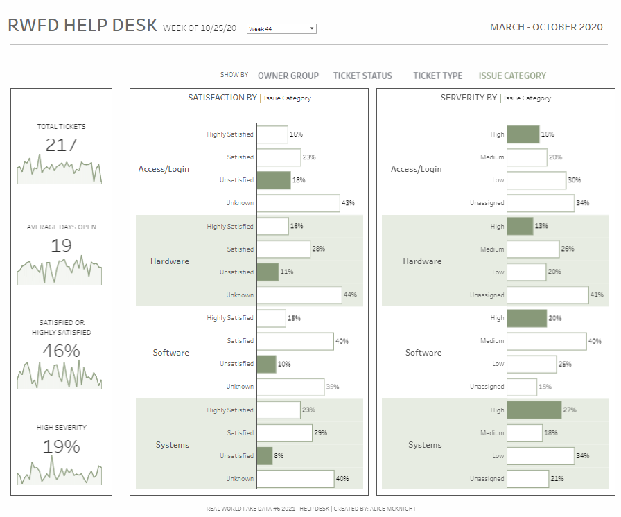
Key Components:
- Total Tickets and Average Days Open: The dashboard presents the total number of tickets (217) and the average days open (19), with accompanying line charts that show trends over time. This feature allows for a quick assessment of the ticket volume handled and the efficiency of ticket resolution.
- Satisfaction by Issue Category: Horizontal bar charts display customer satisfaction levels—ranging from Highly Satisfied to Unsatisfied—across different issue categories such as Access/Login, Hardware, Software, and Systems. This breakdown helps understand which issues drive customer satisfaction or dissatisfaction, providing crucial insights for improving service quality.
- Severity by Issue Category: Another set of horizontal bar charts categorizes tickets by severity (High, Medium, Low, Unassigned) within the same issue categories. This visualization is essential for prioritizing work and highlighting the critical issues that require immediate attention.
Help Desk Dashboard Examples
A powerful help desk dashboard is more than just a collection of charts and graphs; it’s a strategic asset that drives efficiency and customer satisfaction. These seven help desk dashboard examples show that the right dashboard can transform raw data into actionable insights, enabling your team to stay ahead of issues and deliver exceptional service. Whether using a Tableau help desk dashboard or another platform, the key is to tailor your dashboard to your specific needs, focusing on the metrics that matter most to your organization. By regularly reviewing and refining your service desk dashboard, you can ensure it continues to meet the evolving demands of your business, ultimately leading to a more responsive, efficient, and customer-focused support operation.