Welcome to our latest exploration of the dynamic interplay between Tableau and Google Analytics, where we delve into five distinctive dashboards that exemplify the power of integrating these robust tools. As the digital landscape continues to evolve, the ability to not only gather but also intelligently analyze data becomes paramount.
In this blog, we’ll showcase five Tableau Google Analytics dashboard examples that stand out for their innovative approach to visualizing data, providing clear insights into web traffic, user behavior, and overall digital marketing effectiveness. Whether you’re a data scientist, a digital marketer, or a business analyst, these examples will illuminate the potential of combining Google Analytics with Tableau to drive strategic decisions and optimize your digital footprint.
Table of Contents
Affiliate Disclosure: Some of the links on this blog are affiliate links, which means if you click on them and make a purchase, we may receive a commission at no extra cost to you. This helps support our blog and allows us to continue to create content for you. We only recommend products and services we genuinely believe in; all opinions expressed here are our own. I appreciate your support!
This blog contains dashboards curated from Tableau public, we do not take credit for any of these dashboards.
#1 Google Analytics with Tableau: Web Traffic Dashboard | Digital Marketing
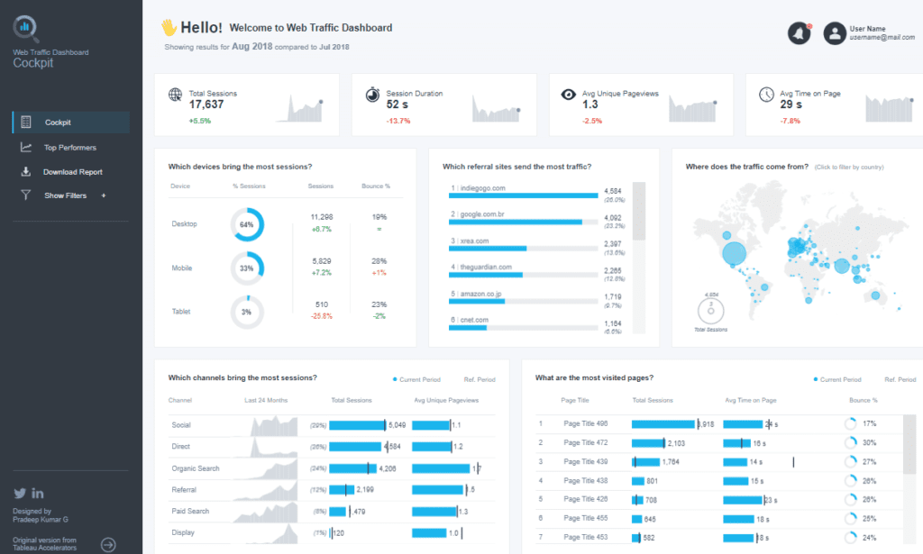
This dashboard is specifically tailored for monitoring web traffic and understanding user engagement over time. It provides a rich, data-driven view into user behavior and website performance, making it an essential tool for digital marketing professionals, web analysts, and strategic decision-makers within an organization.
Purpose and Usage
These Google Analytics Tableau dashboards are crafted to give comprehensive insights into web traffic dynamics by presenting data from Google Analytics in an organized, visually appealing format. The primary users of such dashboards are digital marketers who need to track the effectiveness of their campaigns, SEO specialists analyzing organic search performance, and content managers looking to understand page views and user engagement levels. The dashboard facilitates strategic planning, offering actionable insights that help optimise marketing efforts and enhance user experience on the site.
Chart Types and Layout
The dashboards utilize a variety of chart types to represent data effectively:
- Bar Charts and Line Graphs: depict trends over time, showing metrics like session duration and page views, which help assess user engagement and the effectiveness of different content strategies.
- Geographical Heat Maps: Highlight where web traffic comes from, allowing marketers to tailor strategies based on geographic data.
- Detailed Lists and Tables: Provide session data broken down by referral sources, helping identify which external sites drive the most traffic.
Positive Aspects
One significant advantage of these dashboards is their ability to break down complex datasets into manageable, visually engaging information. Filters, such as country, payment method, or session duration, allow users to customize views according to specific needs, enhancing the dashboard’s utility for targeted analysis.
Negative Aspects
However, the high density of information presented can be overwhelming, especially for users not accustomed to navigating detailed data interfaces. Additionally, the reliance on similar colour schemes across different charts might lead to visual confusion, potentially complicating the data interpretation.
Conclusion
These Tableau with Google Analytics dashboards effectively synthesize vast web traffic data into actionable insights. They empower users to make informed decisions that can profoundly impact marketing strategies and business outcomes. By improving navigation and perhaps simplifying the visual presentation, these dashboards could become even more user-friendly, maximizing their potential as indispensable tools in the arsenal of any data-driven organization.
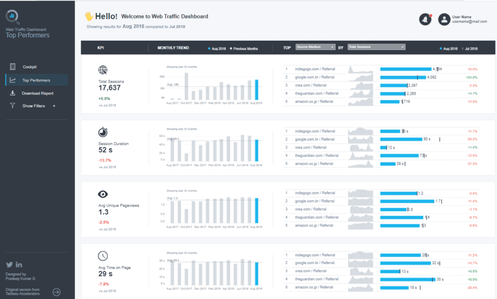
#2 Google Analytics with Tableau: Google Analytics Dashboard
This Tableau Google Analytics dashboard visualizes several key performance metrics for tracking and optimizing website performance.

Purpose and Usage
This Google Analytics with Tableau dashboard is utilized by digital marketing teams, web analysts, and business strategists. It is specifically designed to monitor real-time data on user engagement, traffic sources, device usage, and content interaction, making it a pivotal tool for:
- Digital Marketers: To gauge the effectiveness of various marketing campaigns and adjust strategies based on direct and organic traffic insights.
- SEO Specialists: To analyze page views and session quality, helping refine SEO tactics.
- Content Managers: To understand which content categories perform well regarding user engagement and session duration.
Chart Types and Layout
The dashboard employs a variety of chart types to present data efficiently:
- Bar Charts: These display changes in sessions and pageviews over time.
- Donut Charts: Show the proportion of new vs. returning visitors, providing insight into user loyalty and retention.
- Heat Maps: Visualize data geographically, highlighting where site traffic originates, which can be crucial for localized marketing efforts.
- Line Graphs: Track average session duration and bounce rates, which are critical for assessing the quality of user engagement.
Positive Aspects
The dashboard’s strength lies in presenting complex data in an accessible format. The integration of various data visualizations aids in quickly identifying trends and anomalies. Interactive elements allow users to drill down into specifics, making it a dynamic tool for data-driven decision-making.
Negative Aspects
However, the high information density and similar colours across different charts can potentially overwhelm users. This could complicate distinguishing between data sets at a glance. Additionally, some users might find the dashboard challenging to navigate effectively without proper training.
Conclusion
This Google Analytics in Tableau dashboard provides a robust platform for analyzing web traffic data, offering valuable insights to drive strategic business decisions. The dashboard could enhance its usability by improving aspects like colour differentiation and user interface design, making it an even more effective tool for any data-driven organization.
#3 Google Analytics with Tableau: Google Analytics Marketing Dashboard
This dashboard effectively tracks and analyzes revenue generation, user engagement, and transactional data, making it a vital tool for marketers and decision-makers within an organization.

Purpose and Usage
This Google Analytics Tableau dashboard is crucial for digital marketers, e-commerce managers, and business analysts. It allows them to:
- Monitor Revenue: Track daily revenue trends to understand sales patterns and identify peak performance days.
- Analyze User Behavior: Review metrics such as new users, total users, session counts, and engagement rates to gauge marketing campaign effectiveness and user retention.
- Optimize Conversion Rates: Utilize e-commerce conversion rates and transaction data to refine marketing strategies and improve conversion optimization efforts.
Chart Types and Layout
The dashboard incorporates several types of visualizations to represent data succinctly:
- Line Graph: Displays daily revenue, clearly showing financial trends over time.
- Bar Charts: Show revenue distribution by hour and weekday, helping identify high-performance periods.
- Heatmaps are used to visualize the density of website interactions throughout the week, indicating user activity levels at different times.
- Numerical Indicators: Present essential figures such as total revenue, transactions, and user metrics at a glance, providing a quick overview of key performance indicators.
Positive Aspects
The dashboard’s strength lies in its structured presentation and comprehensive data coverage, facilitating quick insights and strategic decision-making. Its interactive features allow users to drill down into specific data points for a deeper analysis, enhancing the overall utility of the dashboard.
Negative Aspects
However, the dashboard might appear cluttered due to the high density of information, which could overwhelm users unfamiliar with detailed data analysis. Additionally, using similar colours and styles across different charts might lead to visual confusion, making it challenging for users to differentiate between the data visualizations quickly.
Conclusion
Overall, this Google Analytics with Tableau dashboard is an effective tool for monitoring marketing performance and making informed decisions. By offering detailed insights into user behavior and revenue metrics, it supports strategic business initiatives and helps optimize marketing efforts. Improvements in design and layout could further enhance its usability, making it an even more accessible tool for all levels of users in an organization.
#4 Google Analytics with Tableau: Google Analytics Dashboard
This comprehensive dashboard is tailored to showcase various metrics crucial for understanding website performance and user engagement over a specific period, in this case, September 2018.

Purpose and Usage
This Google Analytics with Tableau dashboard is vital for multiple organizational roles. Marketing managers, digital strategists, and business development teams can leverage this dashboard to:
- Track Site Performance: Analyze total site views, peak viewing times, and critical performance trends.
- Understand Audience Geography: Examine visitor locations to target marketing and content strategies better.
- Optimize for Devices: Assess the breakdown of device usage to enhance user experience across platforms.
Chart Types and Layout
The dashboard employs an array of visualization types to communicate data effectively:
- Line Graphs: Illustrate trends in site views over the month, clearly showing traffic fluctuations.
- Bar Charts: Show detailed views daily and weekly, pinpointing higher traffic occurrences.
- World Map: Highlights visitor distribution across the globe, identifying key markets.
- Pie Chart: Details the proportion of website access from desktops, mobiles, and tablets.
- Lists: Rank the most visited pages and active visitor locations, offering insight into popular content and geographic engagement.
Positive Aspects
The dashboard’s clean and organized design allows straightforward interpretation of complex datasets. The integration of various chart types facilitates a comprehensive overview at a glance, aiding in quick decision-making. Its interactive capabilities enable users to drill down for more granular insights, making it a dynamic resource.
Negative Aspects
However, using similar colours in multiple sections might lead to visual confusion, potentially making distinguishing between different data sets quickly challenging. Additionally, while comprehensive, the density of information could be overwhelming for users unfamiliar with data-heavy interfaces, possibly requiring a steeper learning curve to navigate effectively.
Conclusion
Overall, this Tableau Google Analytics dashboard effectively synthesizes vast amounts of web analytics data into actionable insights, supporting strategic decisions that enhance online presence and user engagement. While the dashboard provides extensive data visualization capabilities, improving its colour scheme and simplifying some aspects of its layout could further enhance its usability and effectiveness.
#5 Google Analytics with Tableau: Google Analytic Dashboard – Google Merchandise Store
This dashboard is adeptly structured to assist organizations in understanding the effectiveness of their online presence and marketing strategies.

Purpose and Usage
This Google Analytics in Tableau dashboard is extensively utilized by various roles within an organization:
- Marketing Managers: To track and analyze traffic sources and engagement metrics to refine marketing strategies.
- SEO Specialists: To monitor organic search performance and optimize website content for better search engine ranking.
- Data Analysts: To dissect data on visitor behaviour, session durations, and bounce rates to provide actionable insights into user interactions.
Chart Types and Layout
The dashboard features a multitude of visualization types to present data effectively:
- Line Graphs and Bar Charts: These display trends over time, such as total sessions and average page views, essential for tracking user engagement and site performance.
- Heatmaps and Geographical Maps: Show global traffic sources and user engagement levels, helping to pinpoint geographical areas of interest or concern.
- Lollipop Chart and Column Charts: These charts break down traffic and engagement metrics by country, allowing for a detailed analysis of global user interaction.
Positive Aspects
A key strength of this tableau with Google Analytics dashboard is its comprehensive and organized presentation, which allows users to quickly navigate vast amounts of data. The variety of charts and interactive features enable users to drill down into specifics, making it a dynamic tool for detailed analysis.
Negative Aspects
However, the complexity of information and the density of data presented can be overwhelming, particularly for users not accustomed to detailed analytics interfaces. Additionally, using similar colours across various charts could lead to visual confusion, potentially complicating the data interpretation process.
Google Analytics with Tableau: 5 Great Examples
Navigating through the vast seas of data available in today’s digital-first world can be daunting. However, the five amazing Google Analytics in Tableau dashboards we’ve explored today illustrate how effectively data can be transformed into actionable insights. Each dashboard provides a unique perspective on data analysis, from tracking user engagement to optimizing marketing campaigns. The power of Tableau with Google Analytics offers an unparalleled ability to not only visualize data but also to uncover the deeper narratives that lie within the numbers. As you consider these examples for your applications, remember that each dashboard serves as a blueprint for what is possible when you harness the capabilities of these powerful tools together.