A fraud dashboard is an indispensable tool for organizations across various sectors, enabling them to monitor, analyze, and respond to fraudulent activities in real time. These fraud detection dashboards offer visual representations of data, highlighting trends, anomalies, and patterns that could signal fraud.
This blog will explore five exemplary fraud analytics dashboards that demonstrate how businesses can leverage advanced analytics and visualization techniques to protect their assets and customers. Each example showcases unique features and capabilities, from real-time alerts to in-depth trend analysis, offering valuable insights into tailoring these tools to meet specific organizational needs.
Whether you’re in finance, retail, or cybersecurity, these examples will provide inspiration and practical ideas for implementing or enhancing your own fraud detection dashboard.
Table of Contents
1. Insurance Fraud Example Fraud Dashboard
The fraud detection dashboard titled Insurance Fraud Overview provides a comprehensive analysis of potential insurance fraud from January 2012 to December 2018. It focuses on various metrics and trends related to fraudulent claims, including the number of potential fraud claims, the total financial loss due to fraud, and the average claim amount.
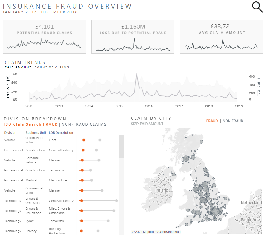
Key Metrics:
- 34,101 Potential Fraud Claims: A cumulative count of suspected fraudulent insurance claims over the period.
- £1,150M Loss Due to Potential Fraud: The estimated financial impact of these fraudulent claims.
- £33,721 Average Claim Amount: The average amount claimed, reflecting the severity or scale of these incidents.
Charts and Visualizations:
- Line Charts Display claim trends over time, showing both the paid amount and the number of claims. This helps identify patterns or spikes in fraudulent activity, making it an essential component of the fraud analytics dashboard.
- Division Breakdown: A bar chart compares the frequency of fraud across different business units and types of insurance, highlighting which divisions are most affected, a key feature of any fraud dashboard.
- Map Visualization: A geospatial representation indicates the distribution of fraud claims by city across the UK. The size of the circles corresponds to the paid amount, providing an intuitive understanding of where fraudulent activities are most prevalent and adding to the effectiveness of the fraud detection dashboard.
Importance:
This fraud analytics dashboard is crucial for insurance companies, helping them visualize and understand the scope and distribution of fraudulent activities. By identifying trends and hotspots, insurers can develop more targeted fraud detection and prevention strategies, ultimately reducing financial losses and improving claim processing accuracy. This data-driven approach allows for more effective resource allocation and enhances overall operational efficiency.
2. Age and Fraud Fraud Dashboard
The fraud detection dashboard titled Explore Age & Fraud Loss provides an in-depth analysis of fraud loss across different age groups using FTC’s Consumer Sentinel Network data. This fraud analytics dashboard allows users to explore how different generations are affected by fraud, highlighting the variations in both the median financial losses and the frequency of fraud loss reports per 100,000 population.
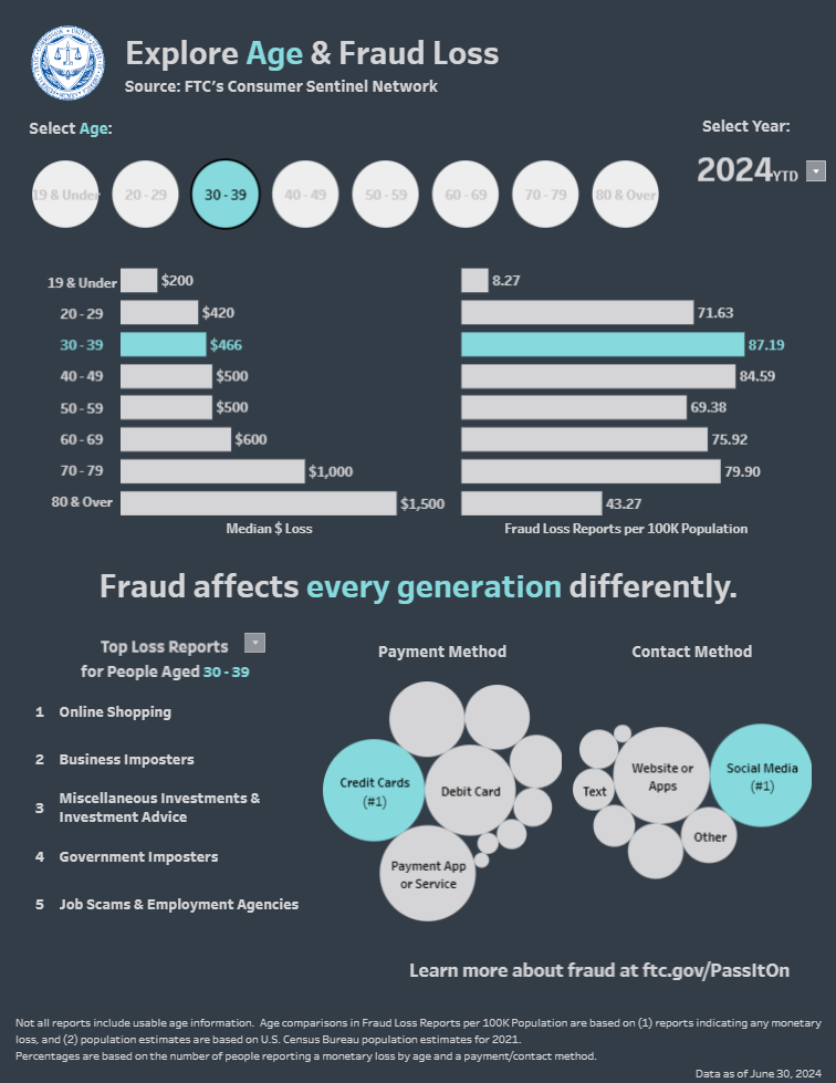
Key Components:
- Age Selection: Users can select different age groups (e.g., 19 & Under, 30-39, 80 & Over) to see specific data related to that demographic.
- Year Selection: The fraud dashboard allows you to select a year, with data currently displayed for 2024 Year to Date (YTD).
Charts and Visualizations:
- Bar Charts: Two bar charts are prominently featured. One illustrates the median dollar loss for each age group, showing the financial impact of fraud. At the same time, the other displays the rate of fraud loss reports per 100,000 population, indicating how prevalent fraud is among different age groups.
- Bubble Charts represent the most common fraud types and payment methods for the selected age group. The size of each bubble correlates with the frequency or significance of that particular category. For example, credit cards and social media are the most common payment and contact methods for fraud in the 30-39 age group.
Importance:
This fraud analytics dashboard is crucial for understanding the demographic-specific impacts of fraud. It helps consumers, policymakers, and organizations identify which age groups are most vulnerable to fraud and what types of fraud are most common among them. By tailoring fraud prevention efforts based on this data, stakeholders can more effectively mitigate financial losses and protect those most at risk. This targeted approach is vital for developing more effective fraud detection and prevention strategies.
3. Fraud Reports Fraud Dashboard
The fraud detection dashboard titled FTC Consumer Sentinel Network – Imposter Scams provides a detailed analysis of imposter scam reports across the United States for the second quarter of 2024. It highlights key statistics about the prevalence and impact of these scams, offering insights into how different states are affected.
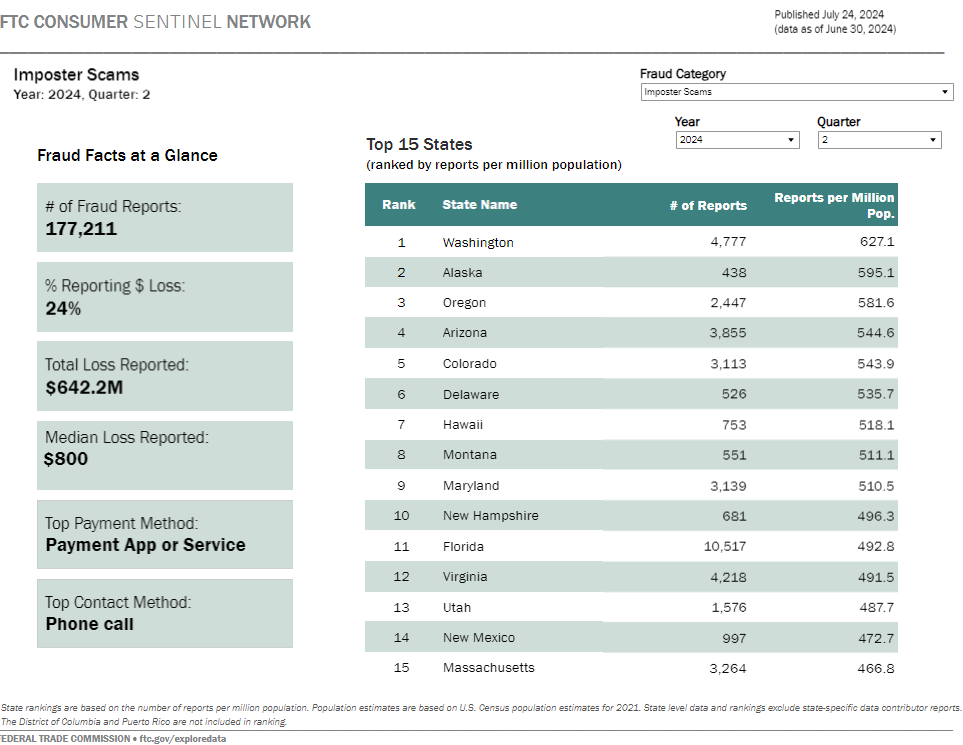
Key Components:
- Fraud Facts at a Glance: This section offers a quick overview of essential metrics, including the total number of fraud reports (177,211), the percentage of cases involving financial loss (24%), the total loss reported ($642.2 million), and the median loss per report ($800). Additionally, it identifies the top payment method used in scams (Payment App or Service) and the top contact method (Phone call).
- Top 15 States: This fraud analytics dashboard ranks the top 15 states by the number of fraud reports per million population. Washington leads with 4,777 reports and a rate of 627.1 reports per million people, followed by Alaska, Oregon, and Arizona.
Charts and Visualizations:
- Data Tables: The fraud dashboard primarily presents information in data tables. The Fraud Facts at a Glance section uses a straightforward list format to display critical statistics, making them easy to digest. The ranking of states is also presented in a table format, which allows for a quick comparison of the number of reports and the rate per million population.
Importance:
This fraud analytics dashboard is vital for understanding the geographic distribution and financial impact of imposter scams across the United States. It enables policymakers, law enforcement, and consumer protection agencies to identify states with the highest incidence of scams and allocate resources accordingly. By analyzing the data, these stakeholders can better understand the tactics used in these scams, such as the most common payment and contact methods, and develop targeted prevention strategies. The dashboard’s clear presentation of data makes it a valuable tool for tracking trends and responding to emerging threats in real time.
4. Fraud and ID Theft Maps Fraud Dashboard
The FTC Consumer Sentinel Network dashboard provides a comprehensive overview of fraud, identity theft, and other related reports across the United States for the second quarter of 2024. This fraud detection dashboard aggregates and presents data on the prevalence and financial impact of various types of consumer fraud, offering valuable insights into how different states are affected.
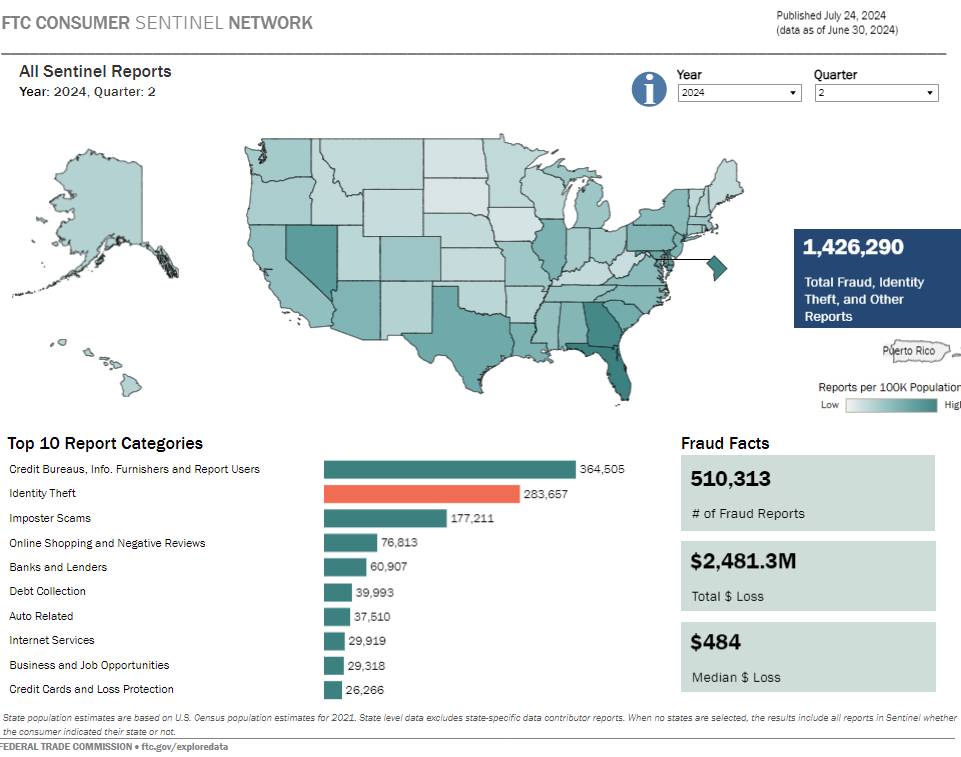
Key Components:
- Total Reports: The dashboard reports 1,426,290 cases of fraud, identity theft, and other related issues. Specifically, it highlights 510,313 fraud reports, resulting in a total loss of $2,481.3 million and a median loss per incident of $484.
- Top 10 Report Categories: A bar chart visually represents the top categories of fraud reports. The leading categories include Credit Bureaus, Info Furnishers and Report Users (364,505 reports), Identity Theft (283,657 reports), and Imposter Scams (177,211 reports).
- Geographical Distribution: The dashboard includes a U.S. map that displays the rate of reports per 100,000 population by state. This heat map helps identify regions with higher concentrations of fraud activity, providing a quick visual reference for areas requiring more focused attention.
Importance:
This fraud analytics dashboard is crucial for understanding the scope and distribution of consumer fraud and identity theft nationwide. By offering a breakdown of the most common types of fraud and their geographic distribution, the dashboard enables policymakers, law enforcement agencies, and consumer protection organizations to identify trends and allocate resources effectively. The clear presentation of fraud data allows stakeholders to quickly grasp the severity of the issues in different areas and develop targeted strategies for fraud prevention and mitigation. The ability to drill down into specific report categories and regions makes this dashboard an essential tool in the fight against fraud.
5. Fraud in My Area Fraud Dashboard
The fraud detection dashboard titled The Biggest Reported Scams in My Area provides a localized analysis of the most common fraud types reported across different regions in the UK during 2014-2016. It allows users to explore the top 10 fraud categories in specific areas by selecting their location on the map. This targeted approach offers valuable insights into the prevalence of various scams at a regional level.
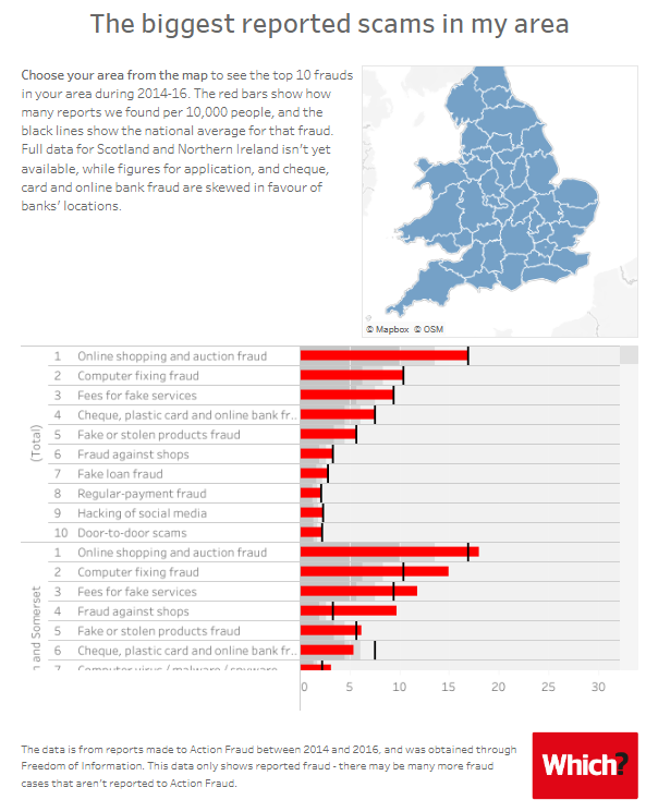
Key Components:
- Regional Map: A map of the UK is provided where users can select their area to view relevant fraud statistics. This visual tool helps to identify the geographic distribution of fraud types quickly.
- Bar Charts: The fraud dashboard uses horizontal bar charts to display the frequency of the top 10 fraud types in each selected area. The red bars represent the number of reports per 10,000 people in the chosen region, while the black lines indicate the national average for each type of fraud. This comparative visualization helps users understand how their area ranks against national trends.
Importance:
This fraud analytics dashboard is crucial for consumers and authorities to understand the local patterns of fraudulent activity. By highlighting the most common scams in specific regions, the fraud detection dashboard empowers users to be more vigilant about the types of fraud they are most likely to encounter. Additionally, it is a critical tool for policymakers and law enforcement to allocate resources effectively, focusing on areas where certain types of fraud are particularly prevalent. The precise, comparative nature of the charts also provides a straightforward way to see whether a particular area is more or less affected by specific fraud types compared to the national average.
Fraud Dashboard Examples
As fraud becomes more complex and widespread, the role of a fraud detection dashboard grows increasingly vital. The five examples discussed in this blog illustrate the power of these tools in identifying, analyzing, and mitigating fraudulent activities.
By integrating real-time data monitoring, advanced analytics, and user-friendly visualizations, organizations can stay ahead of fraudsters and protect their resources more effectively. These fraud analytics dashboards enhance the ability to detect fraud and empower decision-makers with the information needed to take swift and decisive action. Investing in a robust fraud dashboard is no longer optional; it’s necessary for any organization aiming to safeguard its operations and reputation in today’s high-risk environment. Let these examples guide you in maximizing the impact of your fraud prevention efforts.