An expense dashboard is one of the best ways to visualize and manage costs effectively. These dashboards consolidate data from various departments and categories, presenting it in easy-to-understand formats that allow managers to spot trends, control costs, and allocate budgets more efficiently.
Whether you’re monitoring employee spending, tracking departmental expenses, or performing internal audits, the proper expense dashboard can make all the difference. In this post, we will explore five expense dashboard examples highlighting how companies can utilize this tool to streamline expense management, improve financial planning, and save money. Each example shows different features and visualizations that can be tailored to meet the unique needs of any business.
Table of Contents
1. Employee Expense Analysis
This expense dashboard provides an in-depth analysis of employee expenses across different categories and types. It utilizes a variety of charts to give a comprehensive overview, aiding in managing and tracking costs efficiently.
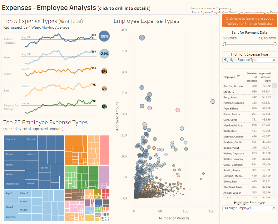
Charts and Visualization:
- Line Graphs: The top-left section of the Tableau expense management dashboard displays the top five expense types, including Airfare, Hotel, Dinner, Taxi, and Personal Car Mileage. The line graphs show the 4-week moving average of each expense category, allowing managers to see trends over time. This indicates how these expense categories fluctuate, helping to identify potential cost spikes.
- Pie Chart: At the top right, a pie chart breaks down the percentage share of each major expense category. For instance, airfare constitutes 28% of the total, and hotels account for 21%, highlighting the most significant cost contributors.
- Bubble Chart: A scatterplot graph illustrates employee expense types in the middle. The size of each bubble correlates with the approved amount, and the x-axis tracks the number of records. This visualization helps identify outliers or patterns in employee spending.
- Tree Map: A tree map in the bottom-left section ranks the top 25 employee expense types, grouped by the total approved amount. It gives a quick overview of which employees or expense types account for the most extensive costs, offering a comparative look at spending across the organization.
Business Applications:
This expense dashboard example can be invaluable for financial teams and department managers. Using visual insights from this expense management dashboard, businesses can monitor high-expense categories, identify trends, and pinpoint areas where cost-saving measures could be applied. Managers can also spot employees with unusually high expenses, making auditing spending easier or setting more stringent budget limits. This level of visibility supports better expense analytics, resource allocation, and overall financial planning.
2. Expenses Audit Dashboard
This expense dashboard comprehensively summarises company expenses by department, employees, and expense types. It offers a clear view of the allocation of resources and highlights areas where costs might rise or fall.
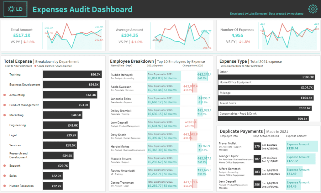
Charts and Visualizations:
- Line Graphs: At the top of the Tableau expense management dashboard, two line graphs compare total amounts, average amounts, and the number of expenses against the previous year. These visualizations help identify trends over time, making it easier to spot any significant fluctuations.
- Bar Charts: In the lower sections, bar charts display total expenses by department and expense type. For example, training, business development, and accounting are the top three departments in terms of total costs. This breakdown is crucial for evaluating which departments are the most cost-intensive.
- Employee Breakdown: A table in the middle provides a detailed view of the top 10 employees by expense, the total number of claims and percentage changes from the previous year. This makes it easy to monitor individual employee spending habits.
- Duplicate Payments: On the right, a table highlights duplicate payments made in 2021, along with the time between claims and expense amounts, allowing managers to catch potential errors or fraud.
Business Applications:
This expense dashboard example can help businesses track spending, identify cost-saving opportunities, and monitor employee or department expenses. Companies can gain insights into specific areas requiring attention or tighter control using this expense management dashboard. Expense analytics provided by this tool can enhance decision-making, helping allocate budgets efficiently and reduce unnecessary costs. By monitoring duplicate payments, businesses can ensure no erroneous or fraudulent expenses.
3. Business Expense Dashboard
This expense dashboard provides a detailed spending overview for December 2020, comparing the performance to December 2019. It visualizes key expense categories and tracks trends across departments, billable statuses, and expense types.
Charts and Visualization:
- Bar Chart: Monthly expenses are represented using a bar chart, showing the total monthly costs throughout the year. The chart compares current spending to the reference period, offering insights into how spending has evolved.
- Donut Charts: By department, the dashboard uses doughnut charts to display the proportion of expenses for each department, such as sales, support, and engineering. The percentage changes from the previous year are also highlighted, indicating where costs have increased or decreased.
- Bar Graphs: In the sections labelled “By Type” and “By Subtype,” bar graphs break down expenses by categories like travel, operations, and meals, as well as subtypes like airfare, printing, and hotel. Each bar includes the current amount spent and the percentage change from the prior period.
Business Applications:
This expense dashboard example can be used by businesses to monitor and closely manage expenses across multiple dimensions. Expense analytics allows managers to see where the most significant costs are being incurred and which areas might require budget adjustments. Using this Tableau expense management dashboard or similar platforms, businesses can track performance against past periods, identify trends in spending by department, and assess the impact of billable versus non-billable expenses. This expense management dashboard supports informed decision-making by offering visibility into key financial metrics, enabling the identification of cost-saving opportunities and better resource allocation.
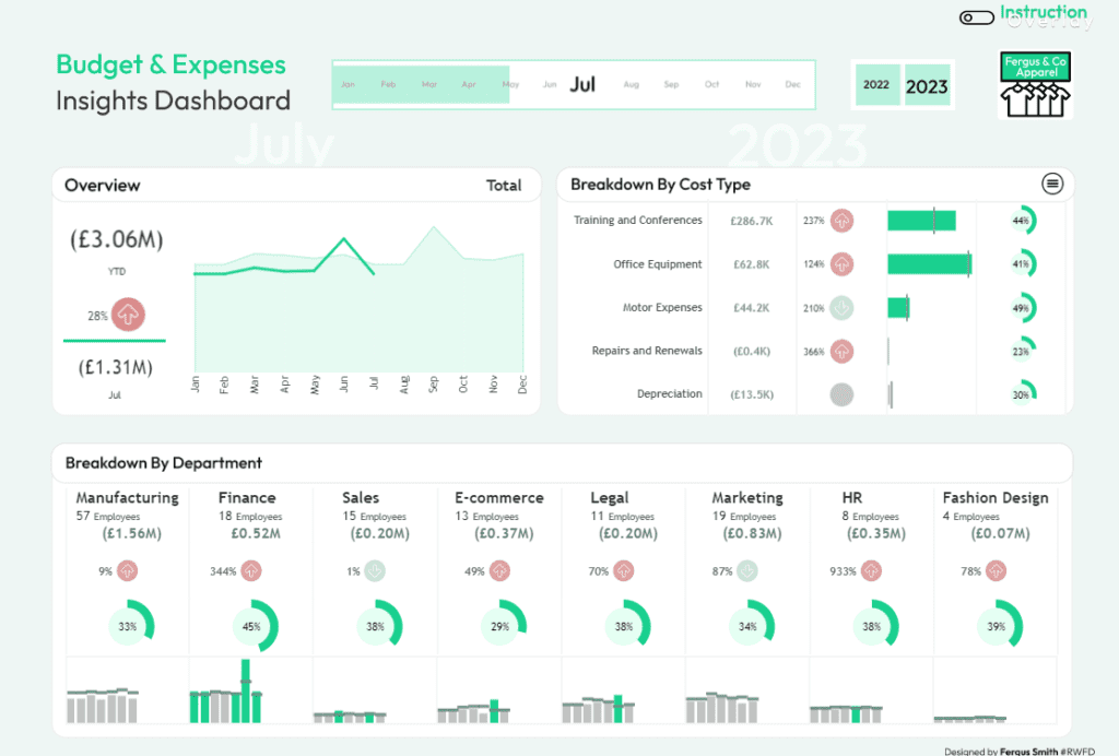
4. Budget & Expenses Insights Dashboard
This expense dashboard provides an overview of the budget and expenses for the year-to-date (YTD), focusing on July. It presents a detailed breakdown of costs by department and type, allowing for easy analysis and decision-making.

Charts and Visualization:
- Line Graph: The overview section uses a line graph to track total expenses from January to December. It highlights the monthly spending trend, helping businesses understand how expenses have evolved.
- Bar Charts: The breakdown by cost type features horizontal bar charts for categories like Training and Conferences, Office Equipment, and Motor Expenses. Each bar shows the total expense, percentage change, and the proportion of total costs, which clarifies how resources are allocated.
- Donut Charts and Bar Graphs: The breakdown by department includes doughnut charts showing the proportion of total costs attributed to each department. Alongside these, bar graphs display the monthly expense patterns within departments such as Manufacturing, Finance, Sales, and more, giving a comprehensive view of where costs are concentrated.
Business Applications:
This expense dashboard example is helpful for businesses looking to manage costs across various departments and expense categories. By leveraging this Tableau expense management dashboard or a similar tool, companies can use expense analytics to identify spending trends, track department-specific budgets, and detect significant cost increases, such as the 933% rise in HR expenses. This expense management dashboard allows businesses to focus on areas needing cost control or optimization while also providing insights for future budgeting. By monitoring expenses on a monthly and YTD basis, businesses can better align their spending with strategic goals and improve overall financial performance.
5. Internal Audit – Expense Analysis
This expense dashboard provides a detailed internal audit and analysis of company expenses, segmented by department and spending category. The dashboard is designed to offer a quick yet comprehensive view of how expenses are distributed across various business areas, using multiple visualizations.
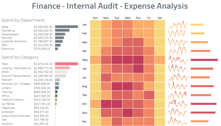
Charts and Visualization:
- Bar Charts: On the left side, bar charts display the total spend by department and category. Departments such as Sales, Marketing, and Development are the top cost centres, with Sales accounting for the highest expenditure. Categories like Meals, Lodging, and Ground Transportation make up the majority of expense categories.
- Heatmap: The middle section features a heatmap that visualizes weekly spending activity. Darker colours indicate higher spending, with most expenses occurring between Tuesday and Thursday. This visual helps identify the most cost-intensive days of the week.
- Line Graphs: Small line graphs on the right side show trends over time for different spending categories. These provide an at-a-glance look at whether spending in certain areas is increasing or decreasing.
Business Applications:
This expense dashboard example is a valuable tool for businesses to perform internal audits and monitor spending patterns. Using this Tableau expense management dashboard or similar tools, managers can gain insights through expense analytics, such as identifying the most expensive departments and cost categories. This expense management dashboard allows businesses to pinpoint areas needing budget adjustments or stricter controls. Furthermore, the heatmap helps to identify patterns in daily spending, which can aid in scheduling and optimizing operational costs. This dashboard allows businesses to maintain financial control and optimize resources efficiently.
5 Best Expense Dashboard Examples
An expense dashboard is indispensable for businesses seeking control over their finances. As the five expense dashboard examples in this post have demonstrated, there are multiple ways to visualize and track expenses based on different needs, whether by department, cost type, or employee spending. With the right dashboard, businesses can quickly spot areas of concern, reduce overspending, and find opportunities for cost-saving initiatives. Additionally, these tools provide insights into spending trends and allow for better forecasting, helping companies allocate resources wisely. By leveraging modern expense dashboardexamples, organizations improve operational efficiency and gain a competitive edge by ensuring that every dollar is spent in alignment with their financial strategies. Ultimately, choosing the right expense dashboard can transform how your business handles its finances and set the stage for long-term growth.