These customer dashboard examples are powerful tools for companies to visualize and analyze customer data in real-time. By aggregating information across various touchpoints, a customer analysis dashboard provides insights into key metrics such as engagement, loyalty, sales, and feedback.
Related posts:
- 8 Amazing Tableau eCommerce Dashboard Examples
- 13 Amazing Tableau Sales Dashboard Examples For Sales Analytics Mastery
- Check Out 13 Amazing Tableau Marketing Dashboard Examples
- Unlock Business Insights: 7 Powerful Tableau Executive Dashboard Examples You Need to See
- 7 Powerful Social Media Dashboard Examples to Supercharge Your Analytics
- 5 Stunning Churn Dashboards That Boost Customer Retention Strategies
This blog post showcases seven customer dashboard examples, each tailored to meet business needs. Whether looking to track customer support trends, analyze purchase behaviours, or measure customer satisfaction, these client dashboards offer valuable perspectives on leveraging data effectively for strategic decision-making.
Table of Contents
#1 Customer Dashboard Examples – Customer Support Case Demo
This customer dashboard example provides a comprehensive overview of open cases categorized by impact level (severe, High, Medium, Low) and status (open or closed). The dashboard uses various charts and tables to visually represent case data over a 12-month period, enabling quick insights into support trends and workload distribution.
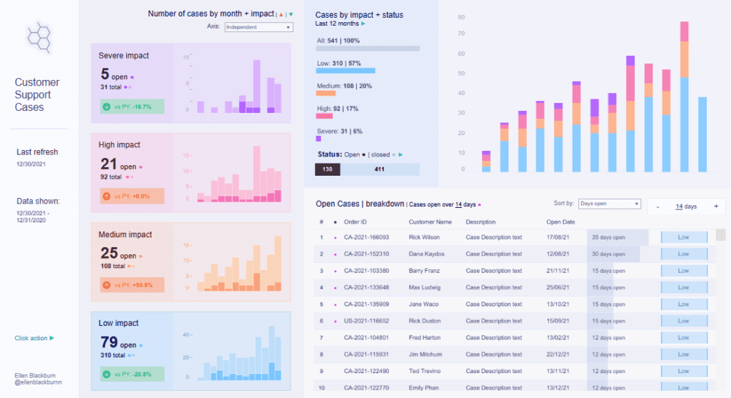
The primary charts in this client dashboard include bar graphs that break down the number of cases by month, impact, and status, displaying each impact category with a distinct colour. This allows users to identify patterns over time, such as increases or decreases in high-impact cases, and assess the support team’s performance. Small trend indicators show comparisons with the previous year’s performance, providing insight into annual progress.
This customer analytics dashboard also includes a detailed table listing open cases with columns for order ID, customer name, description, open date, days open, and impact level. The table can be sorted by various parameters, such as days open, to prioritize cases that require immediate attention.
This customer analysis dashboard is handy for company customer support management. It helps track support performance, prioritize critical cases, and identify trends in customer issues, enabling data-driven decisions to improve customer satisfaction and streamline support processes. This customer insights dashboard offers valuable tools for effective case management and resolution.
#2 Customer Dashboard Examples – Customer Complaints Dashboard
This customer dashboard example provides an overview of complaints, segmented by product types such as credit cards, mortgages, and bank services. The dashboard displays a total complaint count, with specific categories listed to help users filter data easily by product type, providing a focused view on different areas of service.
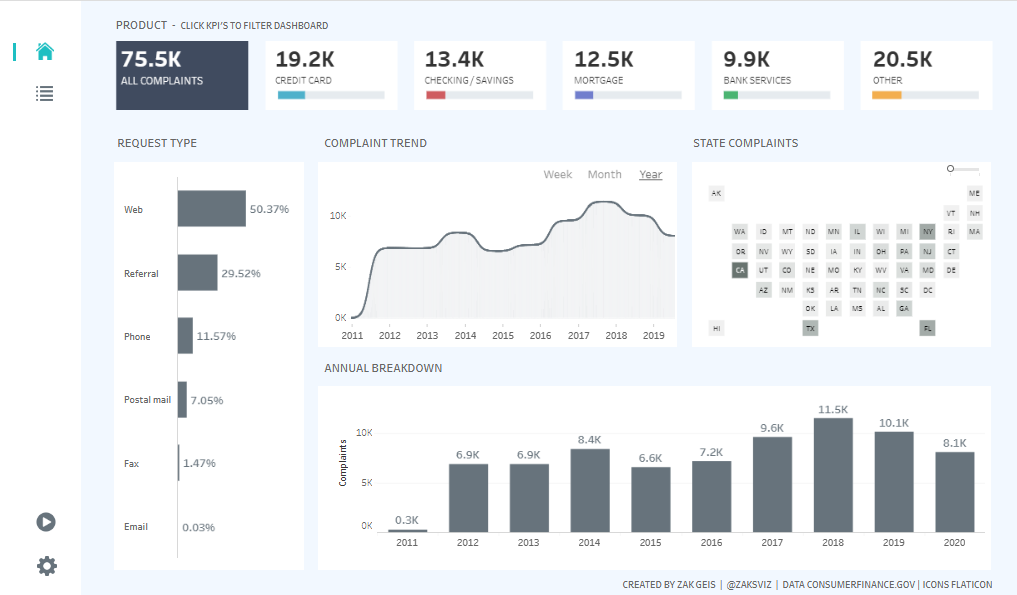
The customer analysis dashboard includes various chart types to help visualize complaint data. A bar chart breaks down complaints by request type, such as web, phone, and postal mail, allowing an understanding of how complaints are submitted. A line chart labelled Complaint Trend displays complaint volume from 2011 to 2019, revealing trends and fluctuations in complaint frequency. There’s also a geographic heat map of state complaints, allowing users to see complaint distribution across states and making it possible to identify regions with higher or lower complaint levels.
An Annual Breakdown bar chart shows yearly complaint volumes, enabling trend analysis across multiple years. With its customer analytics and insights, this client dashboard is a valuable tool for companies aiming to enhance their customer service. By analyzing complaint data, companies can identify service gaps, improve response strategies, and optimize resources to address issues effectively, ultimately enhancing customer satisfaction.
#3 Customer Dashboard Examples – Visualizing Survey Data & Customer Satisfaction
This customer dashboard example provides a versatile view for visualizing survey data, making it ideal for companies looking to analyze customer feedback. The customer dashboard includes eight distinct chart types, each designed to display satisfaction data across three questions rated on a Likert scale from “Strongly Disagree” to “Strongly Agree.” This setup enables deeper customer insights, highlighting areas for improvement and tracking customer sentiment over time.
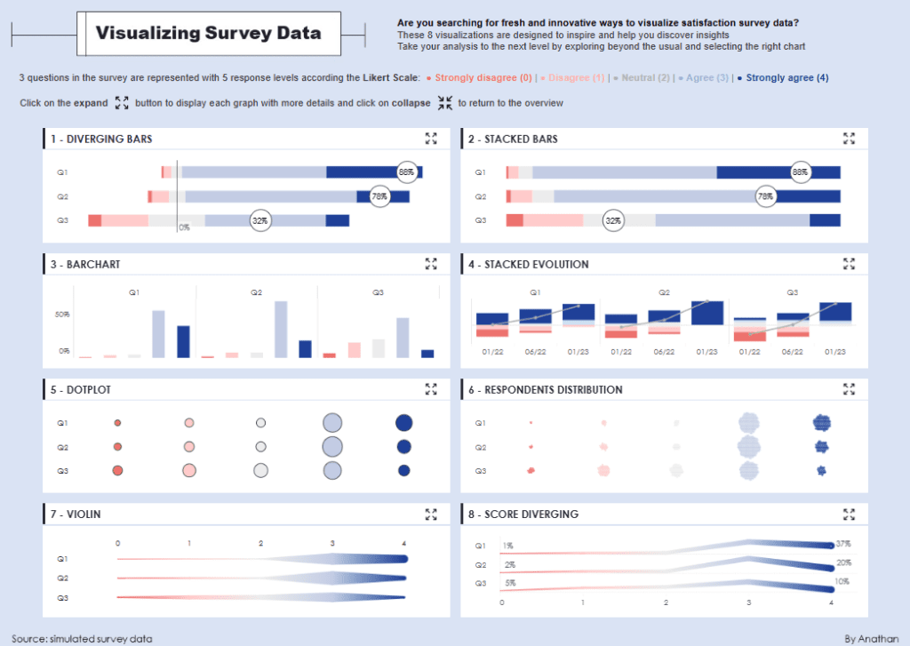
The dashboard showcases various chart styles, such as diverging bars and stacked bars, which help visualize the distribution of positive and negative responses for each question. Stacked evolution charts illustrate how survey responses change over time, giving insight into trends in customer satisfaction. The dot plot and respondents distribution charts present feedback distribution, highlighting how responses vary among participants.
Additionally, the violin plot and score diverging charts offer unique visualizations for identifying patterns and variations in customer responses. These client dashboards provide companies with a customer analysis dashboard that aids in recognizing patterns, improving customer experience, and addressing specific areas of dissatisfaction. This customer analytics dashboard is a valuable tool for businesses seeking to enhance customer relationships and make data-driven improvements based on feedback.
#4 Customer Dashboard Examples – Website Customer Journey
This customer dashboard example provides a detailed view of the customer journey, specifically focusing on a website’s forgotten password process. It tracks the journey from the initial login attempt through various steps of the password recovery process. The dashboard presents several metrics, such as the volume of unique visitors at each step, success rates, and conversion rates, allowing for an in-depth understanding of user behaviour and potential drop-off points.
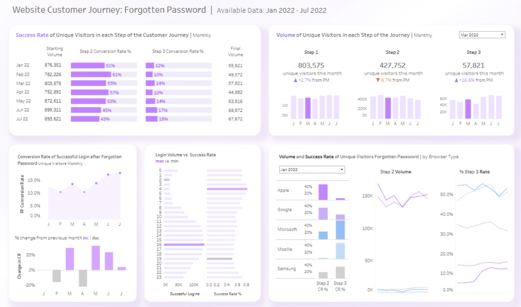
The dashboard incorporates a variety of charts to display data effectively. Bar charts illustrate conversion rates and step-by-step visitor volumes, clearly showing how many users successfully proceed through each step. Line charts track trends over time, such as the conversion rate of successful logins after password recovery, providing insights into changes in user engagement. Additionally, segmented bar charts and trend lines show comparisons across different browser types, allowing the company to analyze user experience by browser.
This client dashboard is a powerful customer analysis dashboard, providing customer insights essential for improving password recovery. By identifying where users drop off, the company can streamline the process to enhance user satisfaction and reduce abandonment rates. This customer analytics dashboard is vital for optimizing customer journeys and improving website usability.
#5 Customer Dashboard Examples – ABC Airlines Customer Report
This customer dashboard example provides a comprehensive view of critical metrics for ABC Airlines, covering customer demographics, loyalty, satisfaction, and travel patterns. It enables a detailed analysis of customer data, helping the airline company make informed decisions to enhance passenger experience and cater to different customer segments.
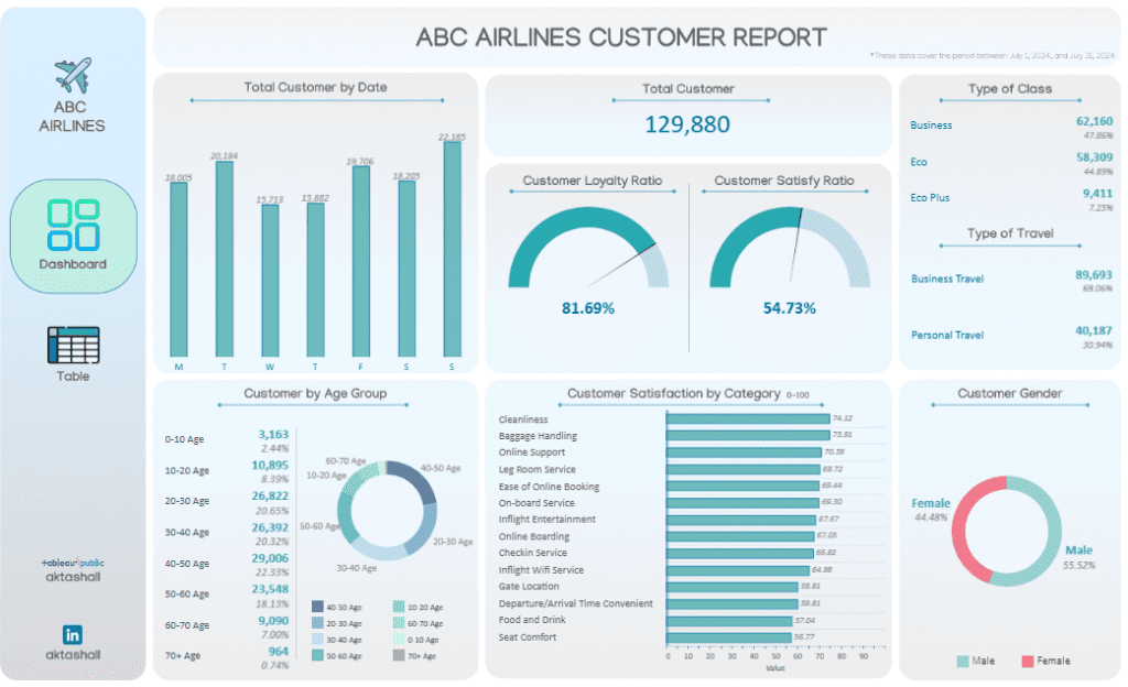
The client dashboards feature a variety of charts and visuals. A bar chart shows the total number of customers daily, offering insights into peak travel days. Gauge charts display the Customer Loyalty Ratio and Customer Satisfy Ratio, which help monitor customer retention and overall satisfaction levels. A pie chart categorizes customers by age group, showing the demographic breakdown, while another pie chart represents gender distribution.
The dashboard also includes segmented data for types of class (Business, Economy, Eco Plus) and travel purposes (Business or Personal), providing valuable customer insights into their preferences. A bar chart ranks customer satisfaction by category, such as cleanliness, baggage handling, and inflight entertainment, offering a clear picture of areas that meet or fall short of customer expectations.
This customer analysis dashboard is a valuable customer insights dashboard for ABC Airlines. It allows them to focus on areas needing improvement, enhance targeted marketing efforts, and ultimately boost customer satisfaction through a data-driven approach. This customer analytics dashboard helps identify trends and shape strategies to optimize service offerings.
#6 Customer Dashboard Examples – RFM CUSTOMER SEGMENTATION
This customer dashboard example offers an in-depth view of customer segmentation using the RFM (Recency, Frequency, Monetary) model, providing valuable customer insights into behaviour patterns. Based on purchasing habits, it categorizes customers into segments, such as Champions, Loyal, Potential Loyalists, and At Risk. To assess customer engagement and value, the customer dashboard visualizes critical metrics, including total customers, average recency, frequency, and monetary values.
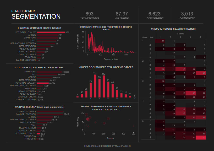
The dashboard includes diverse chart types to illustrate segmentation details effectively. Bar charts display the number of customers in each segment, average recency (days since the last purchase), and total sales made across each RFM segment. This allows the company to identify which customer segments generate the most revenue and which need attention to improve retention. A line chart represents the distribution of customers purchasing items within specific time frames, showing how frequently different segments make purchases.
Additionally, a heatmap visualizes the distribution of unique customers across the RFM score combinations, highlighting performance based on frequency and recency. These client dashboards are essential for a customer analysis dashboard, helping companies identify high-value customers, target at-risk segments with re-engagement strategies, and optimize marketing efforts. This customer analytics dashboard ultimately enables companies to make data-driven decisions to maximize customer lifetime value.
#7 Customer Dashboard Examples – Modern Dashboard Design – Customer Summary
This customer dashboard example summarises key metrics related to orders, profits, and sales, offering valuable customer insights for decision-makers. The customer dashboard displays totals for metrics such as Total Orders, Profit per Order, Sales per Customer, and Profit per Customer, each accompanied by a mini-line chart showing monthly trends. These visuals help identify changes over time, highlighting areas needing attention.
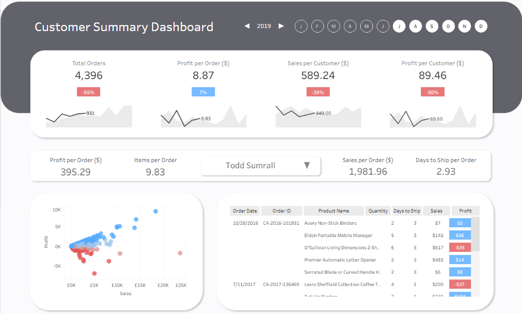
A scatter plot in the dashboard visualizes the relationship between sales and profit, with colour-coded dots representing different orders. This enables companies to identify high-profit orders and those that may be underperforming quickly. A data table provides details for each order, including Order ID, Product Name, Quantity, Days to Ship, Sales, and Profit, allowing for a granular analysis of each transaction.
Additionally, metrics like Profit per Order, Items per Order, Sales per Order, and Days to Ship per Order offer deeper insights into customer behaviour and operational efficiency. This client dashboard is an essential customer analytics dashboard, helping companies track performance across key indicators. As a customer analysis dashboard, it supports data-driven decisions by highlighting profitable segments, identifying trends, and optimizing order fulfilment processes, ultimately enhancing customer satisfaction and business profitability. This customer insights dashboard allows companies to refine strategies and focus on high-impact areas.
Customer dashboards are critical in transforming raw data into actionable insights that can guide business strategies and enhance the customer experience. The seven customer dashboard examples highlighted in this post illustrate the versatility and power of data visualization in understanding and engaging customers. From monitoring customer satisfaction to tracking sales performance, each customer insights dashboard provides a unique value that can help businesses optimize operations and make data-backed decisions. Companies can identify trends, improve customer service, and increase retention by implementing a customer analytics dashboard. Embracing these tools empowers organizations to turn customer data into meaningful actions, ultimately driving growth and strengthening customer loyalty


