A well-designed customer management dashboard provides real-time insights into sales performance, customer satisfaction, lead tracking, and other critical metrics. By centralizing this information, a CRM analytics dashboard empowers teams to make informed, data-backed decisions that enhance customer engagement and streamline operations.
Related posts:
- 7 Powerful Social Media Dashboard Examples to Supercharge Your Analytics
- Google Analytics with Tableau: 5 Great Examples
- 8 Amazing Tableau eCommerce Dashboard Examples
- 5 Powerful Tableau Survey Analysis Dashboards: Unlock the Full Potential of Tableau for Survey Data
- 7 Amazing Customer Dashboard Examples for Actionable Customer Insights
- 5 Stunning Churn Dashboards That Boost Customer Retention Strategies
This blog will explore five powerful CRM dashboard examples that showcase different ways to visualize and leverage CRM data. Each example highlights how CRM reports and dashboards can help businesses optimize performance and reach their goals, from tracking sales pipelines to monitoring customer feedback.
Table of Contents
#1 CRM Dashboard Examples – CRM Dashboard
This CRM dashboard example comprehensively overviews customer demographics, behaviour, and preferences. This customer relationship management dashboard displays a range of critical metrics, including the total number of customers segmented by attributes like gender, age, language, marital status, and education level. Visualizations such as bar charts, pie charts, and maps break down customer segments.
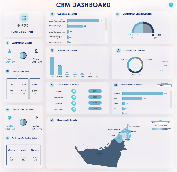
Bar charts in this CRM analytics dashboard represent customer data by service, channel, and location, allowing viewers to identify popular services, customer interaction methods, and the primary customer locations. Pie charts provide insights into categories like “Customers by Special Category” (B2B vs. B2C) and “Customers by Category” (business vs. individual). A map displays customer distribution by emirate, with a focus on the UAE region.
This CRM KPI dashboard is highly valuable for marketing, sales, and customer service teams. Marketing teams can use CRM reports and dashboards to tailor campaigns to specific segments. Sales teams benefit from CRM sales dashboard insights into popular services and preferred channels, helping them target high-potential leads. Customer service teams gain valuable demographic insights, enabling them to personalize interactions and improve satisfaction, making this one of the best CRM dashboards for business insights.
#2 CRM Dashboard Examples – Bank CRM Events
This CRM dashboard example provides an in-depth look at customer complaint management, focusing on metrics such as total complaints, closed cases, in-progress cases, and response time. This customer relationship management dashboard tracks key performance indicators over a specified date range, with each metric displayed alongside a percentage change indicator to show trends. Mini line charts within each metric box display historical data trends over time.
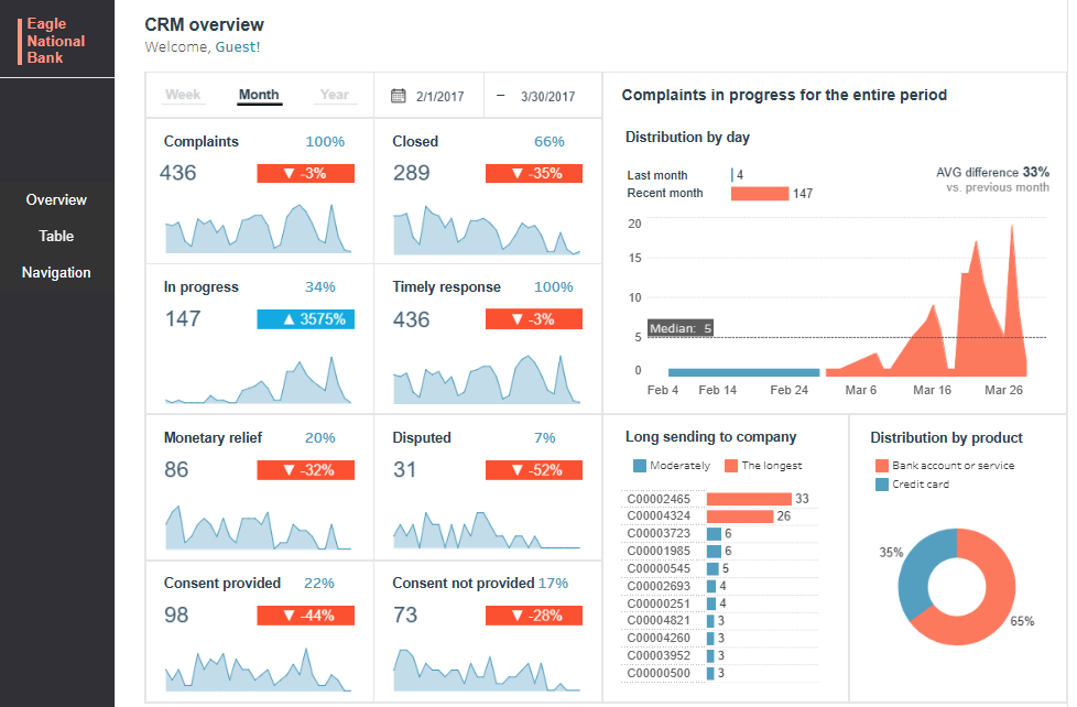
The CRM analytics dashboard also includes a bar chart showing the distribution of complaints in progress by day, offering insights into peak complaint periods. A pie chart illustrates the distribution of complaints by product type, revealing that more complaints are related to bank accounts or services (65%) than credit cards (35%). A vertical bar chart lists cases with the most extended response times, highlighting cases requiring attention.
This CRM KPI dashboard is handy for financial institutions’ customer service and quality assurance teams. Customer service teams can use the best CRM dashboard to track complaint resolution times, identify bottlenecks, and prioritize cases that have been open the longest. Quality assurance teams can leverage insights from CRM reports and dashboards to evaluate performance metrics and implement strategies to improve response times and customer satisfaction.
#3 CRM Dashboard Examples – CRM Opportunity Pipeline
This CRM dashboard example provides an in-depth view of Turbine Software’s sales pipeline, revenue forecasts, and conversion rates. Key metrics include the pipeline value ($2.4B), forecasted revenue ($1.4B), and an overall conversion rate of 61.2%. This customer relationship management dashboard presents data effectively using various charts, including bar charts, pie charts, funnel charts, and maps.
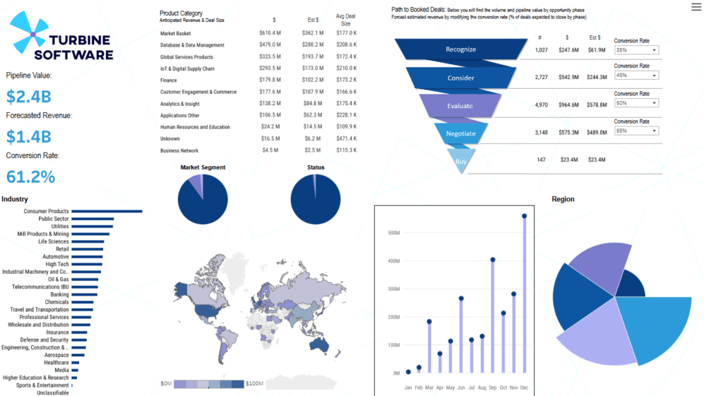
The funnel chart visualizes sales stages from “Recognize” to “Buy,” along with estimated revenue and conversion rates for each phase, giving sales teams a clear view of opportunity flow. The bar chart categorizes industries by pipeline value, with consumer products and the public sector leading. Pie charts illustrate distribution by market segment and opportunity status. A map highlights revenue potential across regions, while a line chart tracks monthly revenue trends.
This CRM analytics dashboard is especially valuable for sales and business development teams. Sales managers can leverage the CRM sales dashboard to monitor revenue forecasts, prioritize high-value deals, and track stage-by-stage conversion rates. Business development teams gain insights into market segments, industry demand, and regional revenue, helping them focus on high-potential areas. As one of the best CRM dashboards, this CRM KPI dashboard enables data-driven decisions for pipeline management and sales growth, making it essential in CRM reports and dashboards.
#4 CRM Dashboard Examples – LLM Benchmark for CRM
This CRM dashboard example, “LLM Benchmark for CRM,” comprehensively compares various large language models (LLMs) used in customer relationship management tasks. It focuses on metrics like accuracy, cost, speed, trust, and safety. The dashboard is segmented into these four key performance areas, allowing users to evaluate the strengths and weaknesses of each LLM provider.
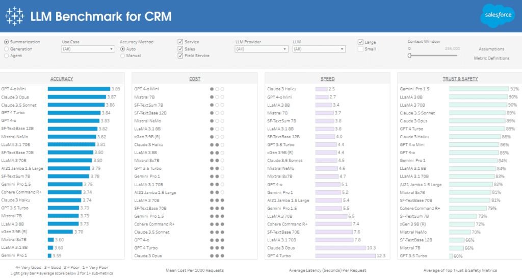
The CRM dashboard uses bar charts to represent each model’s performance across metrics visually. In the accuracy section, models are ranked by their average accuracy score, enabling quick comparison of which models perform best in delivering precise responses. The cost section uses a rating system to display the mean cost per 1,000 requests, showing financial efficiency. Speed is represented with bar charts indicating average latency in seconds per request, offering insights into each model’s response time. Trust & safety is shown as a percentage-based bar chart, ranking models by compliance with safety standards.
This CRM analytics dashboard is handy for IT and data science teams focused on selecting the best CRM dashboard options for LLM integration. By comparing critical metrics in a CRM KPI dashboard format, these teams can identify the most cost-effective, accurate, and safe model to enhance CRM applications, making this one of the best CRM dashboards for operational efficiency and customer interaction improvement.
#5 CRM Dashboard Examples – CRM Dashboard
This CRM dashboard example provides a detailed overview of sales performance, tracking metrics such as total expected revenue, active opportunities, hit rate, and monthly changes. Key indicators include a total expected revenue of $18M, $10M in sales, and a 26% hit rate. Line graphs, doughnut charts, and funnel visualizations effectively represent data across various sales stages.
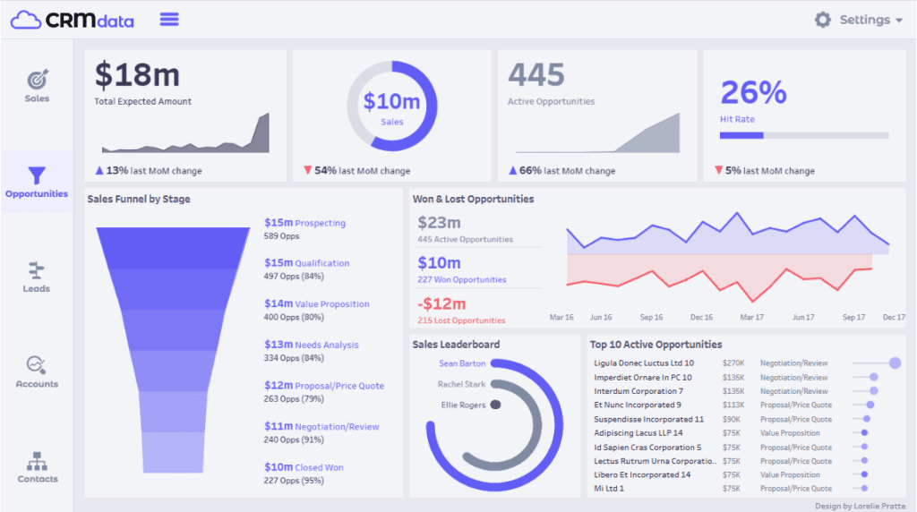
The sales funnel chart in this customer relationship management dashboard breaks down opportunities by stage, from Prospecting to Closed Won, showing both monetary value and the number of opportunities in each stage. This visualization helps sales teams identify where most prospects are and how many opportunities are progressing. A dual-line chart on the right displays won and lost opportunities over time, allowing users to track performance trends and identify improvement areas. Additional elements include a sales leaderboard for top performers and a list of the top 10 active opportunities detailing the company name, deal value, and sales stage.
This CRM sales dashboard is invaluable for sales managers, business development teams, and account executives. Using this CRM analytics dashboard, sales managers can track pipeline health, analyze conversion rates, and assess team performance. Business development teams can leverage this CRM KPI dashboard to prioritize high-value opportunities, while account executives can monitor active deals and optimize closing strategies. This is one of the best CRM dashboards for data-driven sales decisions and is essential in CRM reports and dashboards.
The right CRM dashboard can transform how a business manages customer relationships and sales processes. The five CRM dashboard examples shared in this blog demonstrate the diverse applications of CRM analytics, from sales tracking to customer support. These CRM KPI dashboards enable companies to gain actionable insights, drive strategic decision-making, and build stronger customer relationships. As customer expectations continue to rise, investing in the best CRM dashboard becomes increasingly crucial. By integrating effective CRM reports and dashboards into their daily operations, businesses can stay competitive and ensure a personalized experience for each customer.


