A crime dashboard is essential for law enforcement agencies, policymakers, and researchers. These crime visualizations transform complex crime data into accessible insights, helping communities better understand and respond to crime patterns. By consolidating data from various sources, a well-designed crime dashboard enables users to quickly identify hotspots, analyze trends, and monitor the effectiveness of interventions.
Related posts:
- 10 Amazing Tableau Healthcare Dashboard Examples
- Best 12 Amazing Examples of Tableau Supply Chain Dashboards
- 8 Amazing Tableau eCommerce Dashboard Examples
- 9 Must-See Airline Dashboard Examples Transforming the Aviation Industry
- 5 Amazing Hotel Dashboard Examples to Elevate Your Hospitality Operations
- 7 Amazing Shipping Dashboards That Will Revolutionize Your Logistics Game
Whether focusing on specific crime types, geographic areas, or periods, crime dashboards empower users to make data-informed decisions that enhance public safety. This blog will explore five examples of impactful crime dashboards, each showcasing unique visualizations and insights tailored to different analytical needs. From interactive heat maps to detailed breakdowns by crime type, these examples highlight how a Tableau crime dashboard or similar platform can play a vital role in crime prevention and response efforts.
Table of Contents
# 1 Crime Dashboard – London Major Crimes
This crime dashboard provides a comprehensive overview of significant crime statistics across London boroughs for 2022-2023. It features various metrics, including total crime counts, crime rate per 1,000 people, and changes from the previous year. At the top, critical indicators for each crime type, such as Criminal Damage, Burglary, Robbery, and Theft, display their total incidents and percentage changes from the previous year (PY), with arrows indicating increases or decreases.
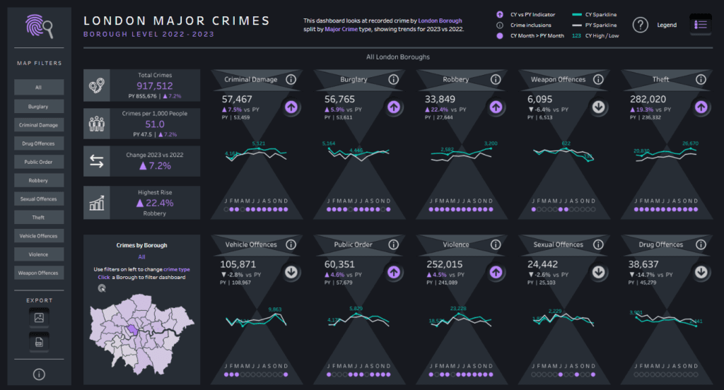
This Tableau crime dashboard uses several types of crime visualizations. Line graphs with colour-coded trends illustrate month-over-month changes for the current year (CY) and PY, allowing users to compare crime patterns. Sparklines highlight key months with significant increases or decreases, and each category includes arrows pointing up or down to emphasize the trends visually. A geographical map of London shows crimes by borough, with an interactive feature to filter by crime type or borough.
These crime dashboards are helpful for law enforcement agencies, city planners, and public policy analysts interested in monitoring crime trends, allocating resources, and identifying areas that need intervention. Community leaders and residents could also benefit from this data to understand local safety issues and advocate for specific crime prevention efforts.
# 2 Crime Dashboard – 50 Years of Crimes
This Tableau crime dashboard provides a visual exploration of five decades of crime data in the United States, covering various crime types such as Murder, Forcible Rape, Robbery, and Assault. The crime dashboard organizes data using multiple crime visualizations, offering an engaging way to analyze crime trends over time.
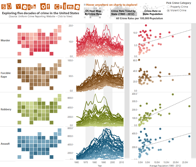
On the left, a heat map represents each crime category, showing the intensity of crime rates by state and allowing users to quickly identify states with higher or lower crime occurrences. The middle section displays line charts with data trends from 1960 to 2012, helping viewers observe rises and declines in each crime category. The rightmost section provides scatter plots that correlate crime rates with state populations, revealing patterns that show possible relationships between population size and crime rate.
This crime dashboard would be handy for criminologists, sociologists, and public policy experts interested in understanding long-term crime trends in the U.S. It would also benefit law enforcement agencies and government officials who need insights into how crime has evolved across different states and over time. Researchers and journalists could also use this Tableau crime dashboard to inform discussions around crime prevention and public safety policies.
#3 Crime Dashboard – Hate Crimes in Chicago
This Tableau crime dashboard visualizes hate crime data in Chicago from 2012 to 2023, collected by the Chicago Police Department (CPD) for the Uniform Crime Reporting (UCR) program. The crime dashboard focuses on various motivation categories, including race, religion, gender identity, and ethnicity, providing insights into the frequency and distribution of hate crimes targeting different groups.
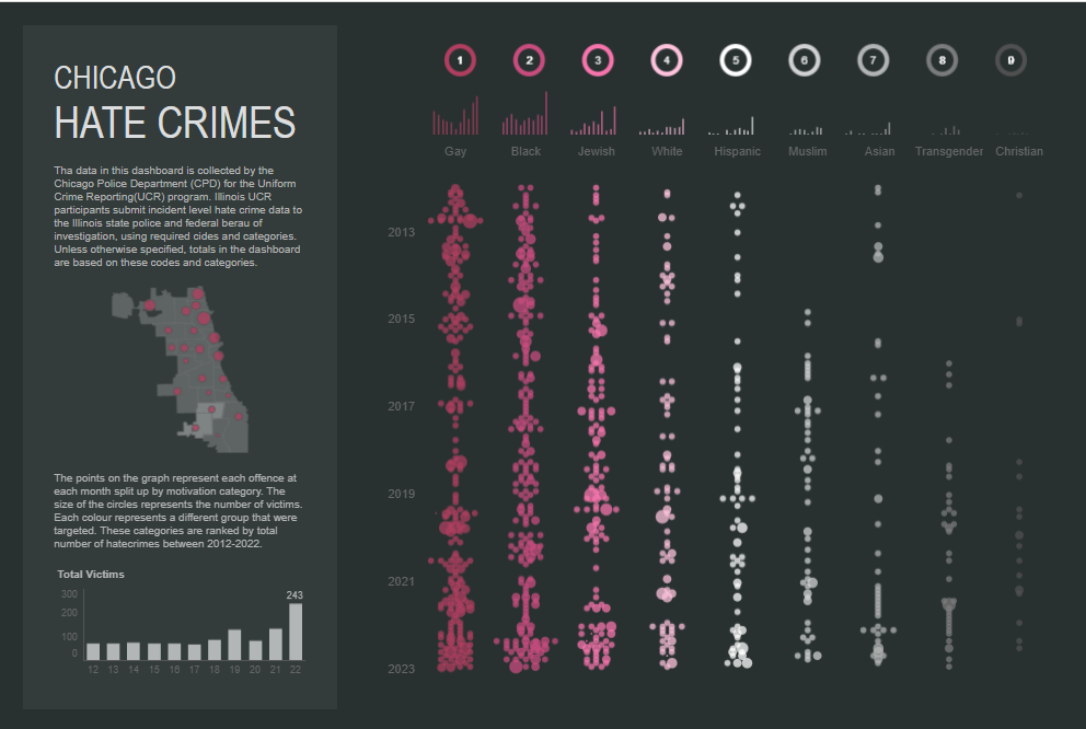
The crime visualization uses a dot plot format, with each column representing a specific category, such as Black, Jewish, Hispanic, Muslim, and others. Rows indicate the years, allowing users to see trends over time for each group. The size of each circle corresponds to the number of victims in a specific incident, making it easy to identify periods with higher hate crime activity against particular groups. Additionally, a bar chart at the bottom left displays the total number of victims per year, giving an overall view of hate crime trends in Chicago.
This Tableau crime dashboard would be handy for law enforcement agencies, policymakers, and advocacy groups aiming to understand and address hate crimes. Sociologists and researchers studying social issues and hate crime trends could also benefit from this crime dashboard, as it highlights which communities are most impacted over time and allows for targeted interventions and policy planning.
#4 Crime Dashboard – Crimes in India
This Tableau crime dashboard provides a district-wise crime visualization of data across India from 2001 to 2014 under the Indian Penal Code (IPC). It captures a comprehensive picture of crime distribution and trends across the country, making it an essential tool for analyzing crime patterns.
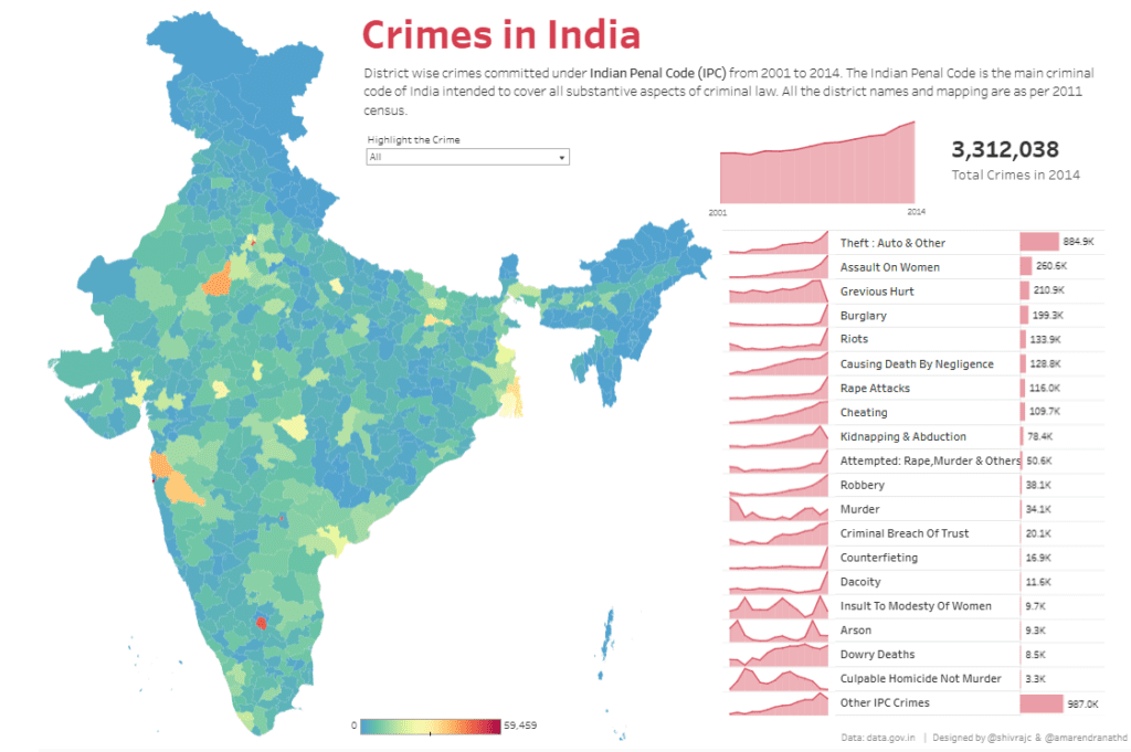
The crime dashboard uses a choropleth map to display the intensity of crime across Indian districts, with colours representing varying crime rates. Darker colours indicate higher crime rates, allowing users to identify hotspots quickly. On the right, the dashboard includes line charts for different types of crimes, such as Theft, Assault on Women, Burglary, and Riots, showing annual crime trends over the years. A bar chart displays the total count of each crime type for the year 2014, providing a snapshot of the most prevalent crimes.
This Tableau crime dashboard would be handy for law enforcement agencies, policymakers, and public safety officials interested in identifying high-crime regions and understanding long-term trends. Social researchers and analysts studying crime in India could use this crime visualization to explore how crime has evolved and varied across states and districts. Additionally, public policymakers could leverage insights from these crime dashboards to allocate resources and design targeted crime prevention initiatives.
#5 Crime Dashboard – Ottawa Crime Map
This Ottawa crime dashboard offers a detailed crime visualization of various incident types across the city. Using a heat map overlay on a city map, it highlights areas with higher crime densities, represented by intense yellow and red colours. This Tableau crime dashboard provides insights into the distribution of incidents such as Assault, Homicide, Drugs, Property Crime, Traffic, and Weapons Offenses.
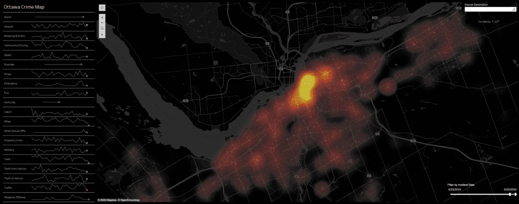
On the left, the crime dashboard includes small line charts for each crime type, showing trends over time. These mini-charts allow users to understand the fluctuations in specific crime categories, helping to identify peak periods or patterns. Users can also filter the data by incident date using a slider, making it possible to observe how crime patterns shift over time.
This Tableau crime dashboard would be handy for law enforcement agencies and city planners focused on identifying crime hotspots and optimizing resource allocation. Public safety officials can use this data to develop targeted strategies for crime reduction. Additionally, policymakers and researchers interested in urban safety could leverage these crime dashboards to understand long-term trends and devise policies to improve community safety. This crime visualization is a powerful tool for real-time crime monitoring and analysis in Ottawa.
Crime dashboards are revolutionizing how communities approach crime prevention and safety planning. The five examples in this blog demonstrate the power of crime visualization in providing actionable insights that support more intelligent decision-making. With features like heat maps, line charts, and filters, these Tableau crime dashboards offer invaluable tools for understanding crime dynamics in various contexts. Whether used by law enforcement, policymakers, or the public, these platforms provide transparency and foster collaboration, enabling a proactive approach to crime management. By harnessing such technology, cities can better allocate resources, enhance safety measures, and engage residents in community-driven solutions. As crime dashboards advance, their role in creating safer, more informed communities will grow, reinforcing the critical connection between data, technology, and public safety.


