A well-designed company dashboard example can be indispensable for organizations seeking to streamline operations, track performance, and gain valuable insights into various aspects of their business. These dashboards consolidate complex data into intuitive visual formats, allowing stakeholders to quickly understand trends, identify opportunities, and address potential issues.
In this blog post, we will explore 13 company dashboard examples that demonstrate the power of these tools across different industries and functions. Whether you’re managing sales, marketing, operations, or customer service, these examples will inspire you to leverage a dashboard for companies to drive success in your organization.
Table of Contents
1. IT Systems Error Dashboard
The company dashboard depicts an example of a company dashboard, specifically an IT Systems Error Dashboard, designed to monitor and analyze various IT system errors within an organization. This dashboard is structured to provide a clear overview of the most critical system errors, with each type of error displayed in its dedicated panel. These panels allow users to track error frequency, identify trends, and assess the impact of each error type over time.
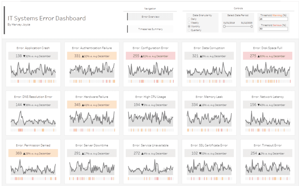
Chart Types:
The dashboard predominantly utilizes line charts to visualize the trend of each error type over the selected period. The line charts display the number of occurrences of each error, helping to identify patterns or spikes in error rates. Additionally, each panel includes a comparison metric showing the percentage change compared to the average for December, which is prominently displayed in an upward or downward arrow format. This helps users quickly gauge whether the situation has improved or worsened.
Dashboard Features:
- Error Overview and Timeseries Summary: Users can navigate between an overall error summary and a detailed time-series analysis.
- Date Granularity: The dashboard allows users to toggle between daily, weekly, monthly, and quarterly data views, offering flexibility in analysing data.
- Date Selection: Users can adjust the date range to focus on specific periods.
- Thresholds: Users can set warning and severe thresholds to highlight critical errors that exceed predefined limits.
Usefulness for Companies:
This company dashboard example is handy for IT departments and system administrators who must maintain optimal system performance and quickly identify potential issues. By tracking error types like Application Crashes, Authentication Failures, Disk Space Full, and more, companies can prioritize troubleshooting efforts, allocate resources effectively, and reduce downtime. The comparative metrics and trend visualizations also support decision-making by highlighting areas that require immediate attention.
2. Human Resources Dashboard
The dashboard for a company showcases a company dashboard example, specifically a Human Resources Dashboard, designed to provide a comprehensive overview of a company’s workforce statistics for 2020 compared to 2019. This dashboard for companies presents various metrics and visualizations that help HR departments analyze employee data effectively.
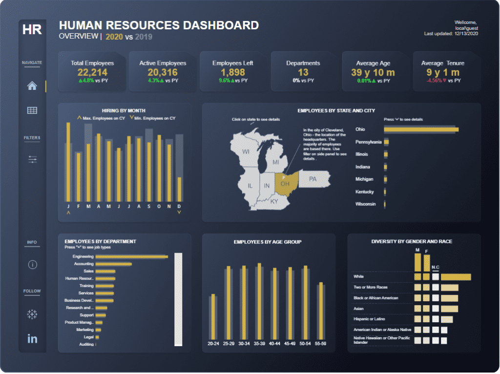
Dashboard Features:
- Key Metrics: The dashboard highlights critical figures such as the total number of employees (22,214), active employees (20,316), employees who left the company (1,898), the number of departments (13), average employee age (39 years ten months), and average tenure (9 years one month). Each metric includes a percentage change compared to the previous year (PY), allowing for a quick assessment of year-over-year performance.
- Hiring by Month: A bar chart displays monthly hiring trends, indicating the maximum and minimum number of employees onboarded each month, which helps identify peak hiring periods.
- Employees by State and City: A geographic map highlights employee distribution across different states, with specific details for cities like Cleveland, Ohio, where the headquarters are located. This visual helps in understanding regional workforce concentration.
- Employees by Department: A horizontal bar chart categorizes employees by department, with Engineering having the highest number of employees, followed by Accounting, Sales, and others.
- Employees by Age Group: Another bar chart breaks down the workforce by age group, offering insights into the company’s age diversity.
- Diversity by Gender and Race: A matrix chart visualizes diversity, showing the distribution of employees by gender and race and highlighting areas of inclusivity.
Usefulness for Companies:
This company dashboard example is a powerful tool for companies to gain insights into their workforce. HR professionals can track employee demographics, monitor hiring trends, and assess diversity efforts. Companies can make informed recruitment, retention, and organisational development decisions by visualizing data like employee turnover, departmental distribution, and regional workforce presence. This data-driven approach supports strategic planning and helps identify areas needing attention or improvement.
3 Profitability Dashboard
The dashboard for a company depicts a comprehensive company dashboard example designed for AdventureWorks, offering an in-depth overview of the company’s sales, profit, orders, and returns. This dashboard for companies focuses on year-to-date (YTD) data comparisons between 2022 and 2021, enabling businesses to track their performance effectively.
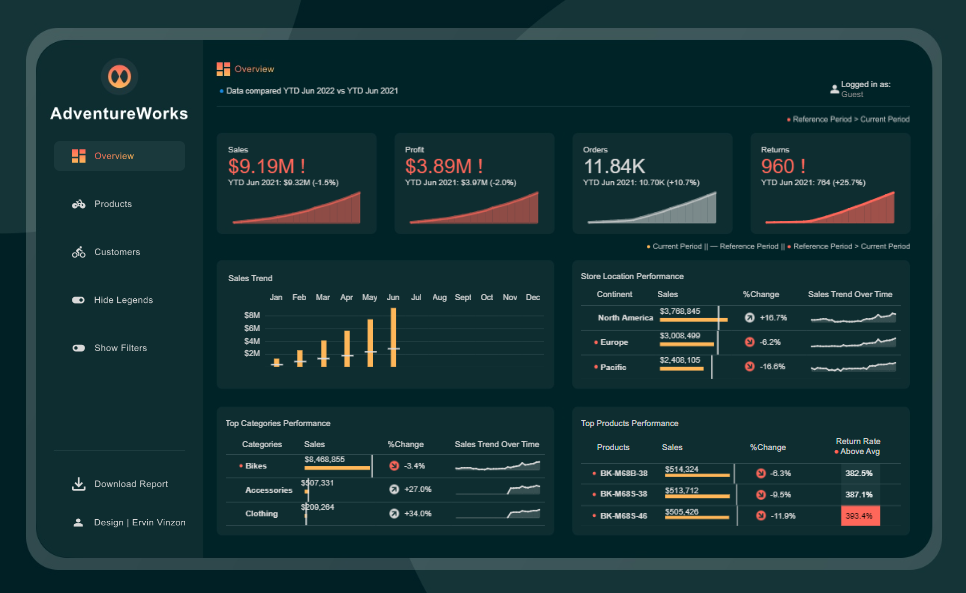
Dashboard Features:
- Key Metrics: The dashboard highlights critical metrics, including total sales ($9.19M), profit ($3.89M), total orders (11.84K), and returns (960). Each metric is compared to the previous year, showing percentage changes that reflect the company’s performance over time.
- Sales Trend: A bar chart illustrates the monthly sales trend, revealing how sales have fluctuated throughout the year. This helps identify peak months and potential seasonal patterns.
- Store Location Performance: A table outlines sales performance by continent, such as North America, Europe, and the Pacific, with percentage changes and line charts depicting sales trends in each region, crucial for understanding geographic market dynamics.
- Top Categories Performance: A dedicated section analyzes top-selling categories like Bikes, Accessories, and Clothing, presenting total sales figures, percentage changes, and trend lines, assisting companies in identifying which product lines drive revenue.
- Top Products Performance: This section highlights individual product performance, listing top products by sales, return rates and trends. It flags products with high sales and return rates for further review.
Usefulness for Companies:
This company dashboard example is a powerful tool for monitoring business performance across various dimensions. By visualizing key metrics such as sales, profits, and returns, companies can make data-driven decisions to optimize their operations. The breakdown by location, product category, and individual products allows for granular analysis, helping businesses identify strengths and areas needing improvement. This dashboard is essential for strategic planning, enabling companies to adjust tactics based on real-time data and trends.
4. Superstore – KPI Color Coding
The dashboard for a company displays a company dashboard example for “Superstore”, offering an in-depth analysis of global sales performance metrics such as turnover, volume, orders, and profit for November 2024. This dashboard for companies provides a detailed breakdown of sales data to help businesses assess their performance effectively.
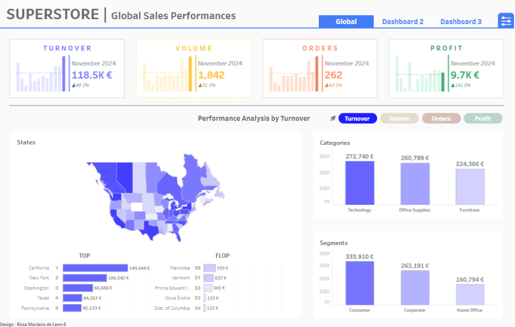
Dashboard Features:
- Key Metrics: The dashboard highlights essential figures, including turnover (€118.5K), volume (1,842 units), orders (262), and profit (€9.7K). Each metric includes a percentage change, offering insights into the performance compared to the previous period.
- Performance Analysis by Turnover: The dashboard presents a performance analysis section, which can filter turnover, volume, orders, or profit. The visualizations include a map of the United States, showing turnover distribution by state, along with top-performing and underperforming states.
- Categories and Segments: Bar charts display turnover performance by product category, such as Technology (€272,740), Office Supplies (€260,789), and Furniture (€224,366). Additionally, the dashboard segments the performance by customer type, showing turnover for Consumer (€333,910), Corporate (€263,191), and Home Office (€160,794).
Usefulness for Companies:
This company dashboard example is a valuable tool for businesses to monitor and analyze global sales performance. By breaking down critical metrics like turnover, volume, orders, and profit, the dashboard allows companies to understand their financial health clearly. The ability to filter data by different metrics and view detailed performance by state, category, and segment makes it easier for companies to identify growth opportunities and areas that need attention. This dashboard for companies supports strategic decision-making by providing real-time data that can guide business strategies and optimize operations for better results.
5. Financial Complaints Dashboard
The dashboard for a company displays a Financial Complaints Dashboard, which provides a comprehensive view of customer complaints for a financial institution. This company dashboard example offers detailed insights into the volume, types, and resolution status of complaints, helping companies to monitor and improve their customer service operations.
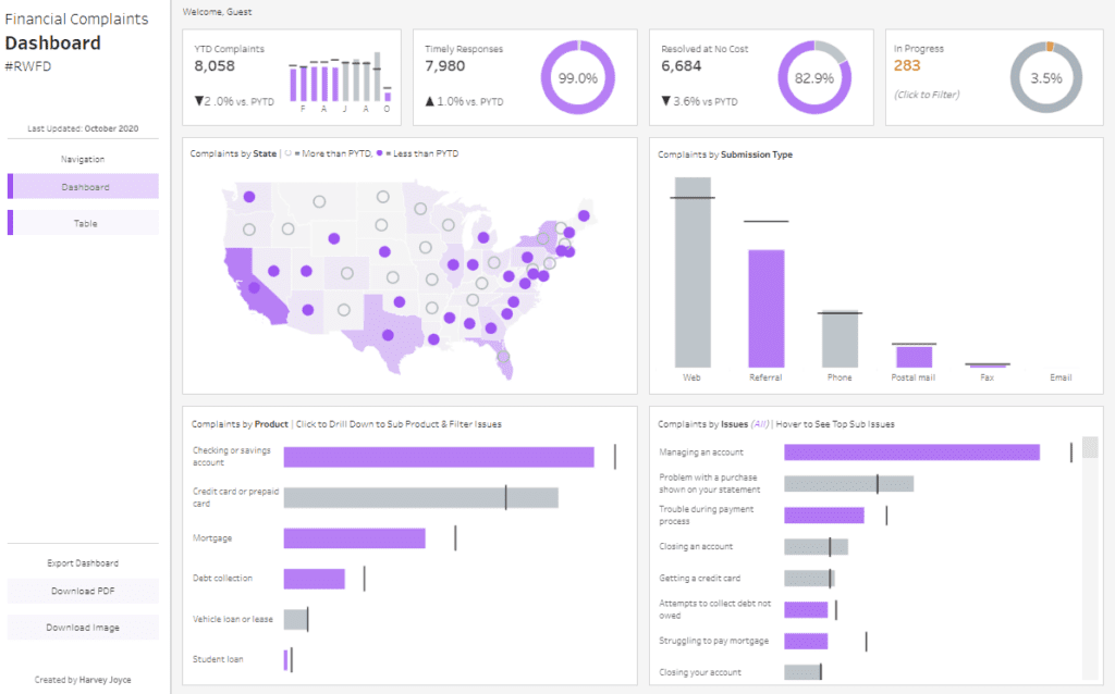
Dashboard Features:
- Key Metrics: The dashboard highlights essential metrics such as the Year-to-Date (YTD) complaints (8,058), timely responses (7,980), resolved complaints at no cost (6,684), and the number of complaints currently in progress (283). Each metric is compared against the Previous Year-to-Date (PYTD) values to assess performance trends.
- Complaints by State: A geographic heat map displays complaints across different states in the U.S., with colour coding indicating whether complaints are higher or lower than the previous year. This visual helps identify regional trends and hotspots for customer dissatisfaction.
- Complaints by Submission Type: A bar chart categorizes complaints based on the method of submission, such as Web, Referral, Phone, Postal Mail, Fax, and Email. This breakdown helps companies understand the most frequently used channels for complaints.
- Complaints by Product: A horizontal bar chart shows the distribution of complaints across various financial products, such as checking or savings accounts, credit cards, mortgages, and student loans. This allows companies to pinpoint which products are most prone to issues.
- Complaints by Issues: Another bar chart categorizes complaints based on specific issues, such as managing an account, purchasing problems, or trouble during the payment process. Companies can use this data to identify common pain points for customers.
Usefulness for Companies:
This company dashboard is a powerful tool for monitoring and analyzing customer complaints. By visualizing key metrics and trends, companies can quickly identify improvement areas, allocate resources to address customer concerns more effectively, and enhance overall customer satisfaction. The ability to break down complaints by region, product, and issue type enables a more targeted approach to resolving problems, ultimately leading to better service delivery and improved customer retention.
6. Call Center Dashboard
The company’s dashboard displays a Call Center Overview Dashboard for March 2024, serving as a comprehensive company dashboard example for analyzing call centre operations. This dashboard is essential for companies to monitor key performance indicators (KPIs) related to customer service, offering insights that enhance call centre efficiency.
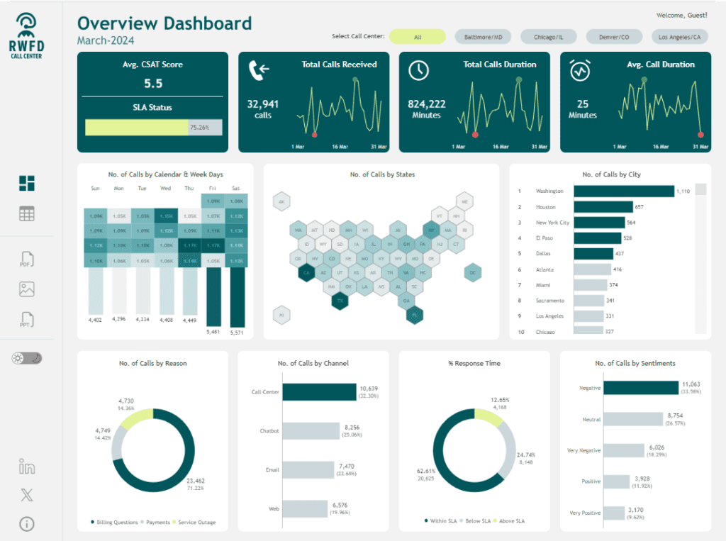
Dashboard Features:
- Key Metrics: The dashboard highlights crucial metrics, including the average Customer Satisfaction (CSAT) score (5.5), SLA (Service Level Agreement) status (75.26%), total calls received (32,941), total call duration (824,222 minutes), and average call duration (25 minutes). These metrics provide a quick overview of the call centre’s monthly performance.
- Calls by Calendar and Weekdays: A bar chart breaks down the number of calls received daily, offering detailed insights into weekly call volume trends.
- Calls by State: A hexagonal map of the United States visualizes the distribution of calls by state, offering regional insights and identifying areas with higher customer engagement.
- Calls by City: A horizontal bar chart ranks cities by call volume, with Washington, Houston and New York City leading.
- Calls by Reason: A doughnut chart categorizes calls by reason, such as billing questions, payments, and service outages, highlighting the most common customer concerns.
- Calls by Channel: A bar chart displays the distribution of calls across various communication channels, including call centres, chatbots, email, and the web.
- Response Time: A doughnut chart illustrates the percentage of calls responded to within, below, and above SLA targets, assessing the call centre’s efficiency.
- Sentiments: A bar chart shows the sentiment of calls, categorizing them as negative, neutral, or positive, helping to gauge overall customer satisfaction.
Usefulness for Companies:
This company dashboard example is a powerful tool for monitoring and optimizing call centre operations. By visualizing key metrics and trends, companies can identify areas for improvement, such as response times, call volume distribution, and customer sentiment. The detailed data on call reasons and channels supports targeted strategies to enhance customer service, while regional and city-level insights inform resource allocation and understanding of customer needs. This dashboard gives companies data-driven insights to improve customer satisfaction and operational efficiency.
7. Email Marketing Campaign Dashboard
The dashboard for a company displays an Email Marketing KPI Dashboard that offers a comprehensive overview of key performance indicators related to email marketing campaigns. This company dashboard example is an essential tool for companies to track and analyze the effectiveness of their email marketing efforts, helping them make data-driven decisions to optimize campaign performance.
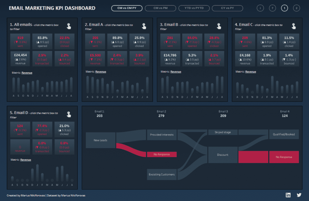
Dashboard Features:
- Critical Metrics for Emails: The dashboard is divided into sections that track the performance of multiple email campaigns (Emails A, B, C, D, etc.). Each section displays critical metrics, including the number of emails sent, open rates, click-through rates, bounce rates, and revenue generated. These metrics are vital for assessing the success of each email campaign.
- Comparative Analysis: This dashboard for companies allows for comparisons across different periods, such as the current month versus the previous month (CM vs PM) and year-to-date versus the previous year-to-date (YTD vs PYTD). This feature helps companies understand trends over time and evaluate improvements or declines in performance.
- Revenue Tracking: Each email campaign’s revenue performance is also analyzed, specifically focusing on how email engagement translates into financial outcomes. This is visualized through bar charts that show revenue trends over the months.
- Funnel Analysis: A Sankey diagram at the bottom of the dashboard visualizes the customer journey from new leads or existing customers through various stages, such as provided interest, no response, or qualified/booked. This helps in understanding where potential customers are lost in the marketing funnel.
Usefulness for Companies:
This company dashboard example is handy for businesses looking to refine their email marketing strategies. By providing detailed insights into key metrics like open rates, click-through rates, and revenue, the dashboard for companies enables marketing teams to identify which campaigns are performing well and which need improvement. Tracking customer journey stages helps optimise the conversion process, ensuring more leads are effectively nurtured into customers. This dashboard empowers companies to enhance their email marketing efforts, leading to better engagement and increased revenue.
8. Loyalty Email Marketing Dashboard
The company’s dashboard showcases a personalized email campaign performance dashboard for XYZ Loyalty, offering a detailed analysis of email marketing efforts and customer engagement. This company dashboard example is a vital tool for companies aiming to measure and optimize their email marketing strategies, especially within loyalty programs.
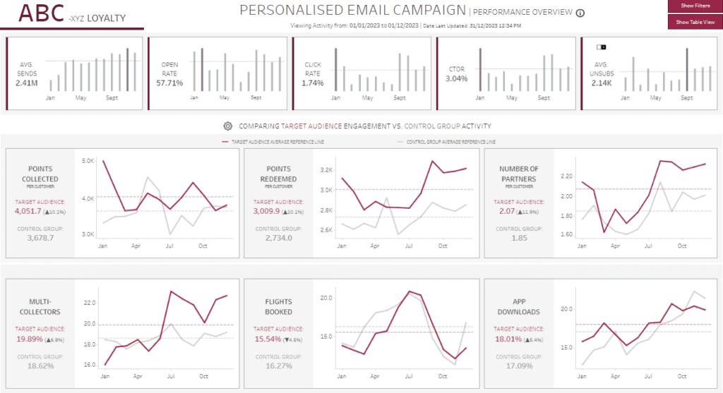
Dashboard Features:
- Critical Metrics Overview: The top section of the dashboard highlights vital metrics, including the average number of emails sent (2.41M), open rate (57.71%), click rate (1.74%), click-to-open rate (CTOR) at 3.04%, and the average number of unsubscribes (2.14K). These metrics are tracked across months, enabling companies to monitor yearly performance trends.
- Comparison of Target vs. Control Groups: The dashboard features line charts comparing the target audience’s engagement with a control group. Metrics include points collected and redeemed per customer, the number of partners per customer, multi-collectors (customers collecting points from multiple partners), flights booked, and app downloads. These comparisons allow companies to assess the effectiveness of personalized campaigns against standard marketing efforts.
- Line Charts: The line charts visualize monthly trends for the target audience and control group across various engagement metrics. These charts are crucial for identifying patterns and anomalies in customer behaviour over time.
Usefulness for Companies:
This company dashboard example is highly beneficial for businesses, particularly those managing loyalty programs, to evaluate the impact of their personalized email campaigns. By comparing the target audience’s engagement with a control group, companies can measure the effectiveness of their marketing strategies. The detailed metrics on customer behaviour, such as points collected, flights booked, and app downloads, provide insights into what drives customer engagement. This dashboard for companies supports data-driven decision-making, helping businesses refine their marketing tactics, enhance customer loyalty, and ultimately increase revenue.
9. Point Of Sales Dashboard
The dashboard for a company displays a Point of Sales (POS) Executive Summary Dashboard, offering a comprehensive overview of sales performance across various products, stores, and store types. This company dashboard example is designed to help businesses track their sales metrics and identify areas for improvement in their retail operations.
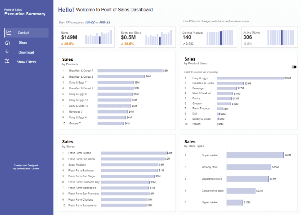
Dashboard Features:
- Critical Metrics Overview: The top section of the dashboard highlights critical sales metrics, including total sales ($149M), sales per store ($0.5M), distinct products sold (140), and the number of active stores (306). These metrics are compared to the previous period, allowing companies to assess their performance quickly.
- Sales by Products: A horizontal bar chart lists the top-selling products, with Breakfast & Cereal 7 leading at $9M in sales. This chart helps businesses understand which products are driving the most revenue.
- Sales by Product Lines: Another horizontal bar chart breaks down sales by broader product categories, such as Dairy & Eggs ($60M) and Beverage ($17M). This allows companies to evaluate the performance of entire product lines.
- Sales by Stores: This section features a bar chart that ranks stores by sales, with Fresh Farm Tucson and Fresh Farm Fort Worth leading at $2M each. This insight is crucial for identifying top-performing locations.
- Sales by Store Types: The dashboard also includes a bar chart that categorizes sales by store type, such as supermarkets ($45M), grocery stores ($35M), and department stores ($33M). This data helps businesses understand how different store formats contribute to overall revenue.
Usefulness for Companies:
This company dashboard example is a powerful tool for retailers to monitor their sales performance across multiple dimensions. By providing detailed insights into product sales, store performance, and store type contributions, the dashboard for companies enables data-driven decision-making. Businesses can use this information to optimize product assortments, improve underperforming stores, and tailor strategies to different store formats. This dashboard helps companies enhance their retail operations, increasing sales and profitability.
10. Sales Pipeline Dashboard
The dashboard for a company displays a Sales Pipeline Dashboard, offering an in-depth overview of open, won, and lost sales opportunities. This company dashboard example is designed to help businesses track their sales pipeline, identify key trends, and optimize their sales strategies.
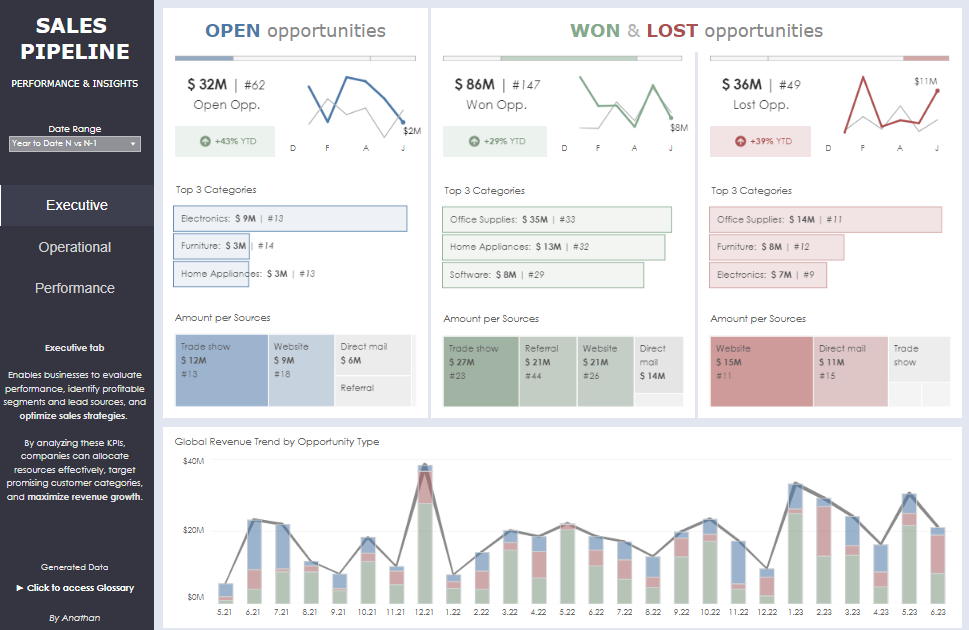
Dashboard Features:
- Open Opportunities: The first section highlights open opportunities, with a total value of $32M across 62 opportunities. A line chart displays the monthly trend of these opportunities, enabling companies to monitor the progress of potential deals. The top three categories under open opportunities include Electronics ($9M), Furniture ($3M), and Home Appliances ($3M). The sources of these opportunities are presented through a bar chart, with trade shows contributing $12M, websites $9M, and direct mail $6M.
- Won Opportunities: The second section focuses on won opportunities, totalling $86M from 147 deals. A line chart illustrates the performance over time, showing growth and successful conversion of opportunities. The top three categories here are Office Supplies ($35M), Home Appliances ($13M), and Software ($8M). Sources of these won deals include trade shows ($27M), referrals ($21M), and websites ($21M), as shown in a bar chart.
- Lost Opportunities: The third section details lost opportunities, amounting to $36M from 49 deals. The line chart in this section highlights the fluctuations and reasons for lost deals. The categories with the most significant losses are Office Supplies ($14M), Furniture ($8M), and Electronics ($7M). As the bar chart indicates, lost opportunities are predominantly sourced from websites ($15M) and direct mail ($11M).
- Global Revenue Trend: At the bottom, a combined bar and line chart showcases the global revenue trend by opportunity type, visually representing revenue fluctuations over time.
Usefulness for Companies:
This dashboard for companies is an essential tool for managing and optimizing the sales pipeline. By visualizing critical metrics related to open, won, and lost opportunities, businesses can identify which segments and sources are most profitable or require attention. This company dashboard example helps sales teams focus on the most promising opportunities, allocate resources effectively, and refine their strategies to maximize revenue. The clear breakdown of data by category and source also aids in understanding the effectiveness of different sales channels, ensuring better decision-making and improved sales performance.
11. Spend Analytics Dashboard
The dashboard for a company displays a Spend Analytics Executive Summary Dashboard, which comprehensively overviews a company’s spending patterns. This company dashboard example is essential for businesses monitoring their expenditures, identifying cost-saving opportunities, and optimising vendor relationships.
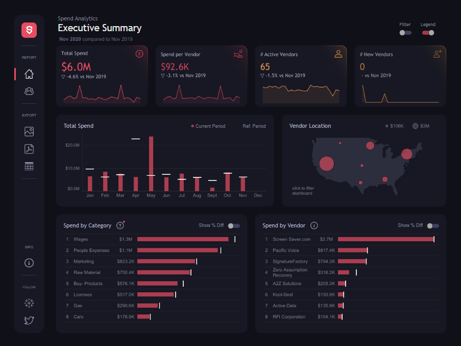
Dashboard Features:
- Critical Metrics Overview: The top section of the dashboard highlights crucial spending metrics, including total spending ($6.0M), spending per vendor ($92.6K), the number of active vendors (65), and new vendors (0). These metrics are compared to the previous year (Nov 2019), helping companies track changes in spending and vendor engagement.
- Total Spend Over Time: A bar chart tracks the total monthly spending for the current period compared to the reference period, providing a clear view of spending trends throughout the year. This helps businesses identify months with unusually high or low spending.
- Vendor Location: A map visualizes vendor distribution across the United States, with bubble sizes representing the amount spent in each location. This geographic representation helps companies understand where most of their spending is concentrated.
- Spend by Category: A horizontal bar chart breaks down spending by categories, such as wages ($1.3M), people expenses ($1.1M), marketing ($823.2K), and raw materials ($750.4K). This allows companies to see where their money is going and identify areas requiring cost optimization.
- Spend by Vendor: Another horizontal bar chart lists the top vendors by spend. This section is critical for analyzing vendor performance and ensuring the best value for money.
Usefulness for Companies:
This company dashboard is a powerful tool for financial management and strategic decision-making. The company dashboard example enables businesses to track their expenses, identify potential areas for cost reduction, and optimize vendor management by providing a detailed breakdown of spending by category and vendor. The geographic distribution of the expenditure also offers insights into regional spending patterns, helping companies make informed decisions about their vendor relationships. This dashboard allows companies to maintain financial control, improve efficiency, and support long-term financial planning.
12. Sales Overview
A company dashboard displays a Sales Overview Dashboard to provide a detailed sales performance analysis across various segments and product categories. This company dashboard example is crucial for businesses tracking sales targets, monitoring growth, and optimising their sales strategies.
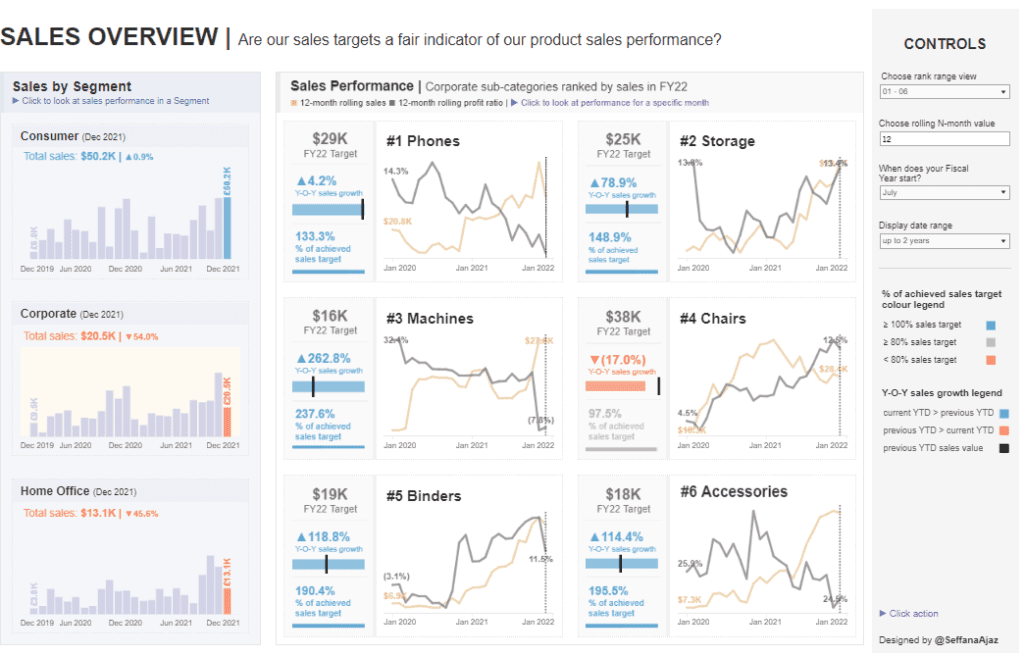
Dashboard Features:
- Sales by Segment: The left side of the dashboard shows sales data segmented by categories such as Consumer, Corporate, and Home Office. Each segment’s total sales and year-over-year (Y-O-Y) changes are displayed. Bar charts illustrate monthly sales trends over the past two years, enabling companies to track performance and identify patterns within each segment.
- Sales Performance by Product: The central portion of the dashboard highlights individual product categories, ranked by their sales in the fiscal year. Line charts display 12-month rolling sales and profit ratios for products like Phones, Storage, Machines, Chairs, Binders, and Accessories. Each product category includes its fiscal year sales target, Y-O-Y sales growth, and the percentage of the sales target achieved. For example, the Phones category has a $29K FY22 target, with a 4.2% Y-O-Y sales growth and 133.3% of the sales target achieved.
- Controls and Filters: On the right side, the dashboard offers controls for adjusting the date range, fiscal year start, and N-month rolling average view. These controls allow users to tailor the data display to their needs, facilitating more accessible trends and performance analysis.
Usefulness for Companies:
This dashboard for companies is a powerful tool for tracking and managing sales performance. By providing a clear view of sales by segment and product category, the company dashboard example enables businesses to quickly assess whether they are meeting their sales targets. The detailed charts and performance metrics help sales teams identify areas of growth and products or segments that may require more attention. Additionally, the ability to customize the data display with filters ensures that companies can focus on the most relevant information, supporting strategic decision-making and driving overall sales success.
13. Web Traffic Dashboard
The company’s dashboard displays a Web Traffic Dashboard, providing a comprehensive overview of website performance metrics for August 2018 compared to July 2018. This company dashboard example is designed to help businesses monitor their web traffic, understand user behaviour, and optimize their online presence.
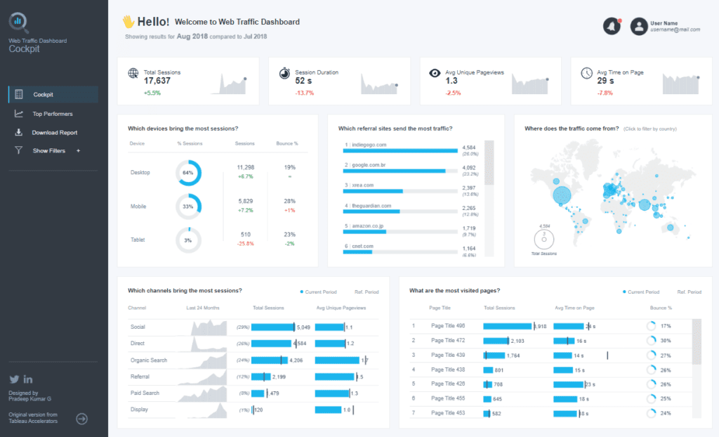
Dashboard Features:
- Critical Metrics Overview: The top section highlights essential web traffic metrics such as total sessions (17,637), session duration (52 seconds), average unique pageviews (1.3), and average time on page (29 seconds). These metrics offer a snapshot of website performance and user engagement over time.
- Sessions by Device: A doughnut chart shows the percentage of sessions by device type (desktop, mobile, tablet). The accompanying bar charts display the total number of sessions, percentage changes, and bounce rates for each device, offering insights into how users access the website.
- Top Referral Sites: A horizontal bar chart ranks the top referral sites driving traffic to the website. This helps companies identify the most effective referral sources.
- Geographic Traffic Distribution: A world map visualizes the geographic distribution of website traffic, with bubble sizes representing the volume of sessions from different regions. This chart helps companies understand their website’s global reach.
- Traffic by Channel: A combination of bar and line charts illustrates traffic sources, including social, direct, organic search, referral, paid search, and display. These charts help businesses identify which channels are driving the most traffic.
- Most Visited Pages: A bar chart lists the top pages visited, including total sessions, average time on page, and bounce rates. This data is crucial for assessing which content resonates most with users.
Usefulness for Companies:
This company dashboard example is invaluable for monitoring web traffic and user behaviour. By providing detailed insights into device usage, referral sources, geographic distribution, and content performance, this dashboard enables companies to optimize their online strategies. Companies can use this data to enhance user experience, improve content relevance, and allocate marketing resources more effectively, ultimately driving better engagement and higher conversion rates.
13 Powerful Company Dashboard Examples
The 13 company dashboard examples highlighted in this post illustrate the versatility and impact of well-designed dashboards in modern business. From tracking sales performance and optimizing marketing efforts to enhancing customer service and managing operational efficiency, these dashboards offer valuable insights that can transform companies’ operations. Adopting the right dashboard for companies tailored to your specific needs can improve decision-making, boost productivity, and stay ahead of the competition. As you consider implementing or refining your dashboards, take inspiration from these examples to create tools that present data and drive actionable results. Investing in the right company dashboard is an example of investing in the future success of your business.