Understanding why customers leave and taking proactive steps to address churn is essential for businesses to build lasting relationships. Churn dashboards are crucial in this process by providing actionable insights into customer behaviours, retention patterns, and potential risks. These data-driven tools allow companies to identify at-risk customers, uncover trends, and design targeted strategies to improve loyalty and satisfaction.
Related posts:
- 8 Amazing Tableau eCommerce Dashboard Examples
- 7 Amazing Customer Dashboard Examples for Actionable Customer Insights
- 7 Powerful Social Media Dashboard Examples to Supercharge Your Analytics
- Best 5 CRM Dashboard Examples to Boost Your Customer Strategy!
- 6 Powerful Sales Funnel Dashboard Examples to Maximize Your Conversions
- 5 Powerful Revenue Dashboard Examples to Track & Boost Your Business Growth
This blog post will showcase five powerful examples of churn dashboards, each tailored to a specific industry or use case. These examples highlight how effective visualization and analytics can transform churn management in industries ranging from telecom and banking to subscription services. Whether you’re a data analyst, marketer, or business leader, these examples offer valuable inspiration for creating or optimizing your customer churn analysis dashboard.
Table of Contents
#1 Churn Dashboard – Telecom Customer Churn Dashboard
The Telecom Customer Churn Dashboard comprehensively analyses customer retention and churn patterns for 2023. It presents critical metrics such as the number of customers, revenue, churned customers, and average satisfaction score, comparing current performance to the previous year. This customer churn analysis dashboard incorporates various visualizations, including bar charts, doughnut charts, maps, and heatmaps, for detailed analysis.
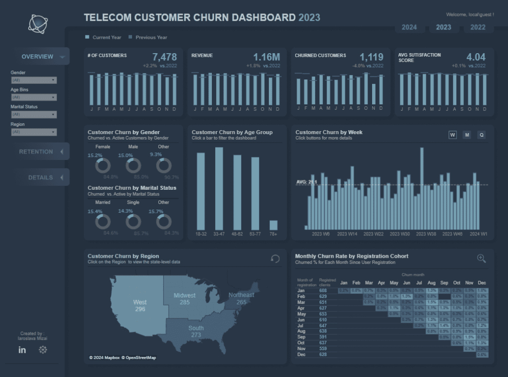
Key insights include customer churn segmented by gender, age group, marital status, week, and region. For example, doughnut charts reveal that female customers have a slightly higher churn rate than males, while younger customers (18-32) exhibit the highest churn among age groups. A weekly bar chart tracks churn trends, highlighting periods of high customer loss. The regional map pinpoints churn hotspots, with the West having the highest churn numbers. Lastly, the heatmap tracks monthly churn rates by registration cohorts, enabling a lifecycle analysis of customer behaviour.
Businesses can leverage these insights from the churn analysis dashboard to design targeted retention strategies. Understanding age-group trends can guide tailored offers while identifying churn-heavy weeks can prompt timely interventions. Regional analysis helps allocate resources to high-risk areas, and cohort tracking can optimize customer engagement strategies at different stages of the customer lifecycle.
#2 Churn Dashboard – Churn Modelling
The customer churn analysis dashboard comprehensively examines customer exit patterns across France, Germany, and Spain. It presents critical metrics, revealing that out of 10,000 customers, 5,151 are active (51.5%), 2,037 have exited (20.4%), and 7,055 hold a credit card (70.6%). Gender-based segmentation shows 4,543 female and 5,457 male customers.
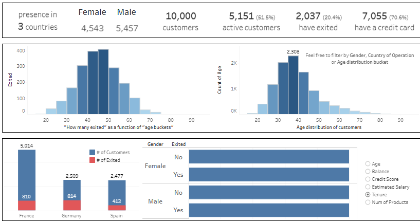
This churn dashboard employs various charts to communicate insights effectively. Histograms analyze customer churn by age, highlighting that most churned customers fall within the 40–50 age group. Another histogram displays the overall age distribution of customers, peaking at 30–40 years. Bar charts visualize customer churn by country, indicating France has the highest churn volume (810 exited customers), followed by Germany (814) and Spain (413). Horizontal bar charts further segment churn rates by gender and other factors like age, tenure, credit score, and account balance.
Businesses can leverage this customer churn dashboard to address retention challenges by targeting high-risk demographics. For instance, the concentration of churn among middle-aged customers suggests an opportunity for personalized retention campaigns. Regional churn insights can guide location-specific interventions, while segmentation by gender or tenure helps identify and resolve underlying causes of churn to enhance customer loyalty.
#3 Churn Dashboard – Bank Churn Dashboard
The bank customer churn analysis dashboard provides a comprehensive breakdown of customer demographics, credit behaviour, and other attributes to assess churn risks. It highlights key metrics such as the average credit limit (6,818), average balance (669.0), and average months on the account (6.20). Gender and marital status distributions reveal that 59% of customers are female, 41% male, with a marital split of 48% married, 44% single, and 8% divorced.
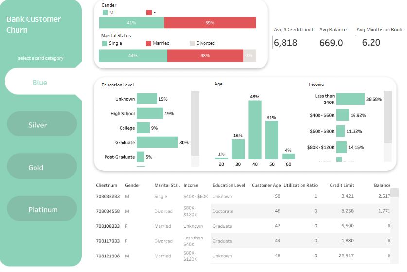
Bar charts detail customers’ education levels, showing that 30% are graduates and 19% have a high school education. Age distribution indicates that most customers are in the 40–50 range (48%), followed by 30–40 (31%). Income brackets show that 38.58% of customers earn less than $40K, while 16.92% earn between $40K and $60K.
The dashboard’s table offers detailed customer data, including gender, marital status, income, education level, credit limits, utilization ratio, and balances.
This churn dashboard allows companies to pinpoint high-risk segments, such as customers with low income or shorter tenure. Targeted interventions, like customized financial products or loyalty programs, can help improve retention for these groups. Understanding key patterns ensures proactive churn mitigation strategies.
#4 Churn Dashboard – Customer Churn Analysis
The customer churn analysis dashboard offers a comprehensive overview of churn statistics and the reasons for customer attrition. It reveals that out of 6,687 customers, 1,796 have churned, resulting in a churn rate of 26.86%. A bar chart highlights primary churn causes, with “competitor made a better offer” at 16.87% and “competitor had better devices” at 16.54%, followed by “attitude of support personnel” at 11.30%.
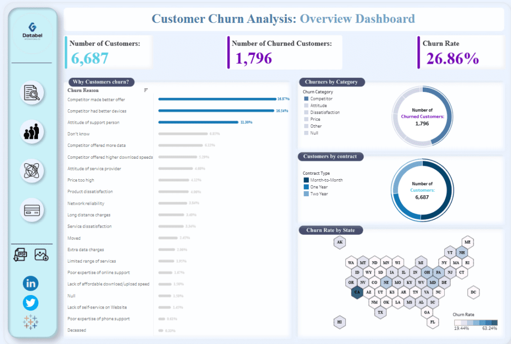
The dashboard also features pie charts segmenting churners by category—such as competitor, attitude, dissatisfaction—and contract type. It indicates that most customers are on month-to-month contracts, which may correlate with higher churn rates. Additionally, a geographic map visualizes churn rates by state, showing significant regional variations.
This churn dashboard enables businesses to pinpoint the root causes of customer churn and develop targeted retention strategies. Addressing service issues or offering more competitive plans could help retain at-risk customers. Geographical insights allow companies to concentrate retention efforts in states with the highest churn rates. At the same time, contract-type data can inform strategies to transition customers to longer-term agreements, thereby enhancing overall retention rates.
#5 Churn Dashboard – Churned Dashboard
The customer churn dashboard provides a detailed overview of customer retention and churn patterns for a telecom company. Key metrics show a churn rate of 26.54% retention rate of 68.29%. It also highlights an average revenue loss per customer of $1.97K and a lifetime value of $1.77K. Out of 5,174 active customers, 1,869 have churned.
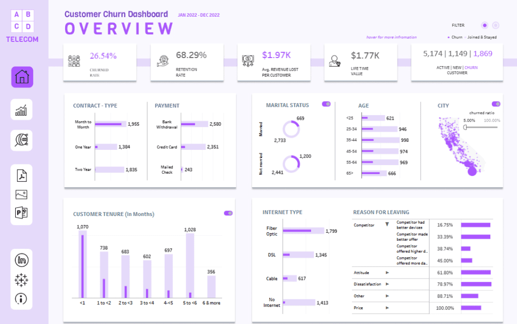
Bar charts display contract types, revealing that month-to-month contracts are associated with the highest churn compared to one-year and two-year agreements. Payment method data indicates that customers using bank withdrawals and credit cards are likelier to churn than those using mailed checks—pie charts segment customers by marital status, showing higher churn among unmarried customers. Age segmentation highlights churn patterns, with younger customers (25–34) exhibiting higher rates.
The dashboard also includes customer tenure data, showing that churn is highest in the first year of service. Internet-type insights reveal churn is most common among fibre-optic and DSL users. Reasons for leaving are summarized, with “competitor offered more data” and “competitor made a better offer” being prominent.
This churn analysis dashboard helps companies identify at-risk segments, such as short-tenure or unmarried customers. This allows for targeted retention strategies, such as incentives for long-term contracts and personalized customer engagement plans.
Churn dashboards have become indispensable for organizations aiming to understand and address customer attrition effectively. The examples shared in this blog demonstrate the versatility of customer churn analysis dashboards in visualizing key metrics, identifying trends, and enabling data-driven decision-making. By leveraging tools that combine real-time analytics with explicit visual representations, businesses can uncover actionable insights that lead to improved customer retention. Whether it’s understanding the reasons behind churn, analyzing demographics, or segmenting customers by contract type, these dashboards provide the foundation for targeted and impactful strategies. As industries evolve, the importance of harnessing data to mitigate churn will grow. By investing in well-designed customer churn dashboards, companies can protect their bottom line and foster more robust, long-term relationships with their customers. Let these examples inspire you to explore how churn analytics can revolutionize your approach to retention.


