Whether you’re tracking email performance, measuring engagement, or comparing campaign success across channels, a campaign dashboard makes it easy to monitor key metrics at a glance.
This blog will explore six powerful marketing campaign dashboard examples that showcase different visualization styles, metrics, and strategic focuses. From email marketing to digital advertising, these dashboards help marketers stay informed, make faster decisions, and optimize performance. These real-world examples will spark inspiration if you’re looking to build or refine your campaign performance dashboard.
Table of Contents
#1 Campaign Dashboard – Email Campaign Dashboard
This dashboard provides a comprehensive overview of key email marketing performance metrics. It visualizes data through a clean and modern interface, making it easy to analyze and compare campaign effectiveness over time.
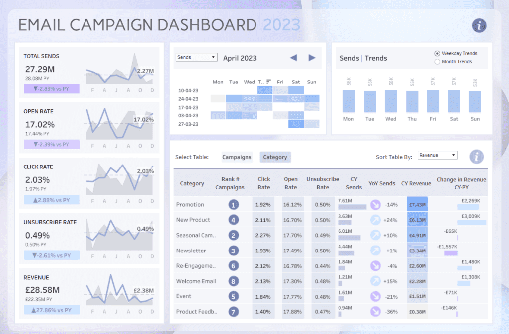
The marketing campaign dashboard includes various types of charts and visualizations. On the left, you’ll find KPI cards for Total Sends, Open Rate, Click Rate, Unsubscribe Rate, and Revenue. Each KPI is paired with a mini line chart and year-over-year comparison, allowing users to see trends and performance changes instantly. A heatmap in the center displays emails sent by day of the week across different weeks in April 2023, while a bar chart on the right visualizes average daily send trends for quick weekday or monthly comparisons.
The bottom section contains a detailed category breakdown table with metrics like Click Rate, Open Rate, CY sends, and Revenue. It also supports sorting by different metrics for deeper analysis in the campaign performance dashboard.
This dashboard is handy for marketing managers, campaign analysts, and digital strategists who want to optimize email performance. By tracking engagement and revenue metrics across different types of campaigns, users can identify high-performing categories and make data-driven decisions to improve future email marketing strategies.
#2 Campaign Dashboard – Digital Marketing Campaign Performance
This digital marketing campaign dashboard offers a clear and interactive view of campaign performance across various channels. It consolidates key performance indicators such as Impressions, Cost, Leads, Cost per Lead, Primed Leads, and Cost per Primed Lead into an easy-to-navigate campaign performance dashboard interface. Each metric is broken down by channel—direct, Paid Search, Paid Social, and Program—making it simple to compare performance across platforms.
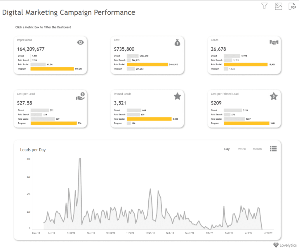
The campaign dashboard uses KPI cards for each primary metric, enhanced with bar visuals to compare values by channel. This allows users to spot the most cost-effective or high-performing sources quickly. For time-based analysis, a line chart at the bottom shows “Leads per Day,” enabling users to monitor campaign performance trends over time with options to switch views between daily, weekly, and monthly data.
This marketing campaign dashboard is ideal for digital marketers, performance analysts, and marketing managers who need to track the efficiency and effectiveness of ongoing marketing efforts. It helps identify which channels deliver the best return on investment, where budget optimizations can be made, and how lead generation trends evolve. By presenting a real-time, data-driven summary, this campaign dashboard empowers teams to make smarter, faster campaign decisions.
#3 Campaign Dashboard – Marketing Campaign Performance Dashboard
This dashboard offers a detailed overview of campaign performance metrics across multiple dimensions. It brings together key indicators such as Impressions, Clicks, Cost per Conversion, Conversion Rate, Revenue, and ROI, allowing users to assess the effectiveness of their campaigns at a glance.
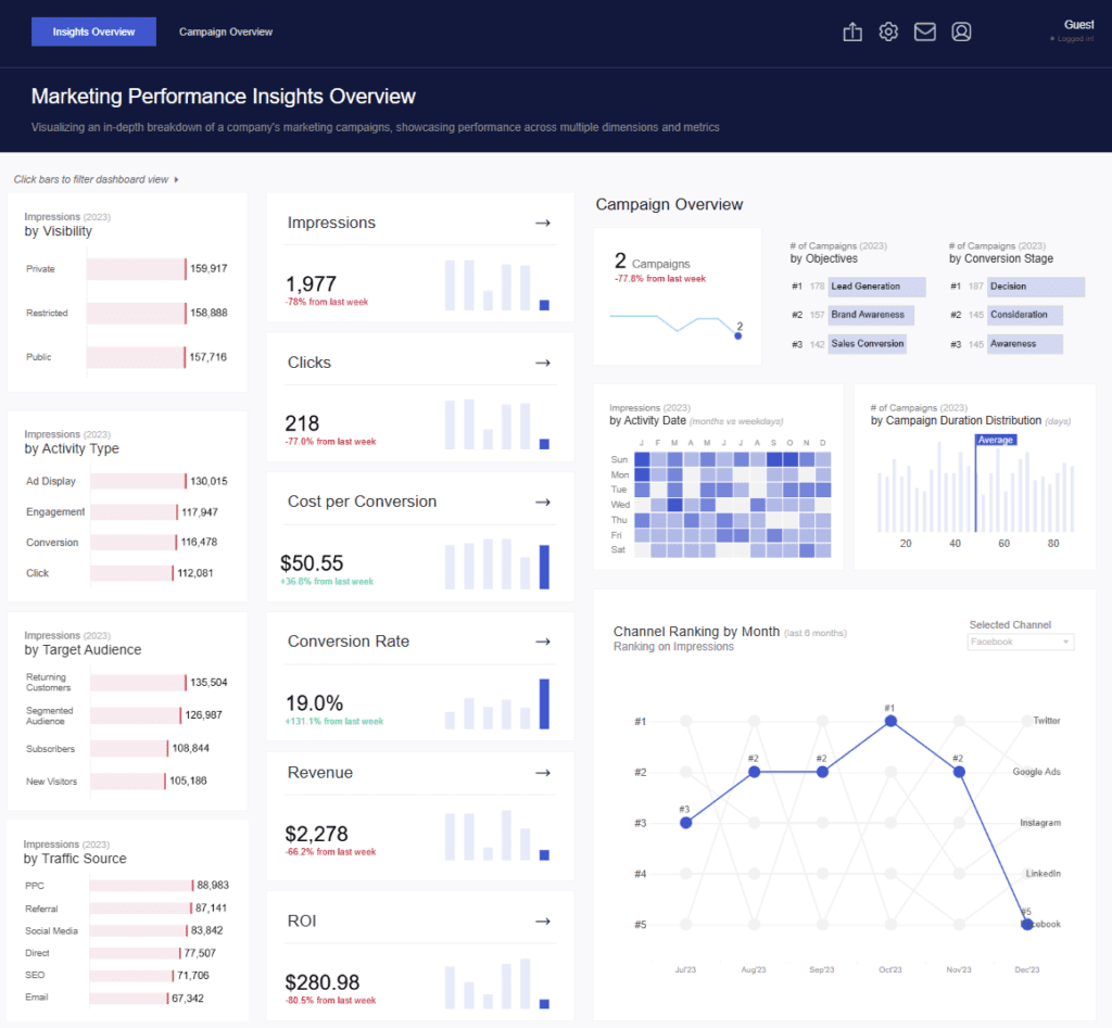
The marketing campaign dashboard features various chart types to visualize data intuitively. Bar charts compare performance across categories like Activity Type, Target Audience, and Traffic Source. Small trend line charts next to each KPI provide week-over-week performance changes. A heatmap shows impressions by weekday and month, revealing activity trends over time. There’s also a vertical bar chart showing the distribution of campaign durations, and a line chart tracks channel ranking on impressions over the past six months.
This campaign performance dashboard is handy for digital marketing teams, analysts, and CMOs looking to evaluate how different strategies and channels are performing. It supports more intelligent decision-making by highlighting where engagement is most potent, which audiences convert best, and how marketing investments translate into returns. By offering a broad and deep view of campaign effectiveness, this campaign dashboard enables organizations to optimize efforts and focus resources where they deliver the most impact.
#4 Campaign Dashboard – Email campaign performance
This email campaign dashboard presents a performance overview of key metrics such as open rate, click-to-open (CTO) rate, click-through (CTR) rate, and unsubscribe rate. It provides a visual summary of data from a selected period, allowing users to compare performance against current results. Circular KPI charts at the top display average values and percentage changes, making it easy to track improvements or declines.
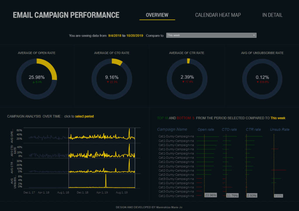
The marketing campaign dashboard incorporates time-series line charts that illustrate trends in open rate, CTO rate, CTR rate, and unsubscribe rate over time. These charts enable users to observe fluctuations, seasonality, and spikes in campaign activity. A performance comparison table lists the top 10 and bottom 5 campaigns for the selected timeframe, with clear visual indicators using horizontal bars to show how each metric performed compared to the current week.
This campaign performance dashboard is handy for email marketing specialists, CRM teams, and digital analysts who want to track the effectiveness of email campaigns. It allows for granular performance analysis, highlights strong and weak campaigns, and supports data-driven optimization. This campaign dashboard lets users pinpoint trends, improve targeting strategies, and enhance overall campaign outcomes across key engagement metrics.
#5 Campaign Dashboard – Email Campaign Overview – Eloqua
This email campaign dashboard comprehensively overviews campaign performance over a selected period. It highlights key metrics such as total emails sent, click-to-open rate (CTOR), delivery rate, open rate, and clickthrough rate. These figures help marketing teams assess overall email effectiveness at a glance.
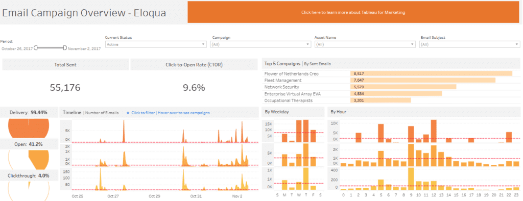
The marketing campaign dashboard presents insights using a mix of visualizations. Donut charts display performance percentages for delivery, open, and click-through rates. Horizontal bar charts highlight the top 5 campaigns by email volume, making it easy to identify the most active initiatives. Time-based performance is visualized through a timeline area chart that shows the number of emails sent daily. Additional bar charts break down engagement by weekday and hour, helping teams understand when audiences are most responsive.
This campaign dashboard is handy for email marketers, campaign managers, and digital analysts who want to track and optimize email outreach. It supports better planning by revealing peak engagement periods and identifying top-performing campaigns. With this campaign performance dashboard, teams can make data-driven decisions to improve targeting, scheduling, and content strategy, ultimately increasing engagement and ROI. A well-structured campaign dashboard empowers organizations to refine their approach and continuously deliver more effective email campaigns.
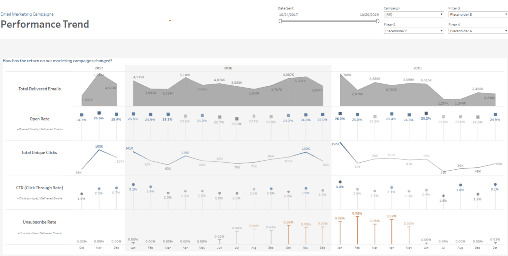
#6 Campaign Dashboard – DIGITAL MARKETING – Email Marketing Campaigns
This campaign dashboard offers a detailed, multi-view summary of email marketing performance, ideal for executive reviews and campaign optimization. It compares year-to-date with previous periods and highlights critical KPIs such as total sent and delivered emails, open rate, click-to-open rate (CTOR), click-through rate (CTR), and unsubscribe rate.
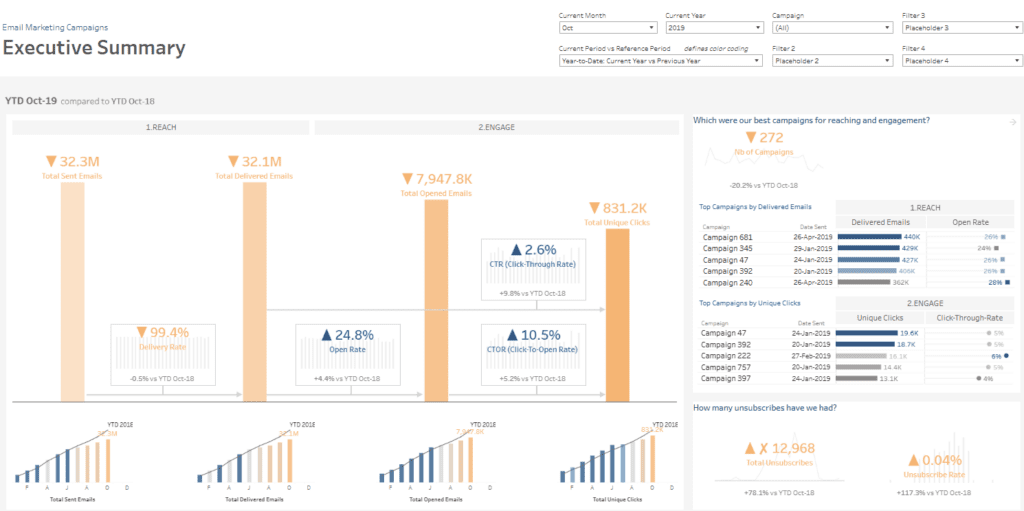
The marketing campaign dashboard uses a variety of charts to deliver insight. Vertical bar charts display totals and year-on-year comparisons. Donut visuals show delivery and engagement rates, while horizontal bar charts rank top campaigns by delivered emails, open rate, unique clicks, and CTR. A scatter plot helps identify the most successful campaigns by plotting CTR against total delivered emails, with bubble size representing engagement. Time-series line and area charts track trends in performance across months and years, giving a historical perspective on open rates, CTR, and unsubscribe behavior.
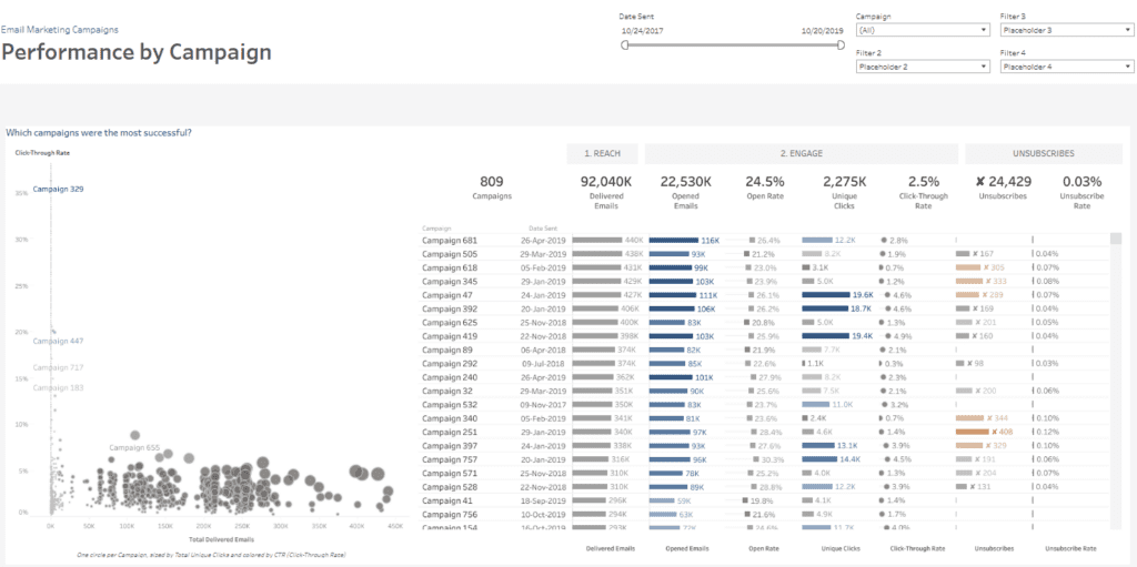
This campaign performance dashboard is valuable for marketing executives, CRM teams, and campaign analysts looking to assess high-level effectiveness and dive deeper into individual campaign results. It helps identify trends, flag underperforming campaigns, and recognize top performers. This campaign dashboard enables thoughtful planning, performance benchmarking, and improved ROI tracking across email marketing strategies by consolidating performance data into a single interactive view.
A vigorous campaign dashboard isn’t just a reporting tool—it’s a strategic asset. The six examples we’ve explored highlight how diverse and dynamic a marketing campaign dashboard can be, whether you’re focused on clicks, conversions, ROI, or audience engagement. Each campaign performance dashboard offers a different perspective, yet all serve the same purpose: to provide clarity and direction in a data-saturated environment. As marketing continues evolving, a reliable, insightful campaign dashboard will be essential for staying competitive. Use these examples to build more brilliant dashboards that empower your team and elevate your marketing campaign performance.