An airline dashboard has become invaluable, offering real-time and historical data on everything from flight performance to customer satisfaction. These tools allow airlines to streamline operations, optimize resource allocation, and enhance the passenger experience by providing a visual overview of key metrics. In this blog, we’ll explore nine examples of powerful dashboards, including airline customer and flight dashboards, each tailored to specific needs within the industry.
Related posts:
- 5 Amazing Hotel Dashboard Examples to Elevate Your Hospitality Operations
- 10 Amazing Tableau Healthcare Dashboard Examples
- Best 12 Amazing Examples of Tableau Supply Chain Dashboards
- 8 Amazing Tableau eCommerce Dashboard Examples
- 5 Powerful Crime Dashboard Examples Transforming Public Safety Insights
- 7 Amazing Shipping Dashboards That Will Revolutionize Your Logistics Game
From tracking flight volumes and on-time performance to analyzing passenger satisfaction and market share, these dashboards demonstrate how data visualization can drive strategic decision-making and operational efficiency. Whether in airline operations, customer service, or market analysis, these dashboards provide insights that can transform your approach to managing and improving airline performance.
Table of Contents
# 1 Airline Dashboard – Air Travel – Global Flight Paths
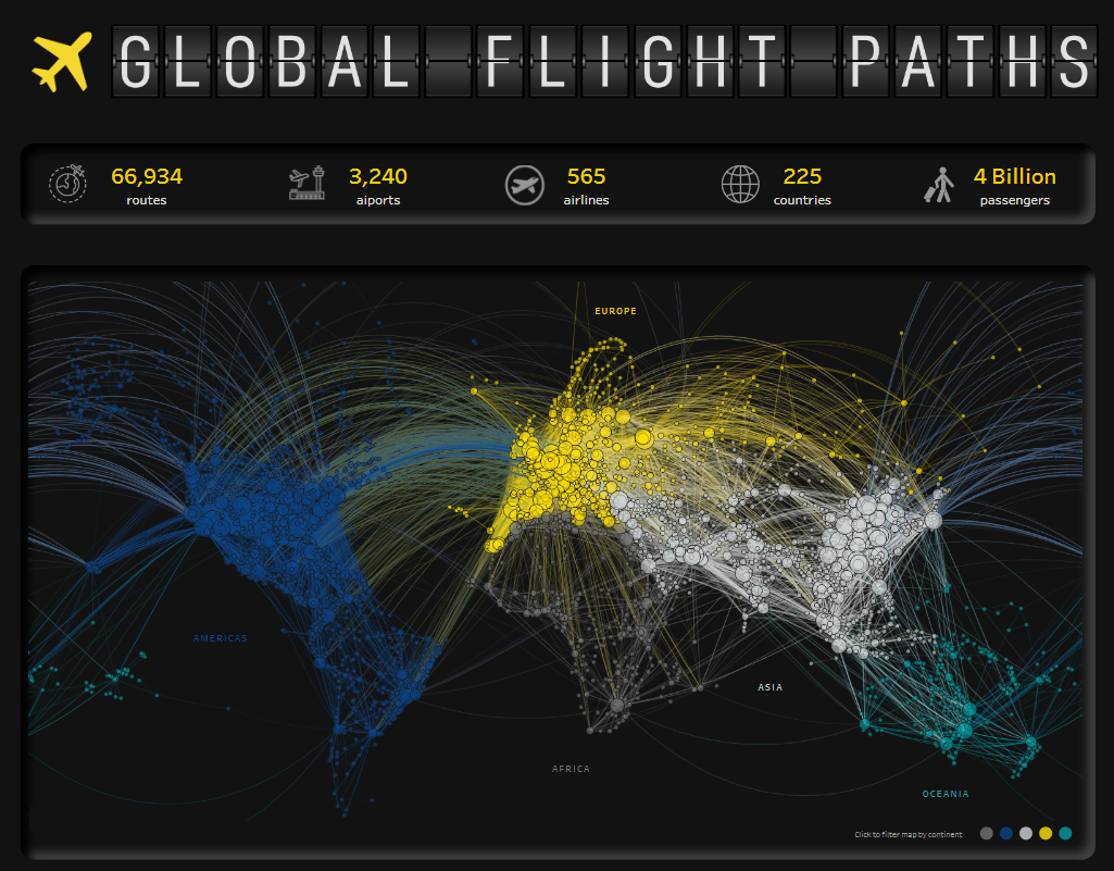
This airline dashboard comprehensively overviews global flight paths, passenger statistics, and airline performance. It utilizes various charts and visual elements to convey information effectively. The main chart is a geographic network visualization, displaying flight routes across continents, with nodes representing airports and lines indicating connections. Colours differentiate regions such as Europe, Asia, and the Americas, making regional flight density and connectivity easy to understand.
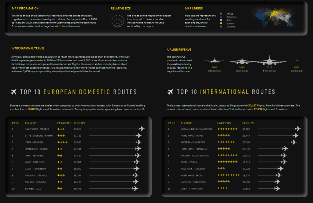
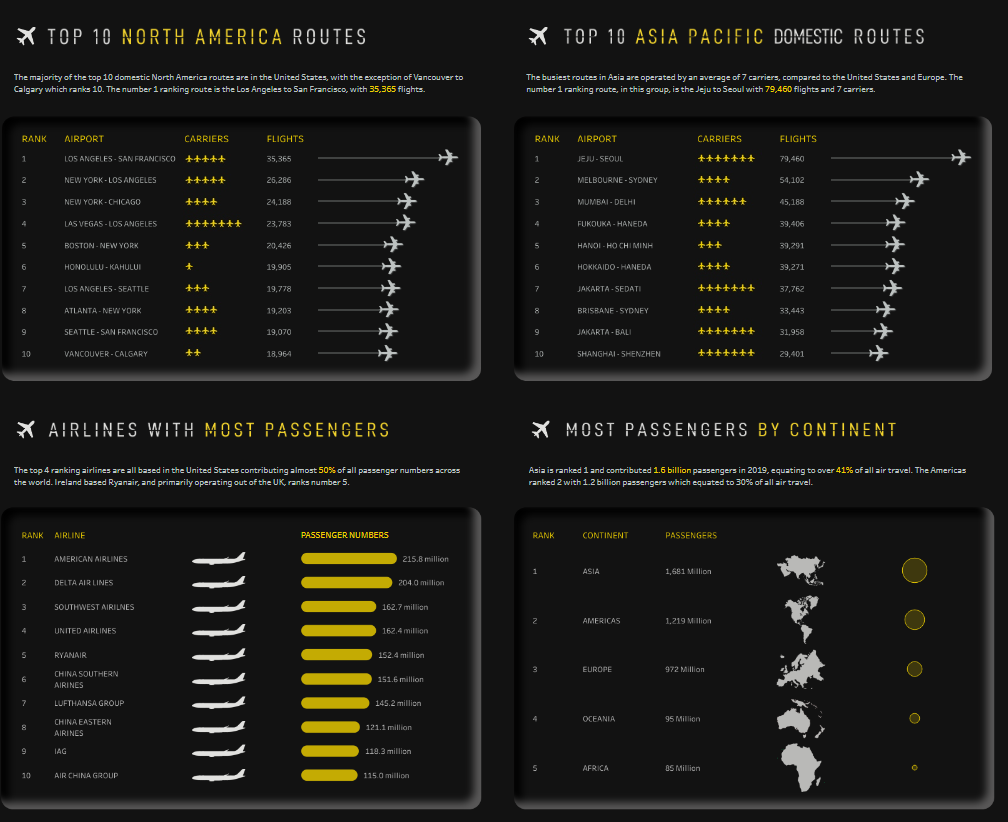
Additional charts in this aviation dashboard include bar charts for rankings (e.g., top airports, airlines by passenger numbers), line charts for trends in global air passengers over time, and circular visualizations to represent airport route frequency and continent-based passenger distribution.
This airline customer dashboard would be handy for departments within an airline’s corporate or strategic planning divisions, such as network planning, marketing, and operations. Network planners can identify high-traffic routes and gaps, marketing teams can target regions with the highest passenger numbers, and operations departments can analyze load factors on busy roads. This airline KPI dashboard supports decision-making for expanding routes, scheduling flights, and allocating resources, ultimately helping optimize route efficiency and enhance profitability in a flight dashboard format.
# 2 Airline Dashboard – United Airlines Aircraft Status
This airline dashboard offers a detailed view of United Airlines’ fleet status, providing real-time insights into aircraft location, maintenance status, and operational readiness. The airline customer dashboard uses a combination of map visualizations and bar charts to present the status and distribution of the fleet across various U.S. locations. Each aircraft type is represented on the bar chart, showing the number of planes currently flying, undergoing maintenance, in modification, or stored.
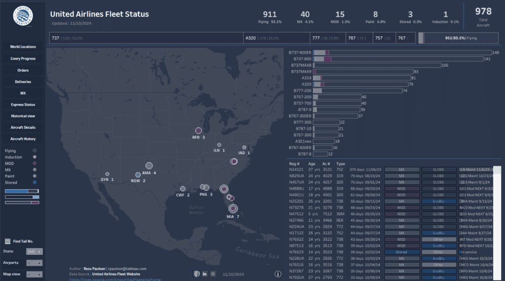
The map highlights specific airport locations, with colour-coded markers indicating the aircraft’s current status, such as flying, induction, maintenance, and painting. A tabular section below provides further details, including aircraft registration numbers, age, type, maintenance status, and specific return-to-service dates.
This aviation dashboard is handy for the airline’s fleet management, operations, and maintenance departments. Fleet management teams can use this flight dashboard to monitor aircraft availability and readiness, ensuring optimal route allocation. The maintenance team benefits from visibility into the maintenance schedule, enabling them to prioritize tasks and avoid downtime. This airline KPI dashboard supports operational efficiency, resource planning, and real-time fleet tracking to meet operational goals.
# 3 Airline Dashboard – The Best and Worst Airlines in the US
This airline dashboard presents a comparative analysis of major U.S. airlines, ranking them based on various customer experience factors, including price, convenience, headaches, and extras. The airline KPI dashboard uses stacked bar charts to display each airline’s performance across these categories visually. Users can adjust the weighting of each criterion—such as airfare, bag fees, route network, on-time arrivals, and lounge access—to see how rankings shift based on their preferences. Each airline’s score is represented as a bar with different segments, showing strengths and weaknesses in each area.
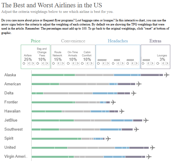
This flight dashboard is particularly valuable for airline customer experience and marketing departments. Customer experience teams can use this airline customer dashboard to identify areas where they might improve to meet passenger expectations better. In contrast, marketing teams can leverage insights to promote strengths, such as low fees or on-time solid performance, to target specific customer segments. This aviation dashboard also provides a competitive overview that helps airlines understand their position relative to competitors, guiding strategic decisions on service enhancements, pricing adjustments, and loyalty programs.
# 4 Airline Dashboard – Airline Social Ratings
This airline dashboard provides a social rating of European airlines based on pilot feedback, focusing on work conditions, work-life balance, and contractual arrangements. The aviation dashboard categorizes airlines into five groups: Social Excellence, Social Partner, Social Snail, Social Misfit, and Social Junk. Each category reflects the airline’s commitment to positive pilot relations, with Social Excellence representing the best and Social Junk the lowest-rated airline.
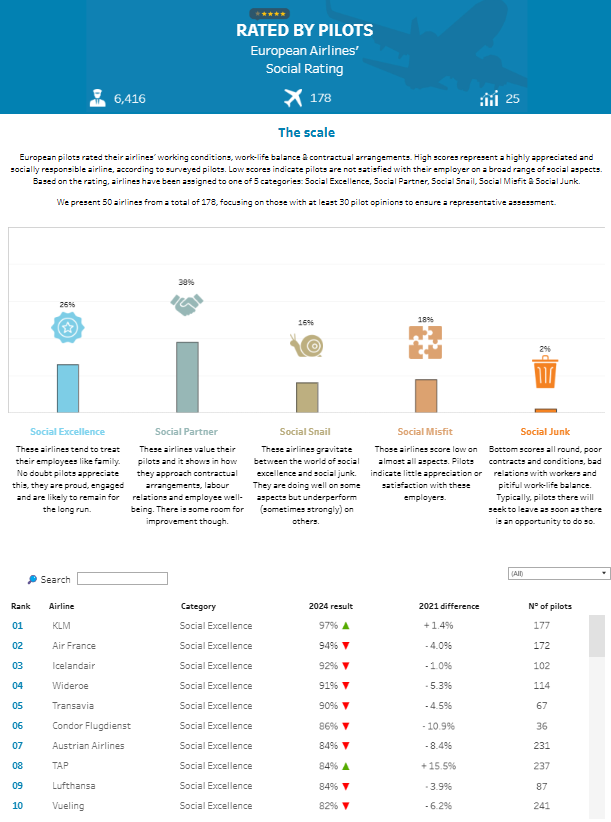
The airline customer dashboard uses a stacked bar chart to display the percentage of airlines in each social category, visually representing the distribution of ratings across categories. Below the chart, a ranked list details individual airline scores, category assignments, score changes from the previous year, and the number of pilot responses, providing insights into airline performance in employee satisfaction.
This flight dashboard mainly benefits airlines’ human resources and employee relations departments. HR teams can use it to assess and improve work conditions, creating competitive strategies to enhance pilot satisfaction and retention. The airline’s KPI dashboard also helps leadership understand how their airline ranks in terms of pilot satisfaction compared to competitors. It enables them to address concerns and develop policies supporting pilot welfare and job satisfaction.
# 5 Airline Dashboard – The United States of Airports
This airline dashboard visualizes the distribution and scale of international airports across the continental United States. The main map shows each airport as a red circle, with the circle’s size representing the number of passengers served. The geographic distribution highlights regions where international travel is most concentrated, with larger circles indicating busier airports. Shaded areas on the map denote regions where each airport is the closest international option for passengers.
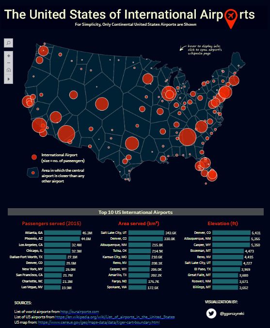
Below the map, the airline customer dashboard includes a comparative table listing the top 10 U.S. international airports. This table provides key metrics: passengers served in 2015, the area each airport serves in square kilometres, and airport elevation in feet. Bar charts within the table provide a quick visual comparison for each metric, making it easy to assess relative airport performance and service areas.
This aviation dashboard is particularly valuable for strategic planning, route development, and marketing departments within airlines. The airline KPI dashboard supports decisions on expanding services, identifying underserved areas, and optimizing airport partnerships. Additionally, marketing teams can use this flight dashboard to target potential high-traffic regions for new routes or promotional efforts, maximizing reach and profitability in densely populated travel corridors.
# 6 Airline Dashboard – Airline Performance Comparison
This airline KPI dashboard provides a comparative performance analysis of major U.S. airlines, focusing on key metrics such as on-time percentage, excessively late percentage, cancelled flights, mishandled bags, and customer satisfaction. Each metric is represented in a circular chart format, color-coded to indicate airline performance levels. These circular charts allow for quick visual comparisons, with different colours highlighting strengths and weaknesses in each category.
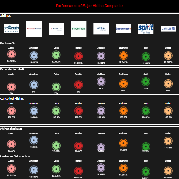
This flight dashboard is highly relevant for an airline’s operations and customer experience departments. Operations teams can use it to track performance metrics that affect punctuality and efficiency, identifying areas where improvements may be needed to reduce delays and cancellations. Customer experience departments benefit from insights into mishandled bag rates and customer satisfaction levels, enabling them to focus on service quality improvements. This airline customer dashboard supports data-driven decisions to enhance customer satisfaction and streamline operations, positioning airlines to optimize performance and deliver a better travel experience. This aviation dashboard offers a holistic view of competitive performance, making it an essential tool for departments aiming to maintain high standards and meet industry benchmarks.
# 7 Airline Dashboard – Airline Satisfaction Dashboard
This airline customer dashboard provides a comprehensive overview of passenger satisfaction across various factors affecting the travel experience. It includes demographic insights, satisfaction levels by travel type, and ratings for specific service areas. The airline dashboard visualizes data using a mix of bar charts, pie charts, and segmented charts. For instance, bar charts show satisfaction levels across different age groups and travel classes, while pie charts represent the distribution of satisfaction between business and personal travellers.
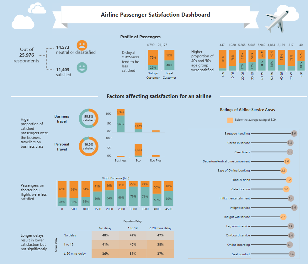
Key metrics include satisfaction ratings for business versus personal travel, with business travellers showing a higher satisfaction rate (58.8%) than personal travellers (10.0%). The dashboard also highlights satisfaction factors like flight distance, departure delay, and service area ratings. Areas like baggage handling, check-in, cleanliness, and in-flight services are rated, with below-average regions marked.
This flight dashboard is handy for customer experience and service improvement teams. Customer service departments can prioritise improvements by identifying areas with lower satisfaction scores, such as seat comfort and ease of online booking. This airline KPI dashboard enables targeted strategies for enhancing customer loyalty and optimizing service delivery. Overall, this aviation dashboard is essential for understanding and improving customer satisfaction across various service areas.
# 8 Airline Dashboard – Indian Airlines Report
This airline dashboard analyses flight data for Indian airlines from March to June 2019. Key metrics include the total number of flights, daily flight volumes, monthly flight trends, and market share by airline. The airline customer dashboard uses various visualizations, including line charts, bar charts, and a pie chart, to present data. The line chart displays the number of flights by date, highlighting the busiest day as May 18, 2019, with 1,008 flights. Bar charts represent flight volumes by month and weekday, showing May and June with the highest flight numbers and Wednesday as the peak weekday.
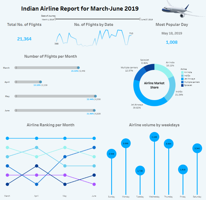
A pie chart offers insights into the airline market share, with Jet Airways holding the largest share at 39.82%, followed by IndiGo with 21.24%. Another line chart tracks airline rankings per month, illustrating fluctuations in each airline’s position over the reporting period.
This airline KPI dashboard is valuable for strategic planning and market analysis departments within airlines. By understanding seasonal and weekly trends, these departments can optimize flight schedules, allocate resources effectively, and adjust strategies to improve market position. This aviation dashboard supports data-driven decisions that enhance operational efficiency and maintain a competitive edge.
# 9 Airline Dashboard – Who is flying? Then vs Now
This airline dashboard provides a comparative analysis of airline travel trends in 2019 and 2020, highlighting the impact of the COVID-19 pandemic on travel volumes. It uses bar charts to show the daily number of travellers passing through TSA checkpoints in the United States, with one chart for 2019 and another for 2020. Starting from March, the dramatic decline in traveller numbers in 2020 illustrates the effects of travel restrictions and health concerns.
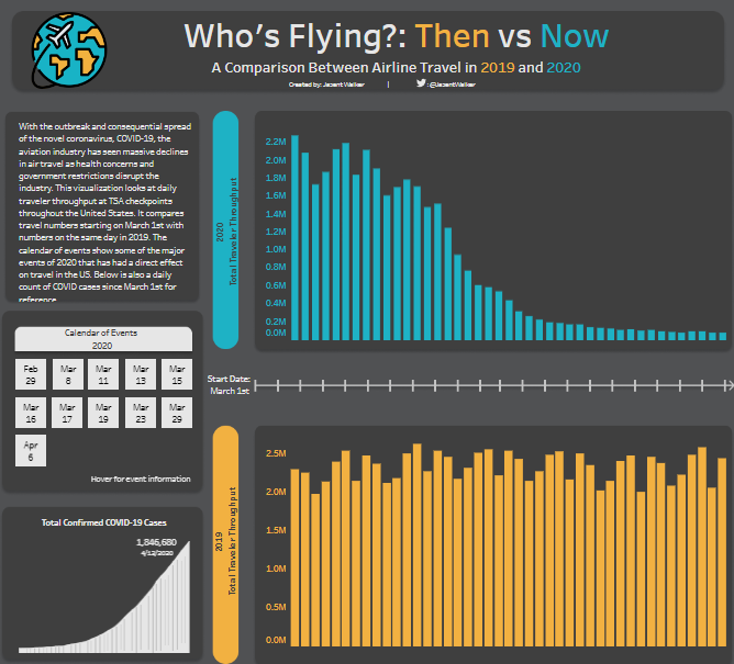
The airline customer dashboard also includes a calendar of significant COVID-19 events in early 2020, marking key dates when significant restrictions and announcements were made, further contextualizing the data. A line chart shows the cumulative number of COVID-19 cases, indicating the progression of the pandemic alongside the decline in airline travel.
This aviation dashboard is handy for airline strategic planning and operations departments. It enables these teams to understand the correlation between external events and passenger numbers, helping them plan for similar disruptions in the future. This flight dashboard provides insights into passenger behaviour trends, allowing airlines to develop contingency plans, adjust operational strategies, and optimize resources during decreased travel demand. The airline KPI dashboard supports data-driven planning and strategic decision-making in response to external crises.
The nine examples shared in this blog illustrate the versatility and depth of information these tools can provide across various facets of the airline business. By leveraging an airline KPI dashboard, flight dashboard, or specialized aviation dashboard, airlines can make informed decisions that improve operational efficiency, customer satisfaction, and loyalty. From dashboards that track key performance metrics to those focusing on passenger feedback, each example shows how data can be transformed into actionable insights. Adopting these dashboards can be a game-changer in an industry where time, efficiency, and customer satisfaction are paramount. As airlines continue to adapt to evolving challenges, embracing these data-driven tools will be crucial for staying competitive and meeting the demands of modern travellers.


