An Airbnb dashboard is a powerful tool for property owners, hosts, and analysts aiming to make data-driven decisions in the short-term rental market. By utilizing Airbnb data analytics, these dashboards uncover critical insights into pricing strategies, occupancy rates, market trends, and regional performance.
Related posts:
- 7 Great Tableau Income Statement Examples
- Google Analytics with Tableau: 5 Great Examples
- 7 Powerful Social Media Dashboard Examples to Supercharge Your Analytics
- Best 5 CRM Dashboard Examples to Boost Your Customer Strategy!
- 5 Amazing Hotel Dashboard Examples to Elevate Your Hospitality Operations
- 13 Powerful Real Estate Dashboards to Transform Your Property Insights and Decision-Making
This post explores five outstanding examples of Airbnb dashboards, each designed to meet specific needs, such as maximizing revenue, identifying seasonal trends, or analyzing geographic data. With practical Airbnb data analysis, these dashboards help users boost their performance and maintain a competitive edge in the rapidly evolving rental market.
Table of Contents
#1 Airbnb Example Dashboard – Airbnb Singapore
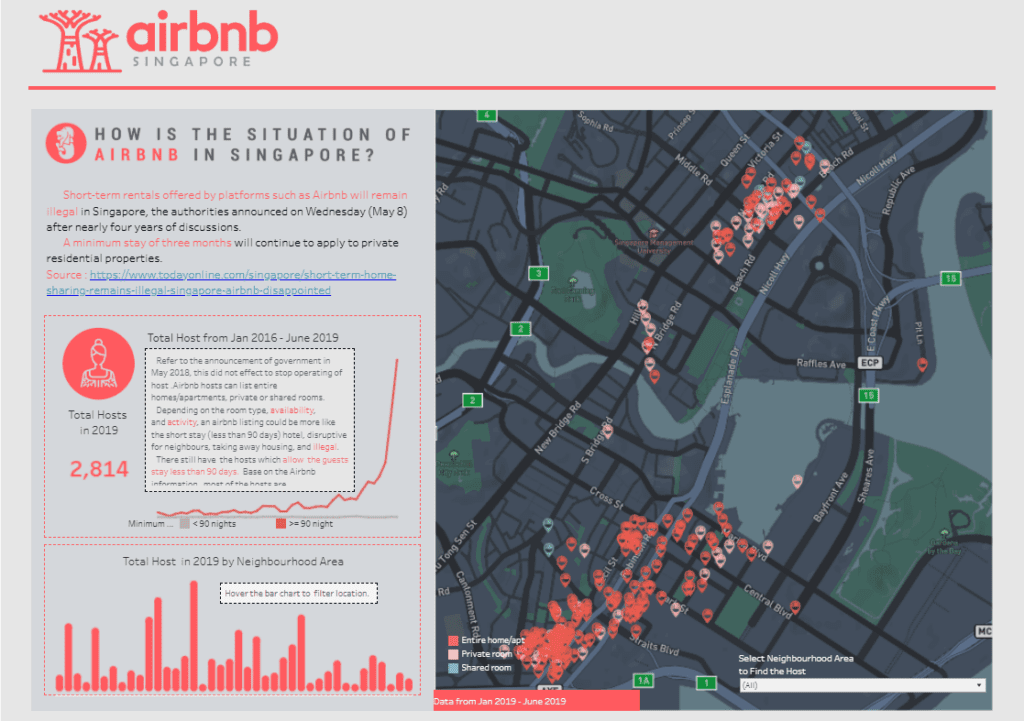
The Airbnb dashboard provides a comprehensive overview of Airbnb activity and trends in Singapore. It uses data analytics to illustrate key insights through charts and visualizations.
Key Features:
- Regulatory Context: The Airbnb dashboard includes information on Singapore’s short-term rental regulations, emphasizing the three-month minimum stay requirement for private properties.
- Host Statistics: It displays the number of active hosts over time (2016–2019) using trend lines and bar charts segmented by neighbourhood, providing valuable Airbnb data analysis.
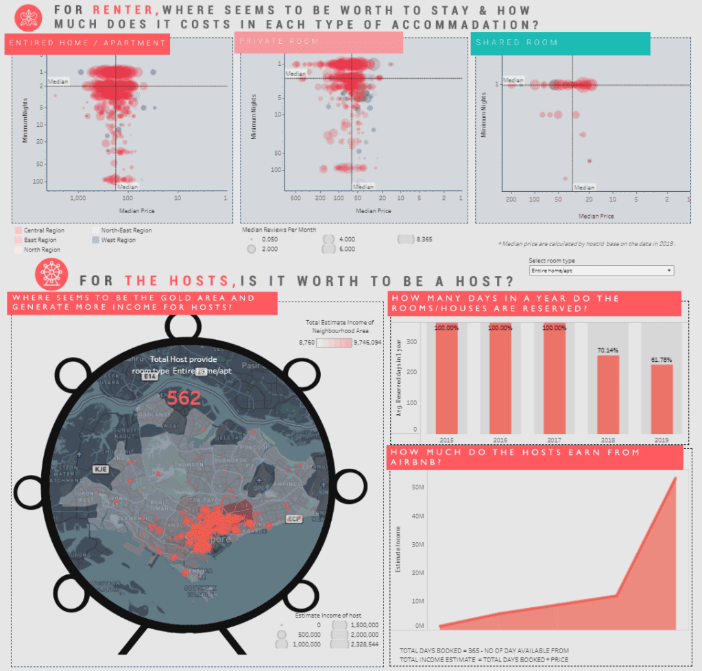
- Property Types: Scatter plots highlight the costs and median prices for different types of accommodations (entire homes, private rooms, and shared rooms), alongside reviews and availability metrics, effectively utilizing Airbnb analytics.
- Geospatial Insights: Maps showcase the distribution of listings across Singapore, categorizing them by type and providing regional insights into gold areas for hosting through Airbnb performance dashboards.
- Host Earnings: Bar charts and calculated metrics display hosts’ income potential based on occupancy and nightly rates, contributing to analytics Airbnb strategies.
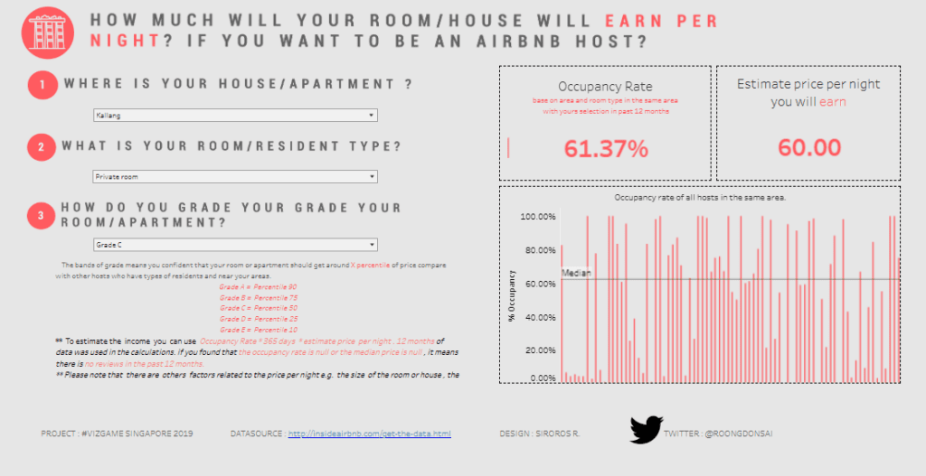
- Occupancy & Grading: An interactive section helps potential hosts estimate earnings by selecting a location, property type, and grade, enhancing the utility of Airbnb dashboards.
Audience:
This Airbnb dashboard is essential for prospective and current hosts to assess market opportunities and compliance. Policymakers and researchers can also use Airbnb data analytics to understand short-term rental dynamics and regional impacts in Singapore.
#2 Airbnb Example Dashboard – Airbnb Sydney
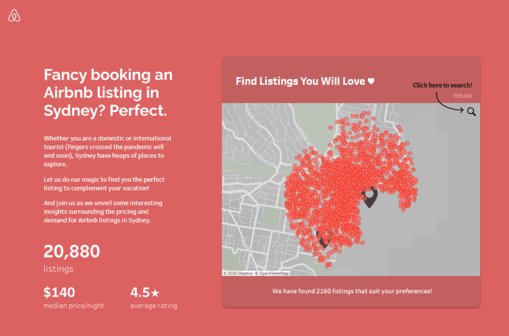
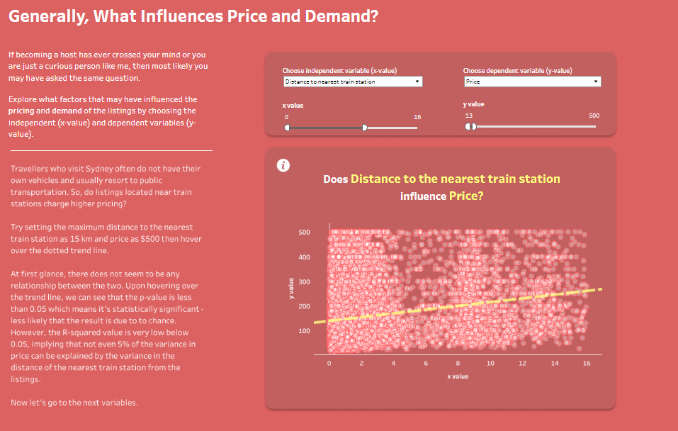
This Airbnb dashboard offers a detailed analysis of Airbnb listings in Sydney, exploring pricing trends, demand, and the impact of external factors like the pandemic. The dashboard employs various interactive features and data visualizations to deliver insights.
Key Features:
- Listings Overview: A map highlights the density of Airbnb listings across Sydney, accompanied by a summary of key metrics such as the total number of listings, median price per night, and average rating.
- Pricing Influences: Scatter plots analyze the relationship between variables like distance to train stations and pricing, supported by statistical overlays for deeper Airbnb data analysis.
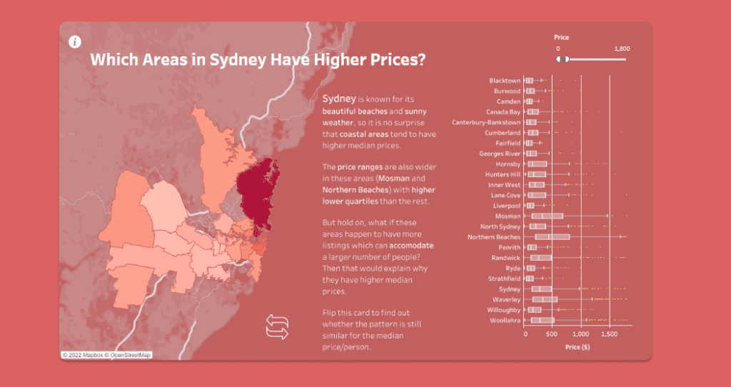
- Regional Insights: Heatmaps and bar charts visualize which areas have higher median prices and compare price ranges by region, leveraging Airbnb data analytics to identify premium locations.
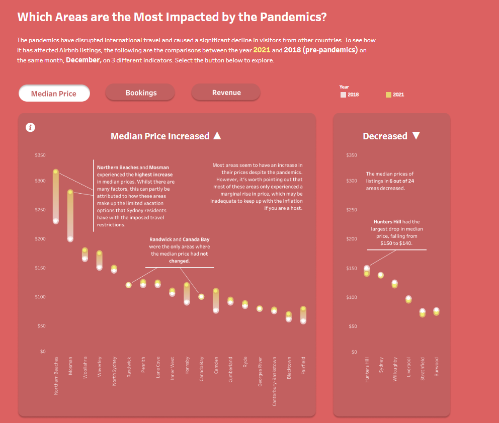
- Pandemic Impact: Comparative line and bar charts illustrate how metrics like median prices, bookings, and revenue changed between 2018 and 2021, showing the effect of the pandemic on Airbnb’s performance.
Target Audience:
This dashboard is ideal for Airbnb hosts and property managers seeking to optimize pricing strategies, travellers comparing rental options, and researchers analyzing Airbnb performance dashboards for trends in the Sydney rental market.
#3 Airbnb Example Dashboard – Top Airbnb Investment Locations
This dashboard analyzes the relationship between monthly Airbnb revenue and rental costs for one-bedroom apartments in various locations. The primary chart is a scatter plot, which clearly represents how average rental costs correlate with Airbnb revenue. Each point on the scatter plot represents a city, and its size reflects the total number of reservation days. In contrast, its colour represents the occupancy rate, offering deep insights through Airbnb data analysis.
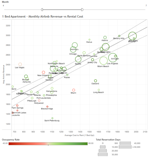
The chart also includes a trend line to highlight the overall correlation between rental costs and Airbnb revenue. Cities above the trend line demonstrate higher revenue relative to rental costs, indicating strong Airbnb performance, while cities below the line indicate less favourable outcomes. This is a key feature of Airbnb performance dashboards.
Additional features include interactive sliders to filter by month, enabling users to use Airbnb analytics to examine seasonal variations. The colour gradient from red to green helps identify cities with low to high occupancy rates at a glance, making Airbnb data analytics highly actionable.
Target Audience:
This Airbnb dashboard is ideal for property owners and prospective hosts assessing the profitability of renting out one-bedroom apartments in different cities. Real estate investors and researchers in Airbnb dashboards would also find this a helpful tool for evaluating market trends and leveraging analytics Airbnb strategies.
#4 Airbnb Example Dashboard – Airbnb In California
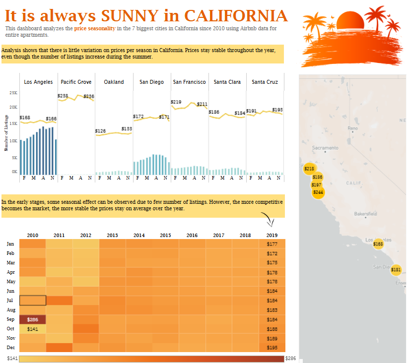
This Airbnb dashboard focuses on price seasonality trends in seven major cities across California, leveraging Airbnb data analytics for entire apartments since 2010. It highlights how prices remain relatively stable throughout the year, even as the number of listings fluctuates during peak seasons like summer.
Charts and Visualizations:
- Line Charts: Each city has a dedicated line chart displaying the average monthly price trends over the year, combined with bar charts representing the number of listings during those months. This integrated approach enhances Airbnb data analysis by providing insights into supply and price dynamics.
- Heatmap: A heatmap illustrates price changes over the years (2010–2019) by month, allowing users to identify patterns or anomalies, a key feature of advanced Airbnb analytics.
- Geospatial Map: A map of California displays average prices across the cities with labelled markers, offering geographical context and supporting comprehensive analytics Airbnb insights.
Target Audience:
This Airbnb performance dashboard is ideal for hosts and property managers who want to optimize pricing strategies based on historical data. It is also beneficial for researchers conducting data analysis on pricing stability and trends. Real estate investors and market analysts can utilize this dashboard to assess market conditions and predict future competitiveness within California’s rental landscape.
#5 Airbnb Example Dashboard – Athens Airbnb Analytic Dashboard
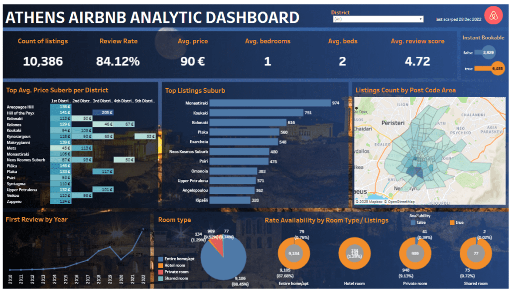
The Athens Airbnb dashboard comprehensively analyses Airbnb listings in Athens, showcasing key metrics such as the number of listings, average price per night, review rate, average number of bedrooms and beds, and overall review scores. This Airbnb performance dashboard utilizes Airbnb data analytics to deliver actionable insights into market dynamics and trends.
Charts and Visualizations:
- Bar Charts: Highlight the top average prices by suburb and district and the most popular suburbs based on the number of listings, demonstrating the power of Airbnb data analysis.
- Pie Chart: This chart breaks down room types (entire homes, private rooms, hotel rooms, and shared rooms) and contributes to detailed Airbnb analytics on property distribution.
- Geospatial Map: A heatmap visualizes listing distribution by postal code, providing geographical context and enhancing Airbnb dashboards for location-based insights.
- Line Chart: This chart tracks the year of the first review for listings, showcasing growth patterns and trends through analytics from Airbnb tools.
- Circular Charts: Illustrate availability rates for different room types, supporting comparisons of instant bookable options in this Airbnb dashboard.
Target Audience:
This Airbnb dashboard is tailored for property owners, hosts, and investors who want to optimize their strategies. It is also invaluable for market analysts and researchers who use Airbnb dashboards and data analytics to explore trends and competitive dynamics in Athens.
The five Airbnb dashboards featured in this post demonstrate the transformative power of Airbnb analytics in understanding market trends and achieving success. Whether you’re a host refining your strategy or an investor evaluating opportunities, these dashboards provide actionable insights through Airbnb data analysis. Equipped with features like heatmaps, scatter plots, and performance metrics, these Airbnb performance dashboards empower users to make data-backed decisions. As the rental market evolves, leveraging analytics Airbnb tools ensures hosts and investors stay ahead, adapt to changing dynamics, and succeed in the competitive short-term rental landscape.


