Discover the diverse world of advanced Tableau visualizations, a powerful tool that transforms raw data into meaningful insights. Whether you’re a seasoned data analyst or just starting, this guide deepens into various advanced Tableau visualizations, providing a comprehensive understanding of their unique purposes and benefits.
Related posts:
- Building an Amazing Tableau Diverging Bar Chart in 5 Minutes
- Tableau Candlestick Charts in an Easy 7 Minutes
- 10 Minute Tutorial For a Great Tableau Shape Chart
- Create a Fantastic Tableau Radar Chart in 5 Minutes!
- How to make a Tableau Jitter Chart in 10 minutes
- How to Make an Amazing Tableau Marimekko Chart
From the captivating Radial Bar Chart to the insightful Diverging Bar Chart, learn how to effectively convey your data’s story, making it visually appealing and easily interpretable. Embrace the journey of mastering these advanced visualization techniques with Tableau and elevate your data analysis skills to new heights.
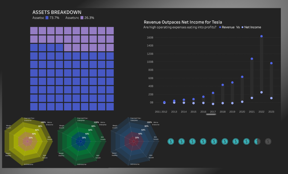
Table of Contents
#1 Advanced Tableau Visualizations: Tableau Radial Bar Chart
Summary: A radial bar chart is an advanced visualization in Tableau that showcases data in a circular layout, with bars stretching from the centre towards the perimeter.
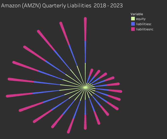
Benefits: This advanced chart in Tableau enhances data comparisons, making them visually compelling, particularly for cyclical relationships. It’s also adept at illustrating data with a singular category and multiple series.
#2 Advanced Tableau Visualizations: Tableau Radar Chart
Summary: In Tableau, the Radar Chart, or spider/star chart, presents multivariate data as a two-dimensional chart, with a minimum of three quantitative variables radiating from a central point.
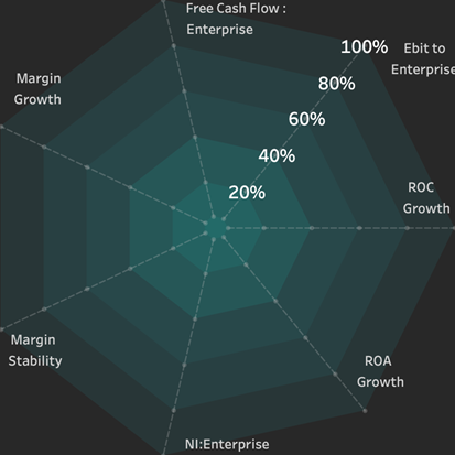
Benefits: This advanced Tableau visualization is instrumental for evaluating performance metrics or skills, enabling straightforward comparisons across various categories.
#3 Advanced Tableau Visualizations: Tableau Shape Chart
Summary: The shape chart utilizes Tableau’s advanced visualization capabilities to represent data values with customized shapes, such as icons or images, where size, colour, or quantity can signify different data dimensions.

Benefits: It offers an intuitive and engaging data representation, especially when the shapes hold relevance to the data displayed, enhancing the user’s understanding.
#4 Advanced Tableau Visualizations: Tableau Donut Chart
Summary: The Donut Chart, an adaptation of the Pie Chart with a hollow centre, segments data circularly to denote categories, showcasing advanced charts in Tableau.
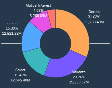
Benefits: Visually more appealing than a pie chart, it can exhibit multiple data series through concentric rings, with the central space available for additional data display.
#5 Advanced Tableau Visualizations: Tableau Candlestick Chart
Summary: Essential for financial analysis, the Candlestick Chart in Tableau depicts asset price movements over time, with each ‘candlestick’ revealing opening, closing, high, and low prices for a specified duration.
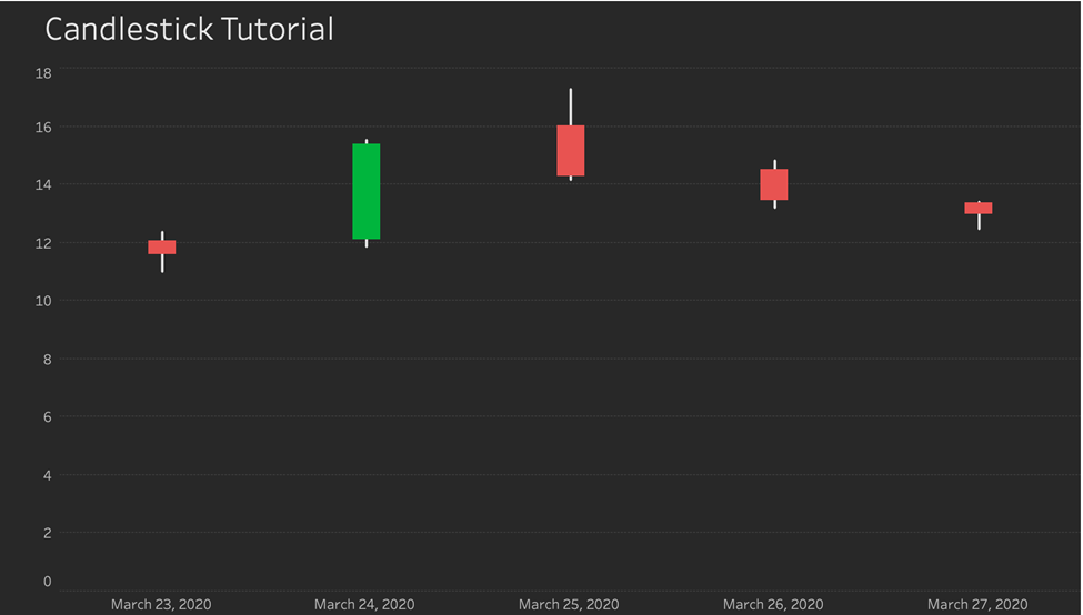
Benefits: This advanced Tableau visualization provides crucial information at a glance, supporting pivotal trading decisions in financial markets.
#6 Advanced Tableau Visualizations: Tableau Lollipop Chart
Summary: The Lollipop Chart in Tableau represents data values as circles at line ends, offering an alternative to bar charts.
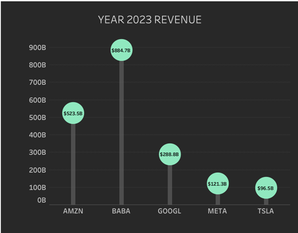
Benefits: It ensures a focused and clear visualization of data variations, simplifying the task of highlighting specific trends or data points.
#7 Advanced Tableau Visualizations: Tableau Bar in Bar Chart
Summary: Tableau training advanced techniques include the Bar in Bar Chart, displaying dual bars per category, one encased within the other, typically for comparative analysis of two related metrics.
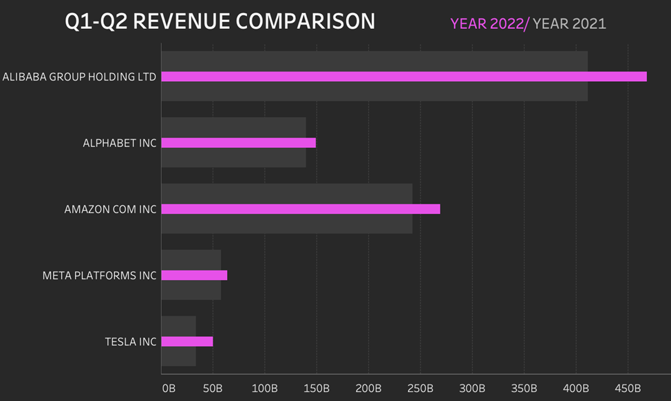
Benefits: It distinctly elucidates the relationship and variances between two metrics, offering a concise and clear comparison.
#8 Advanced Tableau Visualizations: Tableau Waffle Chart
Summary: The Waffle Chart in Tableau visualizes data in a grid, akin to a waffle, with each cell representing a portion of the whole, and is a testament to Tableau’s advanced visualization capabilities.
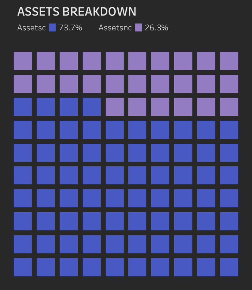
Benefits: This chart type provides a straightforward and engaging method for depicting parts of a whole, particularly suitable for percentage or fraction data representation.
#9 Advanced Tableau Visualizations: Tableau Dumbbell Chart
Summary: A part of Tableau’s advanced viz, the dumbbell chart illustrates shifts between two time points or conditions across various categories using lines and circles.
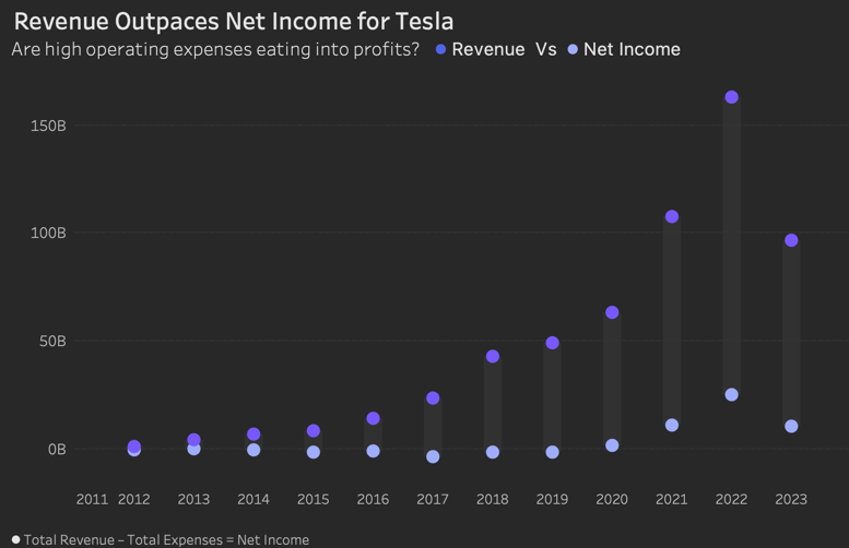
Benefits: It transparently showcases the direction and scale of changes across categories, aiding in quickly identifying trends and anomalies.
#10 Advanced Tableau Visualizations: Tableau Diverging Bar Chart
Summary: The Diverging Bar Chart in Tableau, an advanced tableau visualization, exhibits data values as bars that extend in opposing directions from a central axis, useful for contrasting two conflicting metrics.
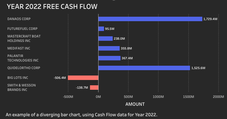
Benefits: This visualization offers a stark view of positive and negative values, simplifying identifying strengths, weaknesses, gains, or losses.
Each of these chart types from Tableau’s advanced visualization toolkit has a distinct purpose and, depending on the data’s nature and the intended message, can be more effective in specific contexts than others.


