
Visual storytelling is pivotal in data analysis, enabling professionals to convey complex data sets coherently and attractively. Various charts offer different perspectives, each with their unique benefits. This blog delves into five distinct chart types: the bar-in-bar chart, lollipop chart, diverging bar chart, waffle chart, and dumbbell chart.
1. Advanced Charts in Tableau: Bar-in-Bar Chart
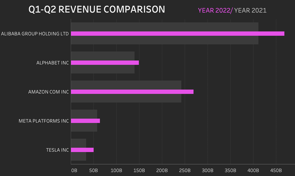
The Bar-in-Bar chart is a compelling tool for representing dual or comparative datasets within a singular visual element. Two bars are displayed within the same X-axis category, one nestled within the other. Here’s why it is invaluable:
- Comparative Insight: Bar-in-bar charts effectively compare two data sets side by side, offering immediate insights into their relational dynamics.
- Space Efficiency: This chart type condenses information into a neat, concise format, enabling viewers to grasp the data without overwhelming visual clutter.
- Clear Benchmarks: They are ideal for benchmarking, helping audiences instantly discern performance against a standard or expected value.
Click here to go to a Tableau bar-in-bar tutorial
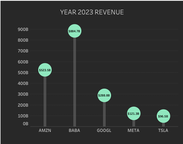
2. Advanced Charts in Tableau: Lollipop Chart
Characterized by its stick and circle elements, the Lollipop chart is a minimalist’s delight:
- Visual Clarity: The circle or “lollipop” at the end of each line accentuates data points, making it easier for viewers to pinpoint exact values.
- Engagement: With their playful and engaging design, lollipop charts can make data presentations more accessible and enjoyable for various audiences.
- Reduction in Visual Noise: The simplistic design minimizes distractions, facilitating more transparent comprehension and comparison of data points.
To build this chart, please view this tutorial on building a lollipop chart in Tableau.
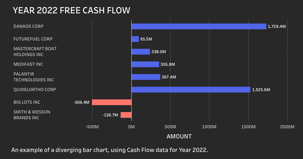
3. Advanced Charts in Tableau: Diverging Bar Chart
Diverging Bar Charts excel in displaying data with variations around a midpoint:
- Highlighting Deviations: The chart is ideal for showcasing the deviation of data points from a central value, making disparities immediately evident.
- Symmetry: The symmetrical layout aids in effortlessly comparing positive and negative values, providing a balanced visual representation.
- Intuitive Color-Coding: Typically, diverging bar charts use contrasting colours to signify above and below average, aiding quick data interpretation.
Click here to see a diverging bar chart in the Tableau tutorial.
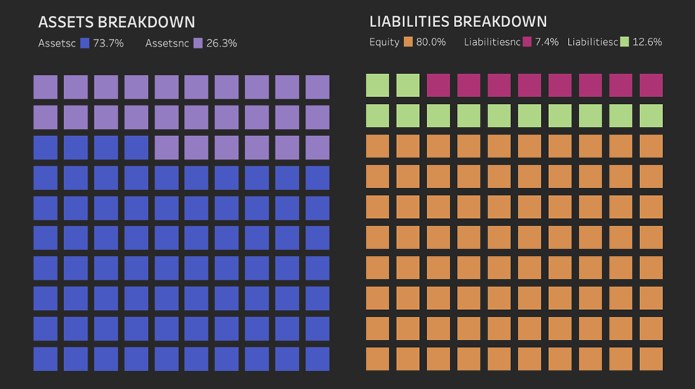
4. Advanced Charts in Tableau: Waffle Chart
Resembling a waffle iron’s grid, the Waffle Chart is perfect for representing part-to-whole relationships:
- Percentage Representation: This chart is a visual delight for representing percentages and proportions effectively, providing a clear picture of the whole.
- Engaging Visuals: A tile-based design it engages viewers while making it straightforward to perceive the data.
- Simplicity: It’s beneficial when representing a single or small set of percentages, turning simple data into an engaging visual story.
Click here to see a tutorial on building a waffle chart in Tableau.
5. Advanced Charts in Tableau: Dumbbell Chart
Dumbbell Charts brilliantly illustrate the change between two data points:
- Comparison: With two dots connected by a line, the chart efficiently highlights the disparity and distance between two data points.
- Change Over Time: It’s adept at visualizing change over time or between two categories, providing an immediate sense of the range and direction of change.
- Minimization of Visual Bias: The linear design minimizes misinterpretation or visual bias, providing a straightforward comparison tool.
To create a Tableau dumbbell chart, view this tutorial.
Conclusion
Selecting the appropriate chart for data visualization is crucial for clear and effective communication. Each chart type, with its unique features and applications, offers different insights and visual styles to cater to specific data storytelling needs. Whether comparing data, highlighting deviations, or illustrating changes over time, the bar-in-bar, lollipop, diverging bar, waffle, and dumbbell charts provide a suite of options for analysts and data enthusiasts to convey their findings with precision and flair.


