An accounts receivable dashboard offers a powerful way to monitor, analyze, and optimize the collection process, providing AR teams with real-time insights into outstanding balances, debtor behaviour, and cash collection trends. Whether you’re looking to improve cash collection efficiency, track late payment fees, or analyze debtor reliability, a well-designed AR dashboard can transform your approach to accounts receivable management.
Related posts:
- Unlock the Power of Tableau Project Management: 7 Inspiring Dashboard Examples
- Top 5 Amazing Expense Dashboard Examples
- 6 Powerful Accounts Payable Dashboard Examples to Streamline Your AP Process
- Unlocking Insights with the Ultimate Audit Dashboard: Your Key to Financial Transparency
- 5 Powerful Risk Dashboard Examples Every Business Leader Should See
- 7 Amazing Help Desk Dashboard Examples
In this post, we’ll explore seven compelling accounts receivable dashboard examples, each tailored to address specific aspects of the AR process. These receivable dashboards showcase a variety of visualizations and KPIs, allowing AR teams to proactively manage receivables, streamline collections, and enhance overall financial stability. Discover how these dashboards can revolutionize your AR strategies and support sustainable business growth.
Table of Contents
#1 Executive Summary
This accounts receivable dashboard provides an executive summary for tracking outstanding and overdue invoices. The AR dashboard is organized into several sections, each visualizing crucial metrics that can aid the accounts receivable department manage collections effectively.
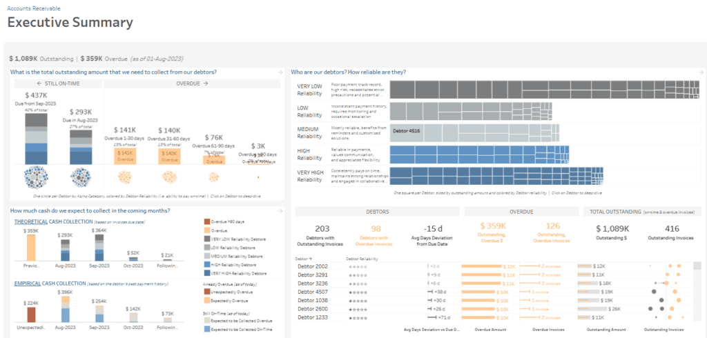
Total Outstanding Amount: This section of the accounts receivable KPI dashboard presents a breakdown of outstanding invoices categorized by aging status (still on time or overdue by different periods). It uses bar charts to indicate amounts due within specific time frames, with circles representing each debtor by category and reliability.
Debtor Reliability: This receivable dashboard’s treemap classifies debtors based on payment reliability, ranging from Very Low to Very High. This categorization helps prioritize follow-up actions, as debtors with lower reliability may require more rigorous collection efforts.
Cash Collection Forecast: This section compares theoretical versus empirical cash collections based on invoice due dates and past payment behaviours. It uses bar charts to project future cash inflows and improve cash flow management.
Key Metrics Summary: KPIs such as the total outstanding amount, overdue amount, and average days deviation are displayed to provide a quick snapshot of overall collection health.
This accounts receivable dashboard example enables the accounts receivable team to track overdue invoices, assess debtor reliability, and forecast expected collections, allowing for proactive management and improved cash flow.
#2 Aging Balance
The Aging Balance accounts receivable dashboard provides an in-depth view of accounts receivable, allowing the department to monitor and manage outstanding and overdue invoices effectively.
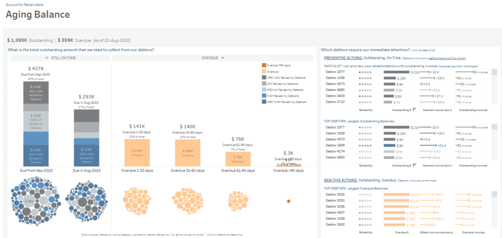
Outstanding and Overdue Balances: A stacked bar chart in this AR dashboard presents the total exceptional amounts due within specific time frames (e.g., Sep-2023, Aug-2023) and overdue periods (e.g., 1-30 days, 31-60 days, 61-90 days, over 90 days). Each section is colour-coded based on debtor reliability, offering a quick overview of which debtors are low, medium, or high risk. Bubble charts below further visualize each debtor’s balance and reliability level, with individual bubbles representing the amounts by aging category.
Immediate Attention Needed: On the right side, lists of debtors are organized by reliability and urgency. A watchlist in this accounts receivable KPI dashboard highlights low and very low-reliability debtors with outstanding invoices, displaying the amount, days overdue, and the number of invoices. Another list displays top debtors with the most significant exceptional balances, helping prioritize follow-up actions.
Largest Overdue Balances: For proactive management, a section dedicated to debtors with the largest overdue balances shows data on the amount, days overdue, and invoice count.
This accounts receivable dashboard example provides actionable insights, helping the accounts receivable team monitor aging balances, prioritize collections based on debtor reliability, and systematically address overdue payments, thereby optimizing cash flow and reducing risk.
#3 Debtor Base
The Debtor Base accounts receivable dashboard provides the accounts receivable department with insights into debtor profiles, enabling them to optimize cash flow and mitigate credit risk effectively.
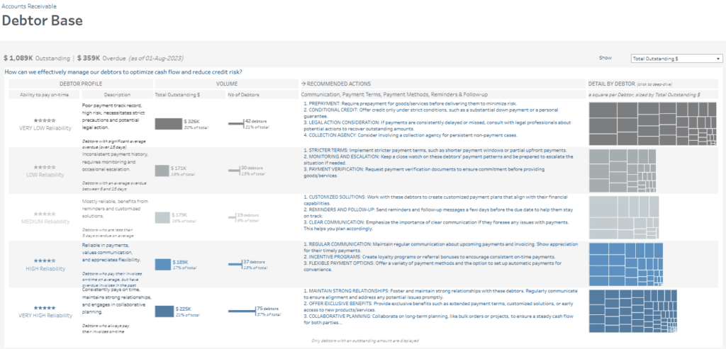
Debtor Profiles: This section of the AR dashboard categorizes debtors by their ability to pay on time, ranging from Very Low to Very High Reliability. Each category includes a description of payment behaviour and its associated risk level, aiding the accounts receivable team in tailoring their approach for each group.
Volume Metrics: This accounts receivable KPI dashboard’s bar chart displays the total outstanding amount and the number of debtors for each reliability category. For example, very low reliability debtors account for $325K, or 30% of the total, and consist of 42 debtors. These metrics highlight where the highest risks are concentrated, helping prioritize collection efforts.
Recommended Actions: Each debtor profile includes specific recommended actions, such as prepayment requirements, stricter payment terms, and communication strategies. These tailored suggestions assist the accounts receivable team in applying a targeted plan for each debtor group.
Detail by Debtor: A treemap visualizes individual debtors by outstanding amounts within each reliability category. This view allows the team to identify high-balance accounts within specific risk groups quickly.
This accounts receivable dashboard example equips the accounts receivable department with tools to segment debtors, implement targeted strategies, and effectively manage accounts, enhancing cash flow stability and reducing exposure to credit risk.
#4 Debtor Deep Dive
The Debtor Deep-dive accounts receivable dashboard offers a focused view of individual debtor profiles, helping the accounts receivable team closely monitor and address specific account behaviours.
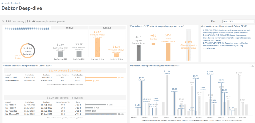
Current Outstanding Balance: This AR dashboard’s doughnut chart provides an overview of the debtor’s outstanding balance, distinguishing between on-time and overdue amounts. This visual summary helps the team understand the debtor’s current standing.
Aging of Outstanding Invoices: Bar charts in this accounts receivable KPI dashboard display the outstanding amounts categorized by the due date, split between on-time and various overdue periods (e.g., 1-30 days, 31-60 days). This helps identify how long invoices have remained unpaid and the urgency level for follow-up actions.
Reliability with Payment Terms: A bar comparison chart shows how well the debtor adheres to agreed-upon payment terms, including average overdue days. This metric allows the accounts receivable team to gauge payment behaviour and assess the need for stricter payment terms.
Recommended Actions: A list of actions tailored for the debtor provides steps like stricter terms, payment monitoring, and verification requirements to improve collection success.
Invoice Details: This dashboard account receivable example includes a table of outstanding invoices, including payment terms, due dates, and days overdue, offering a granular view of the debtor’s unpaid bills.
Payment History Alignment: A bar chart compares actual collected amounts with amounts due over time, helping the team analyze the debtor’s payment consistency.
This accounts receivable dashboard example enables targeted intervention, ensuring better account management and optimized cash flow.
#5 Cash Collection Schedule
The Cash Collection Schedule accounts receivable dashboard provides insights into expected cash inflows, enabling the accounts receivable department to forecast collections and plan cash flow more effectively.
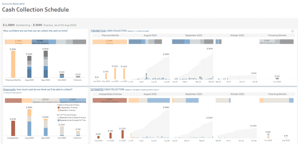
Theoretical Cash Collection: The top section of this AR dashboard uses bar charts to show projected cash collections based on invoice due dates. Each bar represents expected cash collection amounts for previous and upcoming months, broken down by debtor reliability. The charts allow the team to visualize the reliability level associated with each collection, offering insights into which payments will likely arrive on time versus those that might be delayed.
Empirical Cash Collection: Below, bar charts in this accounts receivable KPI dashboard display cash collection estimates based on past payment behaviours, helping the team predict collection amounts if no additional actions are taken. This section categorizes cash as “Expected to be Collected On-Time” and “Unexpectedly Overdue,” providing a realistic picture of future cash flow.
Detailed Cash Collection Forecasts: For August through October 2023, detailed bar and area charts project daily and monthly collection amounts, segmented by overdue, on-time, and expected payment statuses. This information assists in identifying cash flow gaps, enabling the accounts receivable team to prioritize overdue collections for higher-risk debtors.
This accounts receivable dashboard example helps the accounts receivable department manage cash flow, prioritize high-risk collections, and refine financial planning through accurate cash collection forecasting, making it a valuable receivable dashboard.
#6 Cash Collection Efficiency
The Cash Collection Efficiency accounts receivable dashboard analyzes cash collection performance, helping the accounts receivable department evaluate and enhance collection efficiency.
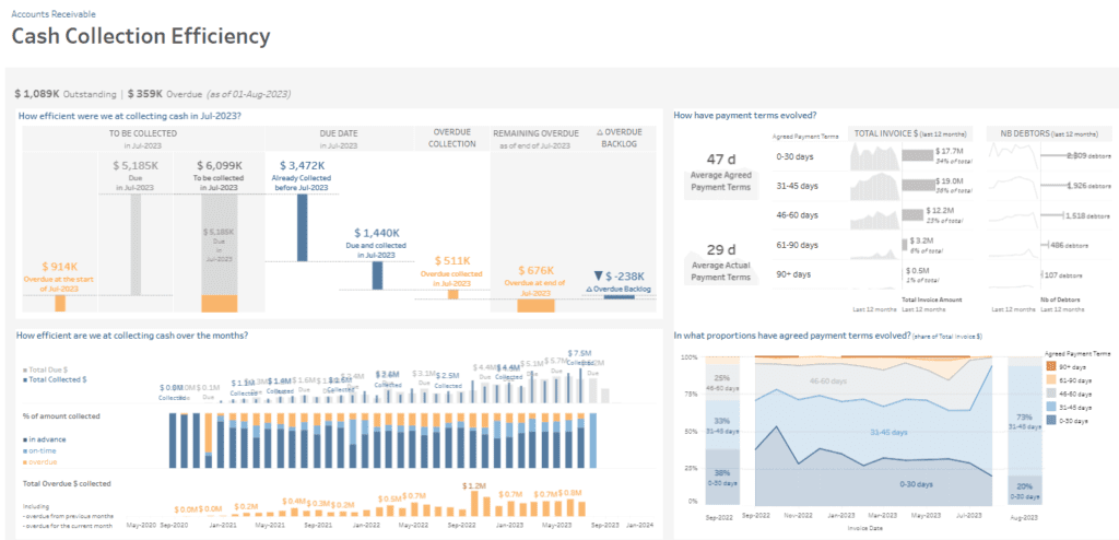
Collection Status: The top left section of this AR dashboard uses bar charts to show the status of collections for July 2023, including amounts due, collected, and overdue. It provides metrics such as overdue collections, remaining overdue amounts, and the reduction in overdue backlog. This section overviews how efficiently the team collected cash within a specified period.
Payment Terms Analysis: A small multiples chart in the top right shows how payment terms have evolved over the last 12 months, displaying the total invoice amounts and the number of debtors across different term ranges (0-30 days, 31-45 days, etc.). This information assists in understanding shifts in debtor payment behaviours and adjusting strategies accordingly.
Monthly Collection Efficiency: This accounts receivable KPI dashboard presents monthly efficiency in collecting cash through a bar and line chart. The bars show the total due and collected amounts, categorized by payment status (in advance, on-time, overdue). The line highlights the percentage of overdue collections, enabling the team to track improvements or declines over time.
Payment Terms Proportion: An area chart at the bottom right illustrates the evolution of agreed payment terms as a share of total invoices, providing insights into trends in payment terms across invoices.
This accounts receivable dashboard example enables the department to monitor efficiency, assess trends in payment terms, and identify opportunities for improved cash flow management, making it a valuable receivable dashboard.
#7 Late Payment Fees
The Late Payment Fees accounts receivable dashboard provides valuable insights into the impact of late payments on cash flow, assisting the accounts receivable department in tracking and managing penalty fees effectively.
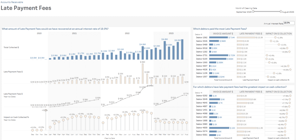
Total Collected and Late Payment Fees: The top section of this AR dashboard includes bar charts tracking total cash collected from 2020 to 2023. Below, separate bar charts display monthly late payment fees, showing the financial impact of delayed payments over time. A cumulative line chart illustrates late payment fees year-to-date, allowing the team to gauge fee collection trends.
Impact on Cash Collection: A bubble chart at the bottom shows the monthly percentage impact of late payment fees on total cash collected. This metric helps the team understand how late payments affect cash flow, providing insights for improving collection strategies.
Debtors with Highest Late Payment Fees: On the right, a ranked list identifies top debtors by the total invoice amount and associated late payment fees. It also highlights each debtor’s impact on cash collection, showing how significant delays affect the overall collection rate.
Debtors with Greatest Cash Collection Impact: Another list ranks debtors whose late payment fees have the highest proportional impact on cash collection, helping prioritize high-impact accounts.
This accounts receivable KPI dashboard example enables the accounts receivable department to analyze late payment trends, assess debtor behaviour, and implement targeted actions to reduce payment delays, enhancing the dashboard account receivable role in financial planning.
An accounts receivable KPI dashboard is an invaluable tool for organizations looking to optimize financial health by improving cash collection and reducing overdue balances. The seven accounts receivable dashboard examples highlighted in this post illustrate the diverse ways AR teams can leverage data to manage debtor relationships, predict cash inflows, and mitigate credit risk. From tracking late payment fees to analyzing cash collection efficiency and debtor reliability, these dashboards empower AR teams to make informed, data-driven decisions that support financial resilience. Implementing a dashboard account receivable solution can lead to more proactive management, enabling organizations to address potential issues before they impact cash flow. Considering these examples, consider how an AR dashboard can be tailored to your business needs, helping you streamline accounts receivable processes, enhance transparency, and achieve your financial goals.


