An accounts payable dashboard is essential for finance teams, providing real-time insights into outstanding invoices, payment timelines, and cash flow requirements. By visualizing accounts payable metrics, such as overdue invoices, creditor aging, and payment efficiency, an AP dashboard enables the accounts payable department to prioritize payments, streamline processes, and support strategic financial planning.
Related posts:
- Unlock the Power of Tableau Project Management: 7 Inspiring Dashboard Examples
- Top 5 Amazing Expense Dashboard Examples
- 7 Amazing Accounts Receivable Dashboard Examples to Improve Cash Flow and Collection Efficiency
- Unlocking Insights with the Ultimate Audit Dashboard: Your Key to Financial Transparency
- 5 Powerful Risk Dashboard Examples Every Business Leader Should See
- 7 Amazing Help Desk Dashboard Examples
Exploring accounts payable dashboard examples can provide valuable inspiration for businesses looking to optimise their AP processes. In this blog post, we’ll highlight six diverse accounts payable KPI dashboards demonstrating how effective data visualization can transform accounts payable management, from tracking payment terms to managing overdue balances and strengthening creditor relationships.
Table of Contents
#1 Executive Summary
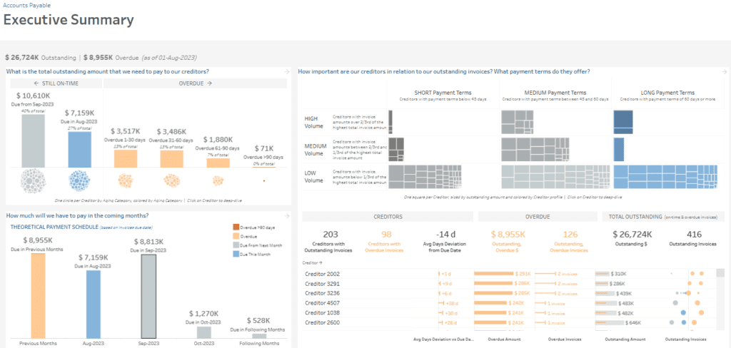
This Executive Summary accounts payable dashboard overviews accounts payable metrics, helping the accounts payable department track and manage outstanding payments to creditors. It showcases total exceptional and overdue amounts, categorized by aging and payment terms, focusing on overdue payments.
Dashboard Sections:
- Outstanding Amounts by Aging: A stacked bar chart breaks down amounts due within specific periods (on-time, overdue by 1-30, 31-60, 61-90, and >90 days). Each aging category is colour-coded and accompanied by a visual of circles representing creditors by aging status.
- Payment Schedule Forecast: A bar chart shows the theoretical payment schedule, detailing the amounts due each month. This provides a predictive view for cash flow planning, and it is a key feature in an accounts payable KPI dashboard.
- Creditor Payment Terms: A treemap visualizes creditors based on payment terms (short, medium, long) and volume (high, medium, low), assisting in prioritizing payments by term and value. This layout is standard in accounts payable dashboard examples.
- Creditor Details: A list of creditors with overdue invoices and days overdue provides actionable insights on which payments require attention, making it a valuable part of any AP dashboard.
This accounts payable metrics dashboard aids the accounts payable department by offering an organized view of obligations, highlighting overdue invoices, helping prioritize payments, and forecasting future cash outflows. The mix of treemaps, bar charts, and visual indicators simplifies payment prioritization and cash flow management decision-making.
#2 Aging Balance
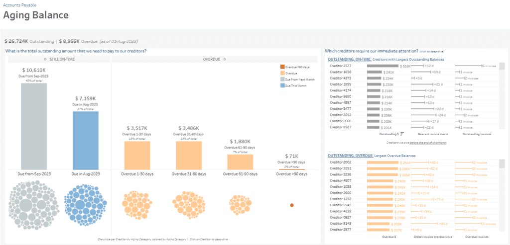
The “Aging Balance” dashboard provides a detailed breakdown of outstanding and overdue payments, enabling the accounts payable department to manage and prioritize creditor obligations effectively. This dashboard displays total exceptional and overdue amounts categorized by due date and aging status, which is crucial for tracking overdue invoices.
Dashboard Sections:
- Outstanding Amounts by Aging: A bar chart separates on-time amounts from overdue amounts, segmented by the aging categories (1-30, 31-60, 61-90, and over 90 days). Circle visualizations below the bar chart represent individual creditors by aging category.
- Creditors Requiring Immediate Attention: Two lists on the right side highlight creditors with the most significant outstanding and overdue balances. The exceptional section shows the creditors due as soon as possible with the essential amounts, while the overdue section focuses on creditors with the oldest unpaid invoices.
This dashboard organizes data into visual representations like bar charts and circular distributions to help identify high-priority payments, overdue liabilities, and creditors with significant balances due. It enables the accounts payable department to prioritize payment schedules, address critical overdue balances, and maintain strong supplier relationships by managing outstanding debts efficiently. The data-driven insights streamline cash flow management and improve decision-making processes.
#3 Creditor Base
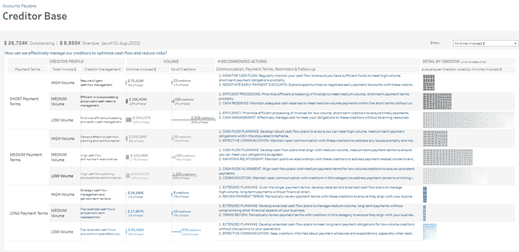
The “Creditor Base” dashboard provides a structured view of creditors, allowing the accounts payable department to optimize cash flow and minimize risks associated with outstanding payments. It categorizes creditors based on payment terms (short, medium, and long) and volume (high, medium, low), enabling focused cash flow management and creditor relationship strategies.
Dashboard Sections:
- Creditor Profile and Volume: Organized in a table, creditors are classified by payment terms and volume, displaying critical data such as total invoiced amounts, number of creditors, and the proportion of the total. This segmentation helps identify high-volume creditors with essential terms of payment.
- Recommended Actions: For each category, the dashboard provides recommended actions such as “Monitor Cash Flow,” “Negotiate Payment Discounts,” and “Align Cash Flow Planning,” helping the accounts payable team implement targeted financial strategies for each creditor type.
- Detail by Creditor: The right treemap visualization offers a deep dive into individual creditors sized by total invoiced amount. This allows the team to identify and prioritize larger creditors or those requiring immediate action.
This dashboard organizes creditor information through tables and treemaps, assisting the accounts payable department in planning payments, managing cash flow effectively, and strengthening creditor relationships. This structured approach supports better financial decision-making and helps maintain healthy liquidity by aligning payments with cash flow capabilities.
#4 Creditor Deep Dive
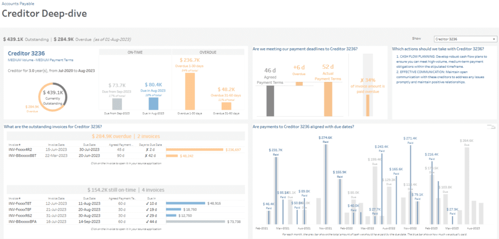
The Creditor Deep-dive accounts payable dashboard offers a focused view of a specific creditor’s financial details, providing the accounts payable department with insights into payment history, outstanding amounts, and due dates. As one of the accounts payable dashboard examples, it highlights the current exceptional and overdue amounts for Creditor 3236, helping prioritize and manage creditor relationships effectively.
Dashboard Sections:
- Outstanding and Overdue Summary: A donut chart and bar charts display the total outstanding amount ($439.1K) and the breakdown of overdue amounts by aging period (1-30 days, 31-60 days), allowing for quick assessment of overdue liabilities in this AP dashboard.
- Payment Timeliness: A comparison bar chart shows the agreed payment terms (46 days) versus the actual average payment delay (52 days), with a notable 34% of the invoice amount overdue, revealing payment performance in this accounts payable KPI dashboard.
- Outstanding Invoices: A detailed table lists overdue invoices, including due dates, payment terms, and days overdue, providing actionable insights to resolve overdue items in this accounts payable metrics dashboard.
- Payment Alignment: A bar chart tracks historical payments to assess alignment with due dates, displaying paid versus due amounts over time.
This accounts payable dashboard supports strategic cash flow management, enhances transparency, and facilitates timely payments by offering a creditor-specific breakdown of outstanding invoices, payment timeliness, and payment history. The insights enable the accounts payable department to strengthen creditor relationships, prioritize overdue payments, and maintain consistent cash flow practices.
#5 Cash Collection Schedule
The Cash Collection Schedule accounts payable dashboard provides a structured overview of payment obligations, allowing the accounts payable department to assess their ability to meet upcoming payment deadlines. This AP dashboard displays total outstanding and overdue amounts, organized by due dates, which is crucial for cash flow forecasting in an accounts payable KPI dashboard.
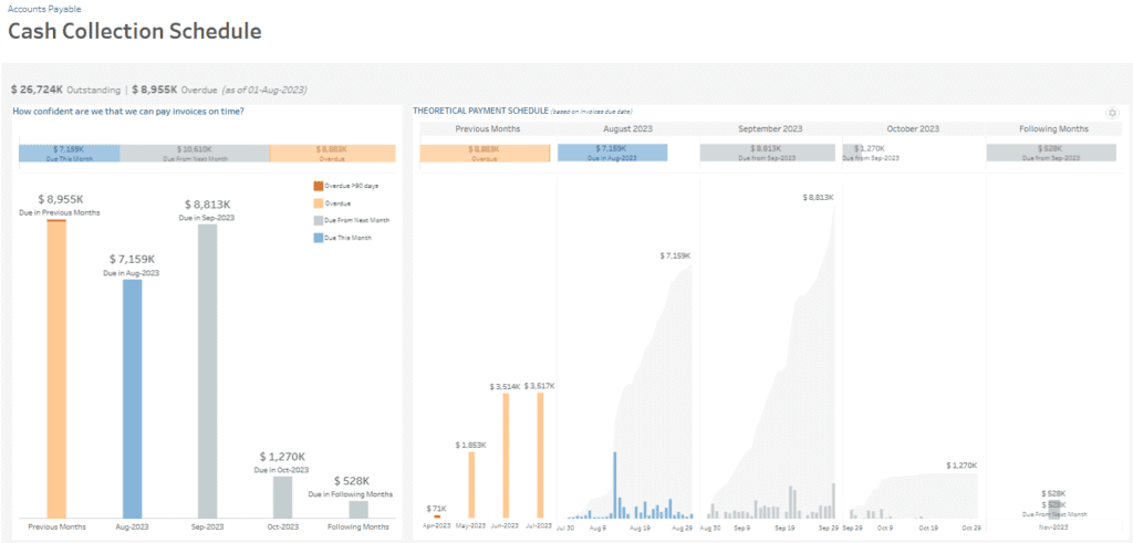
Dashboard Sections:
- Payment Due Summary: A segmented bar chart displays amounts due by aging categories, including overdue payments and those due this month and next. This feature is commonly found in accounts payable dashboard examples. It allows for a quick assessment of current and future liabilities.
- Theoretical Payment Schedule: A series of bar charts illustrate the scheduled monthly payments, detailing overdue amounts from previous months and upcoming payments through October and beyond. Each month’s obligations are colour-coded based on aging status, providing insights typical of an accounts payable metrics dashboard.
- Daily Payment Forecast: A waterfall-like chart shows a breakdown of specific payment amounts due each day within the upcoming months, helping the accounts payable team prepare for daily cash requirements.
This accounts payable dashboard assists by offering a clear view of cash requirements across different timeframes, helping prioritize overdue payments, and improving confidence in meeting upcoming deadlines. By visualizing cash flow demands with bar charts and daily payment forecasts, this tool supports proactive planning, ensuring sufficient funds are available to manage liabilities and maintain positive supplier relationships.
#6 Invoice Payments Efficiency
The Invoice Payment Efficiency accounts payable dashboard analyses payment timelines, overdue amounts, and invoice handling efficiency, allowing the accounts payable department to monitor and improve payment practices. This AP dashboard focuses on payment status for July 2023, historical payment performance, and the evolution of payment terms, making it an excellent example of accounts payable dashboard examples.
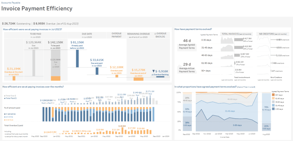
Dashboard Sections:
- Payment Status for July 2023: A combination of bar charts shows the breakdown of invoices due, paid, and overdue within July 2023. It highlights amounts paid on time, overdue payments, and the remaining overdue backlog, offering insights into monthly payment efficiency within the accounts payable KPI dashboard.
- Monthly Payment Efficiency: A stacked bar chart compares total amounts due and paid over time, with colours indicating payments made in advance, on time, or overdue. A secondary chart shows the total overdue dollar amount, helping track trends in overdue liabilities—key metrics in an accounts payable metrics dashboard.
- Payment Terms Evolution: Small line charts display changes in agreed payment terms and the number of creditors, showing the distribution of invoices by age categories (0-30 days, 31-45 days, etc.) over the past year.
This accounts payable dashboard assists in evaluating payment timeliness, monitoring evolving payment terms, and identifying areas for improvement. Through bar charts, trend lines, and colour-coded indicators, this AP dashboard enables better cash flow management, supports strategic planning, and ensures timely payments to enhance supplier relationships and operational efficiency.
Compelling accounts payable management is crucial for sustaining healthy cash flow and maintaining strong supplier relationships. The six accounts payable dashboard examples presented in this blog post offer distinct approaches to monitoring and improving AP processes, utilizing various accounts payable metrics to drive efficiency. By adopting an accounts payable KPI dashboard tailored to specific business needs, companies can comprehensively view their obligations, proactively manage overdue payments, and align cash flow strategies with financial goals. Whether through monitoring payment timelines, managing aging balances, or evaluating payment efficiency, these AP dashboards provide the insights necessary for informed decision-making and a more agile AP department. Integrating these examples into your strategy can empower your team to improve payment performance, mitigate financial risks, and enhance overall operational stability.


