A fitness dashboard is a powerful tool for transforming raw activity data into clear, actionable insights. Whether you’re a casual runner, a gym enthusiast, or a personal trainer, a health dashboard helps track performance, spot trends, and stay motivated. These dashboards offer a comprehensive view of your progress over time by visualizing metrics like distance, pace, heart rate, or calories burned. This post will explore five inspiring examples of fitness dashboards, each showcasing different styles and data visualizations. From tracking daily runs to monitoring long-term patterns, a training dashboard can help you better understand your workouts and stay on top of your goals.
Table of Contents
#1 Fitness Dashboard – Running Log
This fitness dashboard is a 2021 Running Log designed to provide a high-level overview of a runner’s activity throughout the year. It uses a calendar heatmap-style chart, each day of the year represented by a small rectangle. The colour intensity of the rectangles reflects the running activity—darker or brighter shades likely indicate longer or more intense runs. Each month is displayed as a mini calendar, making it easy to spot trends and gaps and maintain consistency at a glance.
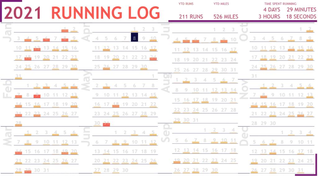
At the top right, the health dashboard also includes key performance indicators (KPIs) summarizing total yearly activity:
- 211 Runs
- 526 Miles
- 4 Days, 3 Hours, 29 Minutes, 18 Seconds spent running
These metrics offer motivation and a clear benchmark for future goals.
This training dashboard is handy for runners, fitness enthusiasts, personal trainers, and even data-driven wellness coaches who want to visualize performance over time. It’s also ideal for habit tracking and understanding seasonality in exercise routines. The clean, visual layout allows for quick assessments and can help users stay accountable and motivated throughout the year.
#2 Fitness Dashboard – Fitbit Fitness Dashboard | Activity Tracker | Health Analysis
This fitness dashboard provides a detailed summary of a user’s physical activity, sleep, and heart health, all presented in a clean, easy-to-read layout. Key metrics at the top include daily steps (8,647), distance (6.3 km), calories burned (2,922), active zone minutes (50), sleep duration (7 hr), and average heart rate (69 bpm). A line chart beneath these metrics shows the daily step trend over time, allowing users to track patterns and fluctuations in activity.
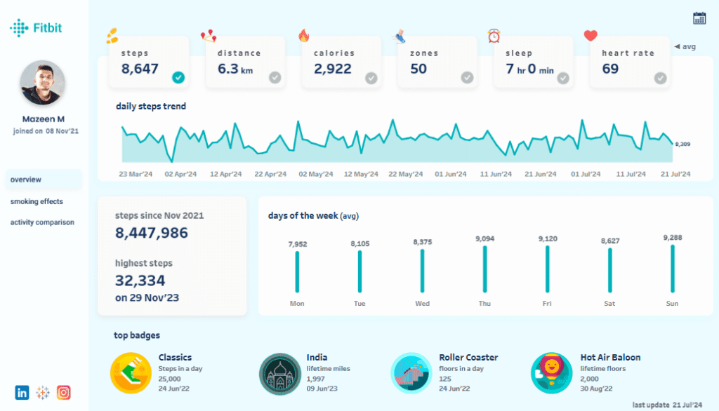
Additional sections in this health dashboard include total steps since joining (over 8.4 million), the highest recorded steps in a day (32,334 on 29 Nov ’23), and a bar chart showing average steps by day of the week, with Sunday being the most active day. The dashboard also highlights top fitness badges earned for milestones like steps in a day, lifetime miles, and floors climbed.
This training dashboard is ideal for fitness enthusiasts, casual walkers, and trainers who want a comprehensive view of daily movement and wellness. It’s also useful for anyone tracking progress over time, setting step goals, or maintaining consistency. The visual format is user-friendly, helping users stay motivated, informed, and on track with their fitness journey.
#3 Fitness Dashboard – Fitness Tracker Dashboard
This fitness dashboard offers a comprehensive view of an individual’s workout data, focusing on heart rate, session duration, and workout types. The main highlight is a dual line and bar chart tracking average heart rate and training duration over time, allowing users to analyze intensity and frequency across a multi-month period. The heart rate data provides insight into cardiovascular performance, while the duration bars reflect workout consistency.
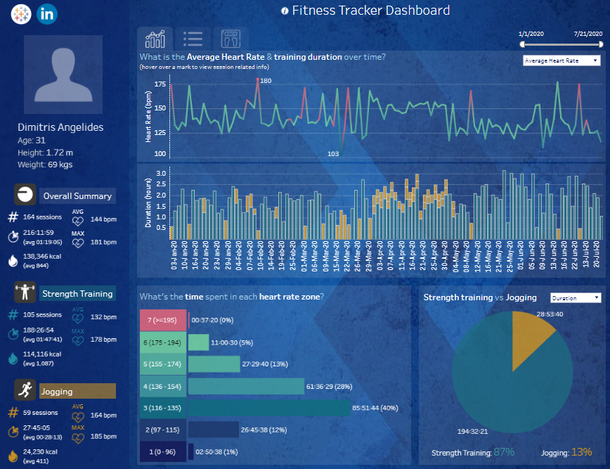
On the left, the user profile includes overall metrics such as total sessions (164), average and max heart rate (144 bpm, 181 bpm), total duration, and calories burned (138,946 kcal). Separate sections break down Strength Training and Jogging, showing session counts, heart rate ranges, and calories burned.
The training dashboard also includes a stacked bar chart showing time spent in each heart rate zone, segmented by BPM ranges, which is valuable for monitoring exercise intensity. A pie chart compares time spent on strength training (87%) versus jogging (13%), giving users a clear view of workout balance.
This health dashboard is perfect for athletes, personal trainers, and fitness enthusiasts who want to analyze training intensity, endurance, and progress. As a fitness dashboard, it helps identify trends, optimize workout plans, and improve performance through data-driven insights.
#4 Fitness Dashboard – Fitness Dashboard
This fitness dashboard presents a user-friendly summary of daily health and activity data. It includes key wellness indicators such as heart rate (69.75 BPM), total steps (3,428), calories burned (1,692 kcal), and sleep duration (115 minutes). At the top, users are greeted with their unique ID and a motivational message encouraging consistency in activity.
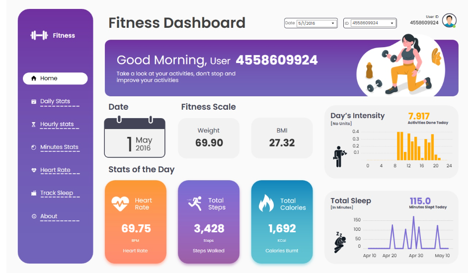
The training dashboard features various data visualizations, including a bar chart for Day’s Intensity, which displays the number of activities done per hour. This helps users track their most active times throughout the day. A line chart at the bottom right tracks sleep trends over several days, offering insights into rest patterns.
In the centre, the “Fitness Scale” includes weight (69.90 kg) and BMI (27.32), giving users a snapshot of their physical status. The layout also provides quick navigation to daily, hourly, and minute-based stats and specific sections for heart rate and sleep tracking.
This health dashboard is ideal for fitness enthusiasts, casual users, or personal trainers seeking a quick overview of their clients’ activity. As a fitness dashboard, it helps monitor performance, recovery, and energy expenditure—making it a valuable tool for maintaining and improving personal fitness.
#5 Fitness Dashboard – My Running Track
This fitness dashboard titled “My Running Tracks” provides a comprehensive overview of running activity over the years. It uses a variety of data visualizations to highlight trends, performance, and patterns. Key performance indicators at the top show totals like 490 activities, 5,314 km total distance, average pace of 5.32 min/km, and personal bests for 10k, half-marathon, and marathon distances.
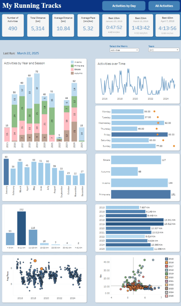
The dashboard includes:
- Stacked bar charts (e.g., “Activities by Year and Season”) to show seasonality.
- The line chart (“Activities over Time”) shows trends in activity frequency.
- Horizontal bar charts will display runs by day of the week and distance distribution.
- Scatter plots showing average pace trends and distance vs. pace correlations.
- Column charts to display activity counts per month and year-by-year distance summaries.
This dashboard is handy for runners, fitness enthusiasts, and coaches who want to track progress, identify patterns (e.g., peak running seasons), and optimize training. It helps users understand how their pace, distance, and consistency have changed. The seasonal and weekly breakdowns can guide training schedules, while personal records offer motivation and goal-setting insight.
These five fitness dashboard examples demonstrate how powerful data visualization can support health and wellness journeys. Whether you prefer tracking your weekly mileage, analyzing seasonal performance trends, or comparing personal bests, a health dashboard layout can meet your needs. A training dashboard can boost motivation, reveal patterns, and ultimately lead to smarter decisions by centralising key metrics and offering visual feedback. If you’re building your fitness dashboard, let these examples inspire your layout, metrics, and style. The goal isn’t just to collect data—it’s to use it to move better, train more competent, and reach your full potential.