A patient dashboard is an essential tool in modern healthcare, enabling data-driven decisions that enhance patient care, streamline operations, and improve outcomes. These dashboards give healthcare professionals real-time insights into critical metrics such as admissions, discharges, resource utilization, and patient demographics.
Related posts:
- 10 Amazing Tableau Healthcare Dashboard Examples
- Unlock Insights with These 7 Powerful Tableau COVID Dashboards
- 7 Eye-Catching Help Desk Dashboards You Need to See for Next-Level Support
- Hotspots, Trends, and Patterns: 5 Mind Blowing UFO Sightings Maps
- 6 Powerful Sales Funnel Dashboard Examples to Maximize Your Conversions
- 5 Stunning Fitness Dashboard Examples That Will Transform How You Track Your Workouts
Whether optimizing inpatient workflows or monitoring patient health trends, a patient dashboard empowers hospitals to deliver efficient, high-quality care. In this post, we explore 9 powerful examples of patient dashboards that showcase how data visualization can transform healthcare operations and drive better patient and provider outcomes.
Table of Contents
# 1 Patient Dashboard – Executive Summary
The patient dashboard offers an executive summary of key healthcare metrics, providing an overview of admissions, length of stays (LOS), discharges, and Diagnosis-Related Groups (DRG). It is an excellent example of a patient care dashboard, incorporating various visualizations such as bar charts, line indicators, and bullet charts to present data effectively.
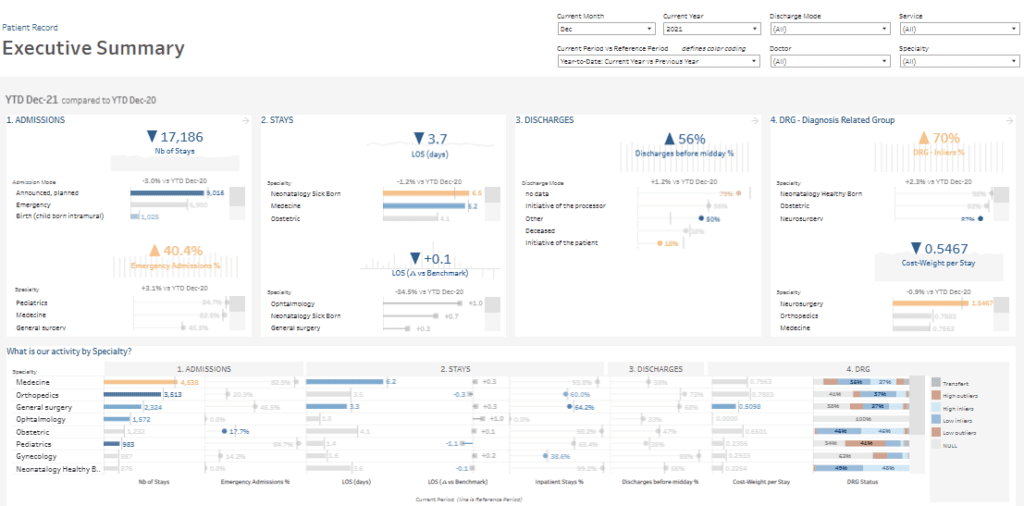
This inpatient dashboard includes metrics like the number of stays segmented by admission types (e.g., planned or emergency) and specialties (e.g., pediatrics, medicine). Bar charts highlight trends compared to the previous year, emphasizing changes in activity. LOS is depicted through bullet charts, showcasing both average stays and variations from benchmarks. Discharges are analyzed by timing (e.g., percentage discharged before midday) and mode, while DRG indicators display the percentage of DRG inflows and cost-weight per stay.
The dashboard features a detailed activity breakdown by specialty, using grouped bar charts for metrics like emergency admissions, average LOS, and discharges. Interactive filters make it a robust patient health dashboard, allowing users to refine data by period, doctor, or specialty, enabling tailored insights.
This patient monitoring dashboard provides patient insight dashboard functionality, benefiting hospital administrators, clinicians, and policymakers aiming to improve operational efficiency and patient experience.
# 2 Patient Dashboard – Top KPI Trends
The patient dashboard provides a detailed overview of top KPIs related to hospital performance. It offers insights into key metrics such as the number of stays, length of stay (LOS), DRG (Diagnosis-Related Group) inflow percentage, cost weight, and discharge timing. This inpatient dashboard leverages various visualizations, including bar, line, and column charts, to effectively display trends over time.
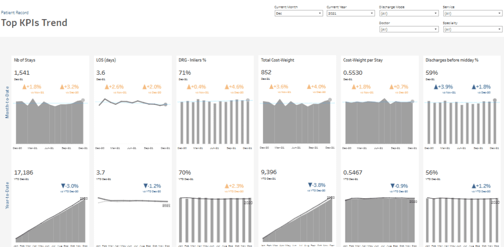
Each KPI is segmented by monthly data and year-to-date summaries, with comparisons to previous periods. The bar and column charts track changes in metrics such as the number of stays, LOS, and DRG inflow percentages, highlighting increases or decreases compared to the prior year. Line charts illustrate average LOS and discharge timing trends, providing a patient insight dashboard to identify patterns or anomalies.
Interactive features allow filtering by variables like discharge mode, service type, doctor, or specialty, enabling tailored data analysis. As a patient care dashboard, it delivers actionable insights for hospital administrators, clinicians, and healthcare analysts.
This patient experience dashboard is an ideal example of patient dashboard examples, focusing on patient health dashboard functionalities to enhance operational efficiency, monitor patient outcomes, and improve the overall patient monitoring dashboard utility in healthcare decision-making.
# 3 Patient Dashboard – Top DRG
The patient dashboard focuses on Diagnosis-Related Groups (DRG), offering a detailed breakdown of top-performing DRGs for the year. This inpatient dashboard uses a combination of bar charts and scatter plots to present metrics such as the number of stays, DRG outliers (low and high), and cost-weight per stay, making it a standout among patient dashboard examples.
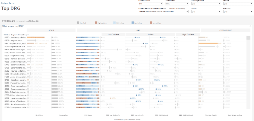
The bar charts display the number of stays and their cumulative contribution to the total, helping users identify the most frequent DRGs, such as newborn admissions or cesarean sections. The scatter plots highlight DRG status, showing the percentages of low outliers, inliers, and high outliers. This patient insight dashboard lets stakeholders quickly identify which DRGs consistently meet or exceed performance benchmarks.
Cost-weight metrics are also visualized using horizontal bar charts, comparing total cost weights and cost per stay across DRGs. This feature enhances its value as a patient health dashboard, helping users evaluate resource allocation and financial impact for different groups.
This patient care dashboard is valuable for hospital administrators, financial analysts, and clinicians. It also serves as a patient experience dashboard, enabling data-driven decisions to improve care processes, optimize financial performance, and monitor key outcomes effectively through its patient monitoring dashboard functionality.
# 4 Patient Dashboard – DRG Deep – Dive
The DRG Deep-Dive patient dashboard provides an in-depth analysis of specific Diagnosis-Related Groups (DRGs). This inpatient dashboard utilizes bar charts, line charts, and distribution visualizations to present the number of stays, DRG inlier percentages, cost weight per stay, and outlier distribution.
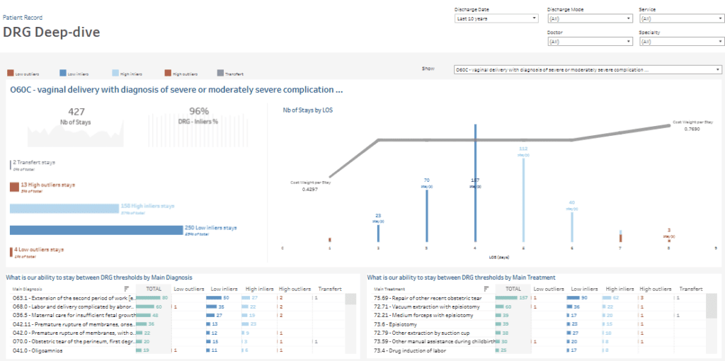
Key metrics include 427 total stays, of which 96% are classified as inliers. Bar charts highlight the distribution of outliers, including low outliers, high inliers, and transfer cases. The line chart plots the number of stays by Length of Stay (LOS), revealing trends in patient distribution over time. Another bar chart visualizes cost weight per stay, offering a clear view of resource utilization for each case.
Detailed tables categorize data by principal diagnosis and primary treatment, summarizing metrics such as low, high, and outliers. These visualizations provide granular insights into DRG thresholds, enhancing the dashboard’s utility as a patient monitoring tool.
This patient care dashboard is among excellent examples, serving as a patient health dashboard and patient experience dashboard. It provides actionable insights, enabling hospital administrators, clinicians, and analysts to effectively optimize care delivery and resource management.
# 5 Patient Dashboard – Cost Weight
The Cost-Weight patient dashboard comprehensively analyses cost-weight metrics across various specialties. Combining scatter plots, bar charts, and summary visualizations, this inpatient dashboard presents key data such as cost-weight per stay, total cost-weight, and year-over-year trends to enable practical financial performance assessments and resource utilization.
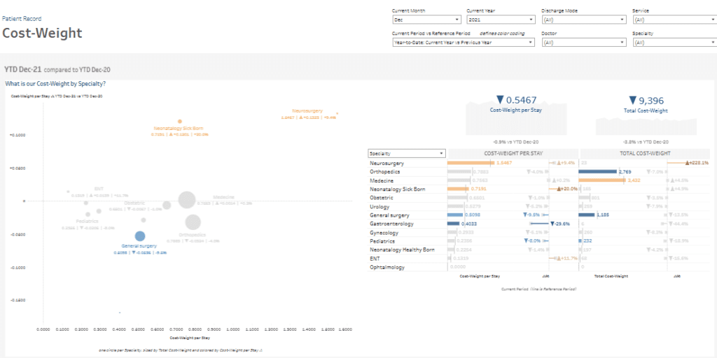
The scatter plot highlights cost-weight per stay for neurosurgery, orthopedics, and neonatal care specialties. It draws attention to areas like neurosurgery with higher cost-weight values and significant changes from the previous year. The size of the data points represents each specialty’s contribution to overall costs, helping to identify high-impact areas quickly.
Bar charts further break down cost-weight per stay and total cost-weight by specialty, offering detailed insights into areas with the most significant financial impact. Summary metrics show an average cost-weight per stay of 0.5467 and a total cost-weight of 9,396, with comparisons to previous years to track progress and identify inefficiencies.
This patient care dashboard is vital for hospital administrators, financial analysts, and healthcare managers. As a patient health dashboard, patient experience dashboard, and patient insight dashboard, it provides actionable data for optimizing resource allocation, improving cost management, and enhancing overall care delivery. It stands out among patient dashboard examples for its functionality and clarity.
# 6 Patient Dashboard – Doctors
The Doctors Patient dashboard comprehensively analyses individual doctors’ performance and impact on key healthcare metrics. This inpatient dashboard uses bar charts, scatter plots, and tabular data to present critical insights, including the number of stays, length of stay (LOS), DRG (Diagnosis-Related Group) distribution, and cost-weight per doctor.
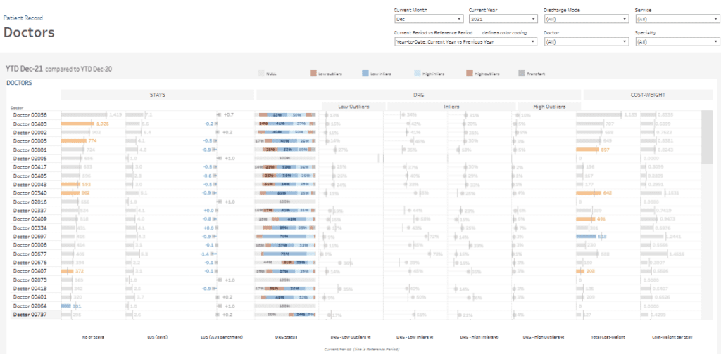
Bar charts highlight the number of stays each doctor manages and their average LOS compared to benchmarks. A detailed breakdown of DRG distribution reveals percentages of low outliers, high inliers, and high outliers for each doctor, helping to identify patterns in care delivery and deviations from expected outcomes.
Cost-weight metrics are visualized through bar charts, showcasing each doctor’s total cost-weight and cost-weight per stay, providing a clear view of financial contributions and resource utilization. Tabular data adds further detail, offering granular insights into individual performance metrics.
This patient care dashboard is valuable for hospital administrators, department heads, and performance analysts. As a patient insight dashboard and patient health dashboard, it supports evaluating doctors’ efficiency, identifies opportunities for improvement, and enhances care quality. Among patient dashboard examples, it also functions as a patient experience dashboard, bridging clinical and financial performance for optimized healthcare delivery.
# 7 Patient Dashboard – Admission – Discharges
The Admissions & Discharges patient dashboard provides a detailed analysis of hospital admissions and discharges, segmented by time of day and mode. This inpatient dashboard utilizes stacked bar charts and percentage distribution charts to visualize patterns in admissions and discharges, delivering actionable insights into operational efficiency and patient flow.
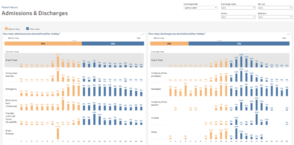
The left panel highlights the proportion of admissions occurring before and after midday, with 55% completed before noon. Admissions are categorized by mode, including planned admissions, emergencies, births, and transfers within 24 hours. Stacked bar charts illustrate the percentage of admissions across various time intervals, enabling users to identify peak periods and trends.
The right panel focuses on discharges, showing that 28% occur before midday and 72% afterwards. Discharge modes are analysed, such as patient-initiated, deceased, or without recorded data. The stacked bar charts detail discharge timing distributions, helping stakeholders pinpoint inefficiencies and plan resource allocation more effectively.
This patient care dashboard is essential for hospital administrators and operations managers. As a patient health dashboard, patient insight dashboard, and patient monitoring dashboard, it enhances decision-making by optimizing scheduling, reducing bottlenecks, and improving the overall patient experience dashboard. Its clear visualizations make it a standout among patient dashboard examples for managing admissions and discharge processes.
# 8 Patient Dashboard – Patients
The Patient Base patient dashboard provides an in-depth overview of patient demographics and distribution across various specialties. This inpatient dashboard incorporates bar charts, line charts, and pie charts to analyze patient age, gender, and specialty-specific trends, offering valuable insights into the hospital’s patient base.
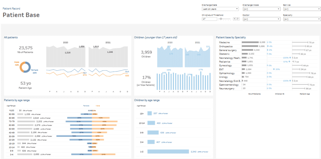
A pie chart illustrates the gender distribution, with 46% male and 54% female patients. Line charts track the number of patients over time, segmented by year and gender, highlighting trends and fluctuations. Bar charts break down patients by age range, from children under 1 year to individuals over 100 years, providing a clear picture of demographic patterns.
A dedicated section focuses on children under 17 years old, who comprise 17% of the total patient base. The dashboard breaks down children by age group and uses bar and line charts to visualize yearly trends in pediatric admissions. A summary of patient distribution by specialty (e.g., medicine, orthopedics, pediatrics) combines bar charts with demographic data, highlighting average patient age and the percentage of children treated in each specialty.
This patient care dashboard is essential for hospital administrators, clinicians, and planners. As a patient health dashboard, patient insight dashboard, and patient experience dashboard, it supports optimized care delivery, resource allocation, and strategic planning, exemplifying effective patient dashboard examples.
# 9 Patient Dashboard – Ad Hoc
The Adhoc Analysis patient dashboard provides an in-depth view of Diagnosis-Related Group (DRG) inlier trends and their distribution across specialties. This inpatient dashboard utilizes bar, line, and Pareto charts to analyze patient data, delivering actionable insights into trends and resource allocation.
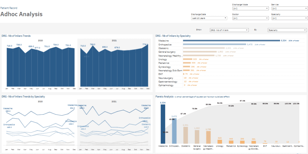
Bar charts illustrate monthly DRG inlier trends over two years, showcasing changes in patient counts and revealing seasonal patterns. Line charts further break down inliers by specialty, highlighting trends in key departments such as medicine, orthopedics, obstetrics, and general surgery. These visualizations enable users to compare performance across various specialties over time.
The Pareto chart demonstrates how a few specialties significantly impact overall DRG inliers. It identifies top contributors, such as medicine and orthopedics, helping prioritize areas for optimization. Additional bar charts provide a detailed summary of DRG inlier counts by specialty, offering a clear snapshot of department-level performance.
This patient care dashboard is vital for hospital administrators, department heads, and healthcare analysts. As a patient monitoring dashboard and health dashboard, it supports data-driven decision-making, resource allocation, and care delivery. It also enhances operational efficiency among patient dashboard examples, making it an excellent patient experience dashboard and patient insight dashboard.
A patient dashboard is transforming how healthcare organizations manage and analyze data. The 9 examples highlighted here demonstrate the versatility and impact of these tools, from tracking admissions with inpatient dashboards to providing clinical insights with patient care dashboards. A patient dashboard enables providers to optimize resources, enhance patient experiences, and deliver personalized care by integrating clear visualisations and actionable data. As healthcare evolves, adopting a patient dashboard remains essential for improving operational efficiency and better outcomes. These patient dashboard examples inspire innovative patient monitoring and care delivery approaches in modern healthcare systems.


