A well-designed procurement dashboard transforms raw procurement data into actionable insights, enabling decision-makers to monitor procurement KPIs, analyze spending patterns, and identify savings opportunities. By leveraging procurement analytics, organizations can streamline processes and enhance supplier relationships.
Related posts:
- Best 12 Amazing Examples of Tableau Supply Chain Dashboards
- Top 5 Amazing Expense Dashboard Examples
- 7 Amazing Shipping Dashboards That Will Revolutionize Your Logistics Game
- 9 Amazing Inventory Dashboards to Revolutionize Your Stock Management
- Check Out 13 Amazing Tableau Marketing Dashboard Examples
- 7 Amazing Help Desk Dashboard Examples
This blog post presents eight innovative examples of procurement dashboards, each tailored to specific business needs. From risk reduction to price-volume analysis, these examples demonstrate the versatility and power of procurement data analytics in driving success.
Table of Contents
#1 Procurement Dashboard – Executive Summary
This procurement dashboard offers a comprehensive overview of purchasing activities, comparing year-to-date (YTD) data for December 2023 against the previous year (YTD December 2022). It highlights critical metrics such as total purchasing volume, realized savings or losses, top purchasing categories, and supplier performance.
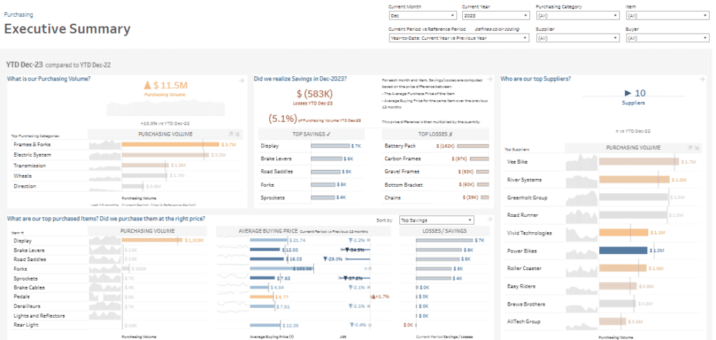
The dashboard includes:
1. Purchasing Volume: A bar chart breaks down purchasing volumes across categories like Frames & Forks, Electric Systems, and Transmission. The total purchasing volume is $11.5M, showing a 10% increase from the previous year.
2. Savings/Losses Analysis: A metric box displays a $583K loss (5.1%), with bar charts identifying top savings (e.g., Display and Brake Levers) and top losses (e.g., Battery Pack and Carbon Frames).
3. Price and Quantity Trends: Bar charts compare average buying prices for top items over the current and previous periods, emphasizing cost fluctuations.
4. Supplier Performance: A horizontal bar chart ranks top suppliers by purchasing volume, showcasing key contributors like Vee Bike and River Systems.
This procurement KPI dashboard is valuable for procurement managers, financial analysts, and supply chain professionals. It enables them to monitor purchasing efficiency, negotiate better supplier contracts, and identify cost savings or optimization areas, ensuring improved operational and financial performance.
#2 Procurement Dashboard – Purchase Categories
This procurement dashboard offers a detailed analysis of top purchasing categories, focusing on purchasing volumes segmented by category, item, and supplier. Comparing YTD December 2023 against YTD December 2022 highlights key contributors to procurement value while providing actionable insights into supplier and item performance.
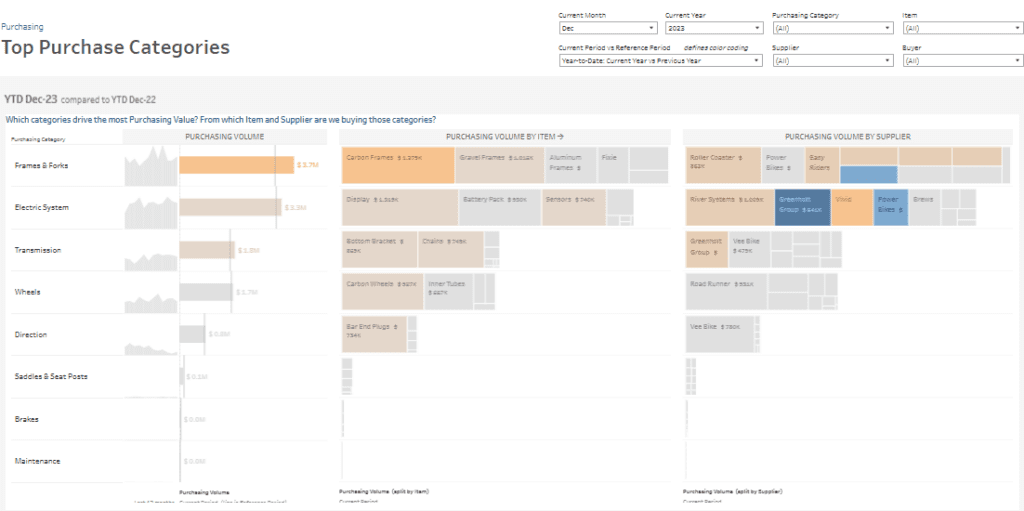
- Bar Charts: The left panel showcases purchasing volumes by category, emphasizing significant contributors like Frames & Forks ($3.7M) and Electric Systems ($3.3M), revealing their impact on total procurement value.
- Treemap Visualizations: The centre panel dives deeper into purchasing volume by item, with prominent items like Carbon Frames ($1.2M) and Displays ($1.1M) taking the spotlight. The treemap format allows for an intuitive understanding of high-value items.
- Supplier Treemaps: The right panel ranks supplier performance, highlighting key suppliers such as Roller Coaster, Power Bikes, and Greenholt Group. Power Bikes, for instance, contributed $944K to total purchases.
This procurement KPI dashboard is vital for procurement managers, financial analysts, and supply chain professionals. Leveraging procurement data analytics enables users to identify cost-saving opportunities, refine supplier partnerships, and optimize spending strategies, ensuring efficient and impactful procurement analysis.
#3 Procurement Dashboard – Savings
This procurement dashboard comprehensively analyses purchasing activities, emphasizing savings and losses to help organizations optimize procurement costs. Comparing year-to-date (YTD) data for December 2023 against the previous year provides insights into purchasing volumes, savings, and losses by item.
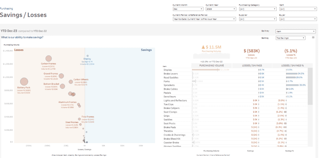
1. Scatter Plot Visualization: The left panel features a scatter plot dividing items into two zones—losses (red) and savings (blue). More giant bubbles, such as Battery Pack (losses of $126K) and Carbon Frames (losses of $103K), highlight significant cost overruns. On the savings side, Display (savings of $7K) and Brake Levers (savings of $6K) stand out as high-performing areas.
2. Key Metrics Display: At the top-right, total purchasing volume ($11.5M), losses ($583K), and percentage loss (5.1%) are prominently displayed, providing a clear snapshot of procurement performance.
3. Tabular Data: The right panel includes a sortable table that breaks down individual items, showing their purchasing volume, savings or losses, and respective percentages. Items are ranked by top savings, allowing users to identify cost-efficient purchases.
This procurement KPI dashboard is invaluable for managers, financial analysts, and supply chain teams. By leveraging these insights, businesses can identify cost drivers, negotiate better contracts, and optimize purchasing strategies, ensuring efficient and strategic procurement management.
#4 Procurement Dashboard – Risks
This procurement dashboard emphasizes risk mitigation by analyzing purchasing volume, price volatility, and supplier dependency. It offers insights into high-volume items with varying price stability and highlights single-supplier dependencies, enabling organizations to make strategic procurement decisions.
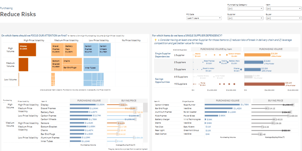
- Treemap Analysis: The left panel utilizes a treemap to categorize items based on purchasing volume and price volatility. For instance, Display ($2.53M) is identified as a high-volume, high-volatility item, whereas Carbon Frames ($2.17M) and Carbon Wheels ($1.73M) are high-volume with low volatility. This visualization aids in prioritizing items requiring immediate attention.
- Scatter Plot and Bar Charts: The right panel focuses on items with single-supplier dependencies, such as Carbon Wheels and Display, which pose supply chain risks. A bar chart ranks items and suppliers by purchasing volume, highlighting key contributors like Vee Bike and Power Bikes.
- Tabular Data: A detailed table at the bottom summarises purchasing volumes and average buying prices for specific items, offering granular insights for procurement analysis.
This procurement KPI dashboard is invaluable for procurement managers, supply chain professionals, and financial analysts. By leveraging procurement data analytics, users can mitigate supply chain risks, reduce the impact of price volatility, and diversify supplier dependencies, ensuring more reliable and cost-effective procurement strategies.
#5 Procurement Dashboard – New Savings
This procurement dashboard highlights savings opportunities. It uses advanced procurement analytics to analyze average buying prices, purchasing volumes, and supplier dependencies. It is designed to help procurement teams make cost-effective, data-driven decisions.
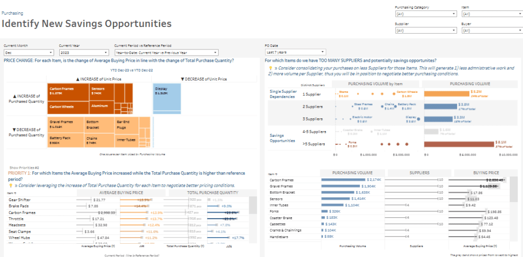
- Price Change Analysis:
- A treemap showcases the relationship between changes in average buying prices and purchase quantities. For example, Carbon Frames and Sensors show both price and volume increases, signalling areas to address, while Display highlights savings potential with a reduction in unit price.
- High-Priority Items:
- A detailed table ranks items such as Gear Shifter and Brake Pads based on increased average buying prices and total purchase quantities. These insights help prioritize supplier negotiations for improved pricing and cost management.
- Supplier Consolidation Opportunities:
- Scatter plots and bar charts assess supplier dependencies. Items managed by multiple suppliers, like Carbon Wheels, are marked as consolidation opportunities to streamline administrative tasks and secure volume discounts.
This procurement KPI dashboard is essential for procurement managers, supply chain analysts, and financial planners. It leverages procurement data analytics to optimize supplier relationships, control costs, and uncover significant savings opportunities while enhancing overall procurement strategies.
#6 Procurement Dashboard – PVM
This procurement dashboard provides a detailed Price/Volume/Mix analysis to uncover the factors driving variations in purchasing volumes. It uses procurement data analytics to compare YTD December 2023 data with the previous year, segmenting changes into three key drivers: price effect, volume effect, and mix effect.
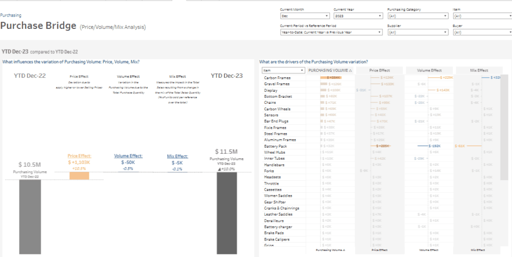
- Price/Volume/Mix Bridge Chart:
- A waterfall-style chart on the left visually explains the $1M increase in purchasing volume, which grew from $10.5M in 2022 to $11.5M in 2023. The price effect accounts for a $1.1M positive contribution (+10.5%), driven by higher average selling prices. Meanwhile, the volume and mix effects contribute slight negative impacts of $50K and $5K, respectively.
- Item-Level Breakdown:
- The right panel showcases item-specific analysis, detailing how price, volume, and mix effects influence purchasing volumes. For example, Carbon Frames significantly drive the price effect, while items like Battery Pack show variations primarily from volume.
- Bar Charts:
- Bar charts visually illustrate each item’s individual contributions of price, volume, and mix effects, offering actionable insights into procurement trends.
This procurement KPI dashboard is essential for managers, financial planners, and supply chain experts. Its focus on procurement analytics enables users to identify price trends, optimize product mix, and refine purchasing strategies for efficient cost management.
#7 Procurement Dashboard – Item
This procurement dashboard offers a comprehensive view of purchasing trends for Brake Calipers. It integrates procurement analytics to provide insights into suppliers, pricing, volumes, and purchasing patterns. It enables teams to perform effective procurement data analytics and make informed item-level decisions.
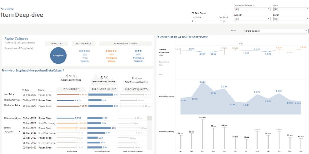
- Supplier Overview:
- The top-left panel highlights supplier details, showing that Brake Calipers are sourced from 2 suppliers. Low-rated indicators for price and purchasing volatility provide a snapshot of stability and supplier reliability.
- Transaction Details:
- The centre section lists granular procurement data, including last, minimum, and maximum prices, purchasing volumes, and quantities. For instance, Power Bikes supplied Brake Calipers at a maximum cost of $10.00, contributing to a total purchasing volume of $8K for 856 units.
- Price and Volume Trends:
- The right panel uses line and area charts to visualize pricing trends and purchasing volumes. For example, the average buying price stabilized at $9.36, with purchasing volumes peaking at $1.2K in March 2022.
This procurement KPI dashboard is essential for procurement managers, financial analysts, and category managers. By leveraging this procurement analysis, users can monitor supplier performance, optimize costs, and ensure stable pricing and reliable supply chains. This tool enhances strategic procurement analytics, aiding efficient and data-driven decision-making.
#8 Procurement Dashboard – Ad Hoc
This procurement dashboard analyses purchasing trends in-depth, breaking down procurement volumes by month, item, and category. It enables stakeholders to identify patterns, prioritize high-value items, and focus on crucial procurement areas to enhance operational efficiency and cost management.
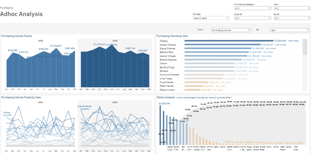
- Purchasing Volume Trends:
- The top-left panel features area charts showing monthly purchasing volume trends for 2022 and 2023. For example, purchasing volumes peaked in March 2023 at $1.14M, highlighting periods of increased activity.
- Item-Level Purchasing Trends:
- The bottom-left panel includes line charts displaying volume trends by item. High-value items like Display and Carbon Frames show consistent procurement throughout the year, providing visibility into purchasing behaviours.
- Volume by Item and Pareto Analysis:
- The top-right panel uses horizontal bar charts to rank items by purchasing volume, with Display ($2.53M) and Carbon Frames ($2.17M) accounting for a significant share of total procurement. The Pareto analysis in the bottom right highlights that a small percentage of items contribute to most procurement costs, helping teams prioritize effectively.
This procurement KPI dashboard is vital for procurement managers, category managers, and financial analysts. By leveraging these procurement analytics, users can monitor purchasing trends, optimize spending, and focus on critical items contributing to overall procurement value, ensuring strategic and cost-effective decision-making.
This post’s eight procurement dashboard examples highlight the importance of leveraging data to make informed decisions. These dashboards provide clear, actionable insights into procurement activities, enabling businesses to optimize costs, mitigate risks, and enhance supplier management. Organizations can achieve greater transparency, efficiency, and strategic alignment in their procurement processes by adopting tailored procurement analytics tools. As procurement continues to evolve, implementing these dashboards will drive cost savings, improve vendor relationships, and maintain a competitive edge in the market.


