Welcome to our comprehensive guide where we delve into the critical question: “What should be on a Tableau marketing dashboard?” If you’re navigating the complex terrain of marketing data, Tableau offers a powerful solution to bring clarity and actionable insights to your strategies. In this blog, we showcase 13 stellar Tableau marketing dashboard examples that cater to a variety of marketing needs.
Related posts:
- 8 Amazing Tableau eCommerce Dashboard Examples
- 13 Amazing Tableau Sales Dashboard Examples For Sales Analytics Mastery
- Best 12 Amazing Examples of Tableau Supply Chain Dashboards
- 5 Powerful Tableau Survey Analysis Dashboards: Unlock the Full Potential of Tableau for Survey Data
- 7 Amazing Customer Dashboard Examples for Actionable Customer Insights
- 7 Amazing Shipping Dashboards That Will Revolutionize Your Logistics Game
From tracking campaign performance to understanding customer behaviours, Tableau for marketing stands out as an invaluable ally. Each Tableau marketing dashboard example we present is meticulously designed to highlight how you can leverage this dynamic tool to make data-driven decisions. Whether you’re a seasoned marketer or a data enthusiast, you’ll see how Tableau marketing analytics transform raw data into strategic assets. (Note, we are presenting a curated list of existing Tableau dashboards from Tableau Public that we admire, we do not take credit for any of this work)
For blogs in this series, check out examples from sales, retail, healthcare or finance domains.
Table of Contents
Dive into the world of Tableau for digital marketing, where each dashboard is an opportunity to refine your digital campaigns with precision. We’ll explore marketing analytics Tableau style — demonstrating the platform’s capacity to handle vast datasets and complex variables with ease.
For those who need a jumpstart, our selection includes ready-to-use Tableau marketing dashboard templates. These templates not only save time but also provide a structured approach to visualize your marketing analytics. Join us as we explore the versatility and depth of Tableau for marketing analytics, and get inspired to elevate your marketing intelligence to new heights.
1 Social Marketing Tracker
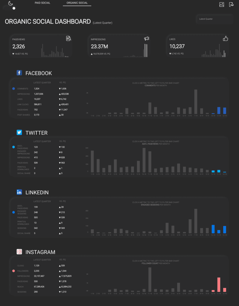
The Organic Social Dashboard displays metrics for non-paid content on various social media platforms. It presents data such as page views, impressions, and likes, along with comparative figures from a previous quarter (PQ). The dashboard is segmented into different platforms including Facebook, Twitter, LinkedIn, and Instagram, each with its own set of metrics.
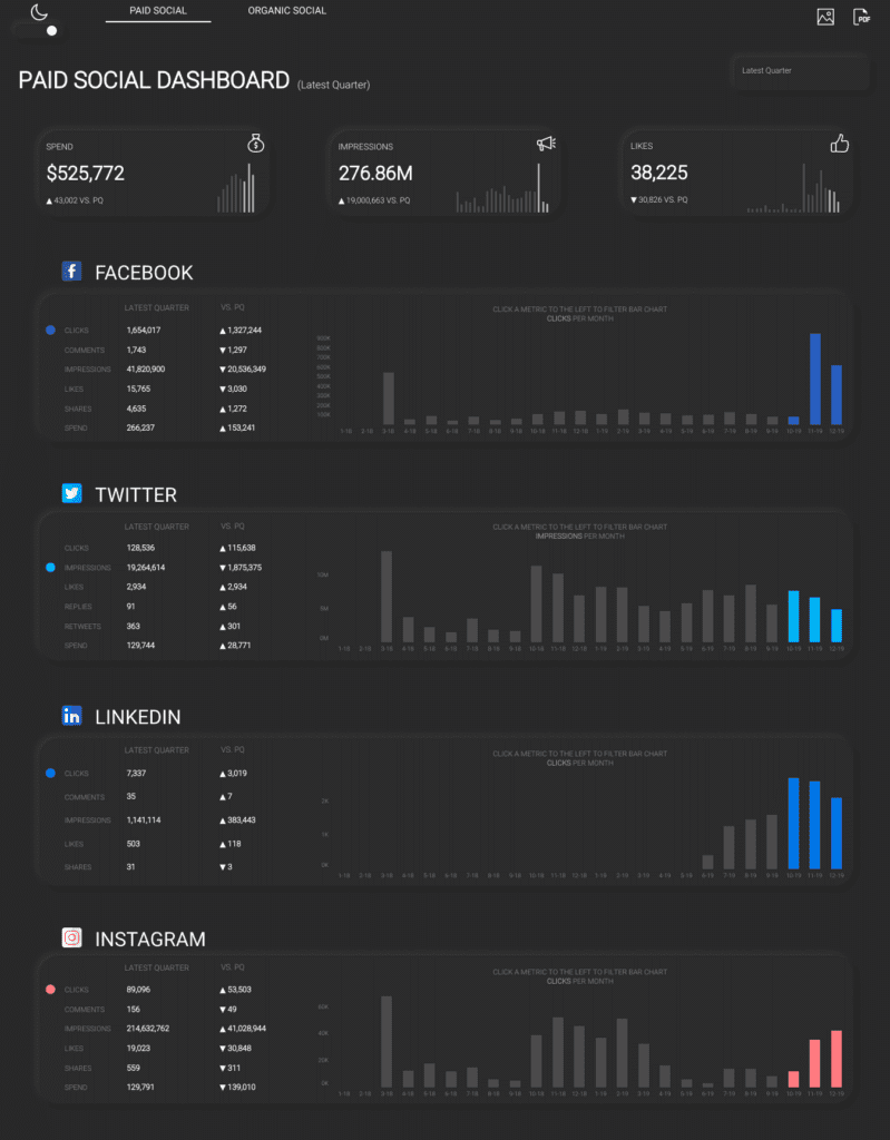
The Paid Social Dashboard Tableau marketing dashboard example focuses on the outcomes of paid advertising campaigns on social media. It shows the financial spend alongside the number of clicks, comments, impressions, likes, shares, and overall engagement received as a result of paid promotions. This dashboard also compares current data with the previous quarter and is divided into the same social media platforms.
Business Utility of Tableau Marketing Dashboard Examples
These Tableau marketing dashboard examples are valuable for assessing the effectiveness of social media strategies. They enable businesses to measure the impact of their organic and paid content, understand audience engagement, and determine the reach of their marketing efforts. This information is critical for optimizing content, adjusting campaigns, and allocating budget to maximize return on investment.
Beneficiaries
Such dashboards are particularly beneficial for:
- Marketing Executives, who need to oversee performance and strategize based on data-driven insights.
- Social Media Strategists, who plan and execute content strategies.
- Advertisers and Business Owners, monitor advertising spend and performance metrics to ensure that their investment in paid social media is yielding desired results.
- Data Analysts, who interpret complex data and translate it into actionable business insights.
2 Marketing Funnel
This Tableau marketing dashboard example shows the December 2017 Marketing KPIs for ACME Corporation. It includes a Visitor Funnel which illustrates the customer journey through different stages: from landing page visits (125,000 users), through registration starts (41,000 users), to completed registrations (13,000 users), and finally to registered users who started a course (9,000 users). Each stage shows a significant drop-off from the previous one, represented as a percentage.
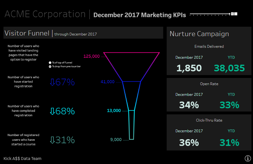
The Nurture Campaign section presents email marketing metrics. It details the number of emails delivered both for December 2017 (1,850) and the year to date (YTD, 38,035). It also shows the open rates and click-through rates (CTRs) for both the month and the YTD, highlighting the engagement levels of the email campaigns.
Business Utility
This dashboard provides a clear visual representation of the marketing funnel and the effectiveness of email campaigns. The visitor funnel can identify bottlenecks or drop-off points in the customer journey, which are critical for improving conversion rates. The email campaign metrics are essential for gauging the success of these campaigns in engaging customers, reflected in the open and click-through rates.
Beneficiaries
The information on this dashboard is particularly useful for:
- Marketing Managers, who can leverage this data to refine strategies and tactics to improve conversions and engagement.
- Sales Teams, who benefit from understanding the funnel conversion rates to better align their efforts with marketing strategies.
- Email Marketers, who rely on open and click-through rates to evaluate content relevance and campaign resonance.
- Data Analysts can use this data to perform more in-depth analyses, forecast trends, and provide actionable insights for strategic decision-making.
3 Digital Marketing Project
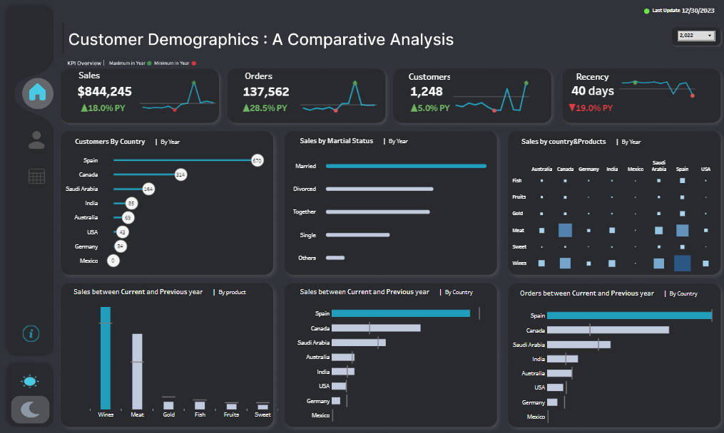
Dashboard 1: Customer Demographics and Comparative Analysis This Tableau marketing dashboard example displays key performance indicators (KPIs) for sales, orders, customer count, and recency of purchase. It breaks down sales by country, marital status, and product categories, comparing current and previous year data. It also shows sales and orders by country and product, indicating market trends and consumer preferences.
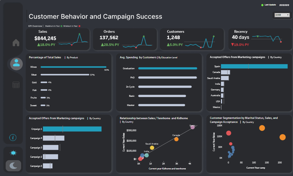
Dashboard 2: Customer Behavior and Campaign Success The second dashboard tracks sales, orders, customer count, and recency of purchase, similar to the first. It goes deeper into customer behavior by displaying the percentage of total sales by product, average spending by customers based on education level, accepted offers from marketing campaigns by country, and customer segmentation by marital status, sales, and campaign acceptance.
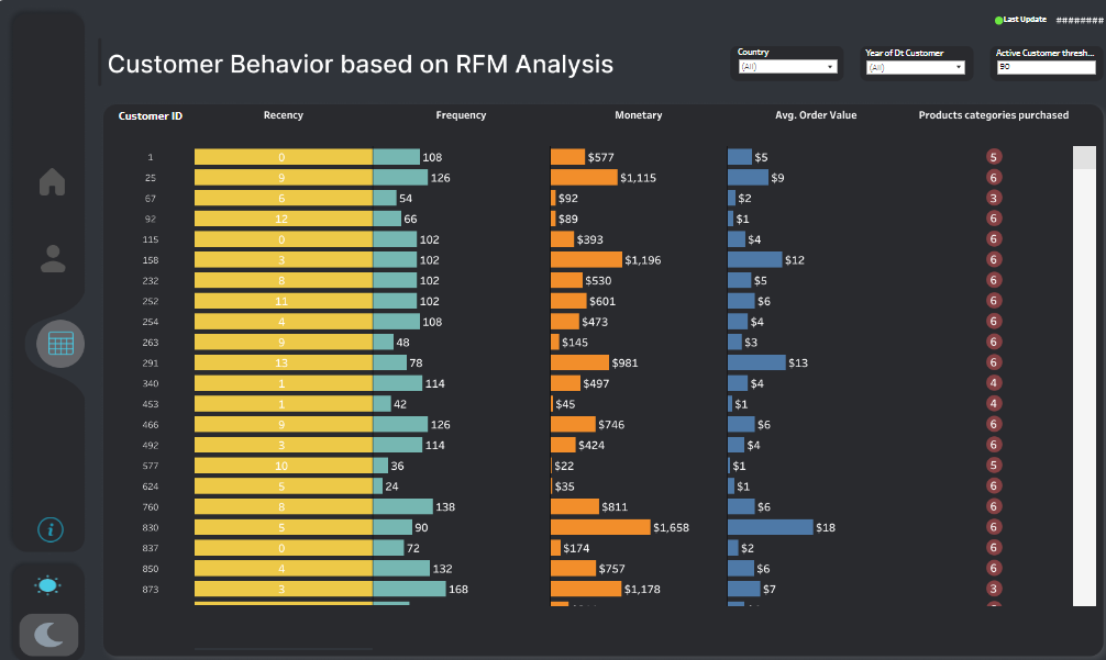
Dashboard 3: Customer Behavior based on RFM Analysis The third Tableau marketing dashboard example is focused on Recency, Frequency, and Monetary Value (RFM) analysis. It lists customers by ID and shows how recently and frequently they purchased, along with the monetary value of their purchases. It also provides data on average order value and product categories purchased.
Business Utility
For Customer Demographics and Comparative Analysis: Businesses can use this data to understand demographic trends and the effectiveness of their sales strategies across different regions and products. This insight can help in tailoring marketing efforts and optimizing product distribution.
For Customer Behavior and Campaign Success: This information is key for developing targeted marketing campaigns and for understanding which products are most popular among different customer segments. The education level data can also inform the content and complexity of marketing materials.
For Customer Behavior based on RFM Analysis: RFM analysis helps businesses identify valuable customer segments to target for retention and upselling. Understanding purchasing behaviour allows for personalized marketing and improved customer relationship management.
Beneficiaries
For Marketing and Sales Professionals: These dashboards are particularly useful for marketing managers, sales strategists, and customer relationship managers who need to make data-driven decisions to optimize marketing campaigns and sales strategies.
For Business Analysts and Data Scientists: The insights provided by these dashboards are critical for analysts and data scientists who are responsible for interpreting data trends and providing actionable recommendations to improve business performance.
For Executives and Decision Makers: Executives and business owners can benefit from the high-level overview provided by these dashboards to inform strategic planning and resource allocation.
4 Digital Marketing Campaign Performance Dashboard
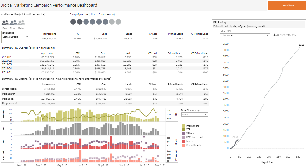
The provided Tableau marketing dashboard example is a Digital Marketing Campaign Performance Dashboard. It aggregates key performance indicators (KPIs) for digital marketing campaigns, including impressions, click-through rate (CTR), cost, leads generated, cost per lead (CP Lead), primed leads, and cost per primed lead (CP Primed Lead). The data is organized into multiple sections: an overall summary, a quarterly breakdown, and a channel-specific analysis for direct media, paid search, paid social, and programmatic advertising. A line graph shows the trend for impressions, CTR, CP Lead, and leads over time, and there’s a pacing chart indicating the cumulative primed leads over the year, compared to the previous year.
Business Utility
The dashboard provides comprehensive insights into the efficiency and effectiveness of marketing campaigns. It helps in evaluating the financial investment (cost) against the outcomes (leads and primed leads) to ascertain ROI. By comparing quarterly performance and channel-specific data, businesses can allocate resources more effectively to the most profitable or promising channels. The trends and pacing charts are useful for monitoring progress and making real-time adjustments to campaigns.
Beneficiaries
This dashboard is valuable for:
- Digital Marketing Managers, who can optimize campaigns based on performance data.
- Media Planners and Buyers, who can utilize the data to refine advertising spends and placements.
- Business Analysts, who can analyze trends and prepare forecasts for future marketing strategies.
- Executives and Entrepreneurs, need to understand the overall marketing performance to inform strategic decisions and budget allocations.
5 Web Traffic Dashboard | Digital Marketing
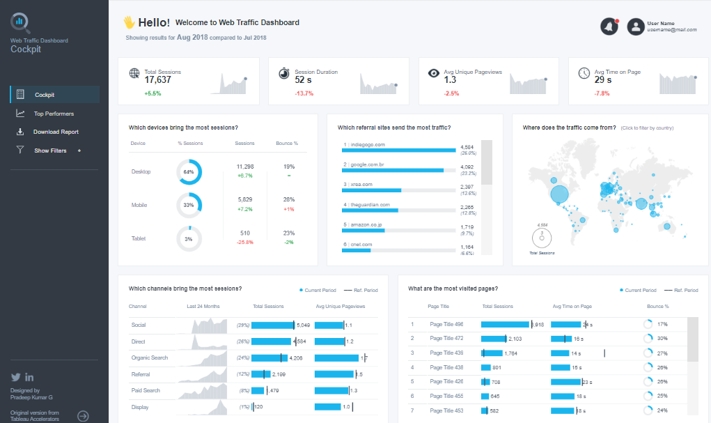
The Tableau marketing dashboard example is a Web Traffic Dashboard that presents various web analytics metrics. It shows total sessions, session duration, average unique pageviews, and average time on page, with percentage changes compared to a previous period. Device usage is broken down into desktop, mobile, and tablet, showing sessions and bounce rates for each. Traffic sources are categorized into channels like social, direct, organic search, referral, paid search, and display, with a comparative analysis of the current and past periods. Referral traffic lists the top websites directing traffic to the platform. A world map highlights the geographic distribution of traffic. Finally, the most visited pages are ranked by total sessions and bounce rate.
Business Utility
This Tableau marketing dashboard example is crucial for analyzing web traffic and user behaviour. It helps businesses understand where their traffic is coming from, which devices users prefer, and which pages are most popular. The data can guide the optimization of marketing strategies and website design for better user engagement. The session and bounce rate information allows for assessing the quality of traffic and the effectiveness of content.
Beneficiaries
The dashboard is useful to:
- Web Analysts, who can interpret this data to improve site performance and user experience.
- Digital Marketers, who need insights into channel effectiveness to allocate resources and plan campaigns.
- SEO Specialists, who can use the organic search data to refine SEO strategies.
- UX/UI Designers, who can make informed design changes based on device usage and page popularity.
- Content Managers, who rely on pageview metrics to develop engaging content strategies.
6 Email Marketing Campaign Dashboard
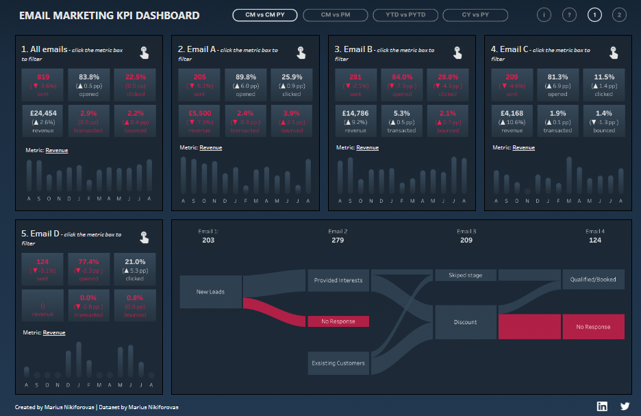
The Tableau marketing dashboard example portrays an Email Marketing KPI Dashboard with various metrics across four different email campaigns. It shows total emails sent, open rates, click-through rates (CTR), revenue generated, transactions made, and bounce rates. Each campaign is individually broken down and includes a monthly performance chart showing revenue trends throughout the year. The fifth panel illustrates a sales funnel for Email Campaign D, depicting the journey from new leads to provided interests, skipped stages, and finally to qualified/booked customers, with segments for those who gave no response or received a discount.
Business Utility
This Tableau marketing dashboard example is instrumental for evaluating the performance and financial impact of email marketing campaigns. By analyzing open rates and CTRs, businesses can gauge how compelling their emails are. Revenue and transaction data helps in assessing the direct monetary success of campaigns. The sales funnel for Email Campaign D provides insights into the effectiveness of the sales process, pinpointing stages with significant customer drop-offs or disengagement.
Beneficiaries
The dashboard serves several roles within a business:
- Email Marketing Managers use this data to refine their strategies, craft better subject lines, and improve content to enhance engagement and conversion rates.
- Sales Teams can identify how well email campaigns are generating qualified leads and where to focus follow-up efforts.
- Data Analysts scrutinize the trends for predictive analysis and to provide actionable insights to improve future campaigns.
- Marketing Executives require these KPIs to report on ROI, justify marketing spend, and make decisions on future marketing strategies.
7 Windsor Marketing Dashboard
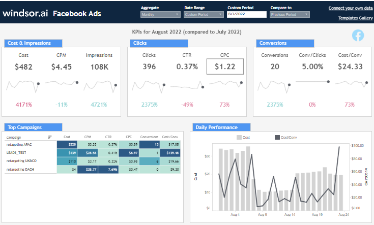
Facebook Ads Dashboard The first of the Tableau marketing dashboard example details the performance of Facebook Ads, showing key metrics such as cost, cost per mille (CPM), impressions, clicks, click-through rate (CTR), cost per click (CPC), conversions, conversion rate, and cost per conversion. It also provides a comparison of current month’s performance to the previous month. The ‘Top Campaigns’ section ranks individual campaigns by these metrics, and a ‘Daily Performance’ graph contrasts cost against cost per conversion over time.
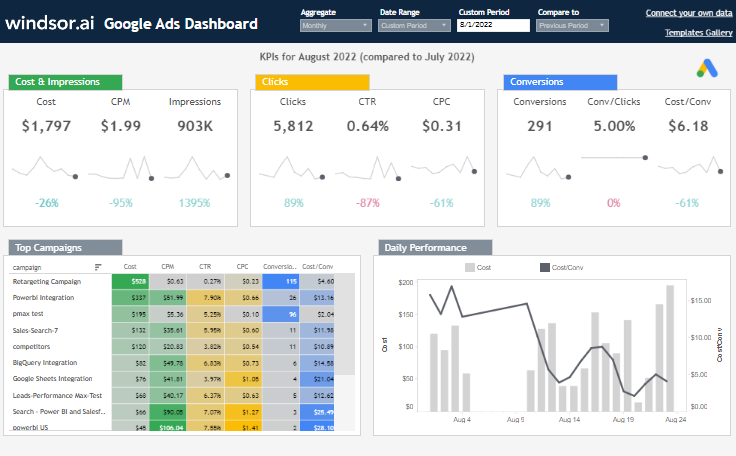
Google Ads Dashboard The second of the Tableau marketing dashboard example mirrors the structure of the Facebook Ads dashboard, tailored for Google Ads. It includes the same array of KPIs and a comparison of performance metrics month-over-month. The campaigns are also ranked, with a daily performance graph for cost and cost per conversion.
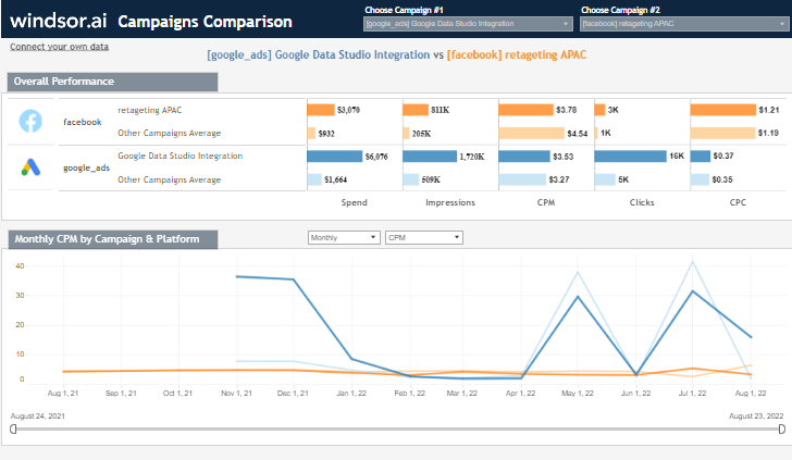
Campaigns Comparison Dashboard The third of the Tableau marketing dashboard example is a cross-platform comparison between Facebook and Google Ads. It provides an overview of overall performance and a detailed monthly comparison of CPM by campaign and platform, highlighting spend, impressions, CPM, clicks, and CPC.
Business Utility
These dashboards are invaluable for monitoring and optimizing digital advertising spend. They enable businesses to track the performance of their ad campaigns across platforms, identify trends, and allocate budgets to the most efficient channels. Understanding which campaigns are yielding the highest ROI allows for strategic adjustments to improve overall marketing effectiveness.
Beneficiaries
- Digital Marketing Managers can use these dashboards to make data-driven decisions to refine ad targeting, bidding strategies, and creative content.
- Data Analysts benefit from comprehensive data aggregation for trend analysis and forecasting.
- Chief Marketing Officers (CMOs) rely on these metrics for high-level strategy development and budget planning.
- Ad Operations Teams need this information to manage day-to-day campaign adjustments and optimizations.
8 Paid Marketing Dashboard
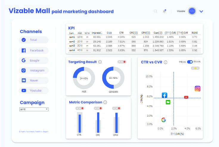
The image shows a “Vizable Mall paid marketing dashboard” which tracks the performance of paid advertising campaigns across various channels: Facebook, Google, Instagram, Naver, and YouTube. The KPI section lists campaigns by age group targets and shows metrics such as impressions, clicks, click-through rate (CTR), cost per click (CPC), cost, conversion rate (CVR), and return on ad spend (ROAS). The “Targeting Result” section displays pie charts for AGE and GENDER distribution of the campaign audience. The “Metric Comparison” area compares CTR, CPC, and CPM across channels. Lastly, a scatter plot contrasts CTR with CVR for each channel.
Business Utility
This dashboard provides a comprehensive overview of a business’s paid marketing campaign performance. It can be used to analyze the effectiveness of different demographic targets and optimize advertising spend based on which channels and campaigns yield the best ROAS. The ability to compare CTR, CPC, and CPM across channels helps in budget allocation and strategy refinement to maximize conversions and minimize costs.
Beneficiaries
This dashboard is particularly beneficial for:
- Digital Marketing Managers who need to oversee campaign performance and make quick, informed decisions on budget distribution and campaign adjustments.
- Data Analysts who analyze marketing data to provide strategic insights on how to improve campaign performance.
- CMOs and Marketing Directors who evaluate overall marketing strategy effectiveness and ROI.
- Media Planners who strategize on channel selection and audience targeting for future campaigns.
9 Marketing Optimization
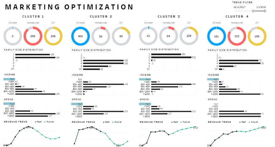
The image depicts a “Marketing Optimization” Tableau marketing dashboard example is divided into four sections, each representing a customer cluster. For each cluster, there are:
- Demographic Composition: Indicated by the number of children, homeowners, and DIY (Do-It-Yourself) enthusiasts represented by coloured rings.
- Family Size Distribution: Bar graphs showing the number of households by family size.
- Income: Bar graphs categorizing the customers’ income into different brackets.
- Spend Bar graphs detailing the spending amounts within specified ranges.
- Revenue Trend: Line graphs showing past and future revenue trends for each cluster.
Business Utility
This dashboard is a vital tool for segmenting customers and understanding different market segments’ demographic, economic, and behavioural patterns. The family size and income distribution can help businesses tailor their marketing strategies and product offerings to match the needs and purchasing power of each segment. Additionally, the spending analysis and revenue trends provide insights into customer value and potential growth areas.
Beneficiaries
The dashboard is particularly useful for:
- Marketing Strategists need to understand customer segments to develop targeted campaigns.
- Product Managers looking to align product features and development with the needs of different customer groups.
- Sales Teams could use this data to prioritize leads and tailor their sales approaches.
- Financial Analysts are interested in predicting revenue trends and understanding the financial implications of market segments.
10 Marketing Pipeline
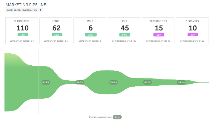
The Tableau marketing dashboard examples shows a Marketing Pipeline dashboard that spans from February 2021 to March 2022. It visualizes the progression of subscribers, leads, marketing qualified leads (MQLs), sales qualified leads (SQLs), opportunities, and customers, along with the percentage change compared to a previous period. Each stage shows an increase or decrease in volume, depicted by the varying widths of the flow chart. The overall conversion rate is also provided, indicating the efficiency of the pipeline at converting initial contacts into customers.
Business Utility
This Tableau marketing dashboard examples is a tool for tracking the effectiveness of a marketing funnel. It allows businesses to see where they are gaining or losing potential customers and adjust their strategies accordingly. For example, the dashboard can help identify if there are significant drop-offs at a particular stage, indicating a potential issue that needs to be addressed to improve the conversion rate. Moreover, it helps in assessing the growth trends over time and making data-driven decisions to enhance marketing and sales efforts.
Beneficiaries
The dashboard is beneficial to:
- Marketing Managers who can use this data to optimize campaigns for better lead generation and nurturing.
- Sales Managers need to understand the quality and quantity of leads being passed to the sales team.
- Business Analysts who analyze pipeline performance to forecast sales and identify areas for improvement.
- Executives who rely on conversion rates and trend data to make strategic decisions regarding marketing and sales resource allocation.
11 Know Your Consumer
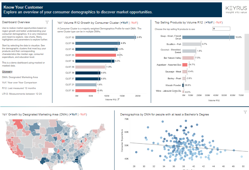
The Tableau marketing dashboard examples titled “Know Your Customer” presents a multi-faceted view of market analytics. It includes:
- YoY Volume R12 Growth by Consumer Cluster: This bar graph shows the year-over-year (YoY) growth of consumer clusters, labeled CLST, indicating volume changes in designated marketing areas (DMAs).
- Top Selling Products by Volume R12: A horizontal bar graph indicates the top-selling products and their volume growth compared to the previous year.
- YoY Growth by Designated Marketing Area (DMA): A color-coded map depicts the growth rate across different DMAs.
- Demographics by DMA for people with at least a Bachelor’s Degree: A bubble chart correlates the number of consumers with a Bachelor’s degree to median consumer expenditure across DMAs.
Business Utility
This Tableau marketing dashboard examples can help businesses identify growth opportunities by analyzing market trends and consumer demographics. Understanding which consumer clusters are expanding can guide targeted marketing campaigns. The sales volume data for products aids in inventory planning and product development. The geographic growth map and educational demographic data enable a granular understanding of market segments, which can be pivotal for strategic planning and localization of marketing efforts.
Beneficiaries
The data is valuable to a variety of roles within an organization:
- Market Researchers can analyze demographic and regional trends to inform product development and marketing strategies.
- Sales Managers can use sales volume data to forecast demand and set targets.
- Marketing Executives can leverage demographic insights to tailor messaging and positioning strategies for different market segments.
- Strategic Planners can utilize YoY growth information to identify high-potential markets and allocate resources efficiently.
12 Bank CRM events
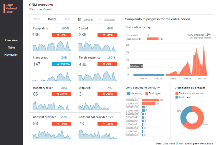
The image depicts a CRM (Customer Relationship Management) Overview Dashboard for Eagle National Bank. It presents data on customer complaints and the bank’s response:
- Complaints Metrics: Total number of complaints, those closed, in progress, with timely responses, where monetary relief was provided, disputed, and those with and without consent provided, each with a percentage change compared to a previous period.
- Complaints In Progress: A line graph showing the distribution of complaints in progress by day, including average difference from the previous month.
- Longest Pending Complaints: A list identifying complaints pending for the longest times.
- Distribution by Product: A pie chart showing the percentage distribution of complaints by product type, such as bank account service and credit card issues.
Business Utility
This dashboard is useful for monitoring and improving customer service efficiency and effectiveness. It can help in tracking how well the bank is handling complaints, identifying areas where the process may be lagging, and ensuring that customers are receiving timely responses and resolutions. Understanding the distribution of complaints can also help in pinpointing systemic issues that might need addressing.
Beneficiaries
The dashboard would be useful to:
- Customer Service Managers, to track the performance of their teams and the status of complaint resolutions.
- Product Managers, to identify and address recurring issues in specific products or services.
- Operations Managers, to ensure that workflows for handling complaints are efficient and effective.
- Senior Management, to oversee customer satisfaction levels and ensure regulatory compliance regarding complaint handling.
13 RFM CUSTOMER SEGMENTATION
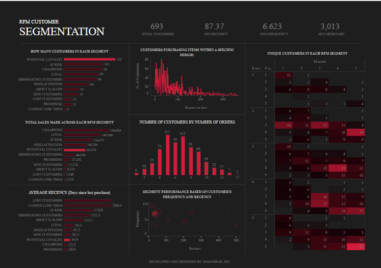
The “RFM Customer Segmentation” dashboard visualizes data on customer behaviour for a company. It includes:
- Total Customers: A count of all customers and other key metrics such as average recency, frequency, and monetary value.
- How Many Customers in Each Segment: A breakdown of customers into segments like Potential Loyalist, New Customers, Promising, etc., based on their purchase patterns.
- Customers Purchasing Items Within a Specific Period: A frequency distribution graph showing when customers made purchases.
- Total Sales Made Across Each RFM Segment: A bar graph displaying sales volume across different customer segments.
- Number of Customers by Number of Orders: A visual representation of how many orders each customer segment typically makes.
- Unique Customers in Each RFM Segment: A matrix categorizing customers by recency, frequency, and monetary score.
- Average Recency: The average number of days since the last purchase for each segment.
- Segment Performance Based on Customers’ Frequency and Recency: A bubble chart plotting the frequency of orders against the recency of purchases across segments.
Business Utility
This dashboard is a powerful tool for analyzing customer engagement and identifying key segments for targeted marketing strategies. It helps businesses recognize which customers are most valuable and which may require re-engagement tactics. By understanding purchasing habits, companies can tailor their marketing efforts, personalize customer experiences, and allocate resources more effectively.
Beneficiaries
- Marketing Managers utilize this dashboard to create segment-specific campaigns and loyalty programs.
- Sales Teams can identify potential opportunities for upselling and cross-selling to different customer segments.
- Customer Relationship Managers might use this data to design personalized engagement strategies for retaining valuable customers.
- Business Strategists can rely on these insights for long-term planning and predicting future buying patterns.


