Tableau Horizontal Sankey charts are helpful in showing how a measure is distributed between the values of 2 discrete dimensions. They show the flow between the members of both dimensions. Tableau Horizontal Sankey diagrams show the dimensions on the right and left sides, and the flow between them runs horizontally to connect them.
What are the different methods for a Tableau Horizontal Sankey Chart?
Several different methods can be used to make Tableau Horizontal Sankey diagrams.
- A Tableau extension called ShowMeMore from InfoTopics can be embedded into the dashboard, and the dimensions and measures can be selected from a list. This option is quick and easy but is only
customizable within the limits of the extension. Extensions are subscriber-based. - Tableau has trialled a beta version of a Sankey diagram in the application. In a future release, Sankey diagrams will likely be available via ShowMe.
- Sankey diagrams can be created using joins in a data source to construct data scaffolding. This method requires multiplying the data size by a minimum factor of 2 and accessing the data source so it is less accessible.
- Sankey diagrams can also be made with calculations within the workbook. This is the method used in the following steps.
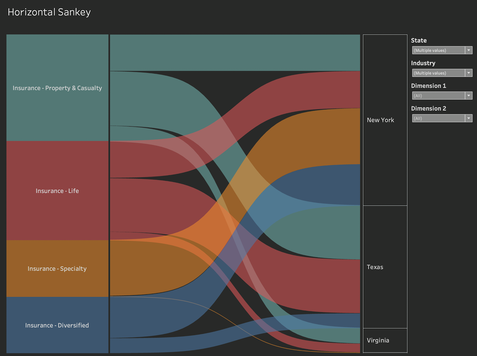
Tableau Horizontal Sankey chart Workbook Examples
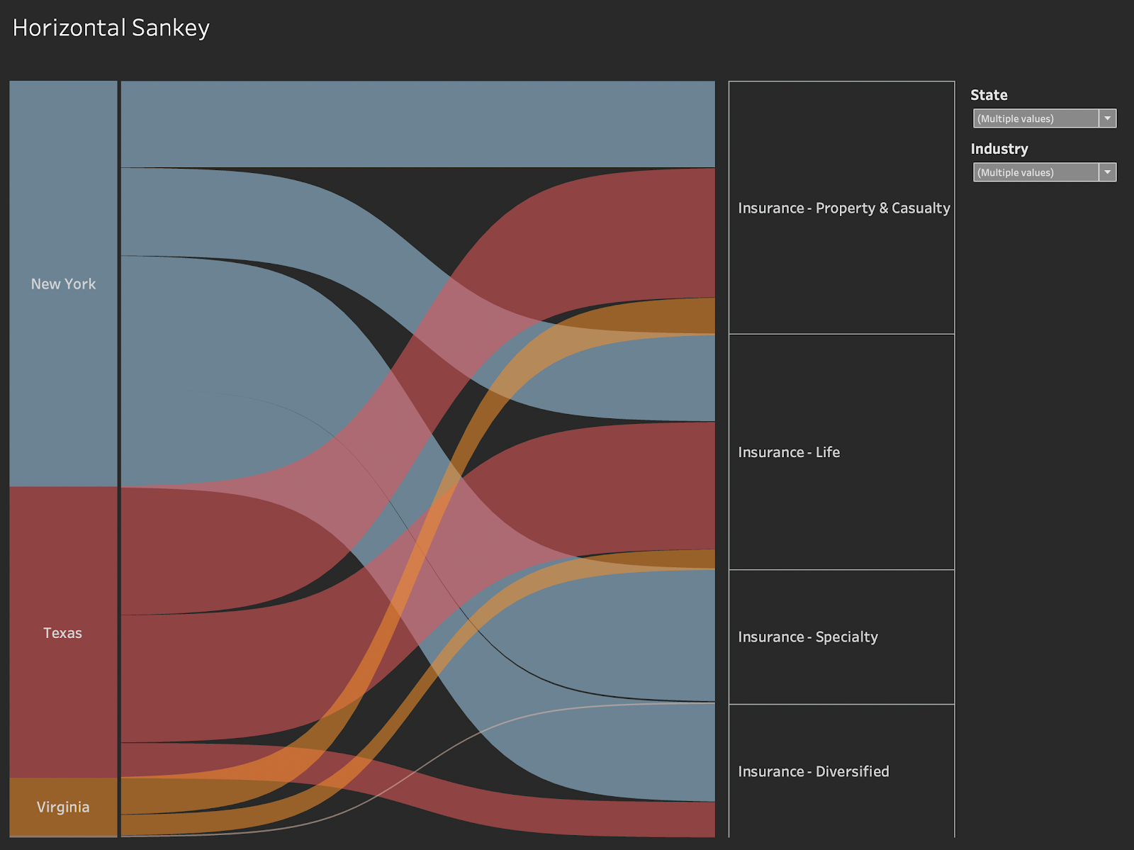
The workbook above shows an example of a Tableau Horizontal Sankey chart that visualises the revenue from individual US states is distributed between different insurance sub-sectors. The parameters in the workbook allow the user to switch the dimensions. The filters in the workbooks allow users to specify which states and insurance sectors are included in the view.
Let’s create a Tableau Horizontal Sankey Chart!
- Connect to your data source and locate the dimensions and measures needed to build your base visualisation and begin to build our Tableau Horizontal Sankey chart.
- We want to build a sheet that is flexible for our Tableau Horizontal Sankey chart so that the users can switch the dimensions and measurements displayed without having to adjust or duplicate the calculations. To do this we need parameters to provide the flexibility to choose and dimensions that reference the choice made.
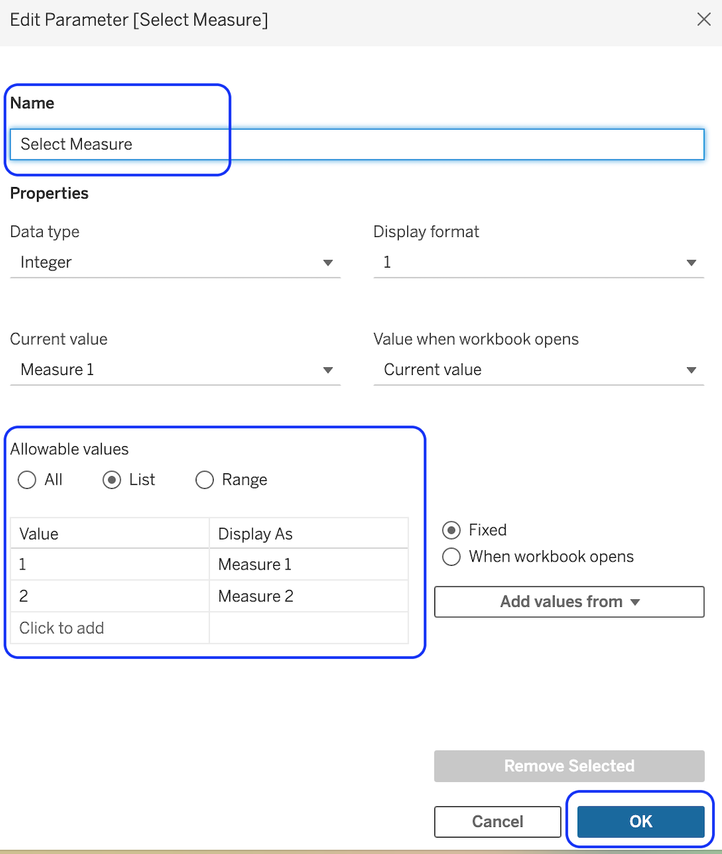
- Create a parameter for our Tableau Horizontal Sankey chart to allow the selection of the measure. Call it ‘Select Measure’ and list the measures you want the user to be able to select from. Make it a type of integer. The value in the allowable list is an integer and the ‘Display As’ description is the value the user will see in the parameter display.
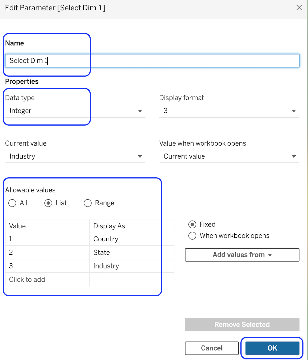
Create a parameter to allow selection of the dimensions for the left- and right-hand sides. Call it ‘Select Dim 1’ and list the dimension you want the user to be able to select from. Make it a type of integer. The value in the allowable list is an integer and the ‘Display As’ description is the value the user will see in the parameter display.
- Duplicate the ‘Select Dim 1’ and call it ‘Select Dim 2’ so we have one parameter for the left and one parameter for the right.
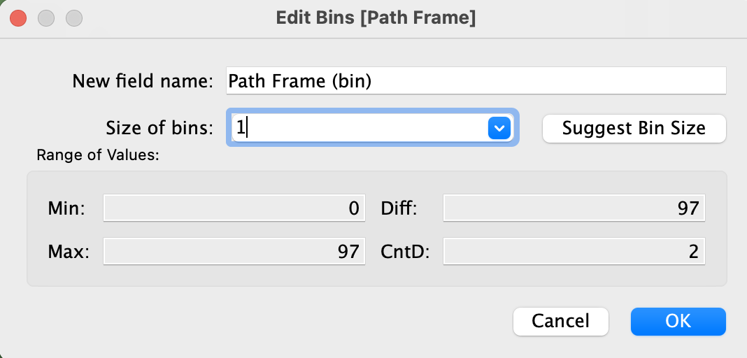
- Next, we need to create a frame starting from the minimum value of the measure chosen in the parameter and ending from the top of the Tableau Horizontal Sankey chart diagram. We need to create even gaps between these points to distribute the visualisation
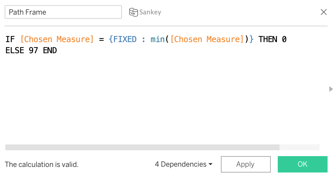
- Create the Path Frame Calculation
IF [Chosen Measure] = {FIXED : MIN([Chosen Measure])} THEN 0 ELSE 97 END

| Calculation Name | Calculation |
| Index | Index() |
| T | IF [Path Index] < 50 THEN (([Path Index]-1)%49)/4-6 ELSE 12 – (([Path Index]-1)%49)/4-6 END |
| Sigmoid | 1/(1+EXP(1)^-[T]) |
| Sankey Arm Size | SUM([Chosen Measure])/TOTAL(SUM([Chosen Measure])) |
| Max Position 1 | RUNNING_SUM([Sankey Arm Size]) |
| Max Position 1 Wrap | WINDOW_SUM([Max Position 1]) |
| Max Position 2 | RUNNING_SUM([Sankey Arm Size]) |
| Max Position 2 Wrap | WINDOW_SUM([Max Position 2]) |
| Max for Min Position 1 | RUNNING_SUM([Sankey Arm Size]) |
| Min Position 1 | RUNNING_SUM([Max for Min Position 1])-[Sankey Arm Size] |
| Min Position 1 Wrap | WINDOW_SUM([Min Position 1]) |
| Max for Min Position 2 | RUNNING_SUM([Sankey Arm Size]) |
| Min Position 2 | RUNNING_SUM([Max for Min Position 2])-[Sankey Arm Size] |
| Min Position 2 Wrap | WINDOW_SUM([Min Position 2]) |
| Sankey Polygons | IF [Path Index] > 49 THEN [Max Position 1 Wrap]+([Max Position 2 Wrap]-[Max Position 1 Wrap])*[Sigmoid] ELSE [Min Position 1 Wrap]+([Min Position 2 Wrap]-[Min Position 1 Wrap])*[Sigmoid] END |
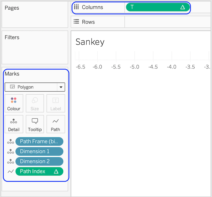
With the calculation created for our Tableau Horizontal Sankey chart, we can now build the sheet that will contain the curves. We will build the left and right bars in a later step.
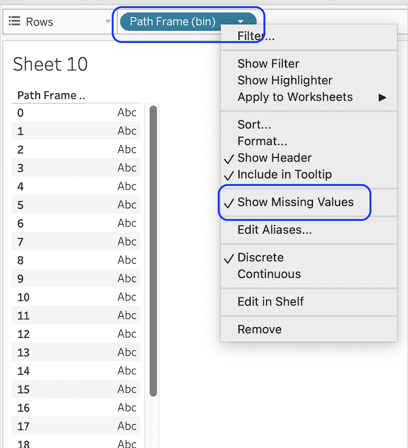
Put Path Frame (bin) onto Rows, then right-click it and select “show missing values”.
- Move Path Frame (bin) to detail card.
- Add Dimension 1 and Dimension 2 to detail.
- Put [T] on Columns and calculate it along Path Frame (bin).
- Change mark type to Polygon.
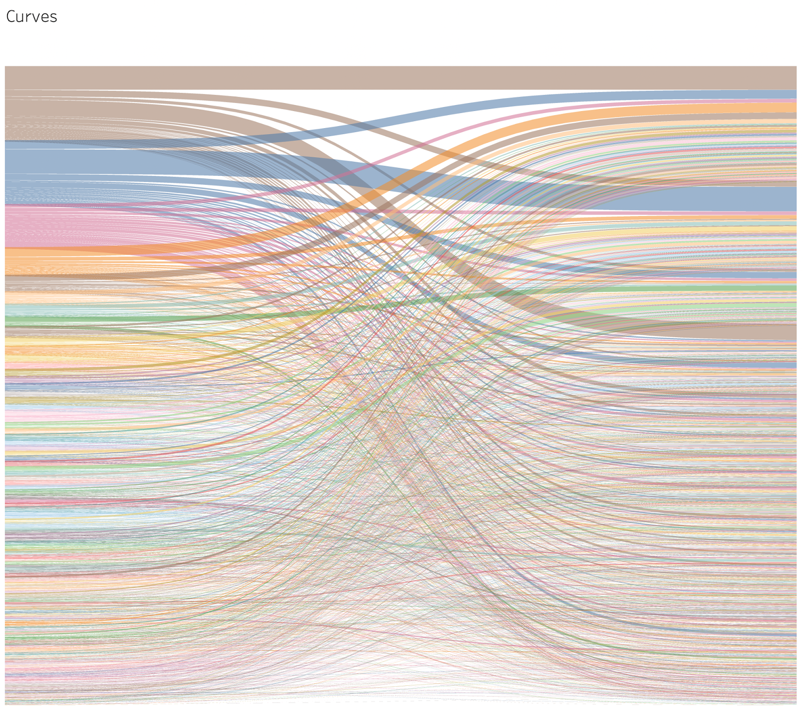
Your sheet should look like this:
Now, we need to configure our nested table calculations, so the curves work correctly for our Tableau Horizontal Sankey chart. Start by putting Sankey Polygons on rows then opening the Edit Table Calculation… menu.
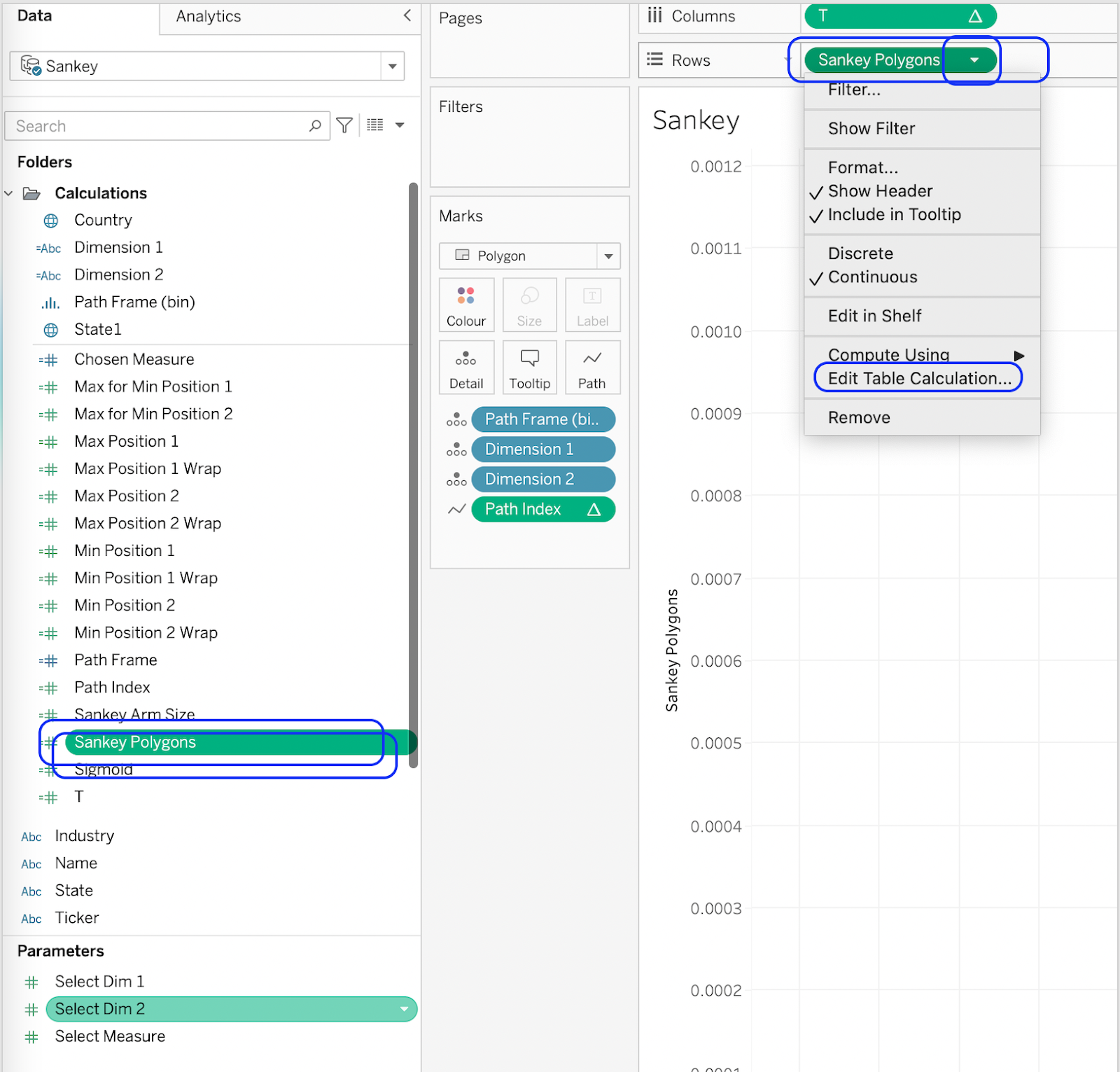
This Tableau Horizontal Sankey chart polygon calculation has several nested table calculations which all need to be specified individually to get the curves to work.
These are the nested table calculations:
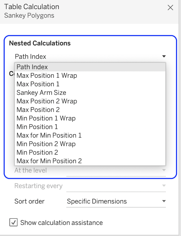
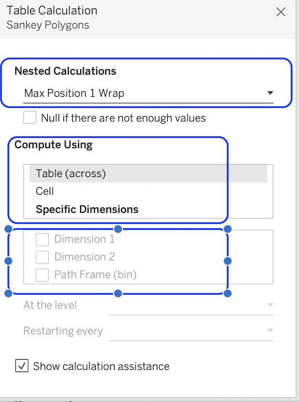
Follow these settings for each nested calculation. The compute using, objects ticked, and the order of the items in the checklist all need to match the examples below. You can move the items in the list by dragging and dropping them. You can pick the next nested calculation when you are ready, from the list at the top.
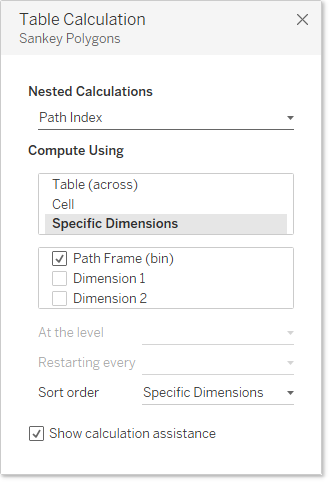
Path Index Settings:
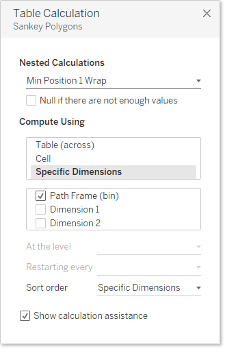
Max Position 1 Wrap Settings:

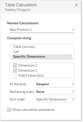
Max Position 1 Settings:
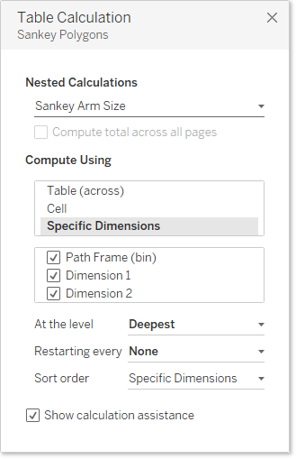
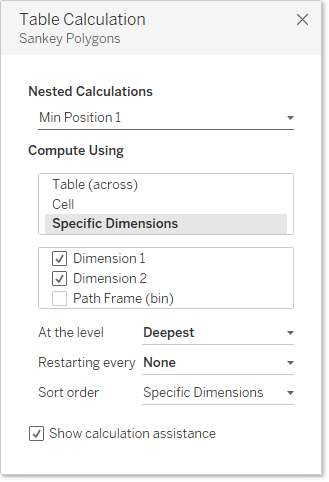
Sankey Arm Size Settings: 1:
Max Position 2 Wrap Settings:

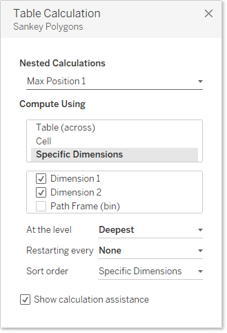
Max Position 2 Settings:
Min Position 1 Wrap Settings:
Max for Min Position 1 Settings:

Min Position 2 Wrap Settings:


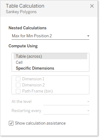
Max for Min Position 2 Settings:
You should now have all the curves and will look like this:
- Now we need to make the stacked bars on either side of the curves to give them some context.
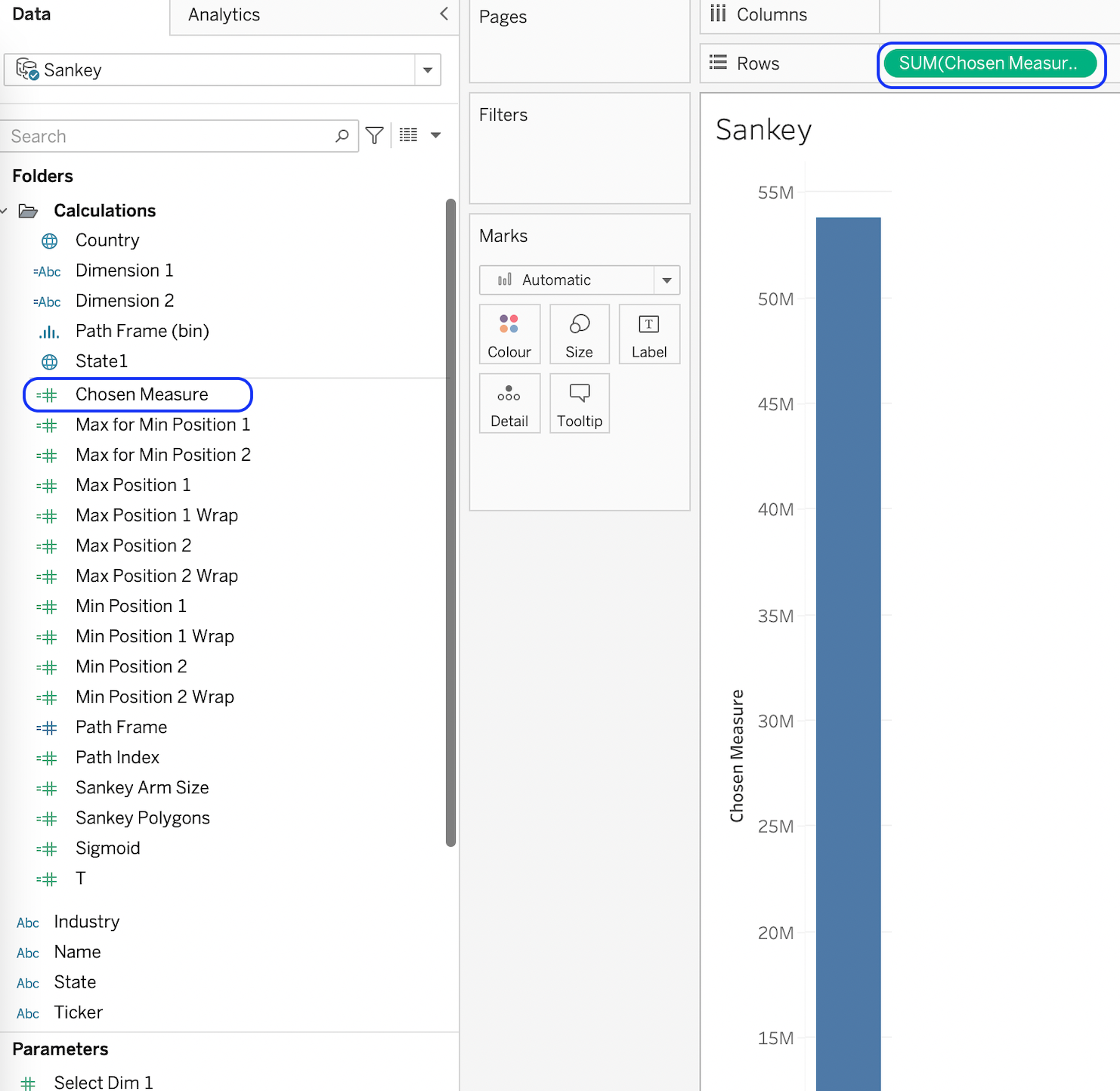
- Create a new worksheet and drag [Chosen Measure] to rows.
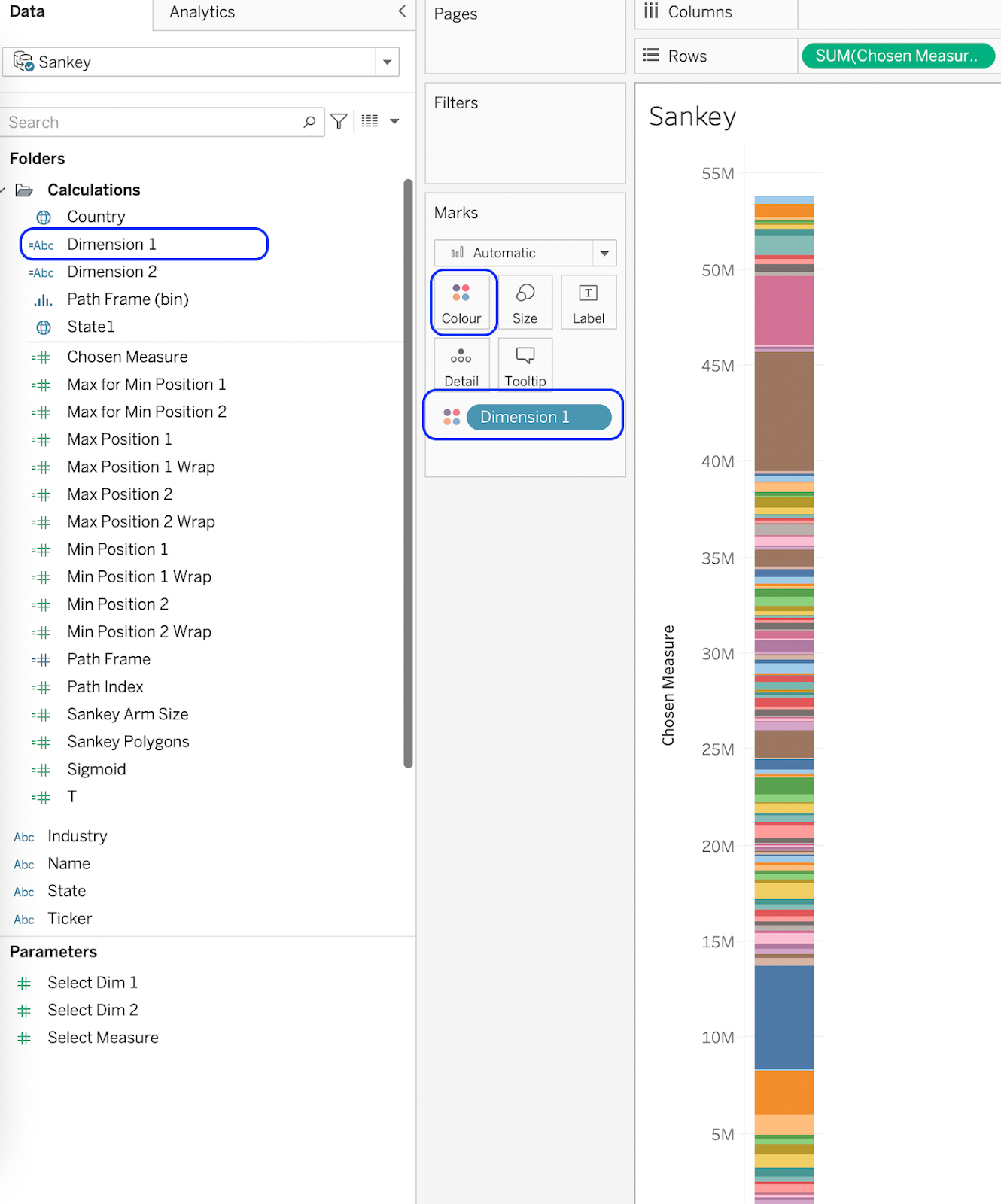
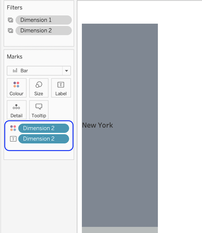
Add [Dimension 1] to colour card. This will split the bar into segments based on the dimension you have selected in the [Select Dim 1] parameter.
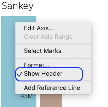
Hide the Y axis by unchecking Show Header
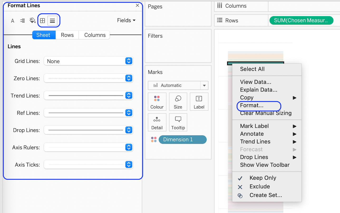
- Remove the borders, gridlines, and reference lines to make the display cleaner.
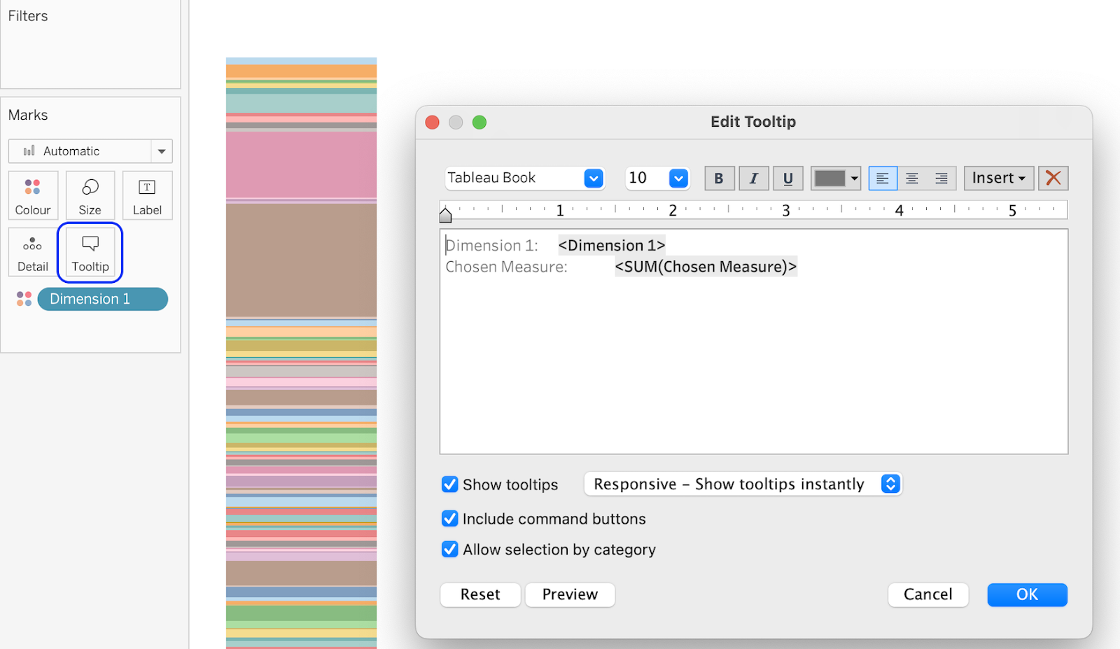
- Remove or alter the tooltip which is displayed when the user hovers over one of the bars.
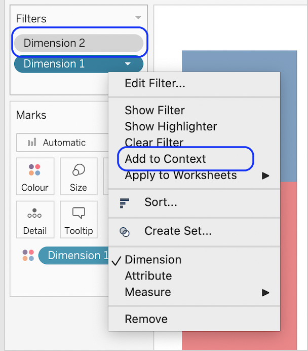
If you have a lot of individual dimension values, you might want to filter the dataset to only show ones of interest. This will make the relationships between the dimensions easier to see because there will be fewer curves. Add [Dimension 1 ] and [Dimension 2] to the filters shelf, apply the filters, and add the filters to the context.
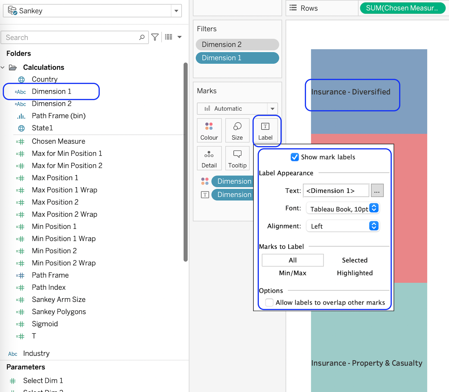
Add labels to identify the bar segments.
Repeat these steps to create the right-hand side but this time use [Dimension 2] as the main dimension.
- Finally, we can bring all 3 sheets into a dashboard. Alter the colour scheme, font formatting, background etc to suit. Make the parameters and filter visible to encourage interaction.
Congratulations! You’ve made a Tableau Horizontal Sankey Chart!
For more on learning about how to create in Tableau, head over to our blog. For more on Tableau consulting to help your company deliver successful Tableau and data projects for finance, marketing and sales head over to our website.