Welcome to our latest blog post, where we delve into the world of Tableau line charts, an essential tool in the arsenal of data visualization. With their simplicity and clarity, line charts are a cornerstone in presenting data in an easily digestible format. Whether you’re a data analyst, a student, or someone interested in understanding trends and patterns, these charts are invaluable.
Related posts:
- Our Amazing Tableau GDPR Compliance Guide
- 10 Amazing Tableau Healthcare Dashboard Examples
- Unlock Insights with These 7 Powerful Tableau COVID Dashboards
- Unlock the Power of Tableau Project Management: 7 Inspiring Dashboard Examples
- Hotspots, Trends, and Patterns: 5 Mind Blowing UFO Sightings Maps
- 5 Amazing Hotel Dashboard Examples to Elevate Your Hospitality Operations
This post presents 30 distinctive examples of line charts, each serving a unique purpose. From tracking financial market trends to monitoring climate changes or analyzing web traffic data, our examples span many applications. We aim to illustrate not just the versatility of line charts but also how subtle variations in their design can significantly impact their effectiveness and readability.
Join us as we explore these examples, offering insights into how each chart is crafted and the specific contexts where they shine. Whether you’re looking to improve your chart-making skills or appreciate the art of data visualization, there’s something here for everyone. Let’s dive into the world of lines and trends!
(These charts have been taken from here; we do not take credit for these nifty line charts!)
Table of Contents
#1 Basic Tableau Line Chart
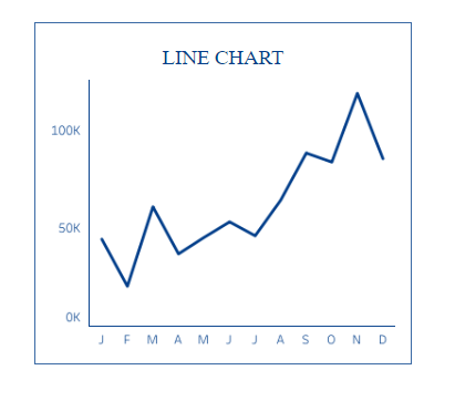
This is a Tableau line chart, a graph commonly used to display information as a series of data points called ‘markers’ connected by straight line segments. It is beneficial for showing trends over intervals of time – in this case, monthly. Looking at the line’s progression, one can quickly understand how its value changes throughout the year. This can be useful for tracking the performance of a business metric, such as sales or user engagement, and for making forecasts or decisions based on the observed trends.
#2 Tableau Line Chart with Dashed Line
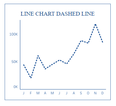
This is a Tableau line chart with a dashed line commonly used to represent data trends over time. The dashed line style might distinguish this data set from others in the same chart or indicate projected or incomplete data. This chart plots points along the vertical axis, representing a quantity (labelled 0K to 100K), against intervals along the horizontal axis, representing time (marked from January to December). It helps visualize patterns or changes in data, such as sales, stock prices, or temperature, over a year, allowing for analysis of peaks, troughs, and general trends.
#3 Line Chart with Size
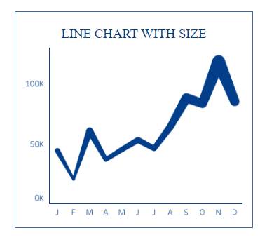
The image shows a line chart where the thickness of the line varies, possibly indicating the size or another dimension of the data, such as volume or magnitude. The chart spans a timeline from January to December on the horizontal axis and shows values from 0K to 100K on the vertical axis. This type of chart can help show trends over time and give visual emphasis to periods with larger quantities or more significant activity, thereby providing a quick and intuitive way to assess when specific values have more weight or importance within the dataset.
#4 Tableau Line Chart Dotted I
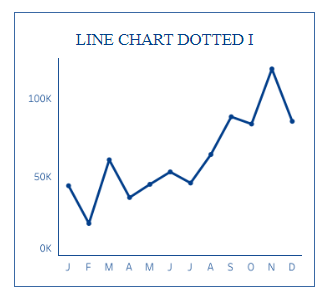
The image shows a line chart with a series of data points connected by a dotted line. This chart is typically used to track changes over periods, with the horizontal axis representing time (January through December) and the vertical axis representing quantity (from 0K to 100K). The dotted line can suggest a tentative trend or forecast future data points. It helps visualize the changes in data values, such as monthly sales figures, allowing for analysis of periodic trends, increases, and decreases over a year.
#5 Line Chart Dotted II
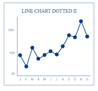
The image displays a dotted line chart with large circular markers at each data point. This type of Tableau line chart is often used to visualize data trends over a period, in this case, a year from January to December, represented on the horizontal axis. The vertical axis shows numerical values ranging from 0K to 100K. The circular markers emphasize each data point, making it easy to see monthly values. This can be particularly helpful for identifying specific data points within the overall trend, such as monthly sales, user engagement, or other metrics that change over time.
#6 Line Chart Dotted III
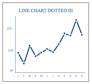
This image features a dotted line chart with small circular markers at each data point. This chart visualises data points over time, specifically over a year, from January (J) to December (D), indicated on the horizontal axis. The vertical axis displays values from 0K to 100K. The dotted lines with markers help to clearly distinguish each month’s data point, which helps identify trends, periodic fluctuations, and specific values in data sets such as financial figures, website traffic, or temperature readings. Such charts are valuable for detailed analysis and comparison of data over set intervals.
#7 Tableau Line Chart with Color
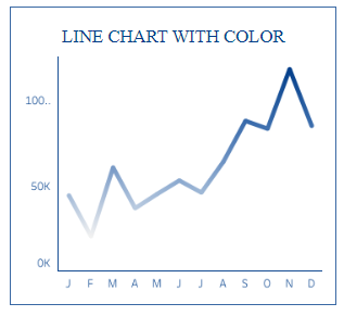
The image shows a coloured Tableau line chart that represents data points over time. The x-axis is labelled with January through December (J, F, M, A, M, J, J, A, S, O, N, D), and the y-axis shows numerical values ranging from 0K to 100K. The line’s colour enhances visibility and can be used to differentiate this data from other data in a multi-line chart or to add visual appeal. This chart type is useful for tracking changes or trends in data across different periods, such as sales, population growth, or website traffic, enabling quick assessment and decision-making based on the visualized data trends.
#8 Tableau Curved Line Chart
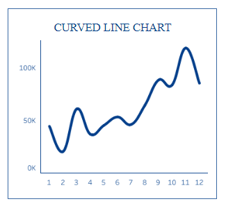
The image depicts a curved Tableau line chart, where the data points are connected by a smooth, flowing line instead of straight segments. The horizontal axis is numbered from 1 to 12, likely representing the months of the year, while the vertical axis is marked with values ranging from 0K to 100K. This type of chart helps illustrate trends and patterns in data over time in a more visually appealing way, as the curves can make the progression between points appear more natural and highlight the rate of change more subtly than a straight-line chart. It is commonly used in finance, meteorology, and marketing to analyze and present data in an easily interpretable format.
#9 Tableau Step Line Chart
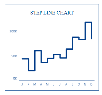
The image presents a step line chart characterized by horizontal and vertical lines that connect data points in a series of steps. This chart type is particularly effective for representing data that changes at specific intervals, highlighting the exact points of change. The horizontal axis shows the months from January to December (J, F, M, A, M, J, J, A, S, O, N, D), while the vertical axis is scaled from 0K to 100K. Step line charts help visualize inventory levels, interest rates, or other data where changes occur at distinct times rather than gradually, making it clear when they occur.
#10 Min & Max Line Chart
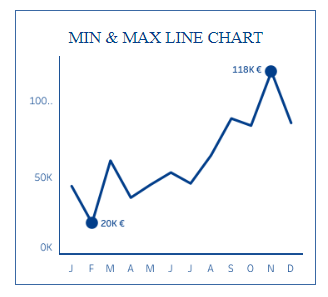
The image displays a min and max Line Chart, a variation of the standard line chart that specifically highlights the minimum and maximum values within the dataset. This chart tracks data over a period, indicated by the horizontal axis labelled with months January through December (J, F, M, A, M, J, J, A, S, O, N, D). The vertical axis shows values from 0K to just above 100K. The lowest value is marked with a large dot labelled “20K €,” the highest value is similarly marked and labelled “118K €.” This chart is helpful for quickly identifying the extremes in a dataset, which can be particularly valuable for financial analysis, sales, or performance metrics, providing clear visual cues for critical data points.
#11 N vs N-1 Tableau Line Chart
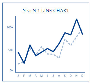
The image depicts an N vs N-1 Line and area Chart, combining a line chart and an area chart. It features a dotted line that represents data from the current period (N) and a shaded area underneath that illustrates the data from the previous period (N-1). This is spread across a 12-month timeline, labelled from January to December on the horizontal axis, while the vertical axis indicates a range from 0K to 100K. This chart type is beneficial for visualizing the degree of change or variance between two time periods, with the area fill providing a quick visual indication of the extent and direction of differences between periods, useful for financial analysis, sales review, or performance tracking.
#12 N vs N-1 Area Chart
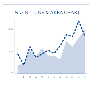
The image depicts an N vs N-1 Line and area Chart, combining a line chart and an area chart. It features a dotted line that represents data from the current period (N) and a shaded area underneath that illustrates the data from the previous period (N-1). This is spread across a 12-month timeline, labelled from January to December on the horizontal axis, while the vertical axis indicates a range from 0K to 100K. This chart type is beneficial for visualizing the degree of change or variance between two time periods, with the area fill providing a quick visual indication of the extent and direction of differences between periods, useful for financial analysis, sales review, or performance tracking.
#13 Forecast Tableau Line Chart (Tableau Native)
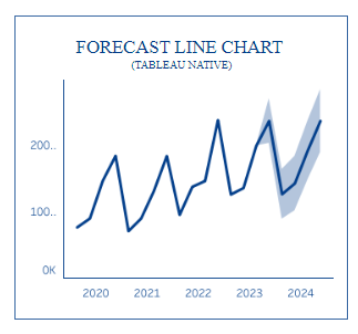
The image displays a Forecast Tableau Line Chart created with Tableau, a popular data visualization tool. This chart type combines historical data visualization with a forecasted trend. The solid line represents historical data, while the shaded area and line indicate the predicted future trend, extending beyond the last recorded data point. It covers a five-year period from 2020 to 2024, with the vertical axis ranging from 0K to 200K. Forecast charts like this are handy for predicting future values based on past trends, aiding in planning and decision-making processes in finance, sales, resource management, and more. The chart allows viewers to understand potential future outcomes with associated confidence intervals represented by the shaded area.
#14 Negative Colors Line Chart
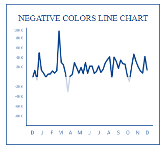
The image illustrates a Negative Colors Tableau Line Chart, representing data including positive and negative values. The vertical axis ranges from -8K€ to 10K€, while the horizontal axis spans 12 months, from January (J) to December (D). This chart type is beneficial for visualizing financial data, such as profits and losses, over time. The areas below the horizontal zero line are often shaded or coloured differently to distinguish negative values from positive ones. Doing this allows for an immediate visual cue to the viewer where losses occurred throughout the year.
#15 Negative Colors Area Chart
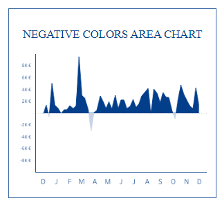
The image shows a Negative Colors Area Chart, which is an area chart that highlights both positive and negative values. The vertical axis is marked from -8K€ to 8K€, and the horizontal axis spans from January to December (D, J, F, M, A, M, J, J, A, S, O, N, D). This chart type is beneficial for displaying the magnitude of changes over time, such as profits and losses, cash flows, or temperature variances. The negative values are typically represented with a different colour or shading below the zero line, making it immediately apparent when the values dip below zero. This visual differentiation helps in quickly assessing periods of growth versus decline.
#16 Tableau Connected Scatter Plot
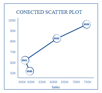
The image shows a Connected Scatter Plot, a graph combining features of a scatter plot and a line chart. Each point represents a data point on the plot, with the horizontal axis labelled ‘Sales’ ranging from 450K to 750K and the vertical axis ranging from 50K to 100K. The 2020, 2021, 2022, and 2023 data points are connected sequentially by a line. This chart helps show the relationship between two variables (in this case, sales and another metric) and track changes in that relationship over time. It’s commonly used to visualize trends or progressions in datasets where both dimensions are significant.
#17 Tableau Slope Chart
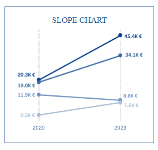
The image displays a Slope Chart, which compares values over two-time points. It shows data from 2020 to 2023, with values at each end ranging from 0.5K € to over 45K €. Lines connect the values from the first year to the second, visually representing the change. This chart type is beneficial for observing the difference rate between two periods for multiple categories or groups. In this chart, the steeper the slope, the more significant the change. Slope charts effectively compare the performance of different segments or entities within the same category, such as sales figures for other products or departments.
#18 Tableau Spread Slope Chart
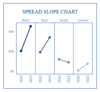
The image depicts a Spread Slope Chart, which compares value changes across different categories over two time points. It displays four categories: West, East, South, and Central. Each category has a pair of values for 2020 and 2023, connected by a line, showing the change over this period. The vertical axis shows values from 0K to 40K. This chart type helps visualize the performance or growth rates across different regions or segments. It allows for easy comparison to see which areas have experienced growth or decline and the magnitude of that change relative to each other.
#19 Tableau Ratio Line Chart
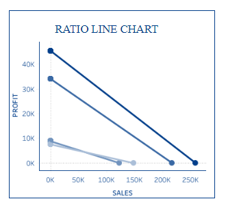
The image illustrates a Ratio Tableau Line Chart designed to show the relationship between two variables. The chart plots ‘Profit’ against ‘Sales’ in this case. The vertical axis represents profit from 0K to 40K, and the horizontal axis represents sales from 0K to 250K. The lines connect points that define the profit-to-sales ratio at different levels. This type of chart is beneficial for analyzing the efficiency of sales in terms of profit generation. It helps understand how profit is affected as sales increase or decrease, which is critical for business analysis and strategic planning.
#20 Tableau Bump Chart
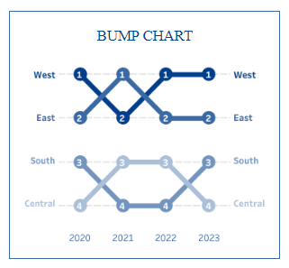
The image shows a Bump Chart, which is used to visualize changes in rank over time across different categories or groups. This chart tracks the rankings of four groups—West, East, South, and Central—from 2020 to 2023. Each line represents one group, and the positions at which the lines intersect indicate changes in ranking relative to each other. Numbers along the lines show the rank position for each group in each year. Bump charts are beneficial for identifying shifts in position, such as the most sales, highest scores, or other rankable data, making it clear when and how the ranks change over the period observed.
#21 Tableau Spark Lines
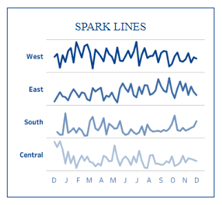
The image displays a set of Spark Lines, which are small, simple charts without axes that are used to show trends in data over time. They are presented for four categories—West, East, South, and Central—and span a timeline from January to December (D, J, F, M, A, M, J, J, A, S, O, N, D). Sparklines are particularly useful for compactly visualizing and comparing the fluctuation or performance of multiple items over a period within a limited space. They are often used in reports or dashboards where the area is at a premium and focuses on showing patterns or trends rather than specific values.
#22 Tableau Gradient Area Chart
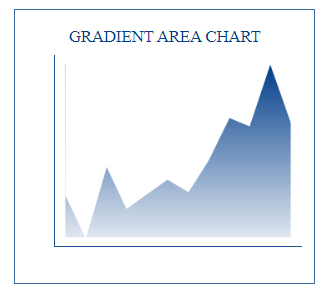
The image depicts a Gradient Area Chart characterized by a filled area under the line graph with a gradient colour scheme. The gradient typically represents the density or intensity of data at different points or can be used simply for aesthetic appeal. This type of chart is used to visualize the volume or magnitude of data over a period, allowing for the assessment of trends, patterns, and cumulative effects. The area fill provides a quick visual cue about the relative size of the data throughout the period, making it useful for presentations or dashboards where a dramatic visual impact can help to communicate the information effectively.
#23 Tableau Stacked Area Chart
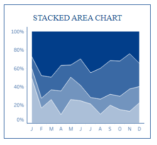
The image illustrates a Stacked Area Chart, where different data series are stacked on top of one another to show the cumulative total. The horizontal axis represents the months from January to December, while the vertical axis indicates a percentage scale from 0% to 100%. This chart type is useful for comparing multiple data series over time and understanding their part-to-whole relationships. It allows viewers to see the overall trend and how the individual categories contribute to the total. This is particularly helpful in scenarios where understanding the distribution of components, like market share or revenue sources, is essential.
#24 Tableau Unstacked Area Charts
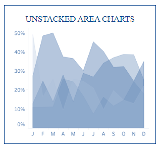
The image shows Unstacked Area Charts, which display the volume of different data series as separate areas on the same graph without stacking them on top of each other. The horizontal axis represents the months from January to December, and the vertical axis indicates a percentage scale from 0% to 50%. These charts help visualize the individual trends of each data series over time, allowing for comparison without the cumulative effect seen in stacked charts. They help independently assess each series’s relative performance, making them suitable for analyzing data like website traffic sources, sales by product category, or resource allocation over a period.
#25 Tableau Spark Area Chart
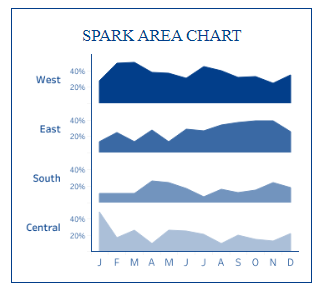
The image features a Spark Area Chart, a collection of miniaturized area charts used to display trends over time for different categories—in this case, West, East, South, and Central. Each mini-chart has its percentage scale on the y-axis, ranging from 20% to 40%, and shares a familiar timeline on the x-axis, representing the months from January to December. Spark area charts are handy for comparing trends across multiple categories within a small space, such as on dashboards or in executive summaries, where they provide a quick visual comparison without detailed numerical data.
#26 Tableau Joy Plot
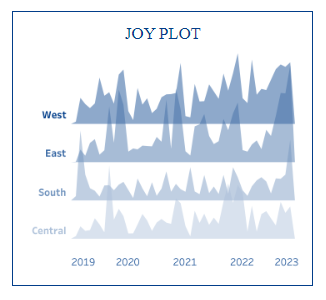
The image shows a Joy Plot consisting of layered area charts, each representing a different category (West, East, South, Central) from 2019 to 2023. Joy Plots help compare the distribution and frequency of a dataset over time or across different categories. They are accommodating when you want to visualize the changes in patterns or densities within multiple groups and can reveal underlying trends that might be missed in other charts. This type of visualization is often used for data where the shape and peaks of the distribution are of interest, such as temperature variations, price changes, or population dynamics over different regions or periods.
#27 Tableau Seismogram
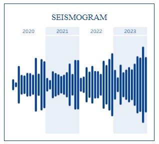
The image depicts a Seismogram, a record produced by a seismograph that measures the motion of the ground, typically used to detect and record earthquakes. It shows readings over a period from 2020 to 2023. The vertical lines of varying heights represent the amplitude of ground vibrations over time. Seismograms are essential for geologists and seismologists as they help understand and analyse the strength, duration, and characteristics of seismic waves generated by earthquakes. This data is crucial for assessing earthquake intensity, determining the location of the epicentre, and predicting potential impacts on structures and populations.
#28 Line Chart Slider
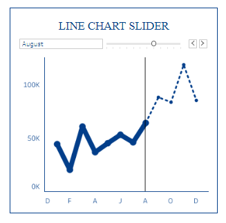
The image illustrates a Tableau Line Chart Slider, a line chart incorporating an interactive slider component. The diagram shows data points connected by lines, representing a trend over time. The horizontal axis is labelled with single letters likely representing months (D, F, A, J, A, O, D), and the vertical axis ranges from 0K to 100K. The slider, positioned above the chart, allows the viewer to select a specific data segment for closer examination—in this case, it’s set to “August.” This chart type is beneficial for interactively exploring datasets, focusing on specific time frames, and making dynamic presentations that can adjust to show particular data portions on demand.
#29 Time Series Line Chart
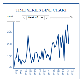
The image presents a Time Series Line Chart, a graphical representation of data points spaced at consistent intervals, showcasing how a particular data set changes over time. The x-axis is labelled with weeks (W3 to W51), and the y-axis measures values from 0K to 30K. An interactive slider labelled “Week 48” suggests that the chart allows users to focus on data from a specific time frame within the series. Time series line charts are valuable for tracking the progression or patterns of data, such as sales, stock prices, or temperature over weeks. They can be instrumental in forecasting future trends based on past behaviour.
#30 Highlight Line Chart
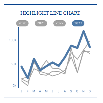
The image shows a Highlight Line Chart, a multi-year line chart with one line emphasized to stand out. This chart compares several years of data—2020, 2021, 2022, and 2023—mapped out over the months (January to December) on the x-axis, with the value range from 0K to 100K on the y-axis. The year 2023 is highlighted, drawing the viewer’s attention to the trend of that specific year. Highlight line charts are useful for visual comparisons over multiple periods, allowing viewers to focus on a single trend while still observing the context provided by the other data. They can be beneficial for identifying anomalies or patterns in the highlighted data within a historical context.


