What is a Tableau Radial Times Series Chart?
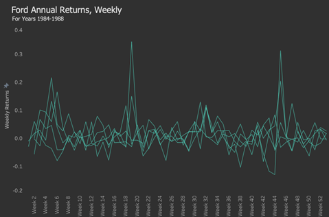
Most standard charts have a radial version that looks more trendy. In many cases, these fancy chart designs come at a cost to interpretability. However, a Tableau radial time series chart seems to do something better than a standard time series, showing cyclical patterns in the data. Note below how we can spot patterns quickly and see how many years are in the data.
Table of Contents
Data Source to Follow Along and Make Radial Time Series in Tableau
To complete the tutorial, download this dataset, which is the weekly return of the cyclical ticker F (Ford). This stock was chosen because it is a well-known cyclical stock, and perhaps this will show up in the radial time series to illustrate its usefulness.
Tableau Radial Times Series Chart: Type 1
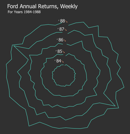
Below is an example of another type of Tableau Radial Time Series Chart. It moves clockwise; from the top outer layer (also looking at inner layers), we can see spikes at Week 5 (roughly 1 o’clock) for all years. We see more spikes in Week 19 (roughly at 5 o’clock). Also, there are spikes at Week 45 (approximately 10 o’clock) for all years. This cyclic behaviour is easier to see in a radial chart than the standard one.
Tableau Radial Times Series Chart :Type 2
Let’s build a Tableau Radial Time Series Chart!
The steps for building a Tableau radial time series chart are similar to many charts using polar coordinates. Now, let’s get to it! Let’s start with the parameters we need.
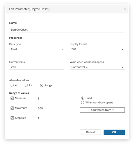
Degrees Offset
It is not required but is convenient for helping to rotate the chart as desired.
Calculated Fields: Index
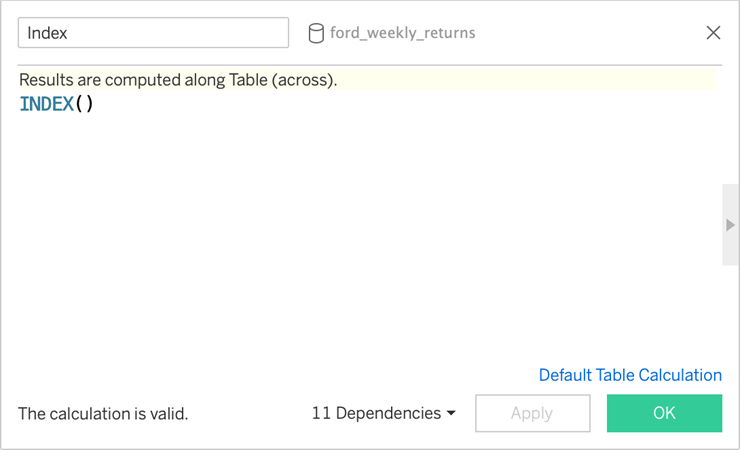
This helps determine angular placement in another calculation.
Index_Window_Max
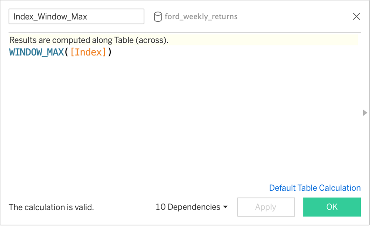
Divide 360 by the maximum number of marks in a layer to determine angular size.
Angle Size
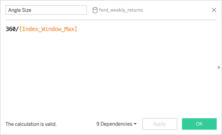
The angle size for each mark to be placed in the view.
Radians
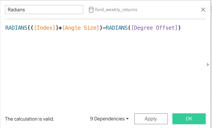
Roll up the angular coordinates into Radians.
What about negative return values on a Tableau Radial Time Series Chart?
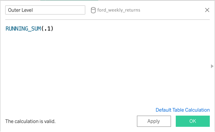
Outer Length Adds a radius to the circle. It’s not necessarily required, but some weeks may have negative returns here. So, the radius not only serves to create an inside buffer but, more importantly, controls for negative values that would flip to the opposite side of the circle. (The negative return values are all small decimals, so adding one makes everything optimistic here.)
Sin
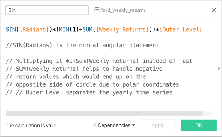
Calculates the placement of each mark for the Y axis.
Cos
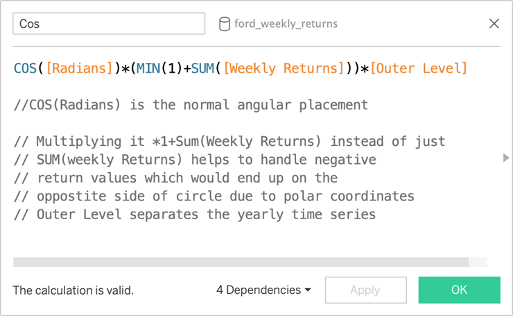
Calculates the placement of each mark for the X-axis.
Now, here are the Directions to our Tableau Radial Time Series Chart :
- Drag Date to the marks card. Set aggregation to Week Number or DATEPART(week’, [Date]).
- Drag Date to the marks card again. Set aggregation to Year or DATEPART( ‘year’, [Date])
- Drag Date to the Filters shelf. Filter for years 1984 to 1988.
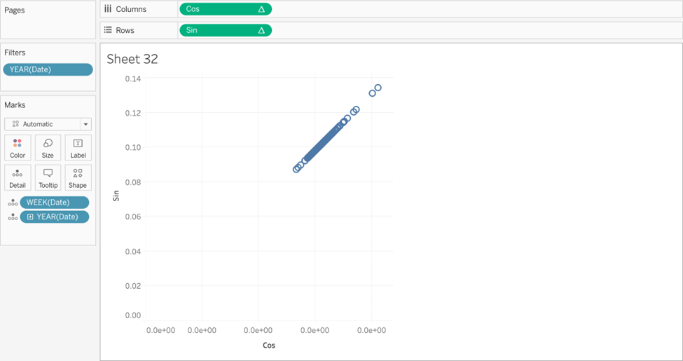
- Drag Cos to Columns.
- Drag Sin to rows.
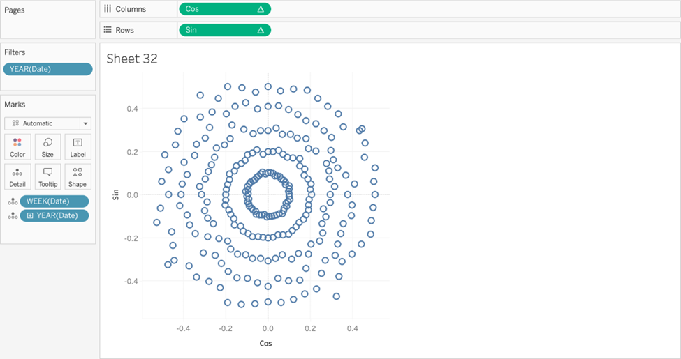
Your view to your Tableau Radial Time Series chart should look like this:
Not to worry, we will edit the table calculations to update the look of the view
6. For both the Sin and Cos fields, select the dropdown on each pill >> Edit Table
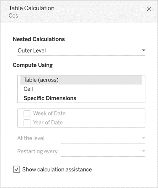
Calculation
7. Using the Table Calculation window, calculate the following table calculations as such:
For Index, select Week of Date.
For Index Window Max, select Week of Date.
For Outer Level, select Year of Date.
You should now have this view:
8. On the Marks card, change the chart type to Line.
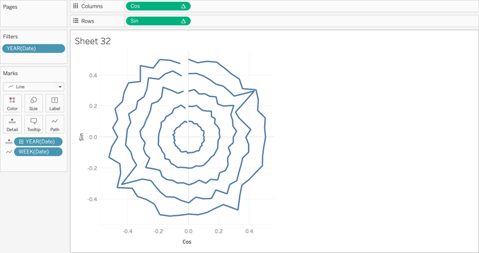
9. Drag WEEK(Date) to path.
You now have a radial time series! Now, let’s add some finishing touches to make it pop. Change colours, add labels, and rotate the chart.
1. Remove all grid lines, axis rulers, row and column dividers, and zero lines.
2. Drag Year of Date to label.
3. Label the start or end of the line. Use the year as a label. Here, we formatted the year to the last 2 digits and used ‘ <YEAR(Date)>↘ as our label.
4. Edit the Degrees Offset parameter to rotate the chart as desired. Here, we chose to rotate by 270 degrees for a vertical orientation.
5. Multiply the [Cos] pill by -1. Ex. [Cos*-1] to flip the chart horizontally to run clockwise instead of counterclockwise.
6. Add an informative title and subtitle.
7. Change chart background color to #303030
8. Change lines to #50D3BD.
9. Edit line thickness as desired.
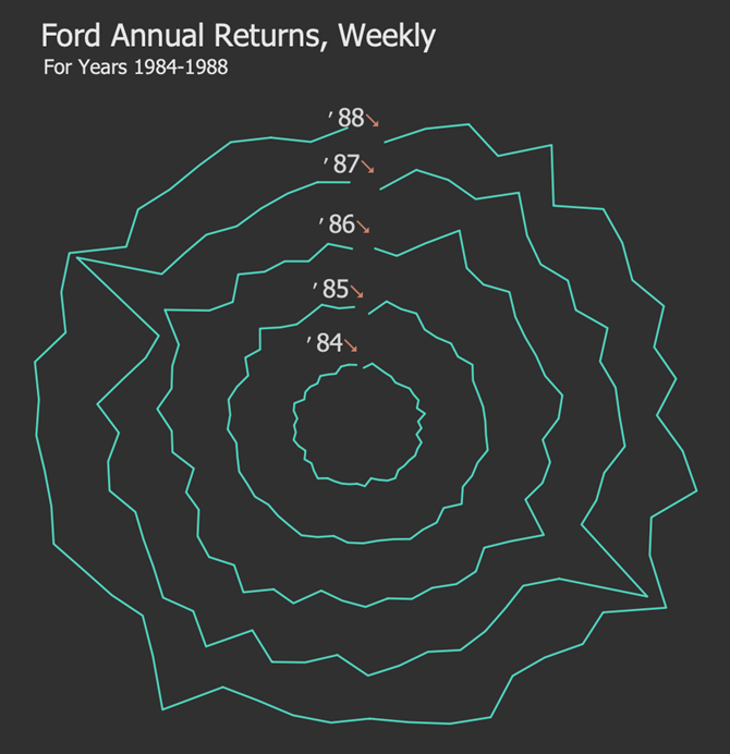
Voila! You have a beautiful Tableau Radial Time Series Chart!
Final Words about Tableau Radial Time Series
A Tableau Radial Time Series chart does an excellent job of showing cyclical patterns for Ford’s returns between 1984 and 1988. However, the standard diagram would be better if the goal is to offer the actual quantities of the returns.
Feel free to experiment with other runs of years, such as 2012 to 2019. It is usual for time series behaviour to change, but typically, the years near each other will have the same trends as these years in the 80s did.
We encourage you to edit the chart creatively, using a dual axis to enhance it further! For more great ideas and help on Tableau Charts, head to our blog at Quantize Analytics. Happy building!
Please let us know if you want to see a tutorial for a chart we have not covered yet!