Welcome to our focused exploration of financial data visualization, where we present seven distinct Tableau income statement examples. Through this blog post, we’ll showcase how Tableau’s powerful visual analytics can transform the traditional income statement Tableau into interactive, detailed dashboards, including the Tableau profit and loss example and the Tableau income statement example. From the simplicity of a Tableau P&L dashboard to the comprehensive Tableau income statement dashboard, we demonstrate the clarity and strategic depth that Tableau brings to financial reporting. Whether you’re fine-tuning business strategies, examining an income statement Tableau, or evaluating a profit and loss dashboard Tableau, these examples serve as an indispensable resource for financial professionals seeking to enhance profitability and operational insight.
Table of Contents
#1 Income Statement Examples – Year-to-Date Income Statement
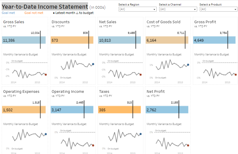
Explore this intuitive Tableau income statement dashboard, which offers a Year-to-Date analysis of key financial indicators in thousands, benchmarking current performance to previous years and budget goals:
- Gross Sales: A critical metric indicating a surge from the last year.
- Discounts: There is a slight escalation of the prior year, affecting gross sales.
- Net Sales: Reflect a positive trajectory post-discounts.
- Cost of Goods Sold: Higher than the previous year, impacting gross profit.
- Tableau Gross Profit: Reveals a notable increase after subtracting COGS.
- Operating Expenses: Elevated from the last year, influencing operating income.
- Tableau Operating Income: Showcases a substantial hike, improving net profit.
- Taxes: A decrease from the previous year, enhancing the profit and loss dashboard Tableau.
- Net Profit: Exemplifies a remarkable upswing, pivotal for strategic decision-making.
The dashboard is ideal for executives, financial analysts, and investors to assess economic performance using the Tableau profit and loss statement, aiding in strategic decision-making.
#2 Income Statement Examples – Income Statement Summary
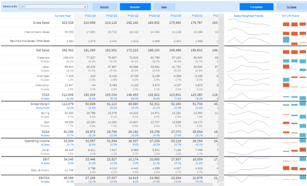
A comprehensive Tableau P&L dashboard summarizing a company’s financial stance over different periods with monthly, quarterly, and yearly data:
- Gross Sales: Aggregate sales revenue figures.
- Intercompany Sales: Within subsidiaries or divisions.
- Returns & Allowances: Reductions impacting net sales.
- Net Sales: Post-deductions revenue.
- Costs: Materials, Labor, Overhead, Absorption percentages.
- COGS: Direct costs tabulated in the Tableau income statement example.
- Gross Margin: Net sales less COGS, indicating production cost profitability.
- Selling & G&A Expenses: Costs for sales and general administration.
- Operating Income: Profits post-operational costs.
- EBIT: Demonstrates operating profits in this income statement Tableau.
- Depreciation & Amortization: Asset cost spread over time.
- EBITDA: Shows pre-tax, interest, depreciation, and amortization earnings, a crucial component of the profit and loss dashboard Tableau.
Visual trend graphs illustrate sales performance and growth, which is vital for financial professionals using Tableau for strategic business health monitoring.
#3 Income Statement Examples – Sankey Funnel Income Statement
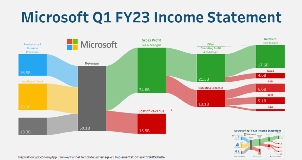
A visual Tableau income statement dashboard representing Microsoft’s financials in a Sankey diagram:
- Total Revenue: Productivity and Business Processes, Intelligent Cloud, and More Personal Computing contribute to a substantial revenue pool.
- Cost of Revenue and Gross Profit: Displaying a solid gross margin.
- Operating Expenses: Detailed R&D, S&M, and G&A expenses, critical for operational analysis.
- Operating Profit: A robust margin highlighting operational efficiency.
- Taxes and Net Profit: Illustrating a formidable net margin, showcasing efficiency in the Tableau profit and loss statement.
Ideal for stakeholders who require a clear, visual understanding of financial health, the Tableau income statement dashboard is a strategic asset for investment and planning.
#4 Income Statement Examples – Profit & Loss Dashboard
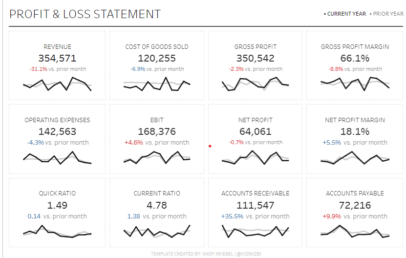
A concise Tableau P&L dashboard detailing critical metrics for financial assessment:
- Revenue: Dips and growth compared to previous periods.
- COGS: Direct costs and their month-over-month implications.
- Gross Profit and Margin: Insight into profitability per revenue dollar.
- Operating Expenses: Reductions indicating cost-saving strategies.
- EBIT: Increases suggesting operational profitability within the profit and loss dashboard Tableau.
- Net Profit and Margin: Bottom-line profitability ratios.
- Liquidity Ratios: Quick and Current ratios showing short-term financial health.
- Receivables & Payables: Indicating sales trends and cash flow implications.
This dashboard allows management, investors, and analysts to assess financial health and make informed decisions swiftly.
#5 Income Statement Examples – Profit & Loss Statement
A concise Tableau P&L dashboard detailing critical metrics for financial assessment:
- Revenue: Dips and growth compared to previous periods.
- COGS: Direct costs and their month-over-month implications.
- Gross Profit and Margin: Insight into profitability per revenue dollar.
- Operating Expenses: Reductions indicating cost-saving strategies.
- EBIT: Increases suggesting operational profitability within the profit and loss dashboard Tableau.
- Net Profit and Margin: Bottom-line profitability ratios.
- Liquidity Ratios: Quick and Current ratios showing short-term financial health.
- Receivables & Payables: Indicating sales trends and cash flow implications.
This dashboard allows management, investors, and analysts to assess financial health and make informed decisions swiftly.
#6 Income Statement Examples – Profit & Loss Dashboard
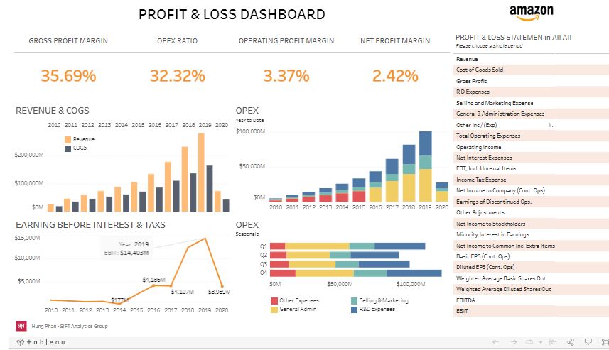
This Profit & Loss (P&L) dashboard presents a multi-year financial overview of Amazon, focusing on key performance indicators (KPIs) and financial metrics through 2020. The dashboard is divided into several sections, each providing valuable insights into Amazon’s financial health.
Key Performance Metrics:
- Gross Profit Margin: At 35.69%, it measures the percentage of revenue exceeding the cost of goods sold (COGS).
- OPEX Ratio: Stands at 32.32%, indicating operating expenses as a share of total revenue.
- Operating Profit Margin: At 3.37%, this reflects the percentage of revenue remaining after deducting operating expenses.
- Net Profit Margin: This shows that 2.42% of revenue is net income.
Financial Trends:
- REVENUE & COGS: The bar chart shows a steady increase in revenue over the years, with the cost of goods sold (COGS) also rising, but at a slower pace.
- OPEX: The stacked bar chart represents operating expenses (OPEX) by quarter, showing seasonality and trends over the years.
Earnings Before Interest & Taxes (EBIT):
- A line chart showing a significant dip in EBIT in 2014, followed by a recovery and growth, peaking in 2019.
The dashboard is handy for investors, financial analysts, and corporate management. It enables a quick assessment of Amazon’s profitability, cost management, and revenue growth over time. The visual format helps identify trends, understand seasonal impacts on expenses, and evaluate the company’s efficiency in generating profit from its operations. The ability to choose a single period for a detailed P&L statement adds to its utility, providing a focused financial snapshot for deeper analysis.
#7 Income Statement Examples – Quantize Analytics Tableau Income Statement
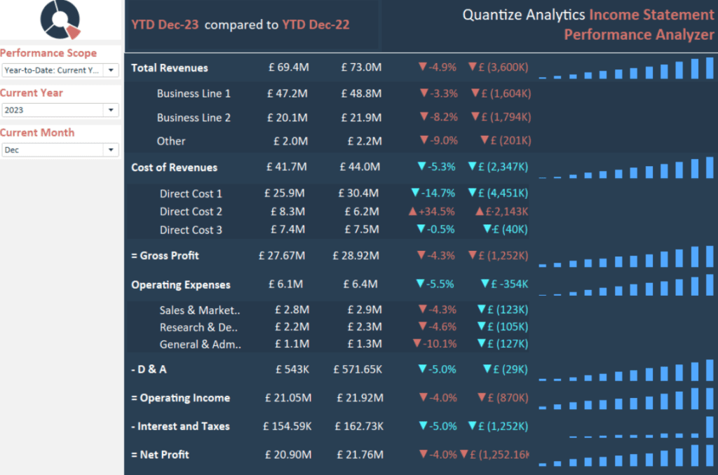
The Tableau Income Statement Dashboard presents a year-to-date financial comparison for December 2023 against December 2022, illustrating a detailed performance analysis for Quantize Analytics. It encapsulates temporal flexibility by allowing modifications based on the current year and month for a dynamic income statement Tableau.
Total Revenues: A £69.4M total revenue is reported on the Tableau profit and loss statement for the current period, reflecting a 4.9% dip from the past year’s £73.0M, a critical metric for evaluating sales vigour.
Revenue Breakdown: The profit and loss dashboard Tableau delineates revenues across Business Lines 1 and 2, and Other categories, with percentage changes marking the variance from the prior year, providing insights into segment performance.
Cost of Revenues and Gross Profit: This Tableau P&L dashboard itemizes direct costs across three categories, highlighting a 14.7% decline in direct costs. The gross profit has similarly retracted by 4.3% YTD, offering essential data for crafting cost management approaches.
Operating Expenses and Income: The Tableau income statement dashboard depicts operating expenses, including sales and marketing and general and administrative, alongside operating income, which is integral for assessing operational productivity.
Net Profit: The Tableau profit and loss example illustrates net profit, indicating a 4% contraction, an alert for profitability scrutiny.
Bar charts accompanying the Tableau income statement example simplify the interpretation of percentage fluctuations, presenting a quick scan of fiscal health. This dashboard is an indispensable tool for financial analysts, managers, and stakeholders, delivering succinct and transparent financial information for strategic planning, budgeting, and performance enhancement.