At Quantize Analytics, our enthusiasm for data visualization is deeply connected with using a Tableau Style Guide efficiently. This invaluable guide isn’t merely a tool but a pivotal, reusable asset, essential for crafting data visualizations effortlessly while maximizing impact, answering the question of many on “How do I make my Tableau dashboard look nice?”.
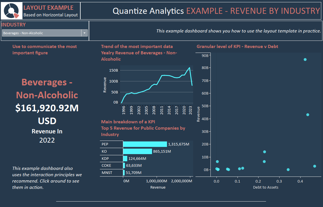
Table of Contents
Efficiency Through Design Principles
Incorporating crucial design principles, our Tableau Dashboard Style Guide is a comprehensive blueprint for crafting clear and compelling visual communications. This guide, steeped in Tableau design best practices, guarantees an enhanced user experience by acting as a guiding light, eliminating repeated design conceptualizations, thereby saving time and resources. Your data analysts will thank you.
Minimizing Rework with Style Guide Tableau
As your committed analytics consultants, we utilize the Tableau Dashboard Style Guide, a dynamic reusable asset significantly reduces rework. This style guide tableau simplifies the intricate process of dashboard development, ensuring intuitive data navigation and rapid insight generation without incessant adjustments and redesign needs.
Consistent and Branded Tableau Dashboards
Our adept design team seamlessly integrates Tableau Dashboard Design Best Practices outlined in the Style Guide, producing visually appealing and user-centric dashboards. In scenarios where design nuances might be neglected, our Style Guide serves as an invaluable reference, minimizing expensive and unnecessary design alterations and presenting itself as a valuable asset.
Investment in Reusable Style Guide Tableau
Investing in a well-constructed Tableau Style Guide is prudent for organizations aiming to craft standardized and branded Tableau dashboards efficiently. The guide, rich with tableau style guide examples, facilitates the creation of professional dashboards with consistent formatting, layout, fonts, and icons, removing the necessity for constant redesigns.
Practical Examples & Easy Accessibility
Quantize Analytics provides a Style Guide that is practical and rich with tableau style guide examples. Crafted meticulously within Tableau, it offers a tangible, easy-to-follow blueprint, ensuring your team achieves design excellence without any guesswork involved.
Seamless Publishing & Deployment
With a design that supports effortless publishing on the Tableau Server, the Style Guide is readily accessible to all developers and Tableau creators in your organization. Its ready-for-use format fosters efficient dashboard creation, establishing it as a crucial resource for teams keen on seamlessly implementing best practices for Tableau dashboards.
Effortless Implementation
Having the Style Guide at your fingertips allows for straightforward implementation of Tableau Dashboard Layout Best Practices. This invaluable guide supports crafting user-friendly, cohesive dashboards requiring minimal to zero rework. This approach saves time and funds and underscores the importance of expertly designed, branded Tableau dashboards, ensuring each project reflects a perfect blend of efficiency and design excellence with Quantize Analytics.
Our Style Guide (Part 1)
Tableau Style Guide – Introduction Dashboard
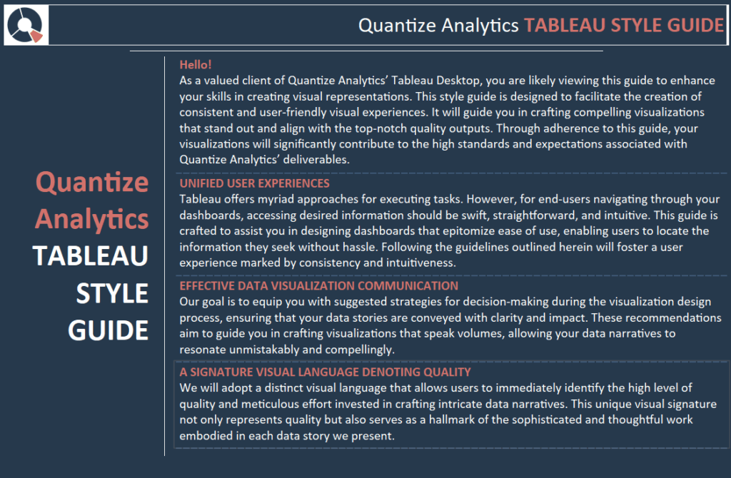
Hello! (Introduction)
As a valued client of Quantize Analytics’ Tableau Desktop, you are likely viewing this guide to enhance your skills in creating visual representations. This style guide is designed to facilitate the creation of consistent and user-friendly visual experiences. It will guide you in crafting compelling visualizations that stand out and align with the top-notch quality outputs. Through adherence to this guide, your visualizations will significantly contribute to the high standards and expectations associated with Quantize Analytics’ deliverables.
Unified User Experience
Tableau offers myriad approaches for executing tasks. However, for end-users navigating through your dashboards, accessing desired information should be swift, straightforward, and intuitive. This guide is crafted to assist you in designing dashboards that epitomize ease of use, enabling users to locate the information they seek without hassle. Following the guidelines outlined herein will foster a user experience marked by consistency and intuitiveness.
EFFECTIVE DATA VISUALIZATION COMMUNICATION
Our goal is to equip you with suggested strategies for decision-making during the visualization design process, ensuring that your data stories are conveyed with clarity and impact. These recommendations aim to guide you in crafting visualizations that speak volumes, allowing your data narratives to resonate unmistakably and compellingly.
A SIGNATURE VISUAL LANGUAGE DENOTING QUALITY
We will adopt a distinct visual language that allows users to immediately identify the high level of quality and meticulous effort invested in crafting intricate data narratives. This unique visual signature represents quality and is a hallmark of the sophisticated and thoughtful work embodied in each data story we present.
Tableau Style Guide – How To Dashboard

UTILIZING THIS GUIDE
In your dashboard development process, there are advised do’s and don’ts (such as initiating bar charts at zero and adhering to best practices for pie charts, among others). However, it’s crucial to acknowledge that data visualization doesn’t have a universal, one-size-fits-all solution. This guide is here to navigate you through these nuances, offering recommendations rather than imposing strict rules, thereby assisting you in effectively communicating your unique data stories through well-designed visualizations.
GRAPH REPRESENTATIONS & VARIETIES
The proposed graph varieties listed here are by no means comprehensive. Instead, they are provided as exemplars of a cohesive style, effectively enhancing dashboards’ aesthetic and functional qualities to align with top-tier standards. Should you wish to venture further and craft Sankey diagrams, ternary plots, or any other unique or unconventional charts, you are encouraged to do so. The sample charts showcased are intended to offer stylistic justification for integrating even the most avant-garde visual representations.
GUIDE’S EMPHASIS
This document serves as a guide rather than a stringent rulebook. While it provides suggestions meant to inspire and be emulated, it doesn’t advocate for outright copying. The key is to strike a delicate balance in applying these recommendations, using them as a foundation upon which you can build and adapt to create compelling visualizations.
NOT A TABLEAU TUTORIAL
Numerous online resources are already available for crafting specific charts or employing particular techniques in Tableau, and we readily direct you to these where relevant.
Tableau Style Guide – Look and Feel
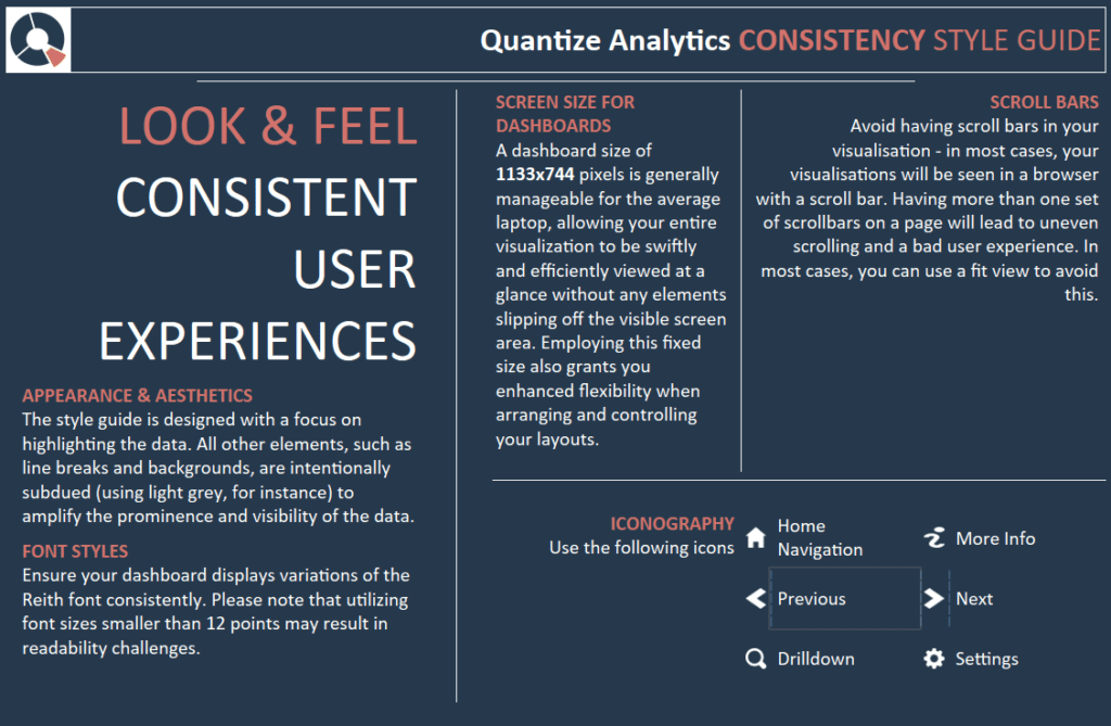
APPEARANCE & AESTHETICS
The Tableau style guide is designed with a focus on highlighting the data. All other elements, such as line breaks and backgrounds, are intentionally subdued (using light grey, for instance) to amplify the prominence and visibility of the data.
FONT STYLES
Ensure your dashboard displays variations of the Reith font consistently. Please note that font sizes smaller than 12 points may challenge readability.
SCREEN SIZE FOR DASHBOARDS
A dashboard size of 1133×744 pixels is generally manageable for the average laptop, allowing your entire visualization to be swiftly and efficiently viewed at a glance without any elements slipping off the visible screen area. Employing this fixed size also grants you enhanced flexibility when arranging and controlling your layouts.
SCROLL BARS
Avoid having scroll bars in your visualisation – in most cases, your visualisations will be seen in a browser with a scroll bar. Having more than one set of scrollbars on a page will lead to uneven scrolling and a bad user experience. In most cases, you can use a fit view to avoid this.
Tableau Style Guide – Interaction
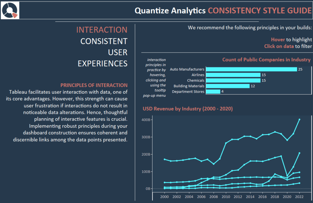
PRINCIPLES OF INTERACTION
Tableau facilitates user interaction with data, one of its core advantages. However, this strength can cause user frustration if interactions do not result in noticeable data alterations. Hence, thoughtful planning of interactive features is crucial.
Implementing robust principles during your dashboard construction ensures coherent and discernible links among the data points presented.
We recommend the following principles in your builds:
Hover to highlight.
Click on data to filter.
Tableau Style Guide- Text
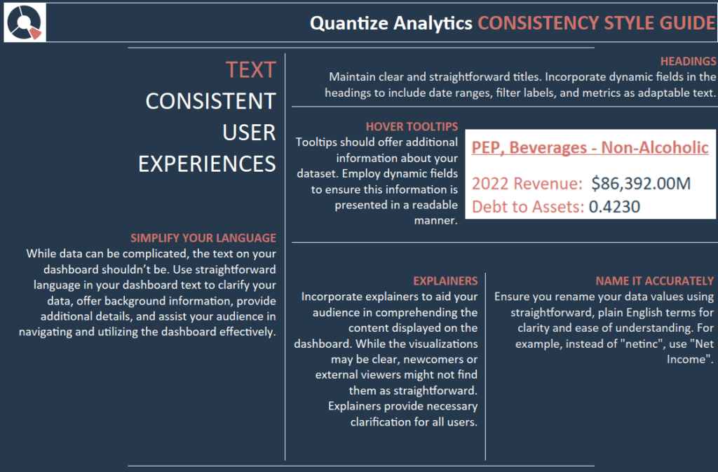
SIMPLIFY YOUR LANGUAGE
While data can be complicated, the text on your dashboard shouldn’t be. Use straightforward language in your dashboard text to clarify your data, offer background information, provide additional details, and assist your audience in navigating and utilizing the dashboard effectively.
HEADINGS
Maintain clear and straightforward titles. Incorporate dynamic fields in the headings to include date ranges, filter labels, and metrics as adaptable text.
HOVER TOOLTIPS
Tooltips should offer additional information about your dataset. Employ dynamic fields to ensure this information is presented in a readable manner.
EXPLAINERS
Incorporate explainers to aid your audience in comprehending the content displayed on the dashboard. While the visualizations may be clear, newcomers or external viewers might not find them as straightforward. Explainers provide necessary clarification for all users.
NAME IT ACCURATELY
Ensure you rename your data values using straightforward, plain English terms for clarity and ease of understanding. For example, instead of “netinc”, use “Net Income”.
Tableau Style Guide – Numbers
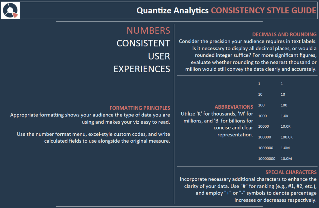
FORMATTING PRINCIPLES
Appropriate formatting shows your audience the data type you are using and makes your viz easy to read.
Use the number format menu and Excel-style custom codes, and write calculated fields alongside the original measure.
DECIMALS AND ROUNDING
Consider the precision your audience requires in text labels. Is it necessary to display all decimal places, or would a rounded integer suffice? For more significant figures, evaluate whether rounding to the nearest thousand or million would still convey the data clearly and accurately.
ABBREVIATIONS
Utilize ‘K’ for thousands, ‘M’ for millions, and ‘B’ for billions for concise and clear representation.
SPECIAL CHARACTERS
Incorporate necessary additional characters to enhance the clarity of your data. Use “#” for ranking (e.g., #1, #2, etc.), and employ “+” or “-” symbols to denote percentage increases or decreases, respectively.
Tableau Style Guide – Typography
FONTS
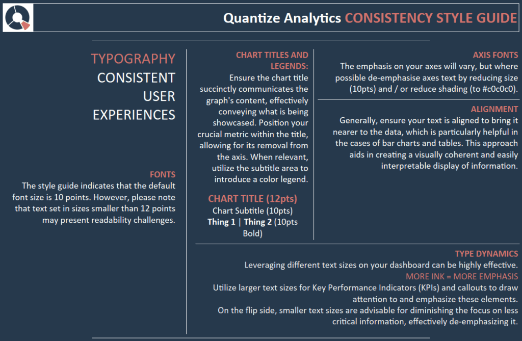
The style guide indicates that the default font size is 10 points. However, please note that text set in sizes smaller than 12 points may present readability challenges.
CHART TITLES AND LEGENDS
Ensure the chart title succinctly communicates the graph’s content, effectively conveying what is being showcased. Position your crucial metric within the title, allowing for its removal from the axis. When relevant, utilize the subtitle area to introduce a colour legend.
AXIS FONTS
The emphasis on your axes will vary, but de-emphasise the axes text by reducing the size (10 pts) and shading (to #898989).
ALIGNMENT
Generally, ensure your text is aligned to bring it nearer to the data, which is particularly helpful in the cases of bar charts and tables. This approach aids in creating a visually coherent and easily interpretable display of information.
TYPE DYNAMICS
Leveraging different text sizes on your dashboard can be highly effective.
MORE INK = MORE EMPHASIS
Utilize larger text sizes for Key Performance Indicators (KPIs) and callouts to draw attention to and emphasize these elements.
On the flip side, smaller text sizes are advisable for diminishing the focus on less critical information, effectively de-emphasizing it.
Tableau Style Guide – Layout
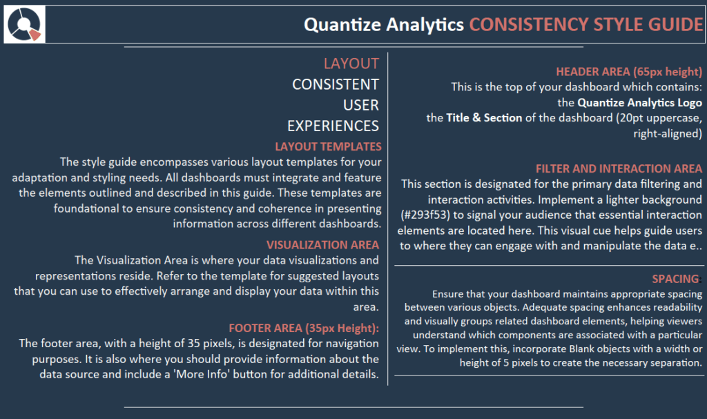
LAYOUT TEMPLATES
The style guide encompasses various layout templates for your adaptation and styling needs. All dashboards must integrate and feature the elements outlined and described in this guide. These templates are foundational to ensure consistency and coherence in presenting information across different dashboards.
VISUALIZATION AREA
The Visualization Area is where your data visualizations and representations reside. Refer to the template for suggested layouts that you can use to arrange and display your data within this area effectively.
FOOTER AREA
The footer area, with a height of 35 pixels, is designated for navigation purposes. It is also where you should provide information about the data source and include a ‘More Info’ button for additional details.
HEADER AREA
This is the top of your dashboard, which contains the following:
the Logo
the Title & Section of the dashboard (20pt uppercase, right-aligned)
FILTER AND INTERACTION AREA
This section is designated for the primary data filtering and interaction activities. Implement a lighter background (#293f53) to signal to your audience that essential interaction elements are located here. This visual cue helps guide users to where they can engage with and manipulate the data effectively.
SPACING
Ensure that your dashboard maintains appropriate spacing between various objects. Adequate spacing enhances readability and visually groups related dashboard elements, helping viewers understand which components are associated with a particular view. To implement this, incorporate Blank objects with a width or height of 5 pixels to create the necessary separation.
Tableau Style Guide – Layout Example

Conclusion – For Now…..
Okay, that was a lot of work to get to one dashboard. The upfront investment in the style guide makes our decisions about visualization much more manageable. We can also see that the dashboard is “on-brand” with minimal effort. Can you imagine the amount of data analyst hours saved when they are not tinkering with design decisions? Stay tuned for the next blog on Tableau style guides, where we will go through individual visualization components.